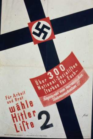
He’s the art director at The New York Times, the author of more than 130 books and writes the blog The Daily Heller for Print Magazine’s website. Nary a book on design can be published nowadays without an introduction written by him. I’m talking, of course, about Steven Heller, who’s work reaches every dusty corner of the design world. He was recently on the Faith Middleton Show talking about the Nazi’s interest in graphic design – kind of a no-brainer if you’ve ever seen Nazi propaganda posters. I’m not sure if Nazi font choice counts as pop culture, but Heller does make some interesting points where that’s concerned.
“Pop culture is often maligned as fleeting, but history shows that sometimes what is pop in one culture has time-honored resonance in later ones. This book is an attempt to show that pop culture, especially as seen through the lenses of design, illustration, satiric and political art (and other things), is integral to a broader understanding of who we are and where we are going.”—Steven Heller, from the Introduction of “Pop: How Graphic Design Shapes Popular Culture”
How do popular culture and graphic design influence one another? What are the goals of design? Are they to sell? To package? To entertain? The answers to these questions are complicated and are intimately tied to the effect design has on the overall culture. POP is the first book to analyze the role of graphic design in the broader culture, as well as the impact of design on other art and entertainment forms, from album covers to baseball stadiums.

about perrin drumm

Clever graphic depicting a person’s impact on twitter. Illustration by la Tigre. [ full story ]

Conceived by the designer Michel Penneman and the architect Olivier Hannaert, the Pantone Hotel is based in Central Brussel, Belgium. Inspired by the famous color matching system Pantone, the 59-room hotel is a great place for designers to sleep over while passing by the Belgium capital.
Pantone Inc’s claim to its fame began 45 years ago with its revolutionary color matching system that allowed designers to reproduce accurate color anywhere in the world. The company is branching out and moving into lifestyle – oriented industries using the same color numbering system to guarantee an exactness of hue. In 2009 they launched sea-vee sneakers.
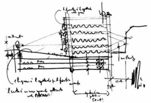
 good sketcher says, “sketching is a must! bad sketcher says ”sketching isn’t all that important, what about model making?” (left) renzo piano.
“I have so much to say about this that I will be quiet and just sketch…” [architect]
“A designer who can’t sketch is like a journalist who can’t write!” ( nike creative director )
“A couple of good points, but it still doesn’t negate that sketching well is the cost of entry. I think this piece explains why sketching isn’t just important to get a job, but an essential part of the the process.” ( comment )
resources:
randy shear
douglas wittnebel
sketchy thinking

about randy shear
 esquire magazine commissions twelve artists and designers to re-engineer their logo and kick off a logo sweepstakes.
tom geismar

universal everything

aaron rayburn

tronic
Esquire’s logo sweepstakes is part of a unique experiment in Augmented Reality with GoldRun — a technology firm who helped put the logo letters from the sweepstakes all across America. Find them, and you could win an iPad. How to find and Esquire letter in your city. Letters created by design firm Tronic.
<a href=" about phil patton

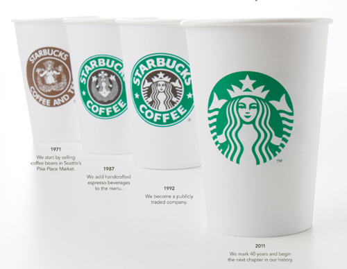
last summer i had a premonition that the starbucks logo was going to change.
the thought made me a little sad because i liked their retro “label” design that subtlety, as a result, distinguished them from most other cleaned up rebrands. as the starbucks brand applications annually evolved the logo was stubbornly staying put. the old logo was very iconic and the siren was the weaker part of the old logo.
no argument about removing the word coffee. not so sure about removing starbucks on packaging going outside their cafes and onto competitive shelves. though don’t underestimate folks to figure these things out. only time will tell on this aspect, i.e., names are unnecessary for large institutions no matter where the products are served up. i predict a starbucks-only logotype being displayed somewhere.
this is a pretty savvy company marketing-wise with a strong in-house team and a powerful brand. how powerful is startbuck’s image? powerful enough to: now be an official stamp of affirmation that a neighborhood is gentrifying; just like holiday inn, to be comforting when found when no other viable known options are available.
though the timing of the rebrand is said to be a salute to company’s 40th anniversary one can’t help but wonder if the new look / strategy will leverage the outcome with current kraft foods litigation.
PRO
1) one color. cost efficient (on cups) and nod towards environment
2) simplified and nice refinement of siren
3) strong visual evolution over 40 years
CON
1) removing name iffy as company moves out of store and into marketplace shelves
2) old one so iconographic that new one dilutes the brand
3) siren was weaker part of logo
on a personal note, i wish the product lived up to it’s brand imaging though i’m glad they’re there when i crave one at the airport.
resources:
official starbucks announcement
starbucks vs kraft foods
logo evolution with nice write ups
logo evolution
lee moody’s facebook: nice commentary
RxART is a thriving nonprofit that brings the work of world-class artists to patients whose spirits are lifted by the presence of colorful, inspirational contemporary art in their daily lives. Since then, artists like Jeff Koons, Matthew Ritchie, Alexis Rockman and William Wegman have lent their expertise to hospitals across the country. A 10th anniversary celebration and fundraiser on November 15 in New York
via GOOD [RK]


The lawyers and accountants have been working weeks on the presentation: the hubs and destinations, the common culture, the synergy, and why this isn’t a trust-buster merger. If this “flies” they know they’ll be the biggest airline on the planet.


Now alone in the new United Loop office space at 77 W. Wacker, United CEO Glenn Tilton, and Continental CEO Jeff Smisek maneuver to close the deal.
Tilton asks, “Scotch? If we’re going to do this the headquarters stays in Chicago. What do you want?”
“No problem with that. I’ll be the new CEO. I’m now wondering what we stick on the planes? What did it cost to paint your planes grey? BTW, I’ll admit I’m getting an adrenaline flow over this. ”
“Yeah, it may have been bad timing to start repainting the planes while we’re filing for bankruptcy I guess. The jury’s out on what our passengers think of the packaging. Probably don’t give a damn.”
“Ready for another? I went to the trouble to talk to our creatives. They said the marriage could be a complicated brand issue and said to stick with what we have.”
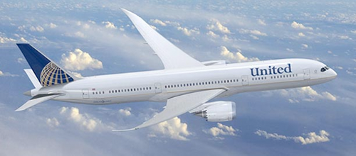
“Let’s keep the process simple. It’s the name and logo. You keep your name and we stick on our logo. They’ll be naysayers but it’s a no-brainer.”
“Come to my computer, I’m getting good at retouching my press head shots.”
Cut. Paste. Cut. Paste. “Wait. Need to type this.” Click. Click. Click. “Shit. Do you text message?” Click. Click. Click. Cut. Paste. “There, what do you think?”


“Very impressive. I’ll be sending you my head shots. I’m hungry as hell, let”s call the wives.”
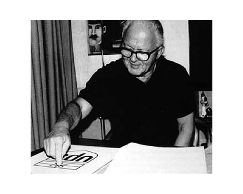
above: saul bass – designer of united logo / brand identity
Resources:
fastcompany
reuters
chicago architecture
