trump tower chicago’s new provocative signage is now national news unfortunately.
above> alex garcia tribune photo
Donald Trump is a lightning rod. Now Trump has made Adrian Smith‘s, architect at Chicago’s SOM, emblematic Trump Tower Chicago a lighting rod. The issue went public three weeks ago when Chicago Tribune architecture critic, Blair Kamin, architecture critic of the Chicago Tribune, jumped all over evidence of new signage in-the-making. Trump responds and it went back and forth prompting mayor, Rahm Emanuel to weigh in, “a tastelss sign”. Trump finds a need to say, ‘I love chicago…and my sign ‘. These happenings now national news, Jon Stewart can’t contain his get-real sentiment either.

above> about the time kamin went public
Let me weigh in from my own experience with this building and two others regarding signage. In 2002, when Trump was looking for marketing proposals I was asked to create a concept for @Properties. The concept: Create two books, a graphic coffee table piece and one with strategies and numbers. @Properties was wildly successful though a very new company. A humongous building in their portfolio would not be a bad thing. The thrust of the concept was jumping into the future, as if @Properties had already won the Trump Tower job. @Properties deftly pitched it but didn’t get the job. Solace was achieved by Trump’s marketing team loving the creativity and boldness of the pitch, it was one of the best. We walked feeling we won and thinking Trump hired a great architect and they would not mess up.
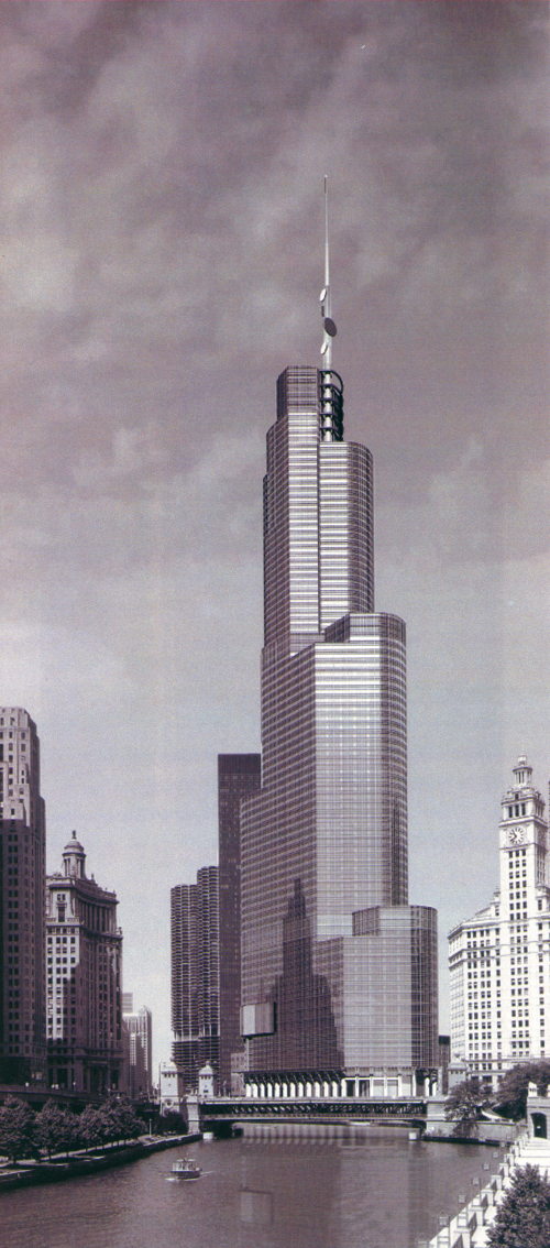
above> trump tower from river walk | image courtesy som / click to enlarge all images on this post
An uh oh moment occurred at the time Santiago Calatrava‘s brilliant and ambitious Spire was looking like it might happen. Under construction at this time, Trump’s building was looking good too. Also at this time, The Spire began placing beautiful marketing signs along both north and south Michigan Avenue. Really understated, as elegant as the building. But then, more signs popped up, freshly mounted in the sidewalks. 10 large bullet-points… Trump Tower is coming.
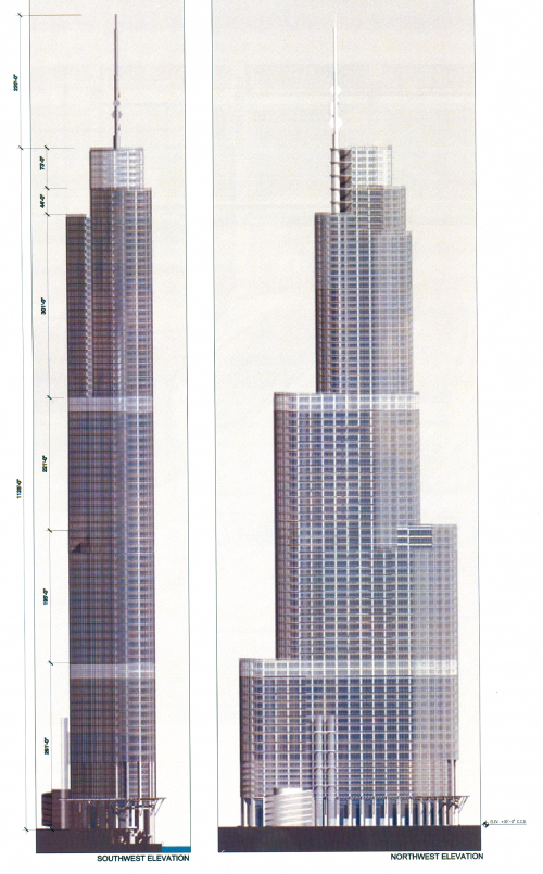
above> trump tower sw/nw elevations | image courtesy som
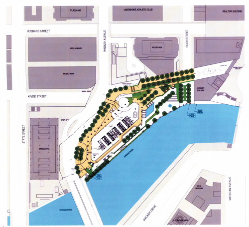
above> trump tower ground plan | image courtesy som

above> trump tower abstract rendering | image courtesy som
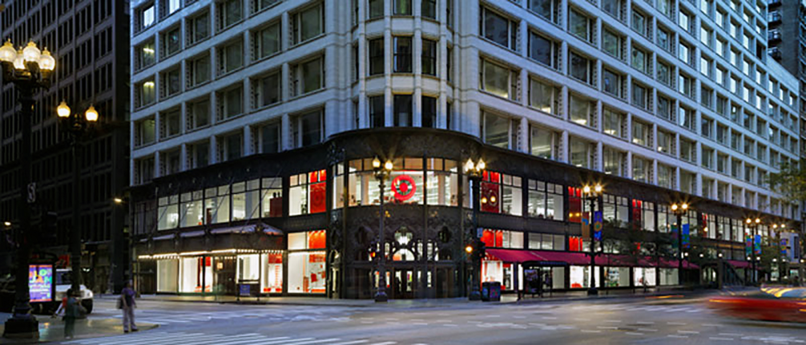
Trump Tower’s new signage comes as no surprise, though very disappointing that someone, didn’t feel the collaboration between Trump and Smith created a magnum opus capable of saying all the right things on its own. The building’s design calls out for more than all cap fatso letters that seem slapped on the facade. Recently faced with the dilemma of marketing their new State Street store and respect Louis Sullivan‘s building Target figured it out by placing all messaging inside the structure and not on it.
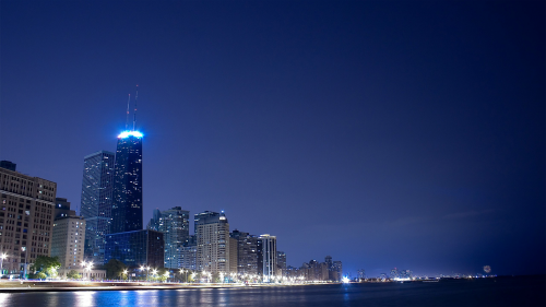
Not many know this story about the John Hancock Center. In 1969, three years prior to my arrival as a designer at The Design Partnership‘s signage partner Mabrey/Kaiser, Bud Mabrey with the help of SOM’s Bruce Graham, the designer of JHC, persuaded John Hancock Insurance to eschew any signage, that a brightly lit observation deck would be all the identity that this building needed. [ interesting jhc tidbits ]
above> bruce graham’s john hancock center | 1969
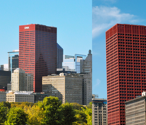
In 1973, again Bud Mabrey and again with the help of the architect, Graham Anderson Probst and White, enticed CNA Financial Corporation to paint their building red. The concept, the red design was used to depict the sun setting over the ocean as illustrated by the red imagery to the west of Lake Michigan. And again, no building identification signage except on the plaza. A sign was eventually added more than 20 years later.
Now the CNA building really has no business being in this conversation, too short, a non-existent brand image, but it does belong with the Hancock Center in the big concept arena. Big concepts don’t mean success and huge concepts go so unnoticed because they may be very open to interpretation. It may take someone next to you to set you straight. But you gotta love their conception, the pitch and execution. I would have praised Trump if he had topped the building with a ‘big concept’ oversized toupée instead.
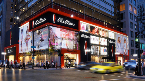
above> developer’s proposal for 300 north michigan avenue
Times Square. The above image surfaced late last year for 300 north Michigan avenue, which is SOUTH of the river and not the Mag Mile. This stretch is becoming known as the Millennium Mile. Yes, a Times Square style will make its way to Chicago. Only if it’s very profitable for the city though. Guessing State Street not Mag Mile suits this format best. Mag Mile is our Madison Avenue. Confident Rahm Emanuel will support the right thing [ Chicago places ads on really public spaces ]
Michael Bierut, Pentagram partner and DesignObserver co-founder said this, “What’s interesting about Times Square is that there are special signage regulations that ensure that every new building has to have big signs on it. They were put in place in the late 80s when there were proposals to replace the older buildings with new (and boring) corporate buildings. Now there are a lot of new skyscrapers there but they are covered with flashing signs. Trivia point: Tibor Kalman helped develop the standards, working with architect Robert A.M. Stern.”
