• CALENDAR
    • Add Your Event
  • architecture
    • art & literature
    • awards
    • buildings
    • sustainable
    • prefabricated
    • public space
    • residences
    • urban planning
  • design
    • art & literature
    • awards
    • collectables
    • concept
    • fashion
    • sustainable
    • home
    • lifestyle
    • safety & special needs
    • transportation
    • workplace
  • editor’s pick
    • featured
    • gift ideas.
    • interviews
    • opinion
  • events
    • auctions
    • competitions
    • conference & Exhibitions
    • fairs
  • news
    • latest news
    • elsewhere
    • lifestyle
    • people
    • producer
    • retailer
DesignApplauseDesignApplauseyour daily design dose
  • CALENDAR
    • Add Your Event
  • architecture
    • art & literature
    • awards
    • buildings
    • sustainable
    • prefabricated
    • public space
    • residences
    • urban planning
  • design
    • art & literature
    • awards
    • collectables
    • concept
    • fashion
    • sustainable
    • home
    • lifestyle
    • safety & special needs
    • transportation
    • workplace
  • editor’s pick
    • featured
    • gift ideas.
    • interviews
    • opinion
  • events
    • auctions
    • competitions
    • conference & Exhibitions
    • fairs
  • news
    • latest news
    • elsewhere
    • lifestyle
    • people
    • producer
    • retailer

Education

Home Tag Education
ncidq certification and how to get there.

ncidq certification and how to get there.

Nov 6, 2017

at the kimball showroom (nyc), idlny will host a special seminar to educate new york state interior designers about the national council of interior design qualification exam.

developed to demystify the certification process for interior designers, this session will offer designers a clear, step-by-step plan to prepare for and ultimately pass the ncidq exam. as a requirement for certification, the exam is the gold standard for demonstrating competency in interior design. passing the exam not only offers prestige and respect, but it will also open the door for interior designers at every step of their career, from qualifying for jobs to securing future leadership opportunities.

with a presentation from thom banks, the executive director of cidq, attendees will learn:
why it’s important to take the ncidq exam
how to certify their work experience
which prep courses are available
when they can take each part of the exam

after the presentation, attendees will have the opportunity to voice questions and comments to cidq staff. readers can rsvp to info@idlny.org.

photo by jen brister

risd furniture design & textiles present in xxi triennale in milan and icff in new york.

risd furniture design & textiles present in xxi triennale in milan and icff in new york.

Apr 7, 2016

the departments of furniture design and textiles at rhode island school of design [ risd ] are presenting the narrative of making at the xxi triennale international exhibition milan 2016 (xx1t) and at the 2016 international contemporary furniture fair (icff) in new york city.

mdw16-risd-Bagdatoglu4

the featured work is based on in-depth, multidisciplinary materials research, with furniture design students partnering with peers in textiles to rethink the use of soft materials in furniture design. rather than using conventional techniques to cover furniture with foam and textiles, in this work students emphasize the inherent qualities of the materials through methods based on weaving, knitting, knotting and crocheting.

throughout the fall 2015 semester, students developed a series of models that led to a full-scale mock-up; these in-depth explorations provided a solid foundation for the construction of the final, well-executed prototypes for the shows.

mdw16-risd-Bannar-Webster1

mdw16-risd-Camarena-Sirothia1

mdw16-risd-Dunbar-Mujica5

mdw16-risd-Henry-Boswell3

mdw16-risd-Mosseri-Runge1

mdw16-risd-Mosseri-Runge6

mdw16-risd-Antignano 2

xxi triennale international exhibition milan> 21st century. design after design | cathedral of the fabbrica del vapore | via giulio procaccini 4 | 2 april > 26 june 2016.

international contemporary furniture fair | the javits center | 655 west 34th street | 14 > 17 may 14–17 2016.

cooper hewitt high school student design challenge winner. #thinkoutside

cooper hewitt high school student design challenge winner. #thinkoutside

Apr 6, 2016

and the winner is…claire christianson, a sophomore at providence academy, chose as her inspiration object a painted porcelain art nouveau vase. christianson explained, “i was inspired by the media of the art nouveau vase. my chair’s form was taken from the tons of little ribbons of clay trimmings that the potter cut off in pursuit of his masterpiece.”

cooper hewitt, smithsonian design museum announces the launch of student design challenge #thinkoutside, its first-ever nationwide competition for high school students, inviting them to submit ideas for an outdoor chair inspired by objects from the museum’s collection. organized by cooper hewitt in collaboration with target, the challenge’s winning chair design will be manufactured by the retailer for exclusive use in the museum’s recently redesigned arthur ross terrace and garden.

cooper-hewitt16-student-vase1

above> vase, 1903; painted by samuel schellink (danish, 1876-1958); manufactured by rozenburg pottery and porcelain factory (the hague, netherlands); painted porcelain; gift of arthur altschul, 1994.

fellow [ finalists ] lauren schrempp (new york), valerie taranto (new jersey), ryan thompson (illinois), and tanner wall (florida), traveled to new york to participate in a design workshop at cooper hewitt with members of target’s design team and museum educators. on sunday, april 3, the finalists presented his or her design in person to the judges.

[ the judges ] cooper hewitt director caroline baumann was joined by a panel of creative experts to evaluate the finalists’ designs, including national design award winner walter hood, principal and founder, hood design; steven keating, head of performance footwear design, puma; rachel shechtman, founder, story; tana smith, youtube star “tanamontana100” and author; todd waterbury, chief creative officer, target; and tony whitfield, associate professor of art and design, parsons school of design. susanna sirefman, president of dovetail design strategists and competition advisor for the challenge moderated the panel’s deliberations. [ details ] #thinkoutside

city in a garden: sustainable chicago poster design competition.

city in a garden: sustainable chicago poster design competition.

Mar 19, 2014

chicagoposter2entries due by friday 4 april 2014 [ details ]

The City of Chicago welcomes designers to the Sustainable Chicago Poster Design Competition: CITY IN A GARDEN. Centered on the belief that graphic design can affect positive change, CITY IN A GARDEN seeks to integrate innovative and compelling design into Chicago’s urban fabric. Winning posters will be displayed on bus shelters and city information panels throughout the city, serving as public art, enhancing daily life in Chicago, and encouraging residents to live more sustainably. CITY IN A GARDEN aims to advance Chicago on its path to being the most livable, competitive and sustainable city.

The goal: To design a powerful, attention-grabbing, memorable poster, incorporating what it means for Chicago to be a sustainable city, bringing the City’s motto “Urbs in horto” (Latin for ‘City in a Garden’) to life. The design should be inspiring, engaging and ultimately, create a call to action for residents to make a difference in our community.

[ judges ] Philip Enquist FAIA, is Skidmore, Owings & Merrill’s firm-wide leader for Urban Design & Planning.
Sara Frisk is the Portfolio Director for IDEO Chicago
Zoë Ryan is the John H. Bryan Chair and Curator of Architecture and Design at the Art Institute of Chicago.
Rick Valicenti is the founder and design director of Thirst/3st, a communication design practice
Pooja Vukosavich is the creative catalyst for Studio V Design, Inc., a graphic design firm in Chicago
Karen Weigert serves as Chief Sustainability Officer for the City of Chicago
[ details ] [ @AIGAchicago @chidm @CCCArtDesign @DesignApplause @hcdinfo @IDSAchicago @IITDesign @saic_news @STA_CHICAGO @SustainColumbia @UIC_Art_Design ]

<a href="527-ronscope200about ron kovach

in the making. barber & osgerby and the design museum.

in the making. barber & osgerby and the design museum.

Jan 24, 2014

above> aluminum front of a london underground train at the entrance to the in the making exhibition

The Design Museum in London, presents “In the Making” an exhibition curated by Edward Barber and Jay Osgerby. An interesting theme is the capturing in various and unfinished states of the production process of 24 objects. The curators comment ‘We have always been fascinated by the making process as it is an integral part of our work. We have curated an exhibition that will provide a platform to capture and reveal a frozen moment in the manufacturing process and unveils an everyday object in its unfinished state. Often the object is as beautiful, if not more so, than the finished product!’

making-install1

making-pencil-optic1derwent pencils in the making |unfinished swarovski crystal / photography györgy kőrössy

making-coke-charles1coke can | charles sofa designed by antonio citerio for b&b italia / photography györgy kőrössy

Most of the pieces are everyday objects – we see forks, pencils, tennis balls and a Coke can. There are indeed B&O objects. The 2012 Olympic torch. My favorite is indeed a B&O creation for Italian furniture producer Vitra, the Tip Ton Chair. The chair is made of made of polypropylene and is manufactured from a single mould without the use of mechanical components. This makes it extremely durable and up to 100% recyclable and defines a whole new chair typology: the solid plastic chair with forward-tilt action. The chair still may need to prove that its ‘half-rock’ feature is both good for the back and blood circulation. Tip Ton is also a candidate for iconic object with its innovative and proprietary profile.

making-torch1the 2012 olympic torch manufacturing process

making-tip-ton1tip ton

An important underlying idea in the installation is a glance at the ongoing dialogue between designers and manufacturing through the making process. ‘This perspective is distinctive to their practice: throughout their careers, Edward and Jay have had a curiosity about the way things are made.’ Though there are several videos of the manufacturing process the ‘in the making’ theme presented an opportunity to go a little deeper into the ‘dialogue’ idea, a unique difference maker with some of the more function-driven, innovation-driven and design-driven objects in this show and like-kind successful objects in general. After all, how do certain products fulfill a need the best or become become iconic in their form and sensitivity. If you indeed get into what’s going on here, prepare to be educated, entertained and maybe even inspired. And discover in London that many of the most advanced techniques for the production of furniture were born right in the Bel Paese.

The exhibition opened on the 22 January and goes until 4 May 2014.

making14-bando-mug1edward barber, jay osgerby

[ barber & osgerby ] [ design museum ] @designmuseum #designmuseum

527-ronscope200about ron kovach

Apple, google and microsoft help students learn to code in education campaign.

Dec 11, 2013

apple, google and microsoft help students learn to code in education campaign. on wednesday 11 december 2013, 5pm, apple is scheduled to host hour-long coding classes at each retail location in the United States. via washington post [RK]

Armin hofmann: farbe/color. A+D museum.

Nov 13, 2013

armin-add_silkscreen2silkscreen

Just in: The A+D museum was kind enough to send images. Detailed captions coming. I met Mr. Hofmann in 1972, at the height of the ebb of the Swiss USA invasion. Seems like 10k AH images through the years. You couldn’t avoid them if you needed an inspiration, taught design and presented his typography / color explorations, went to gallery openings, etc. I’m absolutely not sure that I’ve seen the images in this post though the architectural graphics are new to me. Hope to see this installation in person. The internet is misleading and almost a disservice. Nothing even close to experiencing some things in person.

armin-Disentisdisentis high school | architects hermann and hans peter baur

armincolor_sketch2color sketch

armin-blackwhite_sketchb/w sketch

More information from an exhibition at Galerie Susanna Kulli (30 August – 28 September 2012

)
“It has always seemed to me that there must be a life of color as such, divorced from any object.” (Augusto Giacometti, Die Farbe und ich, 1933)—Until now, the reception of Armin Hofmann’s oeuvre has focused on this renowned Swiss graphic artist’s posters, which are largely in black and white. The exhibition at Galerie Susanna Kulli now offers the first in-depth look at his intense engagement with color. Its centerpiece is a portfolio of silkscreen prints that is unique in Hofmann’s oeuvre.
The silkscreen portfolio is complemented by writings and sketches from Hofmann’s private archive and problems he assigned in his classes.

Recollections of four of his former students—Philip Burton, April Greiman, Aki Nurosi, and Moritz Zwimpfer—open up new perspectives on Hofmann’s close engagement with issues of color.
Each of the twelve plates in the portfolio, created between 1989 and 1999, shows four triangles arranged in a square. By eliminating light-dark contrasts, Hofmann was able to focus on color as such and the contrasts specific to it—cold–warm and luminous–dull, as well as contrasts in hue and quantity. As Hofmann emphasizes, the twelve plates should not be regarded as final results; they are guideposts in a process, and their order is variable. The reduction to a single problem held constant led him to a more nuanced vision and a growing awareness of the sensual qualities of color: “When you work in this manner, you become ever more refined, more sensitive.”
In his teaching, too, Hofmann sought to raise his students’ sensitivity for the qualities and effects of color. 
He had no interest in imparting an authoritative system of color, striving instead to accommodate the individual element in color perception.

Of particular interest in connection with the silkscreen portfolio, which Hofmann describes as “a sort of account of my pedagogical activities,” is a problem he assigned in a class in 1984. The extant sketches produced by the students and their final results bear considerable compositional and chromatic resemblance to the twelve plates in Hofmann’s portfolio.
 Two case studies—of the former PTT-Areal in Arlesheim and the high school in Disentis—further illustrate Hofmann’s use of color in three dimensions. Both buildings were designed by the architects Hermann and Hans Peter Baur, early advocates of an “integration of the arts” into architecture; during the almost six decades of their collaboration with Hofmann, they frequently involved the artist in the planning process from the very outset.
Art for public spaces was the only field of his practice in which Hofmann employed color as a defining artistic element. As in the silkscreen portfolio and in his classes on color, the study of the relativity of chromatic values was central. The critical examination of the role of the mark in its context pervades Hofmann’s entire oeuvre. The engagement with color added another layer to this complex issue and may be seen as bringing further nuance and elaboration to his teaching of form.

venue> a+d museum | 6032 wilshire boulevard los angeles | 323 932 9393
opening reception> 14 november 2013 | 6p
open to public> 14 november 2013 > 19 january 2014 | los angeles

527-ronscope200about ron kovach

20th student design competition. International home + housewares show 2013.

Mar 13, 2013

ihhs-student-sign1click > enlarge

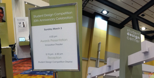
The Student Design Competition turned a proud 20 years-old this March, paying homage to IHA and the 125 winners who launched their careers via this event. IHA said that in 20 years there were over 4,000 entries and 160 industry professional judges. All have contributed with a common goal in mind: to encourage and recognize young designers and raise awareness in the design housewares market of the value of design. Out of the 256 entries received in 2013, six top winners (below) were chosen along with five honorable mentions. BTW, this is Vicki Matranga’s, IHA Design Programs Coordinator, 20th trip to this dance. She founded the competition 20 years ago.

ihhs-studentwin1 
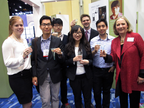
l>r breanna, heman, yutong, yungi, cole, juan and vicki matranga
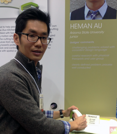
ihhs13-heman1
heman au

DesignApplause talks to the first place winners:

[ First Place $3,000 ]
Duo Kitchenware by Heman Au | Arizona State University, junior

[DesignApplause] I am interested in hearing how you got the inspiration to develop this product, Duo Kitchenware. Can you tell me your name, age, school and major?
[Heman Au] My name is Heman Au, I’m a Junior Industrial Design student at Arizona State University, 31 years-old. The idea came from my aunt who owns a restaurant out in Palo Alto, CA.

[DA] And what’s it called?
[HA] Ada’s Cafe. And the entire restaurant is staffed by people with disabilities. She trains them and staffs them to help them become a productive citizen. So a couple years ago she came to me telling me how the knives that she has at her restaurant don’t really work, and since I’m a design student- you know, help her come up with something that would work for her staff members. At the time, I was only a freshman and I told her, “You know, give me a couple years while I develop my skills as a designer and I’ll come back and help you out.” So, a couple of years passed. I heard about the Housewares competition, so I decided to use this opportunity to design a knife for people with disabilities. And you know, from my research I found out that there’s over 800,000 Americans with one form of disability or another, and also through my research I found that there really is a lack of knives for people with disabilities. There’s a lot of spoons, cups, you know, forks- but no knives to help you cook. So I decided to take the opportunity to design something for kind of more the home use instead of the restaurant use. And that is where the idea came from.

[DA] You said it took 12 weeks to conceive and execute your idea. Four weeks of that was research and testing by two people? Now, going forward, you’re looking for a manufacturer to produce this for you?
[HA] Yes. Mmhmm.

[DA] Would you consider doing Kick Starter?
[HA] Yeah.

[DA] Are there any designers who really inspire you or that you aspire to be like in your work? 
[HA] I really admire Joseph Joseph’s design aesthetic.

[DA] Right. OK. How did you select your materials for it? What is it made out of?
[HA] Actually drawing a blank so…The knife uses a high carbon stainless steel blade, and I picked that not because of its – I mean, it’s durable, but at the same time it has a stark [appearance], so it contrasts with the white cutting board. So it also helps with people who have kind of visual disabilities or spatial disabilities. The handle is just injection molded polypropylene with over-molded TPE, just for comfort. Kind of like the OXO Good Grips. OXO is kind of like another inspiration, just their focus on ergonomics and comfort. And the cutting board is made out of high density polyethylene, just because it’s very durable, but at the same time it won’t damage the blade’s sharpness. So it will keep it sharp longer and it’s great for harsh chemical cleaning or chemicals, it will withstand that. And again you’ll have over-molded TPE for the handle and the back side just for grip.

[DA] What’s the expected lifespan of this product? Did you come up with a way to sharpen this knife yet?
[HA] Yes, so I tested it out. I mean, I didn’t actually test it out, but I tried fitting it with a lot of knife sharpeners out in the market, and it fits in a lot of existing knife sharpeners. So it doesn’t need any special sharpening tool.

[DA] How many times did you actually have to go through the physical process of creating it before you got it right?
[HA] What do you mean?

[DA] Did you know which materials to use right away before you actually created a prototype version or did you have to make a couple of them before you got the right mixture of materials, process, etc?
[HA] Well, the materials are kind of hard because I don’t have a functional prototype to actually see how long the cutting board material lasts. But from the design aspect, just the form and function of it, I went through at least four or five design revisions before kind of settling on what this- what you see in front of you.

[DA]Is there anything else you’d like to say about Duo Kitchenware that you think people should know?
[HA] I actually want to add that besides it being a good tool for people with disabilities, I’ve gotten a lot of feedback telling me that it would be great for kids as well as seniors, who have maybe arthritis or just low strength. And even everyday moms, dads would love to have something like this in their kitchen. You know, that was kind of one of the things that I was trying to keep in mind in my design, was to keep it nice and simple- at the same time, making it look like an everyday, household item. Because obviously people with disabilities, they’re already very self-conscious of their short-comings and they don’t want to use something that’s kind of branded as, you know, of disabled equipment. You know, I’m just pretty excited to see it out in the market, because I think there’s definitely, you know, a group of people that really need something like this. And it would be great for the younger market. I know a lot of times people don’t design for that group, because there’s not a lot of them. You know, it’s better to design for like 7 billion people versus only 700,000 people, but I feel like by making my design more universal to fit, you know, all different sorts of people- it could really help bring it out to market because people want to pick it up.

[ Judges’ Comments ]
>challenging problems solved with consistent design language
>careful research with physical therapists and user group
>clearly defined problem, process well conducted
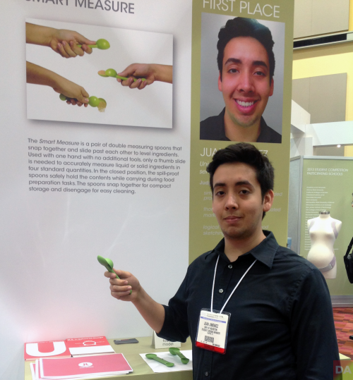

ihhs13-juan1
juan jimenez


[First Place $3,000]
Smart Measure by Juan Jimenez | University of Houston, senior

[DesignApplause] Can you tell me your name, age, school, major?
[Juan Jimenez] My name is Juan Himenez, from the University of Houston. I am 23 years-old, and I’m majoring in Industrial Design.

[DA] Can you tell me about the inspiration and thought process that lead to your actual final product, Smart Measure?
[JJ]  Yeah, so the project when we began, it was to design a kitchen utensil. And the way I began to do research was really just to print out a bunch of recipes and follow them to try to use as many utensils as I could. And what I began to do is to take pictures and document the different problems I found with different products and just narrowing it down until- to something that I felt had a good opportunity. So eventually I narrowed it down to measuring spoons. So from there I began to really just think of how can I solve these problems simply? And I basically just started sketching, making models and stuff like that.

[DA] OK, cool. So do you have a lot of personal experience with faulty measuring spoons or ways you can make it easier?
[JJ] Yeah, I really didn’t start cooking that much until I was given this project. But I think in a way that gave me a little bit of an advantage, because I was immediately like, “this isn’t working” or “this doesn’t work.” I wasn’t someone who is more experienced who would probably be like, “oh, that’s just the way it is.” So I think that actually gave me a little bit of an advantage.

[DA] And how did you decide on the material for the measuring spoon?
[JJ] For this material really what I did was- usually the way I go about it is I think: OK, what properties do I need this to have? So it needs to be- it needs to have a certain amount of flexibility, it has to be strong, and it has to be food-grade safe. So with that I just think, OK what other products have these same properties? And then I look at those products and say OK, what are these made of, and then I use that as kind of like a foundation to begin my material research.

[DA] How long did it take you to complete this project, from conception to completion?
[JJ] A year overall to refine the measuring spoons. The project itself took two weeks, but I went through a lot of different versions as the idea remained in my head.

[DA] OK, so now what’s next? You’ve won this award. How are you going to try to take this idea further?
[JJ] Well, the idea is to try to- I’ve taken it as far as I can with my knowledge of manufacturing. So I’m trying to meet other people who can help me develop it further and possibly take it to market.

[DA] So are you going to try to do, like Heman mentioned Kick Starter, or are you looking for manufacturers that are specifically looking to carry this product?
[JJ] Yeah. There’s a few companies that I like that have this similar, I guess, design style that I’m interested in. But it’s also a possibility to do something on my own, like a Kick Starter project or something to have it still be mine [IP] and just take it further.

[DA] Awesome. Have you ever submitted to this design contest before?
[JJ] No, this is the first time.

[DA] Well, Congratulations.
[JJ] Thank you very much.

[DA] Just another question I had was, are there any particular designers or brands that you really admire that influenced, you know, your desire to do this?
[JJ] I’m a really big fan of OXO. I think they have really simple solutions to problems, to everyday kind of things that maybe you wouldn’t think would be a problem. But they’re just simpler ways of doing things, and that’s definitely a big inspiration to me.

[ Judges’ Comments ]
>simple, novel offering in a crowded product category
>thorough and well-communicated market research
>logical design process, good sketching and mock ups

Other winners for the 2013 Student Design Competition include:

Second Place $2,000 | Yutong Wu | Dolly + Cart | Ohio State University, junior
Third Place $1,000 | Yunqi Yuan | Bella Maternity Posture Support |Ohio State University, junior
Third Place $1,000 | Cole Mishler | POR Painting Organization System | Cleveland Institute of Art, senior
Third Place $1,000 | Breanna Stachowski | The Neat Seat | University of Notre Dame, senior

2013 Honorable Mentions Include: 
Xiaolei Mao | Go Grill | Arizona State University, junior
Alexander Bennett | Certain Spice Dispenser | Rochester Institute of Technology, junior
Justin Bechstein | Pulbak Vehicle Roof Rack | The Ohio State University, junior
Morgan Perry | DuoPress Glucogan Kit | The Ohio State University, junior
Sunoh Choe | The Rack-Over Bathroom Organizer | University of Notre Dame, senior

Grants to the winners’ schools | Each school receives a $415 grant for each winning entry.


about angela evans 

Moving design. An intervention on living sustainably.

Feb 13, 2013

MD_ID_FINAL_k

applications due friday, 15 february!

Moving Design is a coalition of designers and artists, working with community partners, leading initiatives that inspire change through the power of design.

Our 2013 Call to Action is focused on informing and transforming Sustainable Living in Chicago’s West Loop neighborhood. We will select fifteen designers, writers, programmers, and visionaries to generate powerful ideas and become catalysts for smarter, more sustainable living choices. Inspired by the WPA’s simple, strong illustrations and messages, we’ll introduce the neighborhood to ideas and initiatives which will inspire community actions. [ details / apply now ] @movingdesign fb/movingdesign

Pictoplasma nyc 2013.

Feb 5, 2013

cappellini-pictoplasma1cappellini & pictoplasma special invite for DesignApplause readers | 7 february / 7>9p click > enlarge

On February 8-9, 2013, the fourth U.S. edition of Pictoplasma NYC Conference will unfold at the Tishman Auditorium, Parsons The New School for Design. Originating in Berlin, Pictoplasma is an international network of designers, illustrators, animators and artists who share a love for abstract and reduced character representation. The conference attracts upwards of 300 attendees to dive into the contemporary character-driven art and design. To coincide with the marathon of inspiring lectures, talks and panel discussions, Cappellini will host a group exhibition composed of a curated selection of participants.

[ pictoplasma nyc ]
  • 1
  • 2
  • …
  • 4
  • 5

Contact Us

We're currently offline. Send us an email and we'll get back to you, asap.

Send Message
DesignApplause

your daily design dose

Follow Us


about us
contact/help
privacy policy

ADVERTISEMENT

LATEST NEWS

  • the beginning is the most important part of the work. hello 2023.
  • 40m zero-emission domus redefines trimaran concept.
  • this glass is for the birds migratory birds that is.
  • 2023 all-electrifying timeless instant recognition porsche taycan.
  • unrivaled residences found in repurposed chicago tribune tower.

All content ©2007 > 2022 DesignApplause