Dollar redesign project.
the dollar rede$ign project hopes to bring about change for everyone. we want to rebrand the US dollar, rebuild financial confidence and revive our failing economy. [RK]
the dollar rede$ign project hopes to bring about change for everyone. we want to rebrand the US dollar, rebuild financial confidence and revive our failing economy. [RK]
 Nicolai Ouroussoff, architecture critic for the New York Times, expresses an opinion we agree with.
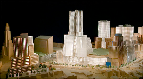
above: a 2006 version of frank gehry’s design for the nets arena and atlantic yards in brooklyn.

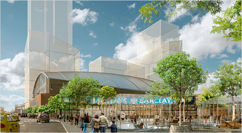
above: the new design for the nets arena by ellerbe becket, an architectural firm based in kansas city.
The decision to scrap a Frank Gehry design takes away an opportunity to build a significant structure in Brooklyn for Nets basketball, is viewed as a major blow to architecture and the public trust.
“Like all great architecture, it challenged our assumptions of what a building of its type can do.” “Clearly, the city would be better off with nothing.” Buildings do last a long, long time.
via curated magazine & RT @curbed
Frank Gehry out as the architect for the Barclays Center, an exotic, $1 billion glass-walled arena. In is Ellerbe Becket, an architectural firm based in Kansas City, Mo., with $800 million arena. Well, $200M is $200M. We know it won’t look the same. via nyt [PR]
 Economic crisis here. But why not always?
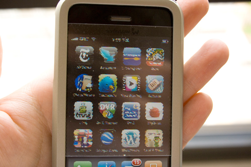
above: the worst product i’ve ever reviewed, the wazabee 3DeeShell
Originally, 10 principles to keep in mind when creating an ad. But maybe ok for product development…
1. No one cares about your company.
You might be intimately familiar with your product or service. You might even love it. But your audience doesn’t. Your ad has to give them a reason to care. Consumers don’t think in terms of features and benefits. Those are marketing terms. Consumers want something that will make their lives easier or bring them success. How will your product or service do this? More importantly, how will your ad convince them it will?
2. Don’t let fear motivate you.
One of the biggest mistakes you can make is to second-guess your audience’s ability to understand. Think of Goodby, Silverstein & Partners’ “Got Milk?” campaign. The entire message is based on the absence of milk. Without picturing milk in a variety of scenarios, the agency created a world without milk. If somewhere along the line, the California Fluid Milk Processor Advisory Board (the client) had rejected the no-milk concept because it didn’t adequately promote the product or make milk “the hero,” the resulting campaign would have been very different. And probably far less memorable.
3. If it works on you, it will work on them.
You are a consumer. You read ads and buy things. If your ad doesn’t convince you, chances are it won’t convince your audience.
4. Talk about one thing.
Volkswagen once ran an ad whose headline read: “It makes your house look bigger.” The message was simple: VW Beetles are small. The headline didn’t mention the car’s gas mileage, price, or engineering. It didn’t even mention VW. It got people to think small is good.
5. Say it differently.
Take the one thing you want to communicate and come up with different ways to say it. In the VW example above, the headline didn’t say “VW Beetles are small.” Think of ways to state an ordinary message in an unusual way so that it gets attention.
6. Let your audience draw their own conclusions.
When Steven Spielberg first screened Jaws, the audience laughed at the shark. His solution? Remove the shark. In the end, you see the entire shark in only a few scenes. But the movie is still terrifying. The same principle applies to advertising. Don’t be afraid to let consumers draw their own conclusion about your company or product. The conclusions we make for ourselves are usually the most powerful.
7. Make design and copy work together.
The headline and image tell the story. Don’t let the visual design overpower the message. And don’t rely on copy alone to convey the entire idea. A headline should never tell you what is in the picture. And graphic design should never be used merely to fill space.
8. Create an emotion.
The worst thing an ad can do is be boring. A series of physiological events occurs when we’re happy, sad, entertained, or angered. Use this to your advantage. Make sure you generate a response in the person looking at your ad. Any response is better than no response.
9. Sell something, don’t just talk.
Imagine this: You’re looking for a new car. You have one in mind. You arrive at the dealership, see the perfect car on the lot, and go inside to inquire about it. Instead of answering your questions, the salesperson launches into a history of the car dealership. Do you care? In advertising, always stay focused on what you’re selling and anticipate the consumer’s needs.
10. Make them respond.
The best ads demand a response. They make consumers want to act. Always give your audience a reason to act and the means for doing so, whether that’s a phone number, fax number, or web address.
[via]
BusinessWeek and startup tracker YouNoodle assess what types of innovation and invention might attract funding dollars in the downturn. businessweek [PR]
Themes include: Functionalism. Sustainable. Life’s rituals. Thoughtfulness. Economic climate illicits “You need that passion, commitment and craziness.” via new york times [PR]
What if…if the strongest consumer impulse becomes not buying? John Hockenberry poses the question. The design community ponders today’s economics. via surfstation [PR]
During WWII, with fears that Japan would overrun Hawaii, the US decided to issue the $1, $5, $10 and $20 Emergency Federal Reserve Notes. via hi + low [PR]
All content ©2007 > 2024 DesignApplause
Notifications