Wall of knowledge concept.
 “wall of knowledge” for the stockholm library are renderings by a team of students at the architecture school of paris la seine.


a neat recap on how the design was generated at CG Society.
 “wall of knowledge” for the stockholm library are renderings by a team of students at the architecture school of paris la seine.


a neat recap on how the design was generated at CG Society.
 stools, the short and the tall.
above: Name of object: wiggle stool — $525 USD
Designer: frank gehry
Producer: vitra
Where to get it: vitra

above: Name of object: kaktus stool — $320 USD
Designer: enrico bressan
Producer: artecnica
Where to get it: memomodern

above: Name of object: stool 60 — $295 USD
Designer: alvar aalto
Producer: artek
Where to get it: hivemodern

above: Name of object: lc8 — $1,100 USD
Designer: le corbusier, pierre jeanneret and charlotte perriand
Producer: cassina
Where to get it: steelform

above: Name of object: offcut stool — $215 USD
Designer: tom dixon
Producer: tom dixon
Where to get it: dailytonic

above: Name of object: axel two-tone stool — $129 USD
Designer: cb2
Producer: cb2
Where to get it: cb2

above: Name of object: eames walnut stool — $849 USD
Designer: charles and ray eames
Producer: herman miller
Where to get it: design within reach

above: Name of object: curved rattan counter stool — $1,300 USD
Designer: mcguire
Producer: mcguire
Where to get it: mcguire furniture

above: Name of object: birillo bar stool — $2,945 USD
Designer: joe colombo
Producer: zanotta
Where to get it: forum diffusion classiques

above: Name of object: meridiana — $740 USD
Designer: christophe pillet
Producer: driade
Where to get it: ambientedirect

above: Name of object: alto stool — $565 USD
Designer: michael merriott
Producer: established & sons
Where to get it: stardust

above: Name of object: stitch stool — $1,540 USD
Designer: adam goodrum
Producer: cappellini
Where to get it: architonic

above: Name of object: coal shovel stool — $800 USD
Designer: thos. moser
Producer: thos. moser
Where to get it: thosmoser

above: Name of object: stool one — $429 USD
Designer: konstantin grcic
Producer: magis
Where to get it: the chair factory

above: Name of object: a_stool — $___ USD
Designer: jonathan nesci
Producer: hale industrial design
Where to get it: hale industrial design
via swissmiss

above: Name of object: jack stool — $___ USD
Designer: jonathan nesci
Producer: hale industrial design
Where to get it: hale industrial design

formerly burj dubai. renamed burj khalifa in honor of sheikh khalifa bin zayed bin sultan al nahyan, president of the united arab emirates (UAE). the building officially opened january 4, 2010.
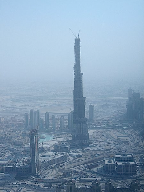
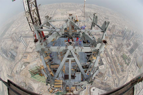
above: from the spire, mid 2008
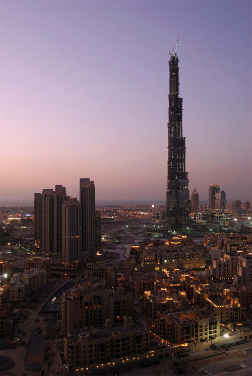
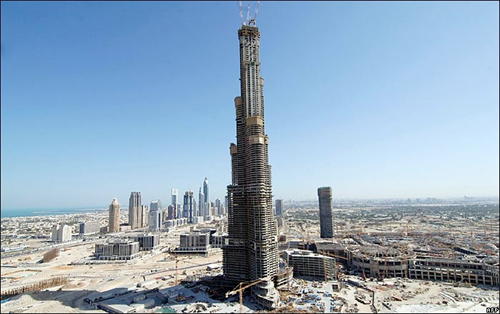


above: The tower is being constructed by a South Korean company, Samsung Engineering & Construction [16] which built the Petronas Twin Towers and the Taipei 101. The tower is designed by Skidmore, Owings and Merrill, who also designed the Sears Tower in Chicago and the Freedom Tower in New York City, among numerous other famous high-rises. The building resembles the bundled tube form of the Sears Tower, but is not a tube structure.
The design of Burj Dubai is ostensibly derived from the patterning systems embodied in Islamic architecture, with the triple-lobed footprint of the building based on an abstracted version of the desert flower hymenocallis native to the region. The tower is composed of three elements arranged around a central core. As the tower rises from the flat desert base, setbacks occur at each element in an upward spiralling pattern, decreasing the cross section of the tower as it reaches toward the sky. At the top, the central core emerges and is sculpted to form a finishing spire. A Y-shaped floor plan maximizes views of the Persian Gulf. Viewed from above or from the base, the form also evokes the onion domes of Islamic architecture.
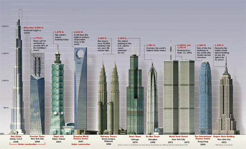
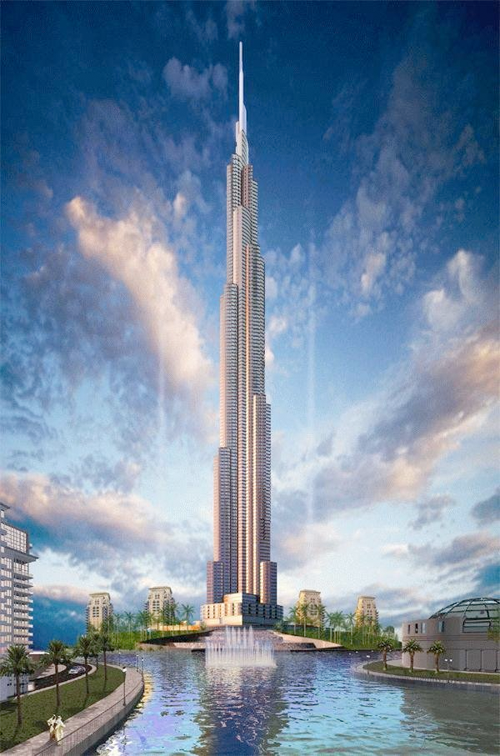
The renamed Burj Khalifa marks the first time since the Middle Ages, when Europe’s Gothic cathedrals rose taller than the Great Pyramid of Egypt, that the world’s tallest building has been located in the Middle East.
Designer: adrian smith ( note: the architects are the chicago office of SOM. smith left in 2006 to open his own firm: adrian smith + gordon gill
Current records:
* Tallest skyscraper to top of spire: 828 m (2,717 ft) (previously Taipei 101 – 509.2 m (1,671 ft))
* Tallest structure ever built: 828 m (2,717 ft) (previously Warsaw radio mast – 646.38 m (2,121 ft))
* Tallest extant structure: 828 m (2,717 ft) (previously KVLY-TV mast – 628.8 m (2,063 ft))
* Tallest freestanding structure: 828 m (2,717 ft) (previously CN Tower – 553.3 m (1,815 ft))
* Building with most floors: 160 (previously Willis Tower – 108)
* World’s highest elevator installation
* World’s fastest elevators at speed of 64 km/h (40 mph) or 18 m/s (59 ft/s) (previously Taipei 101 – 16.83 m/s)
* Highest vertical concrete pumping (for a building): 606 m (1,988 ft) (previously Taipei 101 – 449.2 m (1,474 ft))
* Highest vertical concrete pumping (for any construction): 606 m (1,988 ft) (previously Riva del Garda Hydroelectric Power Plant – 532 m (1,745 ft))
* The first world’s tallest structure in history to include residential space
* Highest outdoor observation deck in the world (124th floor)
* World’s highest mosque (located on the 154th floor)
* World’s highest installation of an aluminium and glass façade, at a height of 512 m (1,680 ft)
* World’s highest swimming pool (76th floor)
Resources:
dubai architecture
eikongraphia
wikipedia
skyscraperpage.com
blair kamin – 1
blair kamin – 2
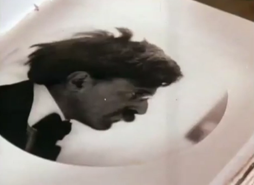 1972. charles and ray eames polaroid SX-70 promo film.
photographer alfred stieglitz
a beautiful, serene refreshing break, we are reminded of recent 30-sec TV spots that have no audio. plus a history lesson.
Designer: Charles and ray eames
Producer: Polaroid
Resources:
the films of charles and ray eames — snore and guzzle.
design museum
the films of charles and ray eames, vol 1-6 — dwr
 SOM (chicago) wins 10th annual steelcase design competition with modernist menorah.
the winning design created by SOM’s Colin Gorsuch, the menorah is a cast piece of solid wax that mimics the liquidity of the ancient consecrated oil.
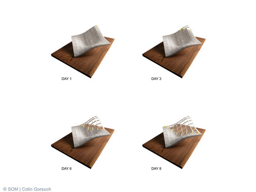
as the menorah burns, its 8×8 framework is revealed. the melted wax falls onto the wooden base and paints a pictorial timeline of the Hanukkah celebration.
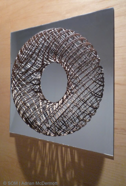
created by SOM’s adrian mcdermott. in traditional christian symbolism, the wreath evokes the circle of life and immortality.
via archpaper
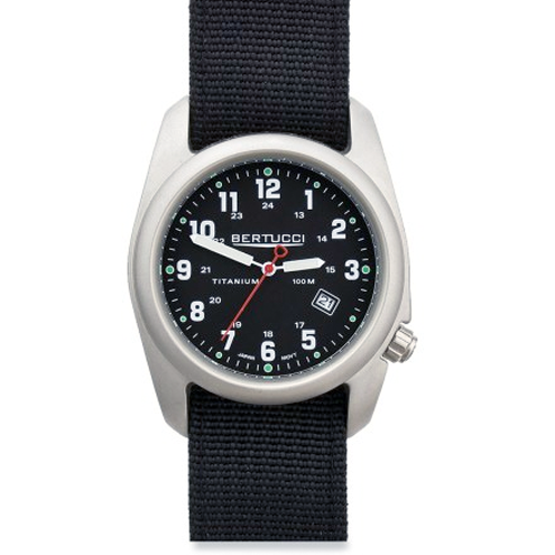
good design is tasteful. great design solves problems.
the A-2T, strikes right balance between innovation and tradition. all-titanium case is lightweight and durable, the mineral crystal face is recessed to avoid scratches and the screw-down crown is off-set so it doesn’t press into your wrist. a nylon band is made of 2-ply nylon with powder-coated steel hardware.
Price: starting at $100 USD
Designer: mike bertucci
here’s a gift suggestion for under $25.00 US. the creator-director, gary hustwit hopes Objectified will get non-designers curious about why objects take a particular shape. it’s an informative and educational movie shot in documentary style. also the kind that gets played over and over again if you have a jones for product design / designers. google it—many reviews out there.
Running time: 75 minutes. Extra footage: 60 minutes.
more objectified information here
Artist: gary hustwit
Producer: swiss dots

good design is as little design as possible
Dieter Rams (born May 20, 1932 in Wiesbaden) is a German industrial designer closely associated with the consumer products company Braun and the Functionalist school of industrial design.
In 1993 I asked Dieter to speak to the Architecture & Design Society at the Art Institute of Chicago. The society recently had a name change: “design” had been added. We joked ( ahem ) at the time that the real estate economy was so bad that the Architecture Society needed new members. We needed a credible and passionate design icon to speak to this group. Dieter became the first designer to speak under the society’s new name.
What I remember that night and again recently while watching the Objectified movie was Dieter’s 10 design principles. Honestly, I can’t tell you for sure that these are the same principles. Hoping Dieter will set the story straight.
I think I like the earlier stuff better. Maybe it was the materials or maybe it was so different than the pack at the time. The first Braun product I remember making a design connect to me was an electric razor. Much of Dieter’s work has long seemed more connected to brutalism than minimalism. Let’s say beautifully, brutally, minimal.
* Good design is innovative
* Good design makes a product useful
* Good design is aesthetic
* Good design helps us to understand a product
* Good design is unobtrusive
* Good design is honest
* Good design is durable
* Good design is consequent to the last detail
* Good design is concerned with the environment
* Good design is as little design as possible
resources:
vitsoe
designmuseum
gizmodo
victoria and albert museum
dieter rams flickr
braun flickr
37 signals
tendesignprinciples
new: a bit late
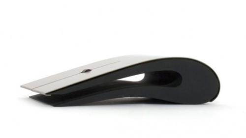
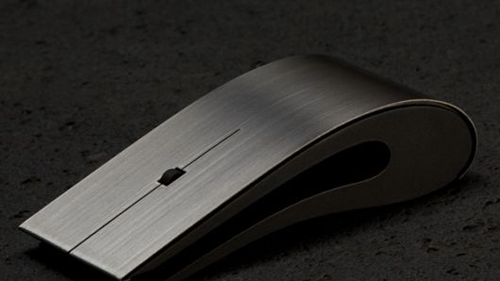
After the Apple’s Magic Mouse mouse, here’s a blow of heart for this design made entirely of titanium and high quality resin, with laser optics.
Good to go on Windows and Mac OS X.
This is a hand-crafted device that is anything but humble (or cheap) or as smart as MM, but lays down challenge on the design front.
The ID mouse is Bluetooth enabled and is constructed from hand-formed grade one titanium and high quality plastic resin. It features a neodymium scroll wheel and is suitable for both left and right-handed users. Powered by two AAA batteries it is available in black or white and has a three-button layout.
Stunning design comes at a price – $1,200 USD
Designer: intelligent design
 What is design? It’s art and commerce, fashion and environment. It’s industrial and digital, graphic and experiential.
What is design? It begins with ideas–ideas based in purpose. It requires a plan or a process. It yields innovation, invention or creation. It is successful if it elicits response–attention, desire, interaction or purchase.
Design is as much a process as it is an end product. The process should be simple.
After all my years in design, I remain wary of the branding and design consultancies that sell the strategic process before the work. The work should speak for itself. Did it deliver on its objectives? Did it break through in the market? Did people vote with interest, conversation, interaction or purchase? Was it beautiful? That’s what really matters. It’s not about the ability to generate nor analyze reams of data or conduct hundreds of interviews.
Smart design requires inputs and information for sure. The best strategy behind design is all about collection and collaboration–of people, talents, ideas, perspectives. It’s about truly seeing vs. just looking. It’s about being curious about what you’re seeing, what it means or what it could mean if used in a new way or combined with other ideas or images.
It takes a certain appetite and ability to digest. Honestly it’s simple. The best talent understands that. Rarely does the most extensive or unique “process” produce the simple insights necessary to do more than document a situation. The proof is in the pudding. Talented designers create it.
To be successful, the business of design must deliver truth and unique beauty. To breakthrough, design must deliver creative differentiation.
As with any well-formed point of view, there’s a process to follow in design. Again, it’s a simple process. It begins with collecting as much input as you can regarding a particular subject and understanding the context of the world in which that product or service will exist and compete. It’s about looking for gaps in the marketplaces where others haven’t thought to go. It’s about finding the truth of an organization, where they’ve come from and what they’re capable of. And then it’s about organizing and mixing ideas and visual elements to deliver a succinctly meaningful and artistic perspective.
Design has been my business for over 35 years. But more importantly, when I think of it, design has been my way of life since I was a small child. A way of interacting with people and gathering perspective. A way of thinking and a way of organizing things in my life, so they would be meaningful, work better, look better. I know this is true for many designers.
It’s amazing to see how the power of design has grown in the past decade. People everywhere are singing the praises of design; looking to find the secrets of design creativity and infuse them into their work; seeking the benefits of beautifully designed products to use in their homes and their lives.
As a designer I see this as both an opportunity and a responsibility. The opportunity is to continue to use our craft wisely, to solve real business problems, to deliver a means to help people find products and services that are uniquely well suited to make their lives a little better every day. Getting there requires that designers and our clients keep things simple.
Author : joe duffy. related topics via “experts designers” as seen in fast company.
All content ©2007 > 2024 DesignApplause