 click > enlarge
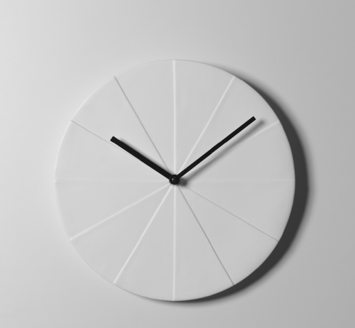
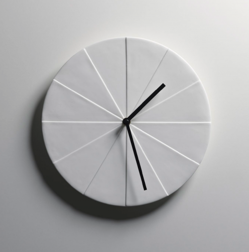
Jussi Takkinen, a furniture and lighting designer who splits his time between personal and freelance projects and design work for Harri Koskinen, needed a new clock. When faced with the decision of finding one to buy that met his standards or designing his own, he opted for the latter. The question now was what form the clock would take. Around that time, Takkinen noticed “a pile of newspapers on the floor which formed a series of steps.” According to him “the sunlight happened to fall onto the newspapers creating a striking series of shadows on the different steps that gave [him] the idea for Osio.”

Like am updated, geometric wall-hanging sundial, Osio (Finnish for sections or steps) bridges ancient methods or telling time with contemporary design. The white bone china clock face has no numbers. Instead, it’s divided into 12 sections of varying heights, one for each hour. When sunlight hits the clock the shadows fall across the sections to give the time. The hands are simply a back up methods for nighttime and cloudy days.

about perrin drumm

there are no numbers, no chimes or clicks and no bright colors.
Perhaps the Norwegian designers at SHE Studio were feeling the stress of a time crunch and, like any good designers, decided to create a solution. The result isn’t another nifty planner or nicely bound to-do list, but a remake of the problem itself: time, or, rather, a clock. However,”Myk” isn’t like any clock we’ve ever seen. The face is wrapped up with a fabric stretched taught over the surface, making the minute and hour hands mere indentations behind the surface. There are no numbers, no chimes or clicks and no bright colors. Everything is minimized, and hopefully your stress level will be too.
There is one little hangup, though. The clock runs incredibly slow (which some might prefer) because of the hands struggle to tick against the tight fabric. The designers are still working on a motor powerful enough to move the hands forward at the proper pace, because we can’t imagine anything more stressful than thinking you have an extra six hours before a deadline only to find out you’re behind. But when they get it right, we think this just might find its way on our office wall.

designer: she studio

about perrin drumm
 designed to allow users to read two time zones.
The color contrast off secondary clock hands are delicately reduced to appear like a shadow. The clock is available in both square and round versions in either white, gold, charcoal, and grey. Dimensions (W X.X D): 25cm X 25cm X 3.8cm
Designer: kitmen kueng

Some water fountains are really people magnets. Observing human interaction, the kinetic creativity of the Jaume Plensas fountain in Chicago the past three years has inspired this post.
( above ) designer, jaume plensas, chicago, USA. water and digital video.

( above ) designer, armand vallancourt, san francisco USA. concrete tubing.
( above ) fountain clock, kanazawa JP. fountain clock.
( above ) designer, unknown, location unknown. the waterboard, not exactly a fountain.

( above ) designer, lotta hannerz, paris, FR. water mobile venus.

( above ) designer, unknown, seattle US. variable pressure fountain.

( above ) designer, unknown, zacatecas MX. a fountain inside a silver mine.

( above ) designer, william pye, sunderland UK. water vortex.
Is there a difference between an older, more traditional fountain vs modern? Do you have a favorite you frequent or fond memories of one?


