
chilewich – let’s connect at neocon 2019.
join chilewich at the forefront of design to discover our new products and fresh colors.
get a first look at the innovative additions to our contract collection at the 51st edition of neocon.
booth 7-7030

join chilewich at the forefront of design to discover our new products and fresh colors.
get a first look at the innovative additions to our contract collection at the 51st edition of neocon.
booth 7-7030

above> introducing montara650 collection by the coalesse design group and lievore altherr molina
coalesse® engages a&d as participants at neocon 2016 / #1032 – a&d community invited to take part in the design process
coalesse, recognized for forward-looking, design-driven products that foster social connection, creative collaboration, and focus and rejuvenation, is inviting the a&d community to participate in the design process through a range of new products and custom capabilities at neocon 2016.
its showroom #1032, will feature expressions of custom capabilities that can be applied through the newly launched potrero415™ tables, massaud conference seating, and the montara650™ collection, among other products, giving a&d professionals the opportunity to discover new ways of personalizing through color and pattern, materials and features, and shape and size to make it their own and enhance emotional engagement at the workplace.
showroom visitors are also invited to participate in the design process through coalesse’s new customizer web app, which demonstrates ways of applying custom color and pattern to the groundbreaking lessthanfive™ chair. the web app and degree of product offerings make customization highly-attainable, empowering clients to be curators of a more meaningful design experience.
below> vitra & artek / #1192 // north american introductions / vitra customized applications
at neocon, vitra will present a series of projects that demonstrate how it has optimized collaboration with client project teams. this provides clients a direct dialogue and unprecedented access to vitra’s top design talent, allowing for the custom-development of new product applications for large scale projects.
above> the vitra color and material library by hella jongerius – ten years ago, the dutch designer hella jongerius began a research project for vitra to study the properties and possibilities of colors, textures, finishes and materials. this long-term project has resulted in the vitra color & material library, devoted to the establishment and further development of an intelligent system of colors, materials and textiles. this concept facilitates a higher degree of specificity in interior design. in her book “i don’t have a favourite colour”, which was launched at vitra’s 2016 milan presentation, hella jongerius describes her method of research and the application of its results to the vitra product portfolio. courtesy © vitra photography labadie/van tour
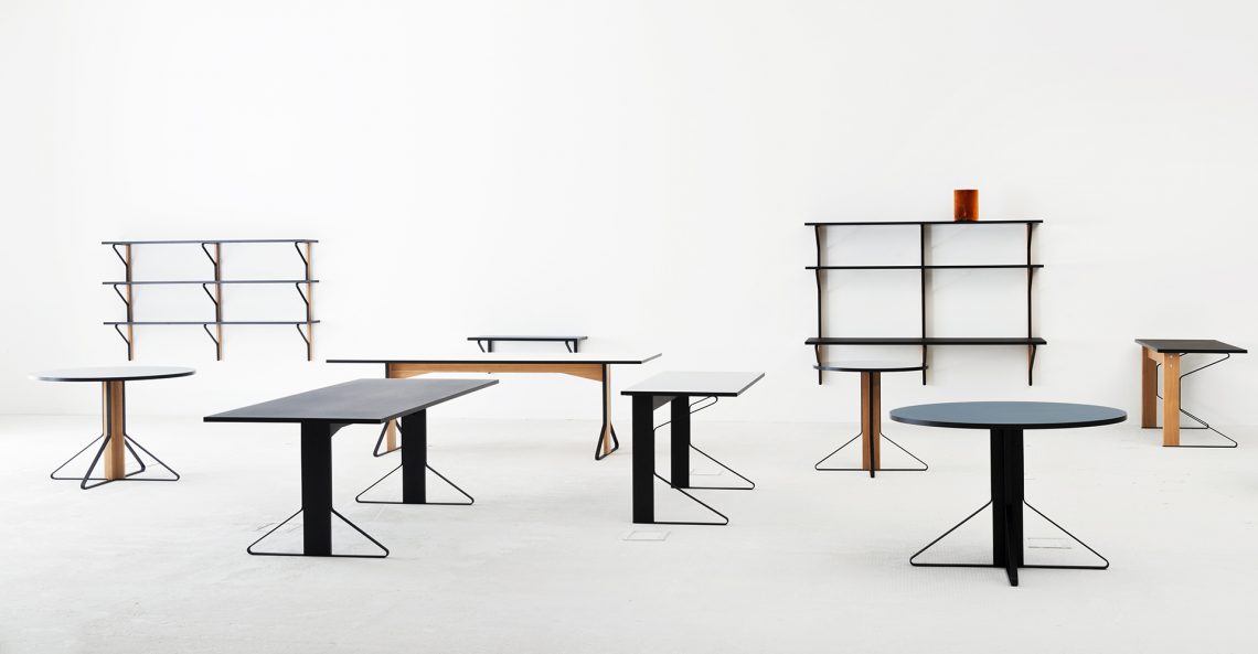
below. the kaari collection by ronan and erwan bouroullec for artek courtesy © artek
below> mohawk group / #377 & 3-121
elevate contemporary spaces to inspired floorscapes through mohawk’s latest production collections. inspired by nature and designed to merge fashion with function.
below> mohawk group / moving floors collection / diagonal relief, fade relief, plane high, plane low, 656 green 24by24
designed to be dynamically moving base on the user’s point of view, moving floors was inspired by the multi-layered beauty of our cultural landscape. empowers designers to create kinetic floorscapes through limitless combinations.

below> haberdasher textiles / by laura guido-clark for herman miller / 3-321
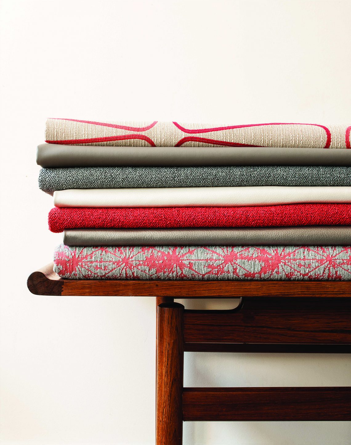
haberdasher is an array of palettes and patterns, inspired by traditional sewing materials—and tailored for projects of various sizes and budgets. giving solids and patterns license to commingle or stand alone, haberdasher gives you license to play. mix. match. curate. collaborate. differentiate. and indulge.
above> there are 5 families each with their own identity.
pins and needles: a simple pattern of pins strewn about a canvas becomes iconic in a highly graphic way. / string plaid: the crosshatch pattern creates a colorful, dynamic, and graphic twist on traditional plaid. / well suited: allows vibrant and deep colors to collaborate in a small scale, two-color nailhead pattern. / fish net: the quilted hand offers dimension and explores a large line of intense, warm, and cool colors. / tailored: the tightly woven grid texture creates a subtle surface that reflects light and contours form.
below> hbf & hbf textiles / 387
hbf has returned to its roots, teaming with esteemed designer and longtime partner michael vanderbyl to create introduce conexus, a work/lounge chair designed to function across any contract setting — offices, lobbies, hospitality environments…
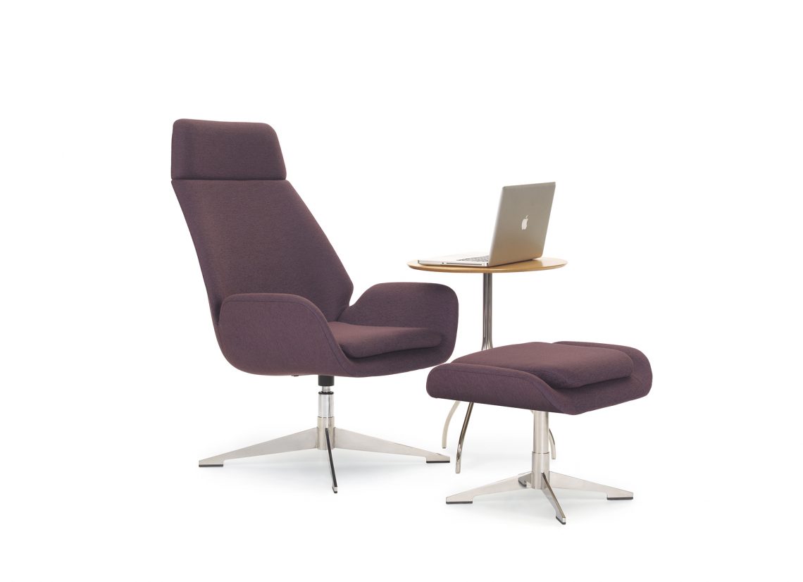
designer michael vanderbyl notes, “i strive for timelessness. conexus plays with the shape of a classic lounge chair and transforms it into a more organic form that showcases the exceptional craftsmanship in the woodwork and the upholstery. the wood merges with the upholstery in such a seamless way that the piece takes on a sculptural quality, an engineering feat that hbf executed masterfully.”
below> hbf textiles highlights color, texture, yarn, and hue in spring 2016 collection
known for their artful and authentic approach to design, hbf textiles is going back to the classics for its spring 2016 collection. hbf textiles vice president of design mary jo miller started with le corbusier’s infamous lc palette of colors from the 1920s, and used these fresh shades as a catalyst for the collection.
below> tek pier / teknion / 1048
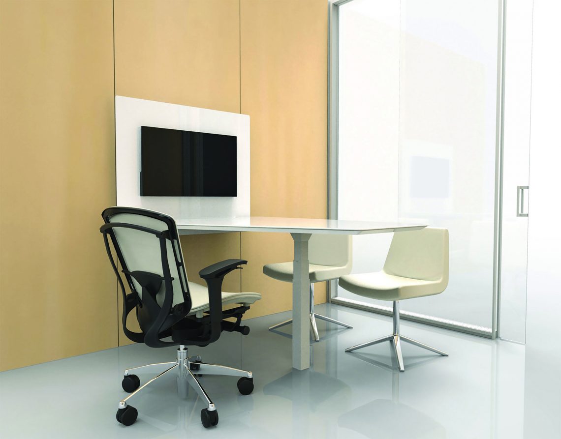
tek pier “is the first product of its kind to successfully merge wall-mounted monitors with height-adjustable worksurfaces,” said paul kruger, teknion’s director of design, architectural products. tek pier takes advantage of teknion’s altos demountable wall cable routing, structure and acoustic performance. the innovative origami mount allows for fluid positioning to share a large format monitor, maintain viewing privacy, or engage in touchscreen applications.
below> designtex / moquette / 1032a
moquette is a textile mash-up that blends a classic velvet weaving technique with the creative possibilities offered by digital printing technology. the woven structure employs a “moquette” construction produced on a modern wire loom, allowing some areas to be woven as flat bands while elsewhere selected yarns are lifted and then cut to create a short, dense pile. beginning with a simple pattern of alternating horizontal stripes of varying widths, the moquette technique adds complexity by introducing a sense of dimensionality, which is enhanced by the luxurious combination of lustrous and matte yarns. finally, the raised, plush surfaces of the woven fabric are printed digitally with a non-repeating and random color pattern.
the result is an intricate layering of textures and colors that evokes natural landscapes, reflecting biologist e.o. wilson’s concept of biophilia—the theory that human beings are instinctively drawn to the natural world, and thus that design following this principle provides a heightened sensation of comfort and repose.
below> parentesit freestanding / by lievore altherr molina for arper / 339
arper extends the functionality of parentesit to include freestanding models for increased privacy and comfort. architectural in scale, these modules carve out a three-dimensional space for concentration or quiet conversation in shared workspaces or collaborative environments.
parentesit was created with a dual inspiration of minimalist art and classic japanese interiors. to shift this approach to an architectural scale, the screen is capable of dividing a room in half, or partitioning off a space for quiet, independent thought.
below> wolf-gordon / & 10 – 161
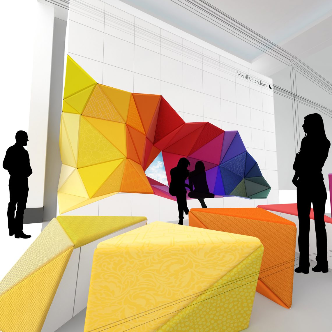
following dazzling installations of sculptures and interactive digital displays in past years of neocon, wolf-gordon has again transformed the market space in a new way. office_excavate re-envisions the cubicle-enclosed office by creating a colorful, open seating space that can be easily rearranged for meetings, coffee breaks, and recharging of phones and humans alike. the furniture, which can be used alternately as seating, desks, tables, or stools, will be upholstered in over 100 different wolf-gordon textiles. office_excavate is a collaboration of karlssonwilker inc., new motor, graham kelman and wolf-gordon creative direction.
below> humanscale / 351
they’re not only previewing a brand new line of diffrient occasional chairs they’re unveiling never-before-seen niels diffrient designs. take a journey through human-centered design innovation and chat with founder and ceo bob king, visionary designer todd bracher and the rest of the humanscale team.
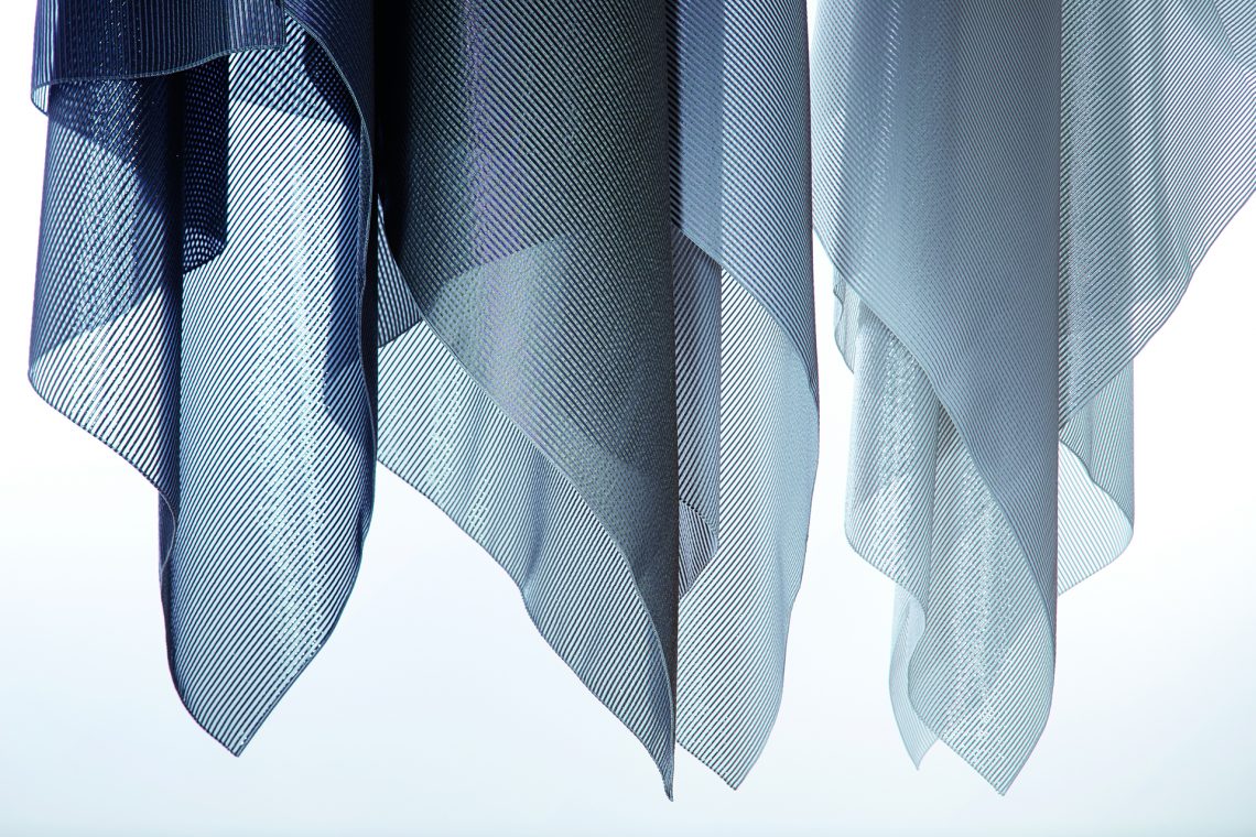
reflectacoustic is a groundbreaking design that controls sound and delivers heat and glare reduction through yarn, weaving and metalized backing technology. the textile absorbs and reflects back a great deal of light; all validated through 3rd party testing.
below node with sharesurface / sharesurface was designed by steelcase design studio / steelcase / 300
steelcase health research reveals exam rooms not designed for the modern healthcare experience . findings uncover five ways exam space is failing physicians, patients and family members; informs new design framework and product, node® with sharesurface
node with sharesurface features a rotating sharesurface that provides dynamic access to information, a central part of the exam experience. physicians using mobile technology are able to chart while maintaining eye contact, pivot the surface to share their screen with the patient and family for education and shared decision making, all while having mobility in the room. the chair’s back and arms allow doctors to have more conversational postures during consultation and the rotating surface arm moves out of the way for examination activities.
below> northern parallel / cf stinson / 10-1150
[ collection summary ]
• 7 new textiles, 72 colorways.
• a collection of coordinating textiles that explores the connections between michigan (where stinson is headquartered) and maine (where stinson houses their design studio).
• shared michigan/maine discoveries:
• similar geographic latitudes
• rigorous climate with diverse seasons
• inhabitants with an appreciation for nature and willingness to embrace the seasons
• michigan/maine ideals include work hard, build with integrity and if you are going to be unique – be honest. shared mindset explored through textiles that are hard working, unique, honest and full of integrity.
• made in america, small carbon footprint.
below> the doni collection / designed by giancarlo piretti for ki / 1181
if you can dream it, doni can express it. create with a fresh palette of energizing brights and sophisticated neutrals. imagine the possibilities with two-tone colors and unlimited custom color possibilities. the collection offers guest, task, tandem and stackable configurations.
below> introducing rockwell unscripted™ / knoll / 1111
rooted in david rockwell’s innovative approach to hospitality environments and public space, and inspired by his award-winning design for theater and entertainment, rockwell unscripted is a comprehensive collection of furniture elements that adapt to the spontaneous choreography of the work day.
“our interest is in getting people to look at their work environments as a stage on which movable furniture can be arranged in endless configurations. you can craft the scene around what it is you’re doing that day,” said rockwell group founder and president david rockwell.
below> lievore altherr molina’s arcel for bernhardt design / 399
below> glass gradients by scholten & baijings / skyline design / 1060
glass gradients by scholten & baijings add dimensionality to a space by establishing a dialogue between the simplicity of the patterns with their signature color palette.
below> suri pouf / designed by sezgin aksu and silvia suardi for kolekiyon / 11 – 113a
inspired by headgear from the ottoman empire
below> elemental wall systems / 3form / 10 – 142
time + weather = beauty
inspired by the rustic look—created from clean materials
below> repiroue perching stool / okamura / 11 – 124
the perfect combination of sitting and standing – a new style of work posture
it is no secret that changing our posture throughout the day is essential to our well-being in the office. what’s more, adapting a posture that is appropriate for the task at hand helps relieve stress placed upon the body. okamura recommends five postures for increased office productivity and efficiency. among them is the perching posture, a perfect combination of standing and sitting.
below> chilewich contract launches speckle / 7 – 6030
speckle is a durable and easy to maintain textile ideal for any environment.
speckle comes in four color ways and in each the warp yarn subtly contrasts with the soft pearlescent silver speckles in the weft direction.
chilewich has experimented laying speckle tiles quarter turned and found that the natural color shift between warp and weft adds a richness and level of interest to this quiet weave. speckle is ideal for spaces in which the floor is a foundation for bolder interior design elements. a sustainable solution of bold and neutral patterns.
below> wilkhahn / 7-3082c
wilkhahn’s dynamic office seating utilizes patented 3d technology to encourage health, creativity, and productivity in the workplace.
by special request of the a&d community, will show for the first time at neocon, a white, through-dyed seat shell and backrest frame.
below> arborite high pressure laminates / 7-1018
recognizing the increasingly blurred aesthetic line between contract and residential design, arborite has curated a selection of residential products with crossover appeal to create commercial stones.
above left > cityscape loft’s modern, wet cement look is ideal for urbanites in search of a low-maintenance, industrial-inspired surface. right> industrial loft evokes the glazed look of oxidized metal, combining light and dark shades with a matte texture for a chic, modern effect.
below> amble / by stephan copeland for lightcorp / 7-8062
why is amble different? amble is a light with no moving joints or articulation – in fact, the only moving part is a gravity-powered “eye.” minimalist design meets elite performance in a battery operated dimmagle led task light. created by renowned lighting designer stephan copeland, amble is highly adjustable yet has no moving joints or articulation. amble’s lean, single-form construction enables excellent adjustability and mobility through the intelligence of its shape.
below> nima / by giancarlo piretti for american seating / 10-148
aimed for the higher education market and various contract environments, nima is an inspiring multipurpose collection of chairs, providing exceptional comfort through a sophisticated minimalist aesthetic.
below> stir kinetic desk m1 / 1067a
the new m1 is a height-adjustable desk driven by software that senses your presence, learns your preferences, enables you to set goals and actively reminds you to change positions throughout the day.
DesignApplause will continue to add to this post as well as social shout it during neocon.

[ chilewich ] using both traditional and modern manufacturing techniques, sandy chilewich’s use of yarn fuses style and sophistication to create innovative textiles and original designs.
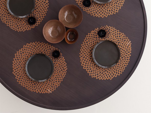
[ dahlia ] extends chilewich’s innovative molded technique beyond the first circle of experimentation. acting more like a charger than a placemat, plates will sit surrounded and enhanced by the open lace cutwork it exhibits. dahlia placemats are suitable for indoor and outdoor use.
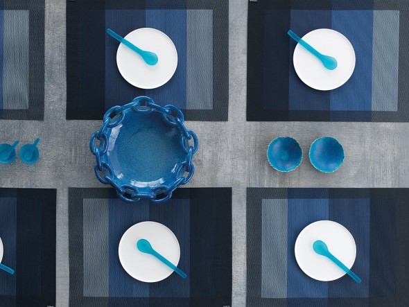
[ color tempo indigo ] every placemat presents a carefully considered spectrum of color from light to dark in block configuration. color tempo placemats are suitable for indoor and outdoor use.
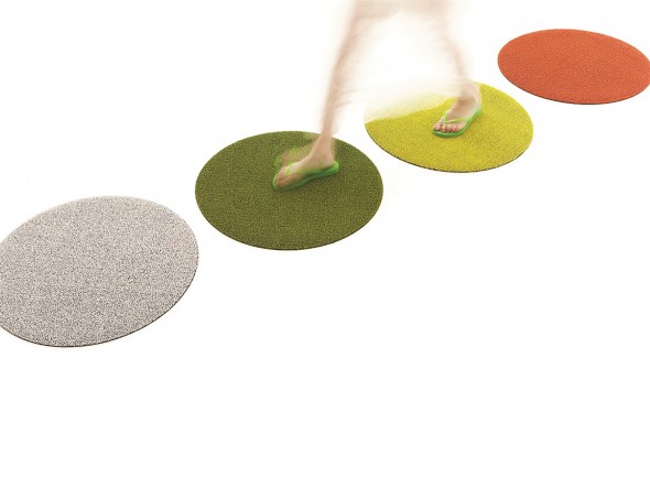
[ shag dot mats ] shag indoor/outdoor mats are made by tufting custom extruded yarns as loops onto a primary backing and then binding them onto a hardworking vinyl that could weather any storm outdoors and provides functionality underfoot indoors.

All content ©2007 > 2024 DesignApplause