this year paola navone decided to complete the family of ajour furniture for gervasoni. the new design chair next will be featured at milan furniture fair isaloni 2019, it suits perfectly with the carve07 collection presented by gervasoni last year in milan, at the isaloni 2018 fair.
cast polished aluminium chair, base in grey lacquered oak. the seat characterized by macro holes is tied to the frame only by thin supports and seems to flow in the air. the polished surface reflects light and the colors around taking on different unexpected looks
the mirror polished surface of the chair reflects the light and colors around, so the chair, like a chameleon, always takes different images.
 click > enlarge
Say the words molded plywood together and we immediately think of the classic Eames chair. Though its seat is molded to accommodate our posterior and is by no means uncomfortable, its sit-abilty is vastly improved by a cushion. However, emerging designer Hyeonil Jeong was able to take the same materials and create a seat that flexes to provide a cushier seat.
Jeong does use one material that the Eames, to my knowledge, never did: bungee cord. While his Caterpillar Stool has a more or less traditional frame, the seat is made from slats of CNC-cut molded plywood woven together with bungee cord, which acts like a shock absorber when you sit down on it.
“No matter how stiff each piece is, flexible relation makes an smooth flow. Its elastic connection allows an organic surface movement despite the rigidity of ply-wood material.”
I love how the seat, when unoccupied, arches upwards with all the slats fitting nicely into place and running smoothly alongside one another. But when you sit down the seat flexes to support you and the slats shift, forming a jagged layer underneath. I’ve been noticing a trend towards woven elements in furniture in general this year, but I’ve never come across a product that strings pieces of wood together to give the material a whole new functionality.

about perrin drumm
 click > enlarge
Without specifically naming Bertoia, French designer Patrick Norguet cites the “tradition of iron wire chairs” as the inspiration for his Kobi chair, designed for Italian furniture manufacturer Alias. Of course, if you want to make a woven metal chair, references to Bertoia are impossible to avoid. Still, Norguet expands on is predecessor’s basket-weave seat, bringing it up higher on the sides. The base is more prominent, too, with thicker legs and a wider support belt made from cast aluminum that wraps from the seat bottom all the way out to the sides.
Seat cushions are available in fabric and leather, and there are two options for the chair as well: support and legs in stove enamelled aluminum with a colored or chrome shell, or a stove enamelled support with aluminum legs in oak veneered aluminum and a shell lacquered in a variety of colors.
Even though my family’s hand-me-down Bertoia patio chairs are rusty and badly in need a paint job, I still prefer the shape of his seat over Norguet’s. What do you think? Is the Kobi an unnecessary remake, an overdue upgrade, or simply another option?

about perrin drumm
 click > enlarge
Is it just me or does the Medici chair by Konstantin Grcic, a Munich-based industrial designer, look like a much improved version of the classic Adirondack chair? Not that I don’t like the Adirondack chair – I have half a dozen on my back patio – but Grcic’s chair is the meeting point between American NorthEastern traditional and European chic.
Designed for the Italian furniture manufacturer Mattiazzi, the chair was actually “born” on their factory floor. Grcic said “The chair was inspired by the material, the machinery and, of course, the skill and craftsmanship of the people we worked with…Right from the beginning, I was looking for a distinct grammar for my design, a language that would express the characteristics of wood. I liked the idea of working with planks. They signify the very beginning of the production process – a tree trunk that is cut into slices. I like the way in which a carpenter joins wood. It is immediate and direct. The construction remains visible and easy to read. Structure turns into form.”
Medici comes in three different kinds of wood: Walnut, Douglas Fir (in natural and yellow) and, for outdoors, thermo-treated Ash.
“Designing for Mattiazzi was like a personal time travel. It took me all the way back to my professional roots. At the very beginning of my career, I was trained a cabinet maker. Working with wood is what I learnt from scratch. It is where it all started for me.”


about perrin drumm
 click > enlarge
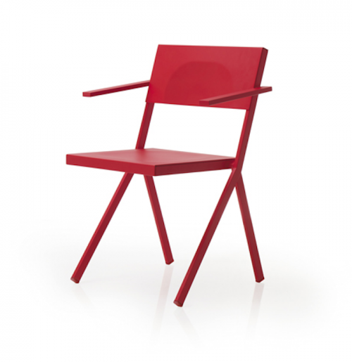
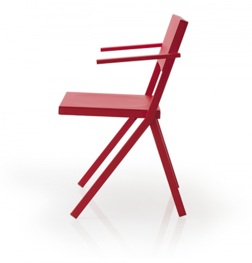
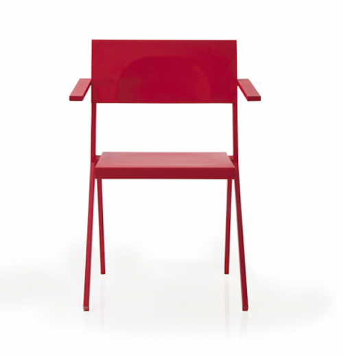
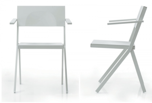
You probably know Jean Nouvel first and foremost as an architect. His work has won him some of the top prizes in his field, including the Aga Khan Award for Architecture, the Pritzker Prize and the Wolf Prize in Arts. But if you were in Milan for Salone Del Mobile you might have seen that his latest endeavor is MIA, a stacking chair he designed for the RBC Design Centre’s restaurant, also named MIA. The backrest, arms and legs are made of flat metal bars of varying widths. The chairs, which come in white, red, black and grey, are weighted so that they can be hooked over the edge of the dining tables to clean the floors. Usually chairs have to be lifted and flipped over the edge of a table, but Nouvel designed MIA so that all that’s required is a simple lift.
The MIA series also includes stacking armchairs, benches, tables and high stools. The line is being produced by EMU, the Italian furniture company, who notes that the collection “is a crystal-clear example of the spirit EMU brings to placing technological development at the top of its priority list, in an atmosphere buzzing with productive creativity. The whole concept stems from the RBC Design Centre in Montpellier, where three important elements were brought together: design, production and distribution.”


about perrin drumm
 click > enlarge
Sofia Lagerkvist, Charlotte von der Lancken and Anna Lindgren of the Swedish design studio Front recently created the Collage chair for artisan furniture manufacturer Gemla. Front combed through Gemla’s archives for inspiration and came up with a collage, so to speak, of the company’s history of products.
Once you look you can see many different chair designs at work here. The legs and rounded back bar remind me of classic midcentury cane chairs, but the shortened backrest recalls a lounge or side chair, while the webbing is reminiscent of vinyl pool furniture. Clearly, the Collage chair, with its supple, dyed leather and handcrafted wooden base is a far cry from patio seating. And unlike other furniture manufactures, Gemla has an in-house team of woodworkers and craftsmen that make their pieces. Collage is not for sale directly from the site. Rather, it’s made to order to enable the client to choose their own colors and materials


about perrin drumm
 click > enlarge
The Paredes Center of Furniture Design in Portugal recently named the GVAL chair the First Prize Winner in the Making Chairs category of their Art on Chairs exhibition. The theme this year is “an idea for the world on a chair,” which is so open-ended and vague I’m not sure it’s even worth it to name a theme at all. Still, their intentions to scout new talent is nobel, and the four designers responsible for the GVAL chair – Vanessa Moreno, Gustavo Reboredo, Louis Sicard and Nenad Katic – couldn’t be more deserving. They used layered sheets of plywood to echo the imagery of tree rings. I’m not sure that really comes off, but the patterns of the wood are so gorgeous and the colors are so rich I’m not sure I even care. The best part are the two two ottomans nestled inside the hollow chair, making it a 3-part piece and storage unit in one.
From their studio, OOO My Design:
GVAL is a product that brings surprising and playful use to an object as ordinary as everyday’s chair. In doing so, it pays homage to the most archetypical of all production materials, wood, in its most natural form: a tree. The shape of the chair and the texture of alternating sheets of plywood is inspired by pattern of tree rings, which in a way represent tree’s memory: each ring usually marks the of one year in the life of the tree.


about perrin drumm
 eyrie chair, a bird nest-inspired chair
Looking through the work of Dutch design group Studio Floris Wubben, the first thing you notice is a lot of wood. I know the whole natural, recycled wood thing is hot right now, but this way beyond just slapping some reclaimed barn wood onto the sides of a credenza and calling it a day. Two of the studio’s projects look more like tree trunks that exploded than actual, usable, sit-able chairs. That’s because they’re made from inverted willow trees. Yeah, I’d never heard of that either. They basically take a thickly knotted, gnarly section of a tree, bust it open and smooth out the inside so you can (sorta) sit on it. To make the legs (which look like they’ve sprouted out from the chair and are about to walk away), the tree’s branches are split and twisted into position and then allowed to dry into shape. If it sounds more art than furniture design, that’s completely intentional. “By using uncommon materials and applications (like the use of decorative materials for constructive purposes) we focus on diminishing prejudices and giving these materials a new face.”
Their latest project is the Eyrie, a bird nest-inspired chair made from tree branches. Definitely more form than function, the Eyrie looks downright painful to sit in. While the overlapping, intertwining strips of wood do give it the woven look of a nest, the haphazard slats and the large ‘nails’ remind me more of the hastily slapped together club house a la Spanky and the gang. See more of Studio Floris Wubben design projects, or buy one the busted open willow tree chairs at Anthropologie in NY.
 “upside down” was done in collaboration with artist bauke fokkema.
more wood? > [ diy panton chair ]

about perrin drumm
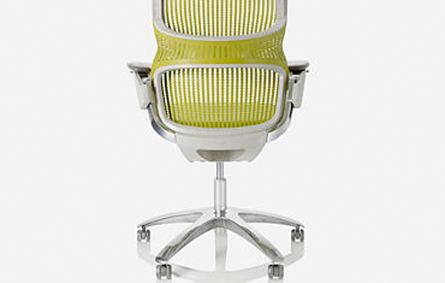
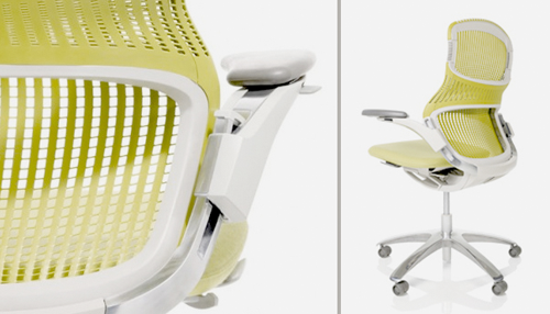
 Officially debuting at NeoCon09.
According to Knoll Director of Design Benjamin Pardo, “Our goal is to connect with a new generation seeking the next generation of workplaces.”

above: though knoll produces more than chairs this is knoll to me.
Producer: Knoll
Knollneocon2009 [3rings]
 No design in this team org chart.
Author, Howard W. Stolz mentions Apple experience but does not make a point that Apple is exception to his org chart example. Probably an oversight.
[
details at product design & development]


