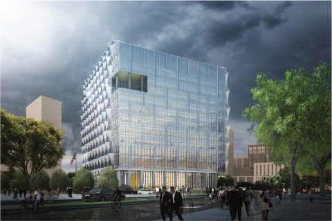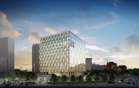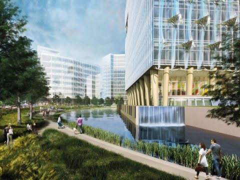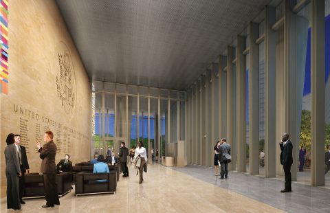
new us embassy unveiled in london. architects kieran timberlake.
it helped that the supergalactic property prices of mayfair meant that the $1 billion cost of the new embassy could be financed by selling the old building, at no expense to the us taxpayer. yet even if the move was driven by expediency, there is still something both brave and inspired about relocating to this unlikely area, which could then be transformed by the embassy’s arrival. // this article edited for brevity / photos courtesy of kieran timberlake
a giant, translucent bladderwrack”, “a high security travelodge”, “a glass box covered in shite”. within hours of its unveiling the architectural press have chosen to be particularly unkind to the new us embassy, which president trump may or may not inaugurate at the still mysterious date when he comes to britain. when the competition-winning designs were received when in 2010, its detractors were dissenting members of the competition jury, lord (richard) rogers and the property developer lord palumbo, who opposed the choice of the young-ish winning practice, kieran timberlake. they would have preferred the winner to be one of rogers’s fellow winners of the pritzker prize – thom mayne of the los angeles practice morphosis, or the new york-based richard meier or pei cobb freed.
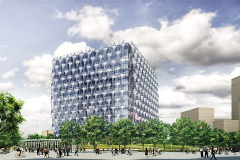
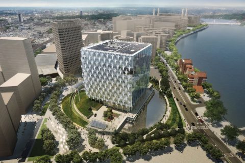
it’s a fortress, of course it is. the architects made it as nice a fortress as possible, a transparent, democratic, open, not-aggressive and environmentally responsible symbol of their country. it wants to combine, as james timberlake of its philadelphia-based architects put it, “security and sustainability”. while its form resembles a castle keep with a moat, it observes requirements to be set back from surrounding roads by 100ft, its concrete bulwarks disguised as earthworks, its anti-truck bollards are fig-leafed with hedges. the moat is an ornamental lake, set back to create gardens accessible to the public without crossing any security lines. the quarters assigned to the marines who guard the complex are like a tasteful metropolitan hotel.
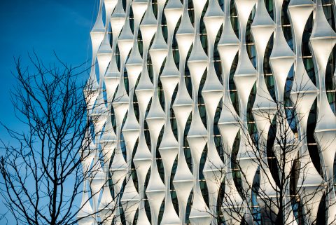
its roof is covered with photovoltaic cells, rainwater is collected and recycled. the walls are in glass, symbolizing transparency, and then veiled on all sides except the north with ethylene tetrafluoroethylene screens to stop the building overheating in the sun. these efforts have been rewarded in both british and american ways of measuring environmental performance, breeam and leed: “outstanding” in the one and “platinum” in the other.
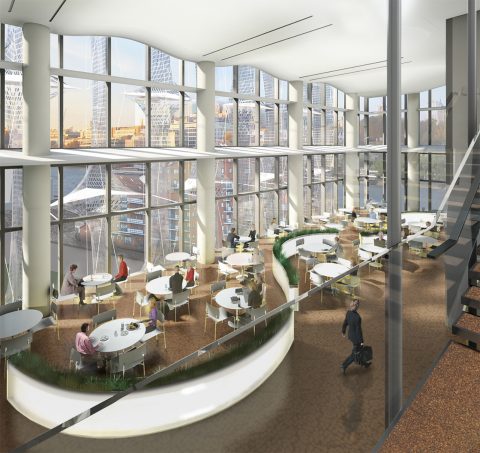
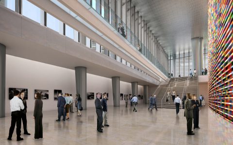
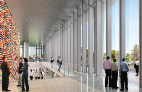
the offices are high ceilinged, well lit and open plan, with a view to encouraging the staff to be more collaborative and productive. dignity is given to all the consular and service entrances, not just the one for dignitaries. the experience of getting a visa, will take place in some of the least obnoxious spaces ever given to this purpose. a multicultural arts programme includes the work of british and american artists.
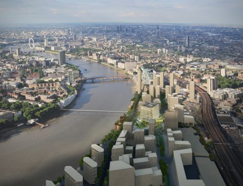
then there’s the decision, made in 2007, to put the embassy in the former industrial area of nine elms, between battersea power station and vauxhall, south of the thames, a quite different place from the grosvenor square location that the embassy was associated with for more than two centuries. the embassy since 1956, designed by modernist eero saarinen, was driven from there due to the increasing difficulty of protecting it.
it helped that the supergalactic property prices of mayfair meant that the $1 billion cost of the new embassy could be financed by selling the old building, at no expense to the us taxpayer. yet even if the move was driven by expediency, there is still something both brave and inspired about relocating to this unlikely area, which could then be transformed by the embassy’s arrival.
the new embassy is bland, vanilla, just as a diplomatic dinner is rarely riotous and a diplomatic speech is rarely spellbinding. timberlake’s multiple objectives are all good and worthy. they also contain the occasional conflict and contradiction – most obviously between being fortified and being nice – which the architects have chosen to smooth over rather than dramatise. the basic shape of the building is a cube, happens to be the most efficient shape for an office building.
but at this precise moment something calm and reasonable and seems quite precious. as timberlake explained the project to the press, you could see the current ambassador, woody johnson – the trump-appointed owner of american football team the new york jets – keep a poker face. you sensed the recycled grey water and leed ratings weren’t really his thing. you can only wonder what a trump-commissioned embassy would be like; something with huge columns or a bit of atlantic city or mar-a-lago, and not bothered about sustainability and public access.
the old boys preferred by rogers and palumbo would have offered more strident shapes but not something that would have better served the embassy’s public purpose. it also does a better job of combining high security and accessibility than its near neighbour, terry farrell’s mi6 building of 1992. the new embassy building is also better than everything else that developers are putting up around it. this is faint praise, of course, but it’s not damning.
