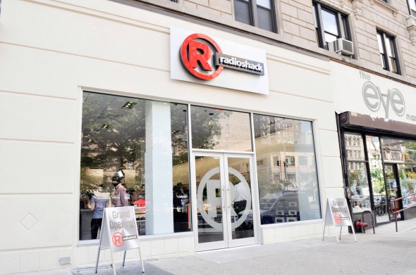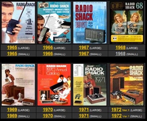

RadioShack stores are closing up one by one across the country retiring like the baby boom generation whose culture it serviced. RadioShack was a place to get spare parts. RadioShack supplied the strange entities called tubes for radios and television sets. Behind the clerks who were never the brightest was the whole area of accessories known as “the grommet rack.”
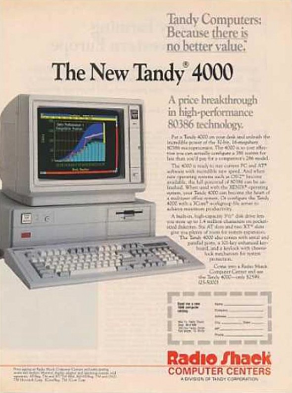
We hardly think of RadioShack as a design store but it was. The RadioShack provided supplies for those who created the mobile phone and the computer and indeed it supplied America with the first personal computers. But today we live in the age of the app. Like many electronic stores they have nothing left to sell but mobile phones. Now that it is closing we can understand what it contributed.


above> tandy 400 ad – 1987
 about phil patton

last summer i had a premonition that the starbucks logo was going to change.
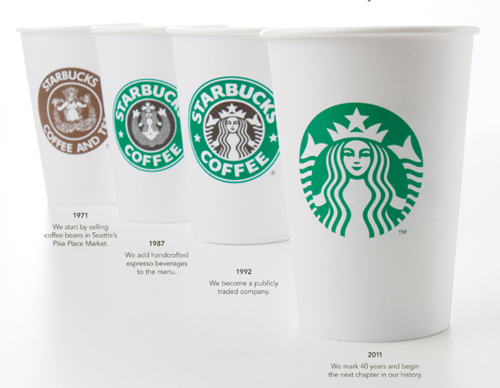
the thought made me a little sad because i liked their retro “label” design that subtlety, as a result, distinguished them from most other cleaned up rebrands. as the starbucks brand applications annually evolved the logo was stubbornly staying put. the old logo was very iconic and the siren was the weaker part of the old logo.
no argument about removing the word coffee. not so sure about removing starbucks on packaging going outside their cafes and onto competitive shelves. though don’t underestimate folks to figure these things out. only time will tell on this aspect, i.e., names are unnecessary for large institutions no matter where the products are served up. i predict a starbucks-only logotype being displayed somewhere.
this is a pretty savvy company marketing-wise with a strong in-house team and a powerful brand. how powerful is startbuck’s image? powerful enough to: now be an official stamp of affirmation that a neighborhood is gentrifying; just like holiday inn, to be comforting when found when no other viable known options are available.
though the timing of the rebrand is said to be a salute to company’s 40th anniversary one can’t help but wonder if the new look / strategy will leverage the outcome with current kraft foods litigation.
PRO
1) one color. cost efficient (on cups) and nod towards environment
2) simplified and nice refinement of siren
3) strong visual evolution over 40 years
CON
1) removing name iffy as company moves out of store and into marketplace shelves
2) old one so iconographic that new one dilutes the brand
3) siren was weaker part of logo
on a personal note, i wish the product lived up to it’s brand imaging though i’m glad they’re there when i crave one at the airport.
resources:
official starbucks announcement
starbucks vs kraft foods
logo evolution with nice write ups
logo evolution
lee moody’s facebook: nice commentary

