Partner Company 2015 is USA. The annual presentation of a partner country at Ambiente increases public interest in the fair, as well as its attractiveness and major role as the most important event in the worldwide consumer goods industry. USA will be showcasing trendsetting ideas, designs and products and the audience and exhibitors will have the opportunity to experience an American way of life in a special presentation and in numerous events and activities on the Monday of the fair. Last year’s partner was Japan. Former partner countries were Denmark and France.

DesignApplause has been talking to New York-based American Scott Henderson since mid-August 2014, following the development of his concept.
[DesignApplause] For this assignment what is MF hoping for?
[Scott Henderson] Messe Frankfurt chose me to be the designer of the Partner Country Exhibition because I work very closely with the primary industries that regularly show at Ambiente, and also because they perceive my work as combining a lightness and wit with innovative practicality.
[DA] What did your design brief ask of you?
[SH] The design brief was simply: Design an exhibit featuring the United States and curate all of its contents with US based products—mostly from the products lines of the Ambiente confirmed US exhibiters. I can also chose some products from US based companies that are not necessarily exhibiting at the show itself. We had 2-3 design reviews and I presented three concepts all at the same level as each other. We collectively chose the direction we’re moving ahead with, which was definitely the strongest one.
[DA] Tell us about the chosen concept.
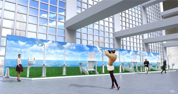
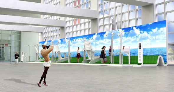
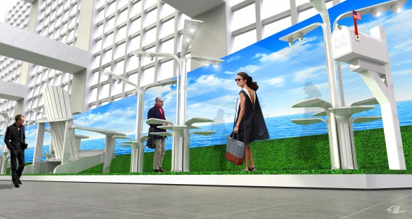
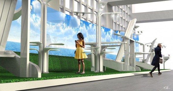
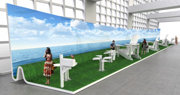
[SH] The big idea begs for a concept that evolves around unique iconic American images and symbols and serve it up to a global audience. The US is unique with regards to densely populated areas separated by vast stretches of open space. This reflects the very different regional looks we have. Matching an iconic product and a geographic region evolved into the Adirondack Chair, a classic I love, and a New England seascape. There are also two classic rural residential mailboxes at each end, befitting to the concept and with their flags in the up position. The flags are American flags, the only explicit reference to the US in the exhibit. There are also display tables abstractly representing plant life growing about these giant chairs.
[DA] What did you learn?
[SH] While I was working on this project, one exercise in the process was to create a visual “mood” board representing all things America. What I noticed while doing this is that as an American, I found out that it can almost be easy to take the USA for granted, especially when you start to consider how the rest of the world may view all of the positive things about our culture, geography, iconic products, etc. When assembling imagery that represents the many aspects of American life and its diversity on many levels, I was reaffirmed to how the territory is quite deep.
[DA] What are the challenges?
[SH] The greatest challenge for me in designing the exhibit was how to decide what to do amid the seemingly endless possibilities. Messe Frankfurt Ambiente being an international trade fair, I also thought about each concept not just through regional eyes, but through the global perspective, in effort to create a presentation that will be universally positive, yet authentically American. The serenity of the New England seaside, with the giant (9 feet tall) and truly American Adirondack Chairs facing the ocean scene from high on a cliff-side, seemed to be a great way to do this. The exhibition is titled Seashore Galore and is erected in a very open space which lends itself to the expansive, light and airy look of the design.


above / below> an earlier iteration of the seaside concept


above / below>
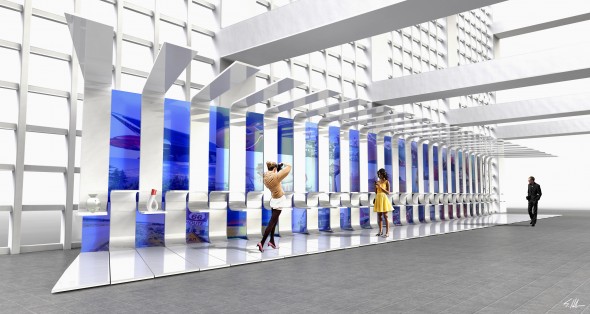
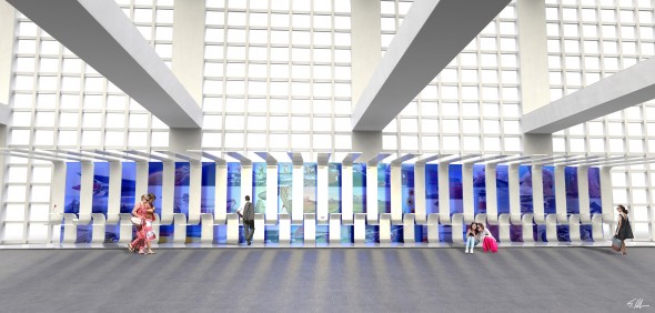
[SH] Concept 1, my first idea staggered panels emanating from the floor, and ceiling, creating display shelves at two different heights. A show attendee can just walk up to this curved display wall to access the various products. The staggered panels abstractly represent the stripes of the American Flag, with negative and positive spaces playing off of each other. Through the negative space created by the staggered panels is an LCD Video Wall that would show images of American life, geography and culture. The images would be moving around randomly and perhaps synchronized to sound in some way.
I was going for a “Slick” “designy” solution with this first attempt, but at the end of the day, I think that people have all seen technology and slickness, and no matter how well we executed on this idea, people might just walk on by as it lacks the emotional connection that the final chosen direction with the Adirondack Chairs has.


above / below>
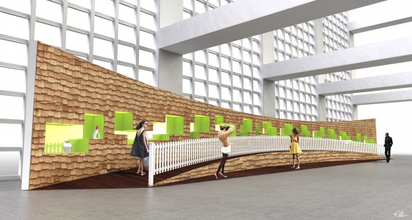
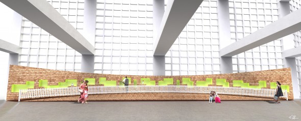
[SH] Concept 2, using cedar shakes, an authentic American building material found on salt box houses in regions like the north east, I experimented with cutting through the “roughness” of the cedar to expose high-gloss, lacquered and randomly staggered display boxed that would be brightly lit from inside. The juxtaposition between the rough and smooth, and natural earth tones versus a vibrant tertiary color, were interesting to me. Since the space is 4 meters tall, I explored using some of the vertical height by incorporating a ramp that runs the length of the exhibit, to allow show attendees to walk ‘up’ into the space. The picket fence is meant to again combine tradition with a contemporary treatment—creating a contrast that was intended to be powerful. I think playing iconic tradition against contemporary details and colors often has the potential for high-impact.

[ Partner Country USA ] exhibition and activities will be held in the Foyer of Hall 4.1 throughout the duration of the fair.

[ scott henderson ] I think good design involves a big idea that is so
built-in to the product that becomes its total story. A bad design is one that attempts to get 10 or 15 small ideas to work together, resulting in a muddled or forgettable story. With my own design work, I try to incorporate one big idea that you see right away at a glance that makes you say, “I get it”, and when you get it, you smile and experience happiness. If the idea is strong enough, a very mundane object that was part of the world’s background emerges into the foreground.

