 click > enlarge
One year after he got his Masters in Design Products at the Royal College of Art in London in 2001, Sylvain Willenz opened his own design office in his hometown of Brussels. In the past eight years he’s worked with brands like Cappellini, Established & Sons, Hay and Tamawa, and has won a handful of awards, including two Red Dot Best of the Best Product Design Awards for his work with Freecom Mobile Drive.
What I particularly like about Willenz’s work is that even when it’s at its most technical it remains approachable, never intimidating. The simple, minimal forms and bright elementary colors are a friendly callback to the Bauhaus aesthetic. In fact, one of Willenz’s more recent pieces, the Folk rug, is right at home with Bauhaus textile designer Anni Albers’ bold geometrical patterns.
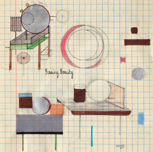
Designed for Chevalier Edition, the Folk rug “was born out of the desire to organize geometric forms while exploring colors and structure. The motifs clearly evoke and play with the idea of folk or traditional rugs in a deliberately simplified manner.” Willenz, who works mostly in lighting and furniture and has never before collaborated with a manufacturer on a textile or pattern said “the opportunity to work solely on a graphic level does not occur very often in my design office and when Chevalier Edition approached me for this collaboration the assignment was certainly appealing. The exploration of two-dimensional forms became, without a doubt, most liberating and I truly enjoyed this exercise.”
The Folk rug is made from 100% handknotted wool and comes in three color variations, Light, Dark and Bright.
<


about perrin drumm
 click > enlarge
Nipa Doshi and Jonathan Levien established Doshi Levien, their London-based design office, in 2000. For the past thirteen years the partners have focused on work that “celebrates the hybrid and explores the coming together of cultures, technology, storytelling, industrial design and fine craftsmanship.” In an interview Doshi said, “The language that interests me is that of the hybrid. The visual language that cannot be placed or defined. The language that talks about plurality of global culture and ideas.”
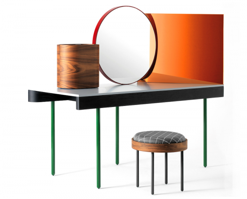
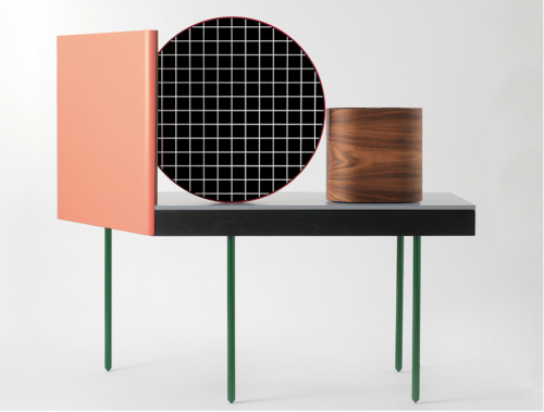
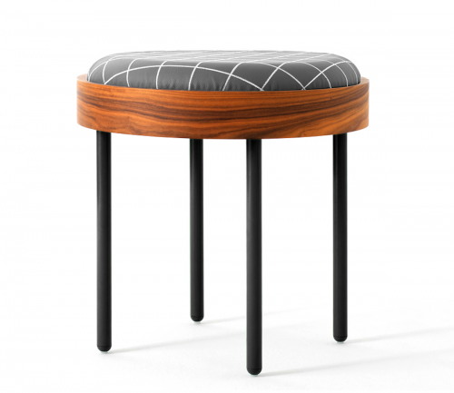
One of their recent projects, a vanity called Chandlo, is a perfect example of Doshi Levien’s ethos. The design for Chandlo draws inspiration from Bauhaus and, apparently, from the bindi worn by Indian women on their forehead. The elements from Bauhaus and De Stijl are obvious in the skinny, linear legs, the gridded pattern on the stool cushion and the strong, mirrored geometric shapes on the tabletop. The reference to the bindi is a little more conceptual and is rooted more in the general idea of the ritual of grooming.
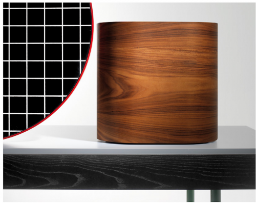
Chandlo is composed of “a central, front faced mirror with a red steel frame, a side mirror with a rose colored filter and a plywood jewelry box with rosewood veneer, all structured on a solid ash surface.” From Doshi Levien’s website:
“Chandlo was designed as a special prototype made by BD Barcelona for Das Haus 2012. This was an installation by Doshi Levien for IMM Cologne that explored their vision of a perfect home. Das Haus consisted of interconnected spaces opening up to a central courtyard. The different areas of the home depended mainly on objects and furniture to define space.”


about perrin drumm
 click > enlarge
Not since Josef Alber’s brilliant Bauhaus-era nesting tables have I seen a similar design that does it better, and while nothing really tops Bauhaus for me, Rotterdam-based designer Reinier de Jong’s REK coffee table comes awfully close. Like Alber’s design, REK offers an elegant, space-saving solution. It’s three tables in one, which basically triples your available surfaces for when you have guests over. When company leaves, it tucks away neatly into a central cube-like shape.
“REK is a coffee table that grows with your coffee needs. When you have visitors, just get some chairs and extend the table any way you like. Built-in stops make sure you will not extend the sliding parts too far.
The top and two sides of REK are white HPL and the edges are finished with your choice of solid wood: oak, berch or beech. The end grain side of the wood is beveled in order to get a grip: A subtle detail. The dimensions of REK table obviously vary with its configuration: 60 by 80 cm in collapsed state, its maximum lenth is 170 cm and its maximum width is 130 cm.”
de Jong’s other furniture is surprisingly different, like the bright yellow, Beetlejuice-esque Volt table and the fire engine red Keer chair. He does offer one other design in the REK line, a bookcase that, like the coffee table, expands and folds away depending on how large your library is.


about perrin drumm
 charles and ray eames | dcm | herman miller 1946/1970 | photos courtesy of wright
Apple products combined cutting-edge design with cutting-edge technology. American ate it up. You don’t always (or usually) get such class acts in the consumer marketplace.
But I want to underscore another class act in American functional design: Herman Miller. I have an Eames chair (the one with the metal frame and wood back and seat) that my father-in-law used in the office of the building supplies business he built after he and and his wife fled Germany in 1938. Many of their possessions reflected the mid-Century modernist taste.

Unfortunately and non-intentionally a relative somehow broke the back off the chair shortly after my husband died. I wanted it fixed appropriately. Someone advised me to take it to an art gallery that specialized in mid-century modernism. But I just called Herman Miller and asked if they could fix it.
Well, you would have thought I was the First Lady by the way I was treated. As promised, shortly after the call I received two emails with my case number, a sample UPS label and a personal note from the woman with whom I originally spoke who had an expertise on whatever product anyone wished to return.
It turns out that Herman Miller simply needed to remove the broken molding on chair’s back, send it back and I could reattach it using a standard screwdriver. My contact advised me it would be a 3-4 week turn-around. Instead, I received the rebuilt back piece within a week of sending it.
It’s difficult to describe the feeling I had: the confidence that Herman Miller was actually taking care of me and my priceless family heirloom. My in-laws, carried the Bauhaus sensibility with them when they sought refuge in America.
This is not a story of bravery, heroism, moral enlightenment or anything like that. It is simply a statement of appreciation for a level of care and professionalism that all too often is missing in America today. My chair, whole again, represents a heritage I want to pass on.
specifications:
designer: charles and ray eames
producer: herman miller
object: dcm 1946/1970 | ash, chrome-plated steel, rubber, plastic | 19.25 w x 22 d x 29.5 h inches

about cam2


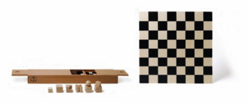
This design classic in chess sets is manufactured by Naef Spiele AG of Switzerland under license from the Bauhaus Archive in Berlin and represents the ultimate in the Bauhaus form follows function principle of design. Stripped of symbolism, the pieces are shaped to reflect their movement on the chess board; a cross for the bishop, an L-shape for the knight, etc. The set comes complete with a box (44 x 7.5 x 4.5 cm) to hold the pieces and the playing board (36 x 36 x 1.2 cm). $600 usd.
designer: josef hartwig
producer: >naef spiele
period: 1923
 classic design is always in style, but have you found yourself wondering which of your bauhaus or mid-century favorites are still in production, and if so, where you can get them?
above: frank gehry’s wiggle side chair

above: george nelson’s home desk

above: george nakashima’s straight chair

above: marcel breuer’s wassily lounge chair
The answer to that is Edition20, a searchable database of all the best 20th-century goods that are still being produced under their original license. No links to knock-off manufacturers or reproductions or vintage classics that are no longer made.
The site itself is straightforward, easy to navigate and totally addictive. Even the most lukewarm design interest will be sparked by the labyrinthine path sure to ensue after the first click. George Nelson’s 1958 Home Desk by Vitra leads you to Frank Gehry’s 1972 Wiggle Side Chair, which leads you to his other work for Knoll, which can lead you to anything from George Nakashima’s 1948 Straight Chair to Marcel Breuer’s 1928 Wassily Lounge Chair to any of the famous pieces by Harry Bertoia, Mies van der Rohe or Eero Saarinen. And that’s just the chairs. For serious research or just a midday diversion, Edition20 satisfies.
Resources:
edition20
george nelson’s home desk
frank gehry’s wiggle side chair
george nakashima’s straight chair
marcel breuer’s wassily lounge chair

about perrin drumm
 click > enlarge


