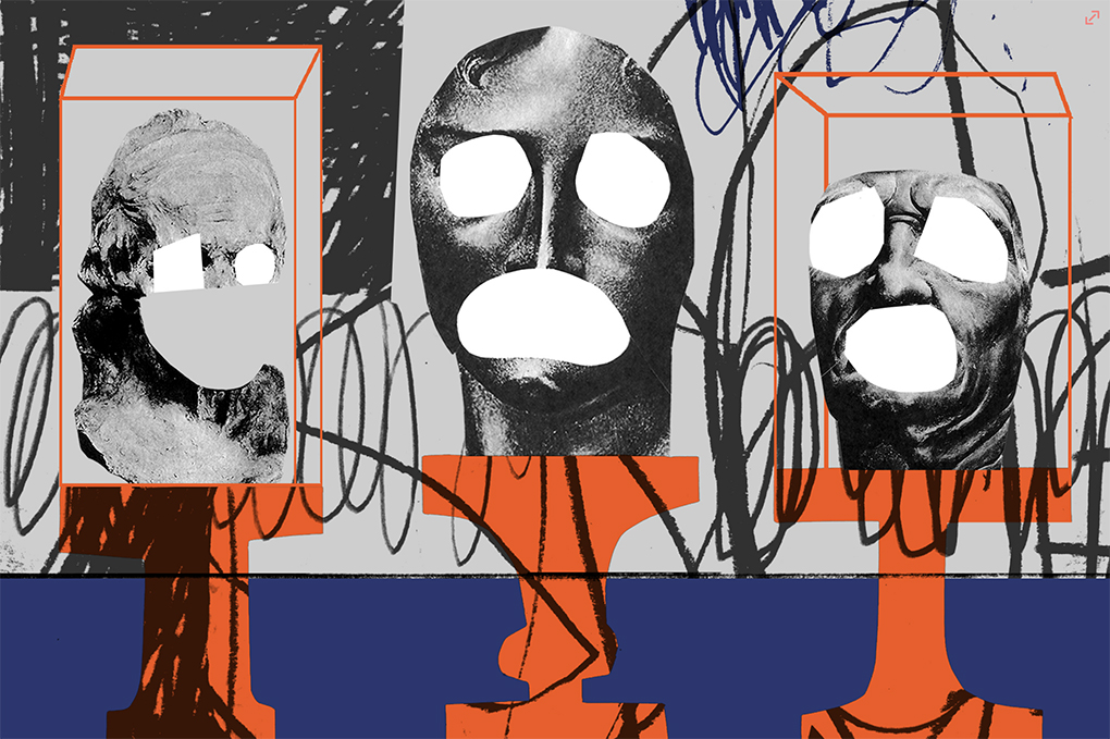
above > designer george douglas
each year millions of americans face the reality of living with a mental illness. during may, DesignApplause and the rest of the country are raising awareness of mental health. each year we fight stigma, provide support, educate the public and advocate for policies that support people with mental illness and their families.
this post debuted on 1 may 2019 and updated 1 may 2024.
[ resources ]
us mental health awareness week 2023
mental health america
nami / national alliance on mental illness / why care?
national institute of mental health
[ visual inspiration ]
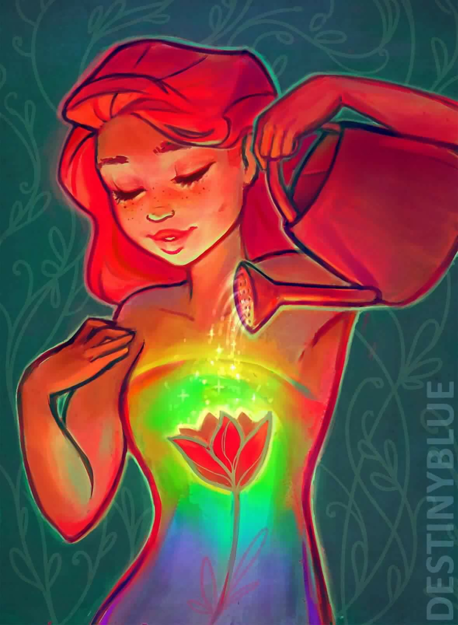
above > self care / designer destinyblue
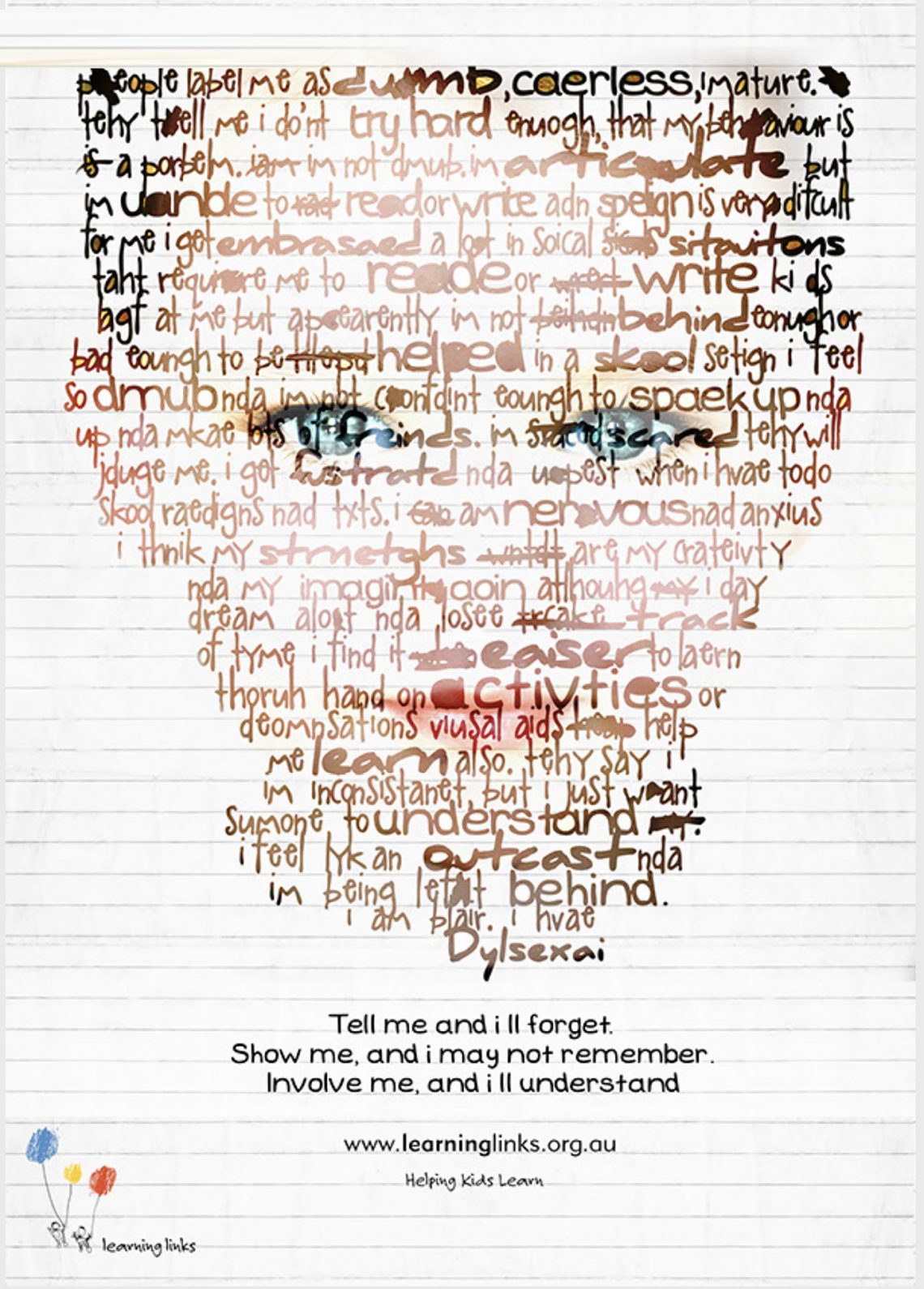
above > dyslexia is a learning disorder that involves difficulty reading due to problems identifying speech sounds and learning how they relate to letters and words (decoding). also called reading disability, dyslexia affects areas of the brain that process language.
therefore a child’s brain assumes or perceives alphabets / objects differently
the idea of this campaign is to support the children suffering from dyslexia, and to bring awareness amongst parents, teaching staff and others dealing with children of dyslexia to understand what their brain functions like or how it is difficult for them to adapt and understand the basics of learning. designer shravani virkud
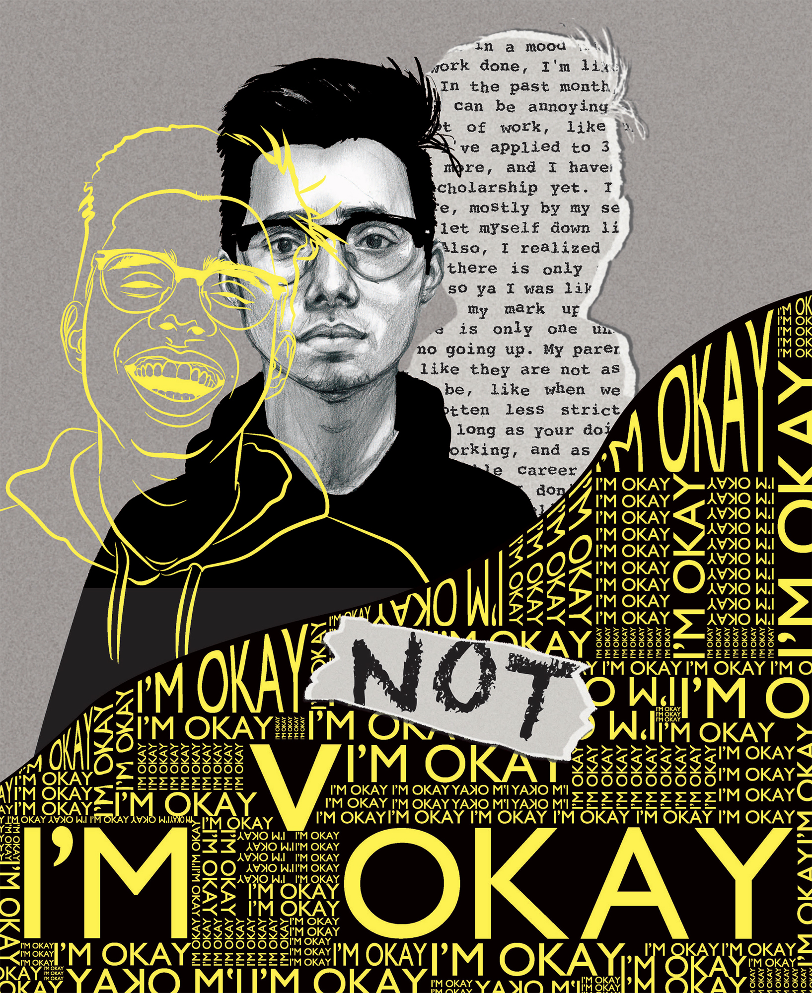
above > i’m not. designer anoosh mubashar
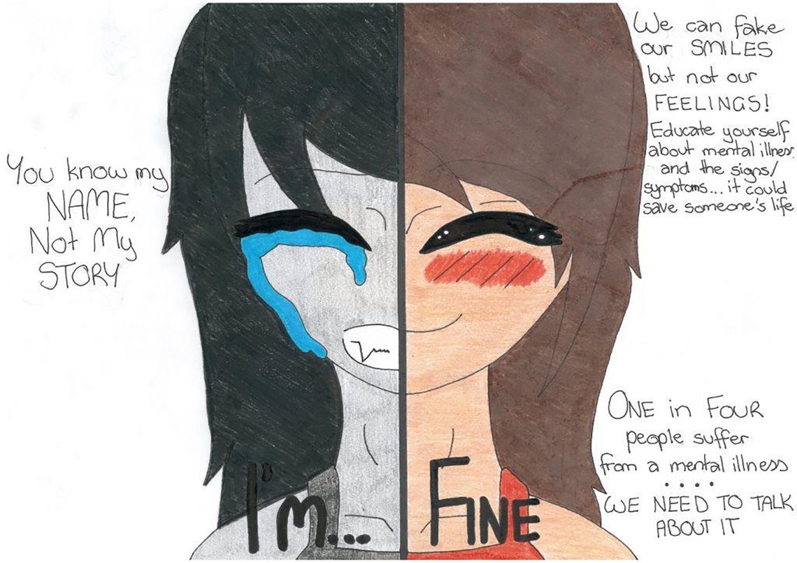
above > designer grace bates
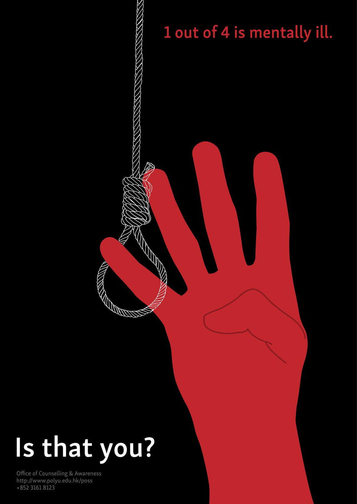
above > designer anoushka agarwal / i created a series of poster targeting mental health. i kept the colour theme red, black and white to show the seriousness and potential danger of lack of mental well being. this series shows the suicide aspect of mental ill-being. the posters come with supplementary information to make the message more clear. in all of the posters, i have provided the details of office of counselling and awareness at polyu, hong kong instead of some external counselling service keeping in mind the target audience, the university students and also the ease with which they can be contacted.
this project is also based on project semi-colon. an author uses a semicolon instead of a full stop when he doesn’t want to end his sentence. so the project was based on not giving up hope and making things better instead of resorting to suicide. the noose and the comma are a reflection of the project.
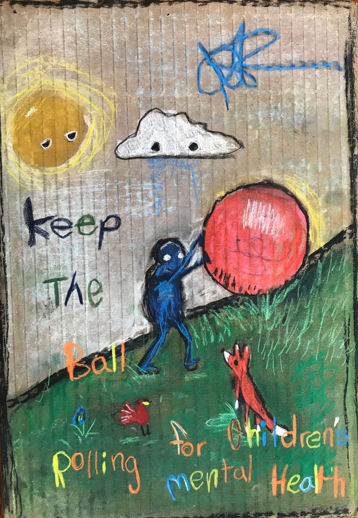
above > idaho federation of families for children’s mental health
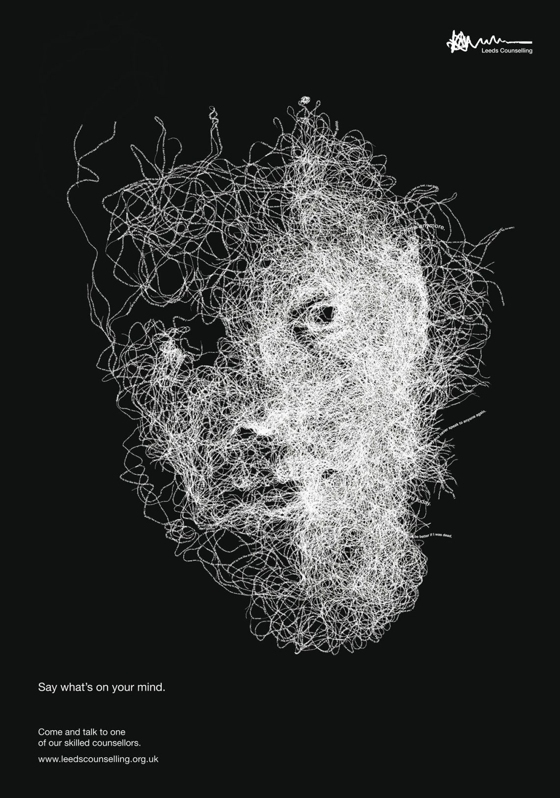
above > designer john barton / sometimes a poster is designed to target just a section of the population, who may have trouble expressing their emotions; for example males. barton, a uk graphic designer created this poster for leeds met students’ union, to encourage males to go to counseling / ivline
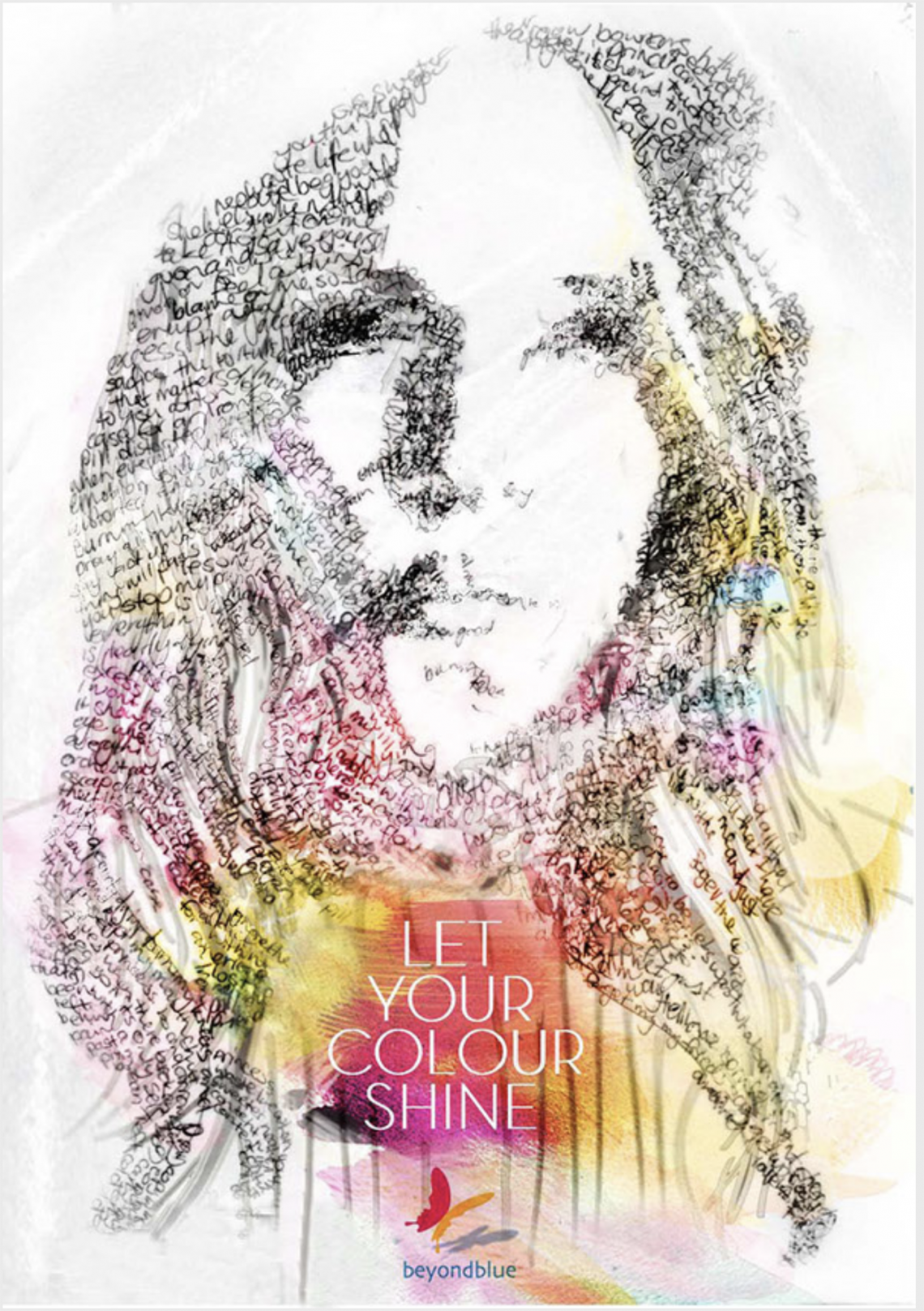
above/ below > designer patrizia tresca / focusing on the depression and dyslexia, these posters aim to create awareness and engage the viewer with their personal messages.
above > designer george douglas / the links between creativity and depression and how the design industry can tackle mental health via eye on design
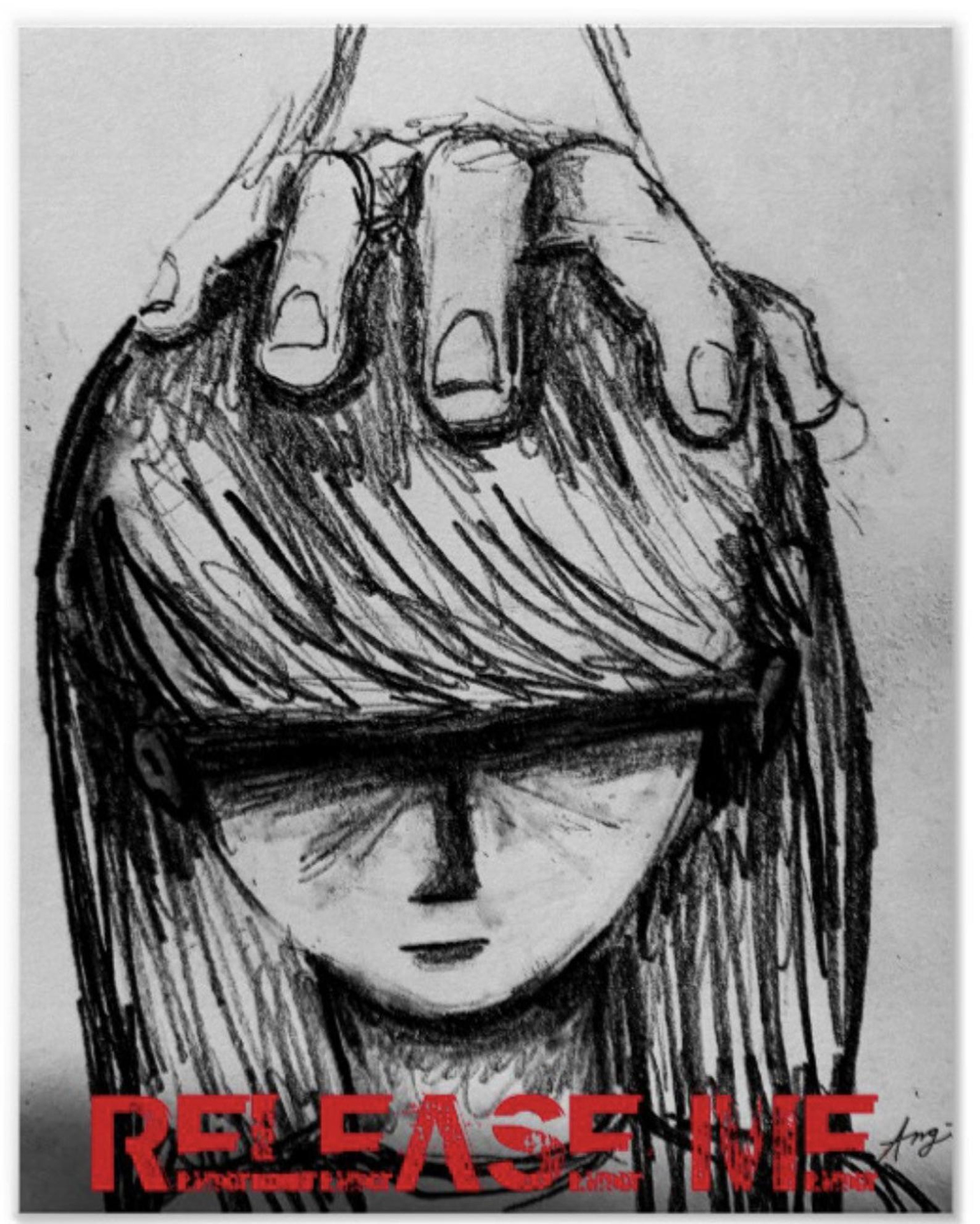
above > designer angela nardiello – angelphis 13 / this 11×14 print is created from an original hand-drawn sketch. it communicates enduring the healing process of manipulation/mental abuse. victims of other situations including depression and other disorders, current human rights abuse situations, and more can also relate to this sketch.


