• CALENDAR
    • Add Your Event
  • architecture
    • art & literature
    • awards
    • buildings
    • sustainable
    • prefabricated
    • public space
    • residences
    • urban planning
  • design
    • art & literature
    • awards
    • collectables
    • concept
    • fashion
    • sustainable
    • home
    • lifestyle
    • safety & special needs
    • transportation
    • workplace
  • editor’s pick
    • featured
    • gift ideas.
    • interviews
    • opinion
  • events
    • auctions
    • competitions
    • conference & Exhibitions
    • fairs
  • news
    • latest news
    • elsewhere
    • lifestyle
    • people
    • producer
    • retailer
DesignApplauseDesignApplauseyour daily design dose
  • CALENDAR
    • Add Your Event
  • architecture
    • art & literature
    • awards
    • buildings
    • sustainable
    • prefabricated
    • public space
    • residences
    • urban planning
  • design
    • art & literature
    • awards
    • collectables
    • concept
    • fashion
    • sustainable
    • home
    • lifestyle
    • safety & special needs
    • transportation
    • workplace
  • editor’s pick
    • featured
    • gift ideas.
    • interviews
    • opinion
  • events
    • auctions
    • competitions
    • conference & Exhibitions
    • fairs
  • news
    • latest news
    • elsewhere
    • lifestyle
    • people
    • producer
    • retailer

in a nod towards electricification gm has new logo.

Home designtransportation >>automobilein a nod towards electricification gm has new logo.

in a nod towards electricification gm has new logo.

Jan 8, 2021 | automobile |
in a nod towards electricification gm has new logo.
advertisement

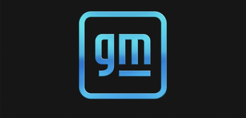
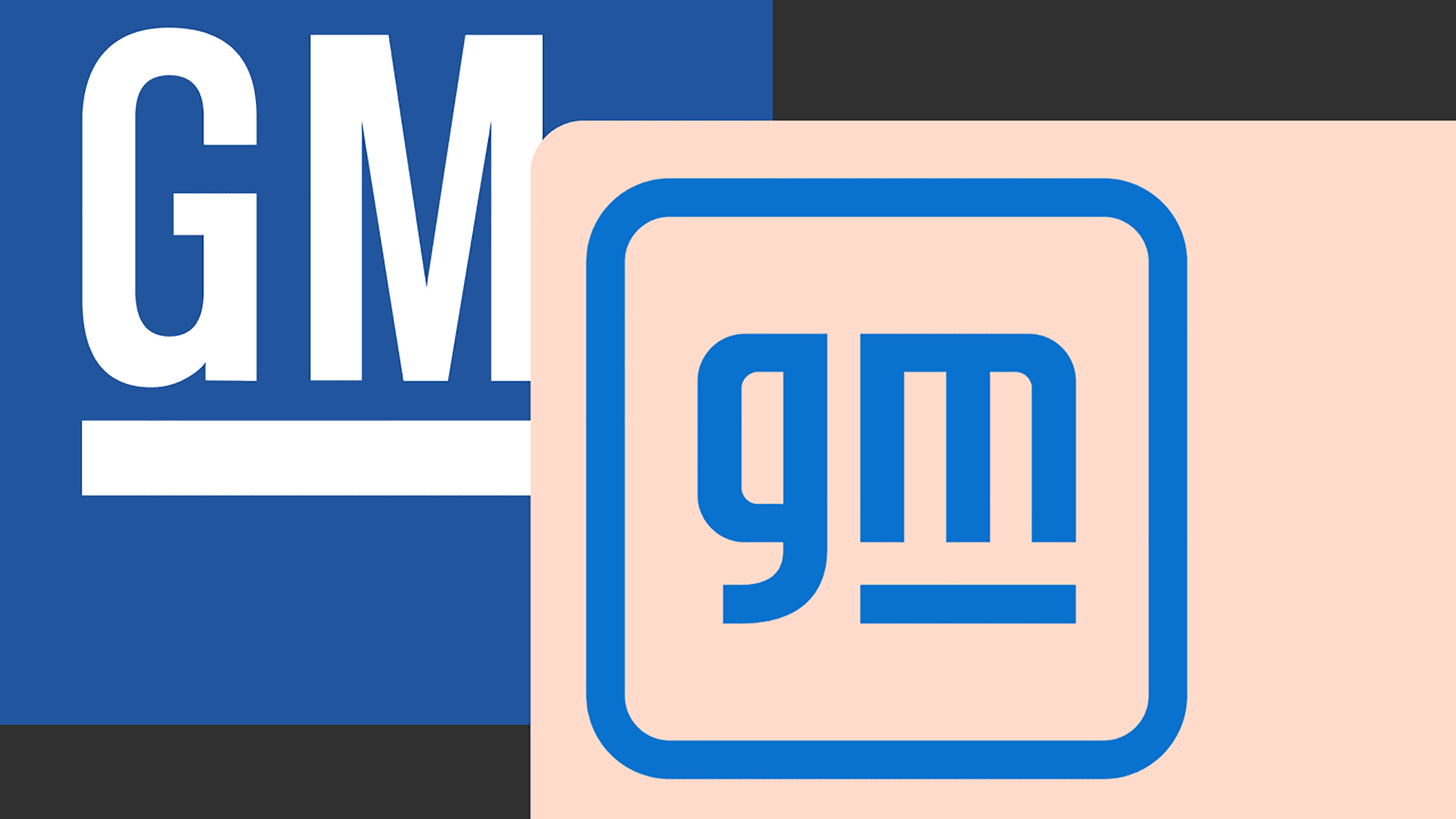
for the first time in a decade—and only the fifth time in its history—general motors is getting a new logo.

the company said in a statement:
the new gm logo features a color gradient of vibrant blue tones, evoking the clean skies of a zero-emissions future and the energy of the ultium platform [gm’s ev battery system]. the rounded edges and lower-case font create a more modern, inclusive feel. the underline of the “m” connects to the previous gm logos as well as visually representing the ultium platform. and within the negative space of the “m” is a nod to the shape of an electrical plug.


[ image” gm ]

like the clean skies blue.

[ general motors ]
0
Share

about DesignApplause

DesignApplause (DA) is an architecture and design online narrative with over 5,000 interdisciplinary photo-rich articles and editorials. from interviews with significant creative forces such as founders/owners, architects, artists, critics/curators, designers, educators, historians and producers, to the discovery of front-line architecture and innovative products, DA is read by a worldwide audience.

view all entries by DesignApplause.

Contact Us

We're currently offline. Send us an email and we'll get back to you, asap.

Send Message
DesignApplause

your daily design dose

Follow Us


about us
contact/help
privacy policy

ADVERTISEMENT

LATEST NEWS

  • lissoni new york introduces lissoni architecture.
  • ford switches gears re most dramatic auto business model switch in your lifetime.
  • expo chicago 2023 discovers artists that embrace architecture and design.
  • a man for all reasons brit architect/designer david chipperfield wins 2023 pritzker architecture prize.
  • the beginning is the most important part of the work. hello 2023.

All content ©2007 > 2022 DesignApplause

Prev Next