• CALENDAR
    • Add Your Event
  • architecture
    • art & literature
    • awards
    • buildings
    • sustainable
    • prefabricated
    • public space
    • residences
    • urban planning
  • design
    • art & literature
    • awards
    • collectables
    • concept
    • fashion
    • sustainable
    • home
    • lifestyle
    • safety & special needs
    • transportation
    • workplace
  • editor’s pick
    • featured
    • gift ideas.
    • interviews
    • opinion
  • events
    • auctions
    • competitions
    • conference & Exhibitions
    • fairs
  • news
    • latest news
    • elsewhere
    • lifestyle
    • people
    • producer
    • retailer
DesignApplauseDesignApplauseyour daily design dose
  • CALENDAR
    • Add Your Event
  • architecture
    • art & literature
    • awards
    • buildings
    • sustainable
    • prefabricated
    • public space
    • residences
    • urban planning
  • design
    • art & literature
    • awards
    • collectables
    • concept
    • fashion
    • sustainable
    • home
    • lifestyle
    • safety & special needs
    • transportation
    • workplace
  • editor’s pick
    • featured
    • gift ideas.
    • interviews
    • opinion
  • events
    • auctions
    • competitions
    • conference & Exhibitions
    • fairs
  • news
    • latest news
    • elsewhere
    • lifestyle
    • people
    • producer
    • retailer

lifestyle

Home newslifestyle (Page 3)
2014 introductions from fritz hansen.

2014 introductions from fritz hansen.

Jul 26, 2014

above> analog table and drop chair

Fritz Hansen’s 2014 product launches continue to reflect their commitment to quality and exclusive design. With a theme of “unplugged relations” Fritz Hansen introduced the Analog table by Jaime Hayon and the re-launch of the Drop chair by Arne Jacobsen to inspire us to notice and cherish each other’s presence.

After more than 50 years in hibernation, the Drop is now re-launched! The chair was designed by Arne Jacobsen in 1958 as part of his masterpiece, the legendary SAS Royal Hotel (now known as Radisson Blu Royal Hotel) in Copenhagen. The Drop was originally produced along with the Swan and the Egg, but exclusively for the hotel and was never put into standard production. In addition to the original design of pliable, upholstered foam, the Drop is now available in a moulded plastic version that is especially relevant for modern interiors.

The Analog table is celebrating the authentic way of connecting with people around a table by bringing us closer. The world is filled with communication through digital devices. Analog provides a space where no device is needed. The table promotes a return to the genuine togetherness that is a stark contrast to the digital life we face with demands of constant on-line presence. Analog gives you an invitation to engage, to share, to be intimate and present – to be off-line.

Analog is not a square, not a circle, not an oval – it is a new form that takes the best from the three classic shapes and brings them together in a new, organic form. There is no hierarchy, just a beautiful platform for conversations which is a perfect match for modern relationships among family members, friends and colleagues.

Along with this theme, Fritz Hansen also announced the reunion of the entire Poul Kjærholm collection including the PK 11 chair, PK 55 desk, PK 62 and PK 63/PK 65 coffee tables.

fritz-PK62-PK63_Lifestylepk 62 (right) and pk 63 tables

Poul Kjærholm’s furniture has a special place in Fritz Hansen’s heart. The pure and beautiful lines fit naturally into the Fritz Hansen universe. Poul Kjærholm is known for using natural materials such as marble, wood, leather and canvas, which he pushed to their limits to show the beauty in their strength and the strength of their natural qualities. Throughout his career, Poul Kjærholm translated values of simplicity and a love of nature into outstanding and unique furniture. The Poul Kjærholm Collection is beautiful and timeless and produced in top quality. Every piece in this highly sophisticated collection has a strong identity and the subtle ability to light up any type of space by giving it a touch of Nordic aesthetics.

“It has always been a very refined group of connoisseurs who understands the uniqueness in Poul Kjaerholm’s extreme minimalism and it will probably remain so. However, the interest in the exclusive and outstanding design and quality strike a chord internationally. We have therefore chosen to tell the full story about Poul Kjaerholm’s design by acquiring the rights to the entire collection,” says Christian Grosen Rasmussen, Head of Design. “The new products are the PK 11, PK 51/PK 55, PK 62 and PK 63/PK 65. Each of them is a unique piece of furniture design that lends our existing collection additional character and distinction. The Poul Kjærholm Collection is much stronger when it includes all the pieces, because that offers more opportunities to combine products. Furthermore, the furniture will be made of the best materials and held to the same high and uncompromising quality standards, which is a crucial feature of the Poul Kjærholm Collection.”

fritz-PK11-PK55
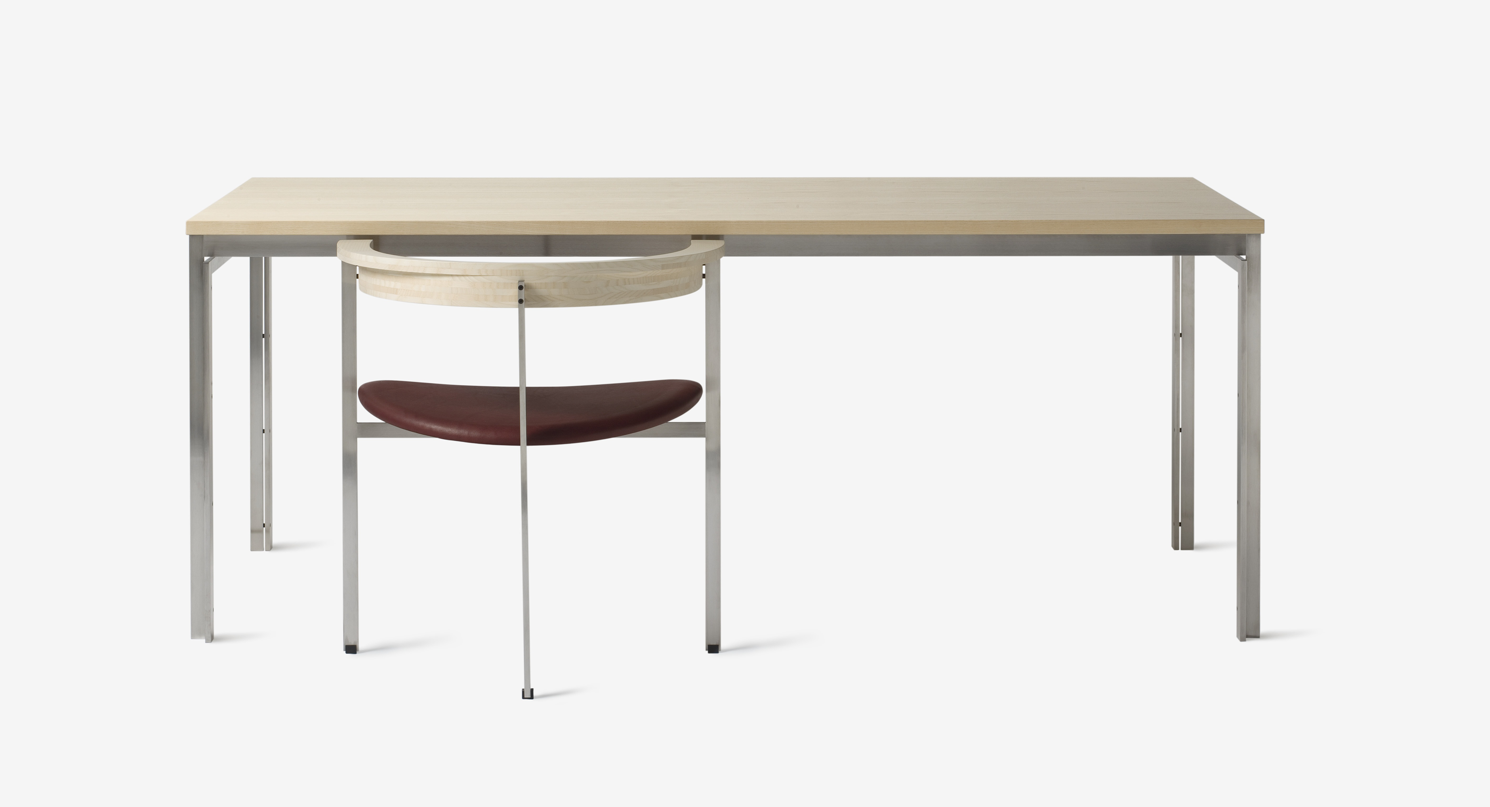
pk 11 chair and pk 55 table

fritz-PK65_Lifestyle1
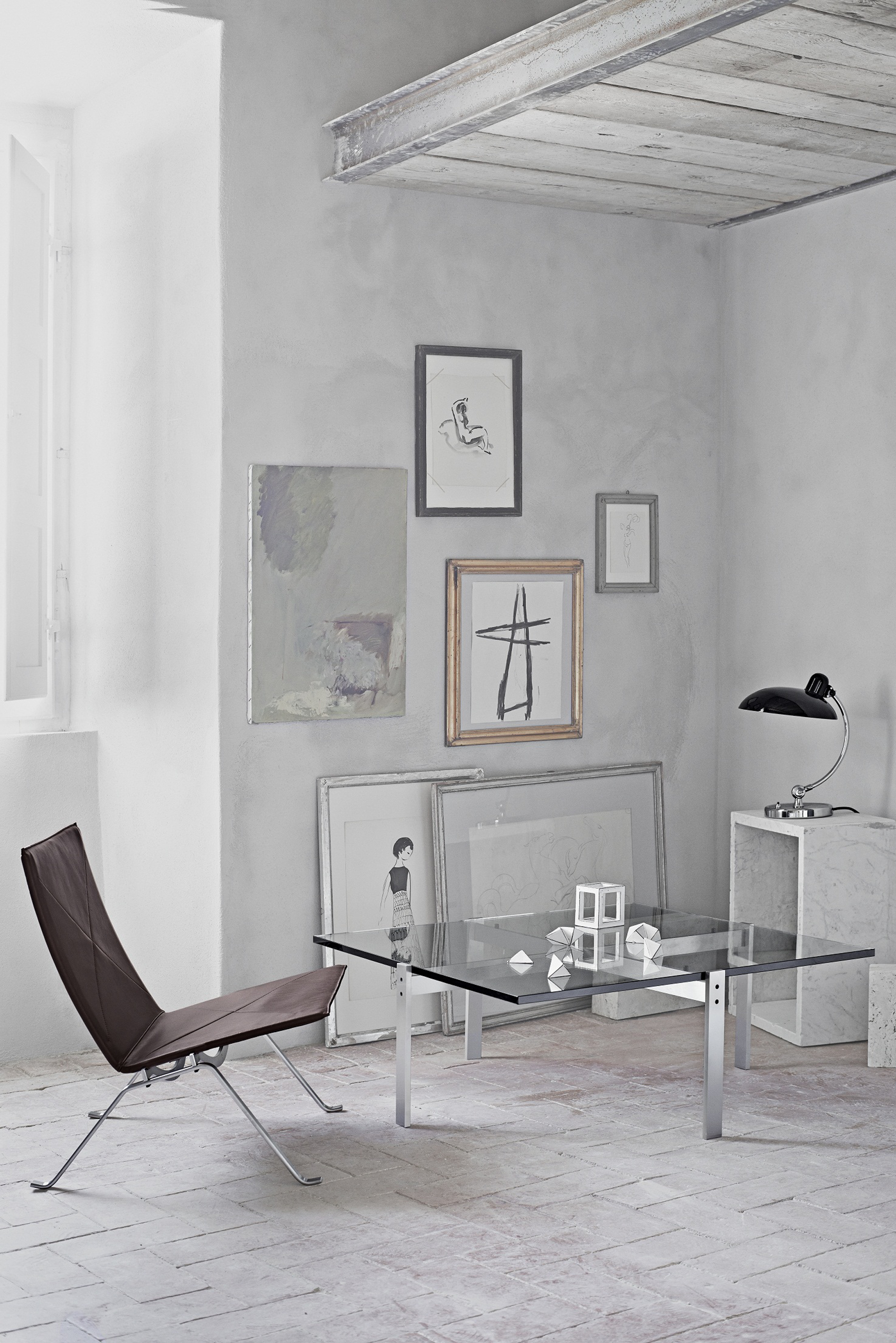
pk 65 table and pk 22 chair
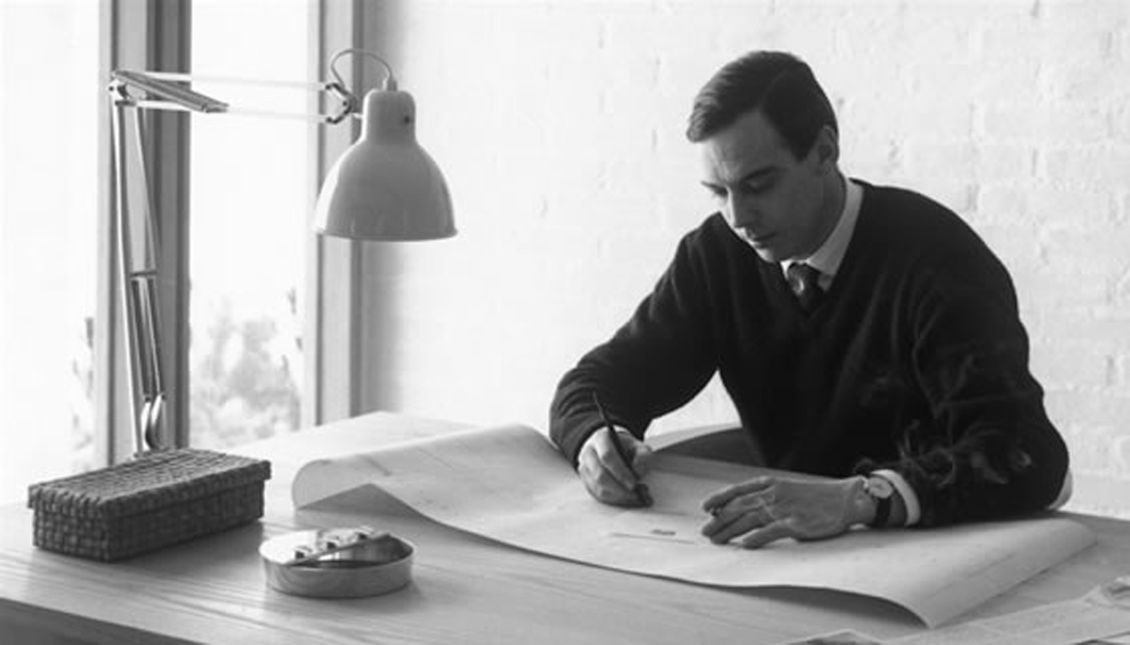
fritz-poul1poul kjærholm

[ Fritz Hansen ] Founded in 1872 in Denmark, is one of the world’s most recognizable producers of iconic furniture for public and private spaces. The history of the company is characterized by meticulous craftsmanship, unique design and a sense of understated elegance. Leading architects and furniture designers from all over the world have produced timeless furniture for the company’s collection, which embraces innovative techniques and new materials. Contributors
include legendary designers such as Arne Jacobsen, Poul Kjaerholm, Bruno Mathsson, Piet Hein, and Piero Lissoni as well as young innovators like Kasper Salto and Todd Bracher.

Today Fritz Hansen furniture is embraced by a range of global consumers from city dwellers to business executives who celebrate the company’s ability to enlighten and delight with design. Fritz Hansen products can be seen around the world in residences and high-profile corporations, luxury hotels and art centers including the famed SAS Royal Hotel in Copenhagen and the Museum of Modern Art (MoMA) in New York.

Dronography and fireworks collaborate in 2014.

Dronography and fireworks collaborate in 2014.

Jul 17, 2014

>above> new phantom 2 vision+ and hero 3

Last April a Phantom 2 quadracopter using a Hero3+ Black Edition was flown into fireworks. No one is sure how impactful this particular feat is however on the 4th of July quite a few drone videos were made.

video shot april 2014

One in particular went viral, shot by videographer Jos Stiglingh who was presented with a unique opportunity to film fireworks up close, also used a Phantom 2 and Hero3+ Silver. 2014 may become known as the year of dronography and fireworks credited with fully catching the public’s eye. [ the video ]

hero3plus-2hero 3+ black edition | hero 4 to be released october 2014

Here are two companies seemingly designing products for each other. [ gopro ] manufactures high-definition personal cameras, often used in extreme action video photography. They are known for being compact, lightweight, rugged, wearable or mountable in unusual places such as outside planes, cars, boats, bicycle and motorcycle helmets, army tanks and drones. The cameras capture still photos and/or video in HD through a wide-angle lens and can be configured to work automatically with minimum intervention and/or remotely.

[ dji ] as of 2013, manufactures micro air vehicles (MAV)s for aerial survey / surveillance. With it’s relative ease of use and affordability, these unmanned aerial vehicles (UAV) are also popular amongst aerial photographers for aerial photography and videography.

phantom2-hero3-1new phantom 2 vision+ and hero 3

GoPro lists the Phantom ‘for everyone’ on their website and also has an ‘expert’ product link which points to the new Spreading Wings S1000. A fully loaded Phantom 2 Vision+, $2,500 usd; Spreading Wings S1000, $6,000 usd.


[ drone perspective ] [ gopro goes public ] [ getting started in dronography ]

The clark institute expands via tadao ando, selfdorf architects and reed hilderbrand.

The clark institute expands via tadao ando, selfdorf architects and reed hilderbrand.

Jul 4, 2014

above> visitor center and reflecting pool | image courtesy of tadao ando architect & associates

Fourth of July marked the opening of the much expanded and renovated Clark Art Institute in Williamstown, in western Massachusetts. Originally opened in the Berkshire mountains by Sterling Clark, who feared nuclear attack on New York City would destroy art there, it is officially the Sterling and Francine Clark Art Institute, now rebranded and newly logoed as The Clark.

After 12 years, the museum has completed a $145 million expansion. There are new buildings, including an entrance by Pritzker prize winner Tadao Ando along with a vast water feature and a pavilion by Annabelle Selldorf, who directed the interior renovation of the original 1955 Beaux Arts building and the 1970s addition, now renamed the Manton Research Center by Pietro Belluschi with Architects Collaborative. The vast site, with hills and trails, was designed by Reed Hilderbrand landscape architect and Madeline Burke-Vigeland of Gensler was the supervising architect for the whole project.

patton-clark-ando2visitor center and reflecting pool | image courtesy of tadao ando architect & associates

Ando had already designed a building for the Clark, the Lunder Center at Stone Hill at the edge of its 140 acre site, six years ago. The freestanding research and conservation building with galleries shows off Ando’s brand of zen modernism. It layed off the imprint of plank like wooden forms in the concrete against actual wooden walls opposite them. The new building is more formal and elegant, steel, glass, concrete and granite. Ando is an unabashed devotee of Le Corbusier and the new building even shows the same sorts of dimples left in the concrete from the construction forms that Corbu did.

Here the concrete is joined by a red granite, to pick up on the Seventies building. That stone along with the long walls and reflecting pool suggests another modernist master—Mies and the Barcelona Pavilion with its green marble.

patton-clark3
patton-clark1

patton-clark4

patton-clark2

patton-clark-stonehill5stone hill center | 2008 ©jeff goldberg/esto

One wonders what the long winter of Western Massachusetts will do to the pool, lined with rounded stones that perhaps suggest the shallows of the Hoosic River, power source for the disused nineteenth century factories in the area. One has been converted into MASS MOCA, Massachusetts Museum of Contemporary Art, a few miles away.
1,6> images courtesy of the clark institute
2-5> images ©jeff goldberg/esto

[ the clark ] { selldorf architects ] [ reed hilderbrand ]

about phil patton

Douro marina. Barbosa guimaraes.

Douro marina. Barbosa guimaraes.

Jul 4, 2014

Designed by the architectural firm Barbosa & Guimarães, the Douro Marina accommodates 300 vessels up to 20 meters and is assumed as the largest boat harbor between Cascais and Galicia. The site is about 2,000 m2, and spread over three buildings each with two floors.

duoro-marina11

douro-marina2

The central support building is a rectangular volume that is suspended in an external steel structure that looks like the skeleton of a huge boat. Two restaurants, a cafeteria, a nautical shop, a spa candle and fill the other spaces beautiful building erected right next to the pier. In addition to the spaces store, also has two rooms for meetings or events, which can be used together or separately.

duoro-marina7

duoro-marina5

duoro-marina6

Project completed: 2012 [ barbosa guimaraes ]

Quatar’s al bayt stadium showcases tent-like design

Quatar’s al bayt stadium showcases tent-like design

Jun 28, 2014

In 2022, the new Al Bayt Stadium will have the capacity to host 60,000 spectators, and will fulfill all FIFA requirements for hosting FIFA World Cup™ matches through the semi-final round. Dar Al Handasa serves as the design consultant for Al Bayt Stadium and Precinct, and Projacs serves as the project manager.

albayt1

albayt3

albayt4

[ design ]
Al Bayt Stadium perfectly embodies the spirit of Qatar. Using the latest technologies and breath-taking innovations, it tells the story of a nation that, in times of both scarcity and plenty, has welcomed visitors into its warm embrace and treated them as family, regardless of differences in background, history or culture.

For centuries, Qatar has been home to both nomadic and sedentary populations. The nomadic population lived primarily in the desert and herded animals, including camels, sheep and goats. The country’s sedentary population primarily lived along the coastline, engaging in pearl diving, fishing and trading with neighboring settlements. Although located close to Qatar’s coast, Al Bayt Stadium and Precinct will introduce fans and visitors from around the world to the culture of the desert.

Al Bayt Stadium is modeled after Bayt Al Sha’ar, a tent traditionally used by nomadic peoples in Qatar and neighboring countries. The distinctive exterior, black with prominent white stripes, served a number of purposes. The width and number of white stripes identified the tribe of the owner. The tent was easily spotted from afar. For those traveling through the sometimes harsh landscapes of the desert, the site of a black-and-white striped tent on the horizon meant an invitation to enjoy the hospitality of the tent’s owner, whether known or not to the traveller. Al Bayt Stadium will carry on this tradition, beckoning football lovers near and far, bringing them together to put aside their differences in a global celebration of the beautiful game.

The tent’s exterior was also optimized for staying cool in the summer and warm in the winter, just as Al Bayt Stadium will maintain ideal temperatures for player performance and fan comfort year-round.

The tent’s interiors contrast sharply with their monochromatic exteriors. The red, patterned interiors, in a traditional Sadu pattern that differed from area to area and family to family, greeted visitors who stepped inside the Bayt Al Sha’ar, enveloping them in the warmth of their hosts and inviting them to relax and shelter from the elements. Likewise the interior of Al Bayt Stadium, where the Sadu pattern will provide visitors from abroad with a taste of traditional Qatari design, and remind local fans of their heritage.

[ sustainability ]
Of necessity, the tents upon which Al Bayt Stadium is modeled are uniquely sustainable and suitable to the deserts in which they are found. They are named after the animal hair from which they were woven with care, from the same animals that grazed outside. Despite the relative simplicity of their design, they were expected to fulfill a number of requirements. They had to be quick and easy to erect and deconstruct, and light enough to be carried by pack animals, sometimes for long distances; they needed to be airy and cool in the summer, and warm and cozy in the winter.

Al Bayt Stadium shares the dedication to sustainability witnessed in generations of tent-dwellers. Employing the latest construction techniques and materials, the stadium will target both Leadership in Energy and Environmental Design (LEED) and Global Sustainability Assessment System (GSAS) ratings. To achieve Qatar’s goal of hosting a carbon neutral 2022 FIFA World Cup™, the stadium and precinct will incorporate green building materials that minimize embedded carbon, and incorporate energy usage best practices. In addition, renewable energy will be generated within Al Bayt Precinct, further reducing the carbon footprint.

[ legacy ]
Qataris today can be found traveling to every corner of the world. As the country has gained a more global perspective, herding animals has become much less prominent in the life of the nation. However, Bayt Al Sha’ar still plays a prominent role in the lives of many Qatari families. It is a gathering place, where the old can teach the young about bygone eras, before Qatar began to develop rapidly. It is also used to preserve the traditions of the desert. Outside of many Bayt Al Sha’ar, you will find a post upon which hunting falcons perch as their owners enjoy a glass of tea and tell stories of the hunt inside the tent.

Just as the Bayt Al Sha’ar remains central to family life in Qatar, the precinct surrounding Al Bayt Stadium will become a centre of community life in the city. Landscaped paths will welcome residents seeking exercise, whether on foot, on bicycles or riding horses. Retail areas will create opportunities for small businesses to thrive.

Further echoing the Bayt Al Sha’ar, parts of Al Bayt Stadium will be transportable. In line with the SC’s legacy commitments, the upper tier of Al Bayt Stadium will be demountable. In the years after 2022, the stadium’s upper tier will be removed. The modular parts will be used to build stadiums in countries around the world that lack adequate sporting infrastructure.

This spirit of giving, so deeply embedded in Qatari culture, will repeat itself across all of the stadiums being delivered by the SC and its stakeholders, creating a legacy of football development across the world. The culture of generosity and caring for neighbors, practiced for centuries in the deserts of Qatar, will become a model for building a better future for all of us.

100 years later the fire hydrant gets first redesign.

100 years later the fire hydrant gets first redesign.

Jun 26, 2014

Fire hydrants have provided de facto city sprinklers for kids in city neighborhoods for generation. But water pressure for fire fighting and tap pressure can suffer if too many well meaning citizens open hydrants in their neighborhoods. That’s why the Spartan hydrant was invented.

patton-hydrant3http://designapplause.com/wp-content/xG58hlz9/2014/06/patton-hydrant2.png

The Sigelock Spartan looks like the water hydrant of the future. Its practical advantage is that it cannot be opened except with a special wrench and therefore not by an individual on the street.

patton-hydrant1

The Spartan has been installed in the town of Long Beach Island, near New York. The town folk seem to like it—but what do the dogs say?

about phil patton

Marvelous sugar baby by kara walker.

Marvelous sugar baby by kara walker.

Jun 26, 2014

patton-sugar1

Designers and artists in New York have only a few days left (until July 6) to see a landmark construction just north of the Williamsburg Bridge shoreline.

Kara Walker’s giant sculpture at the Domino factory ruin in Brooklyn is the art work of the summer. It is formally titled “A Subtlety or the Marvelous Sugar Baby an Homage to the unpaid and overworked Artisans who have refined our Sweet tastes from the cane fields to the Kitchens of the New World on the Occasion of the demolition of the Domino Sugar Refining Plant”.

patton-sugar2

The “Marvelous Sugar Baby” is a 35-foot-tall figure suggesting a black woman as sphinx that evokes racial and sexual stereotypes. Think Mammy or Aunt Jemima conjoined with primitive Venus figures or other sexual cartoons.

It suggests the Great Sphinx of Giza and other sphinxes of art, pondering questions and prophecies. The figure appears to show a sense of erosion by wear and time. As a oversized figure inside a huge structure it can also read as sacred statuary in a temple: Athena in the Parthenon or Lincoln in white inside his memorial in Washington.

It is about the process by which dark sugar becomes white refined sugar at the hands of dark people working for white people. In the Caribbean during slavery the process meant literally working slaves to death.

patton-sugar3

But it also touches on many other meanings of sugar and race. A sphinx with the head of Aunt Jemima, the piece teams with plays on racist clichés. The face is “mammy” in all her complex cultural roles. (Aunt Jemima, one of the oldest American household trademarks, goes back to 1893 but continues to exist–refined and almost undetectably racist—at least by comparison with Washington Redskins or Cleveland Indians team garb.

The back of the Walker figure also possesses dramatically animal haunches and genitalia. I thought of David Bowie in man/dog guise on the Diamond Dogs album cover. The figure could be sibyl as well as sphinx, one of Walker’s sketches suggests.

It recalls a classic overscale American roadside attraction, notably Mammy’s Cupboard near Vicksburg, Mississippi, photographed by Edward Weston in the 1930s. After a while, so much white sugar also suggests so much granulated salt. The salt of tears and sweat by the workers, a woman of salt like Lot’s wife, or the desert salt flats.

about phil patton

carsten höller and álvaro siza at vitra.

carsten höller and álvaro siza at vitra.

Jun 25, 2014

above> tower slide | carsten höller | 2013

The Vitra Campus recently launched two new projects for their campus; The Álvaro-Siza-Promenade and the Vitra Slide Tower by Carsten Höller.

The Vitra Slide Tower by Carsten Höller adds a new structure to the Vitra Campus in Weil am Rhein. With its prominent clock at the top, it is not a building in the classical sense but a viewing tower with a slide – and a work of art that enables a new and unique experience of self and art. The Vitra Slide Tower is 30.7-metre-high. The final solution is noticeably more pragmatic looking than Höller’s body of work and those of other buildings and sculpture on the campus.

‘a slide is a sculptural work with a pragmatic aspect, a sculpture that you can travel inside. however, it would be a mistake to think that you have to use the slide to make sense of it. looking at the work from the outside is a different but equally valid experience, just as one might contemplate the endless column by constantin brancusi from 1938. from an architectural and practical perspective, the slides are one of the building’s means of transporting people, equivalent to the escalators, elevators or stairs. slides deliver people quickly, safely and elegantly to their destinations, they’re inexpensive to construct and energy-efficient. they’re also a device for experiencing an emotional state that is a unique condition somewhere between delight and madness. it was described in the fifties by the french writer roger caillois as ‘a kind of voluptuous panic upon an otherwise lucid mind’.’ – carsten höller

[ the ongoing development of the vitra campus ] The construction of the Vitra Slide Tower is yet another step in the thirty-year development of the Vitra Campus. The production premises were first opened up to the public with the 1984 sculpture Balancing Tools by Claes Oldenburg and Coosje van Bruggen. Next came the Vitra Design Museum by Frank Gehry (1989), the Conference Pavilion by Tadao Ando (1993) and the VitraHaus by Herzog & de Meuron (2010), the Prima sculpture by her Fire House (2013). The Vitra Slide Tower and the new Álvaro-Siza-Promenade further open up the grounds to the public and offer visitors a new experience. At the same time, the tower reinforces the topographical reorientation of the Campus.

vitra-site3

1 Factory Buildings, Nicholas Grimshaw, 1981; 2 Balancing Tools Claes Oldenburg – Coosje van Bruggen, 1984; 3 Factory Buildings Nicholas Grimshaw, 1986; 4 Gate, Frank Gehry, 1989; 5 Factory Building, Frank Gehry, 1989; 6 Vitra Design Museum, Frank Gehry, 1989; 7 Conference Pavilion by Tadao Ando, ​​1993; 8 Fire Station, 1993, Prima, 2013 by Zaha Hadid; 9 Factory Building, Alvaro Siza, 1994; 10 Dome, Richard Fuller. 1978-2000; 11 Petrol Station, Jean Prouvé, 1953-2003; 12 Bus Stop, Jasper Morrison, 2006; 13 VitraHaus, Herzog – de Meuron, 2010; 14 Factory Building, SANAA, 2010; 15 Tower Slide, Carsten Höller, 2014; 15 Álvaro Siza Promenade, Álvero Siza, 2014.

vitra-promenade1a resting area along the promenade

The new Promenade by Alvaro Siza extends and opens up the concept of “A day at Vitra” with a pilgrimage pathway that now directly connects Zaha Hadid’s Fire Station to Herzog & de Meuron’s Vitra Haus building and entrance.The new pathway acts similar to a pilgrimage route with multiple stations, settings and episodes along the way.

The Portuguese architect was a logical choice for the unique walkway as he completed the brick-clad production hall in 1994 and devised the layout of the adjacent parking areas. It’s yet another step in the thirty-year development of the Vitra Campus where visitor’s are invited to tour the museums, flagship store and buildings completed by internationally recognized architects.

vitra-oldenburg1balancing tools claes oldenburg – coosje van bruggen | 1984

vitra-gehry1vitra design museum | frank gehry | 1989

vitra-hadid5fire house (1993) | prima (2013) in foreground | zaha hadid

vitra-bucky2dome | richard fuller | 1978-2000 // vitrahaus | herzog – de meuron | 2010

vitra-campus1photo iwan bahn

vitra-lamp1

trump tower chicago’s new provocative signage is now national news unfortunately.

trump tower chicago’s new provocative signage is now national news unfortunately.

Jun 24, 2014

above> alex garcia tribune photo

Donald Trump is a lightning rod. Now Trump has made Adrian Smith‘s, architect at Chicago’s SOM, emblematic Trump Tower Chicago a lighting rod. The issue went public three weeks ago when Chicago Tribune architecture critic, Blair Kamin, architecture critic of the Chicago Tribune, jumped all over evidence of new signage in-the-making. Trump responds and it went back and forth prompting mayor, Rahm Emanuel to weigh in, “a tastelss sign”. Trump finds a need to say, ‘I love chicago…and my sign ‘. These happenings now national news, Jon Stewart can’t contain his get-real sentiment either.

trump-sign-early1

above> about the time kamin went public

Let me weigh in from my own experience with this building and two others regarding signage. In 2002, when Trump was looking for marketing proposals I was asked to create a concept for @Properties. The concept: Create two books, a graphic coffee table piece and one with strategies and numbers. @Properties was wildly successful though a very new company. A humongous building in their portfolio would not be a bad thing. The thrust of the concept was jumping into the future, as if @Properties had already won the Trump Tower job. @Properties deftly pitched it but didn’t get the job. Solace was achieved by Trump’s marketing team loving the creativity and boldness of the pitch, it was one of the best. We walked feeling we won and thinking Trump hired a great architect and they would not mess up.

Trump_Tower-from-riverwalk1

above> trump tower from river walk | image courtesy som / click to enlarge all images on this post

An uh oh moment occurred at the time Santiago Calatrava‘s brilliant and ambitious Spire was looking like it might happen. Under construction at this time, Trump’s building was looking good too. Also at this time, The Spire began placing beautiful marketing signs along both north and south Michigan Avenue. Really understated, as elegant as the building. But then, more signs popped up, freshly mounted in the sidewalks. 10 large bullet-points… Trump Tower is coming.

Trump_Tower-SW-&-NW-Elevations1

above> trump tower sw/nw elevations | image courtesy som

trump_tower-ground-plan1

above> trump tower ground plan | image courtesy som

Trump_Tower-abstract-render1

above> trump tower abstract rendering | image courtesy som

Trump Tower’s new signage comes as no surprise, though very disappointing that someone, didn’t feel the collaboration between Trump and Smith created a magnum opus capable of saying all the right things on its own. The building’s design calls out for more than all cap fatso letters that seem slapped on the facade. Recently faced with the dilemma of marketing their new State Street store and respect Louis Sullivan‘s building Target figured it out by placing all messaging inside the structure and not on it.

Not many know this story about the John Hancock Center. In 1969, three years prior to my arrival as a designer at The Design Partnership‘s signage partner Mabrey/Kaiser, Bud Mabrey with the help of SOM’s Bruce Graham, the designer of JHC, persuaded John Hancock Insurance to eschew any signage, that a brightly lit observation deck would be all the identity that this building needed. [ interesting jhc tidbits ]

trump-hancock1

above> bruce graham’s john hancock center | 1969

trump-cna2

In 1973, again Bud Mabrey and again with the help of the architect, Graham Anderson Probst and White, enticed CNA Financial Corporation to paint their building red. The concept, the red design was used to depict the sun setting over the ocean as illustrated by the red imagery to the west of Lake Michigan. And again, no building identification signage except on the plaza. A sign was eventually added more than 20 years later.

Now the CNA building really has no business being in this conversation, too short, a non-existent brand image, but it does belong with the Hancock Center in the big concept arena. Big concepts don’t mean success and huge concepts go so unnoticed because they may be very open to interpretation. It may take someone next to you to set you straight. But you gotta love their conception, the pitch and execution. I would have praised Trump if he had topped the building with a ‘big concept’ oversized toupée instead.

trump-timessquare1

above> developer’s proposal for 300 north michigan avenue

Times Square. The above image surfaced late last year for 300 north Michigan avenue, which is SOUTH of the river and not the Mag Mile. This stretch is becoming known as the Millennium Mile. Yes, a Times Square style will make its way to Chicago. Only if it’s very profitable for the city though. Guessing State Street not Mag Mile suits this format best. Mag Mile is our Madison Avenue. Confident Rahm Emanuel will support the right thing [ Chicago places ads on really public spaces ]

Michael Bierut, Pentagram partner and DesignObserver co-founder said this, “What’s interesting about Times Square is that there are special signage regulations that ensure that every new building has to have big signs on it. They were put in place in the late 80s when there were proposals to replace the older buildings with new (and boring) corporate buildings. Now there are a lot of new skyscrapers there but they are covered with flashing signs. Trivia point: Tibor Kalman helped develop the standards, working with architect Robert A.M. Stern.”

527-ronscope200about ron kovach

cantilevers and concrete defines issam fares institute. zaha hadid architects.

cantilevers and concrete defines issam fares institute. zaha hadid architects.

Jun 13, 2014

The Issam Fares Institute for Public Policy and International Affairs (IFI) building by Zaha Hadid Architects (ZHA) at the American University of Beirut (AUB) continues the on-going implementation of the 2002 AUB Campus Master Plan by Sasaki Associates (in colaboration with Machado and Silvetti, MGT of America, and Dar Al-Handasa, Shair and Partners) to advance the university’s academic mission in the 21st Century with facilities of the highest international standards.

The IFI was established as a neutral, dynamic, civil, and open space where people representing all viewpoints in society can gather and discuss significant issues, anchored in a long-standing commitment to mutual understanding and high quality research. The institute aims to harness, develop and initiate research of the Arab world to enhance and broaden debate on public policy and international relations.

zha-12_IFIAUB_Hufton-Crow

The design significantly reduces the building’s footprint by ‘floating’ much of the IFI’s facilities above the entrance courtyard to preserve the existing landscape integral to the 2002 master-plan, create a new public space for the campus, and establish links from the university’s Central Oval to the Middle Campus and Mediterranean Sea to the north. “The building emerges from the geometries of intersecting routes as a series of interlocking platforms and spaces for research, engagement and discourse,” said Zaha Hadid Architects.

zha-02_IFIAUB_Hufton-Crow

zha-15_IFIAUB_Hufton-Crow

Relocating the infirmary closer to the new university hospital presented AUB with the opportunity to build the institute on the constrained site with a 7 meter drop in elevation between its south and north boundaries. The existing AUB campus combines buildings constructed in concrete throughout the 20th Century in a variety of revivalist and modernist styles with different cladding and rendering treatments.

zha-03_IFIAUB_Luke_Hayes

zha-18_IFIAUB_Hufton-Crow
zha-ifi-bw1


[ vitals ]
2011 Construction begins (January 2011)
2012 Concrete structural frame completed & Cantilever propping released
2013 External systems rerouting, landscaping, and interior finishes
2014 Inauguration

Total site area: 7,000 m2
New exterior spaces: 4,000 m2
Total floor area: 3,000 m2
Auditorium capacity: 100 seats
Floors: 6
Maximum height: 22 m
Length of cantilever: 21 m
Total surface of fair-faced concrete: 6,000 m2
Total surface area of glazing: 800 m2
Concrete cast in-situ: 4,200 m3
Total Steel used for structure: 800 kg
Employees on site: 90 (builders & technicians) for 1,100 days
Total working hours: 500,000 hours

  • 1
  • 2
  • 3
  • 4
  • …
  • 43
  • 44

Contact Us

We're currently offline. Send us an email and we'll get back to you, asap.

Send Message
DesignApplause

your daily design dose

Follow Us


about us
contact/help
privacy policy

ADVERTISEMENT

LATEST NEWS

  • lissoni new york introduces lissoni architecture.
  • ford switches gears re most dramatic auto business model switch in your lifetime.
  • expo chicago 2023 discovers artists that embrace architecture and design.
  • a man for all reasons brit architect/designer david chipperfield wins 2023 pritzker architecture prize.
  • the beginning is the most important part of the work. hello 2023.

All content ©2007 > 2022 DesignApplause