

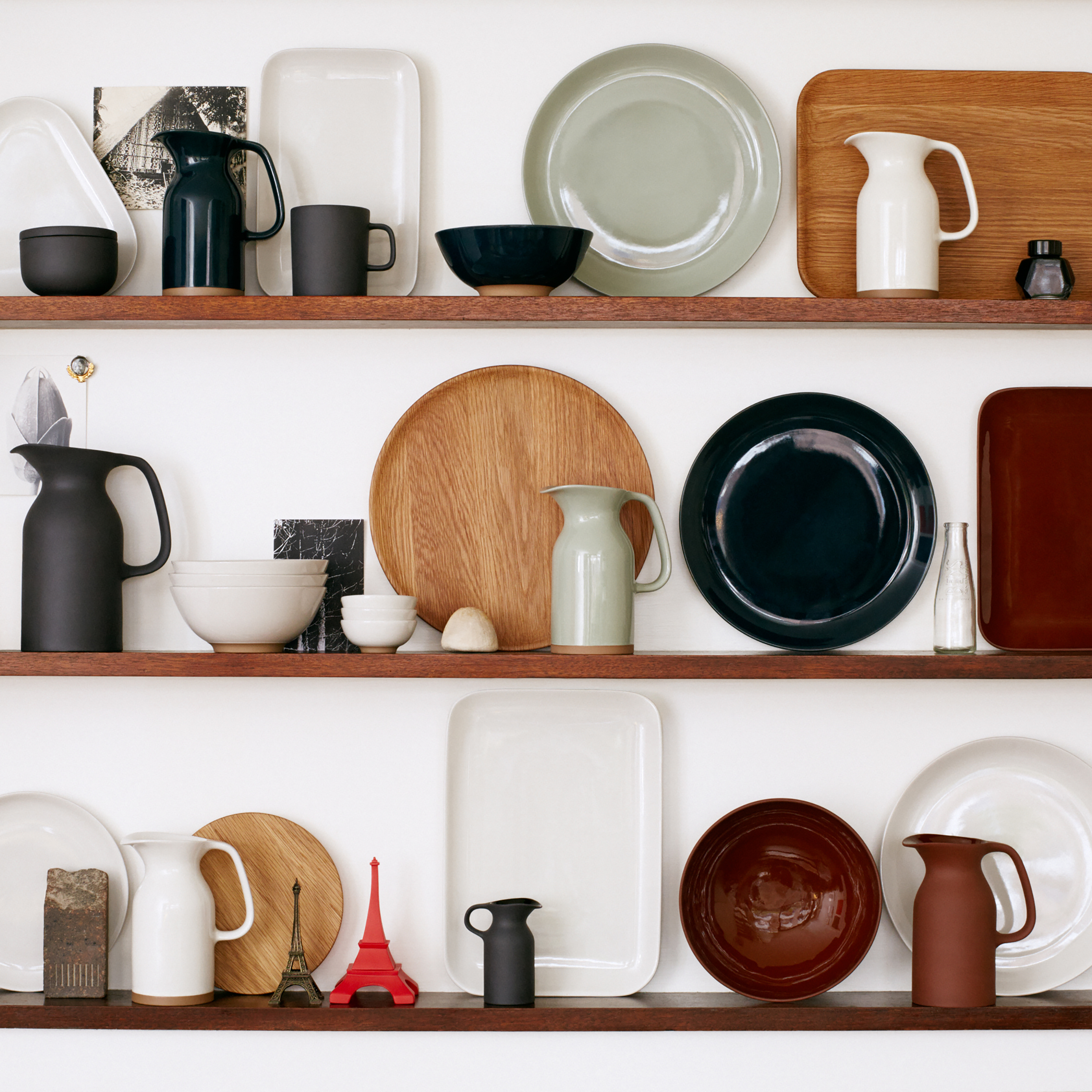
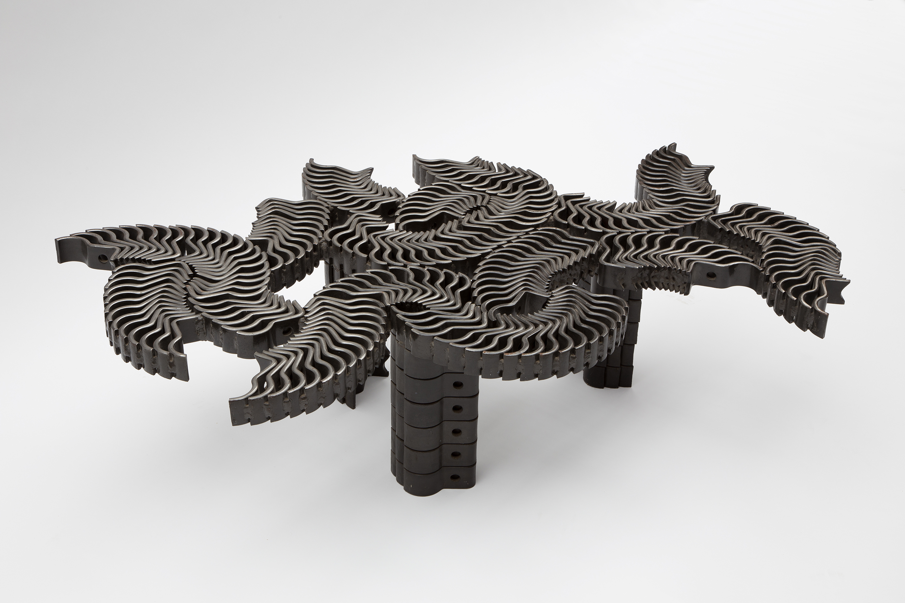
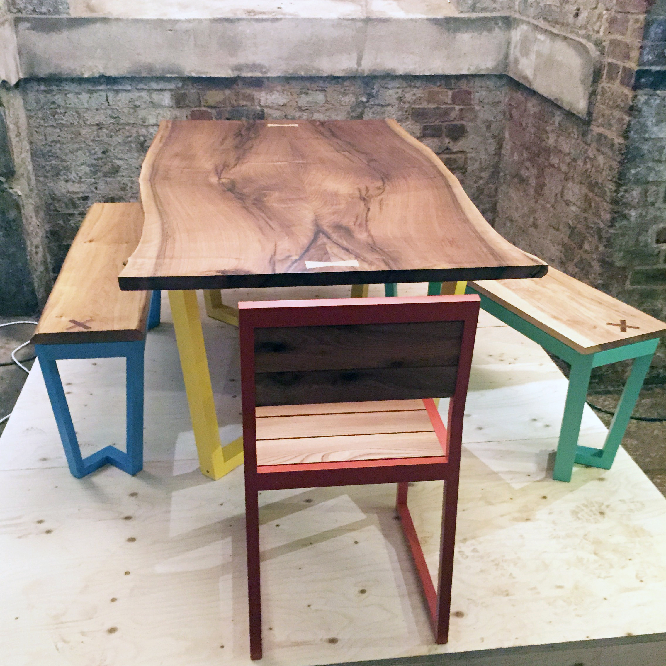
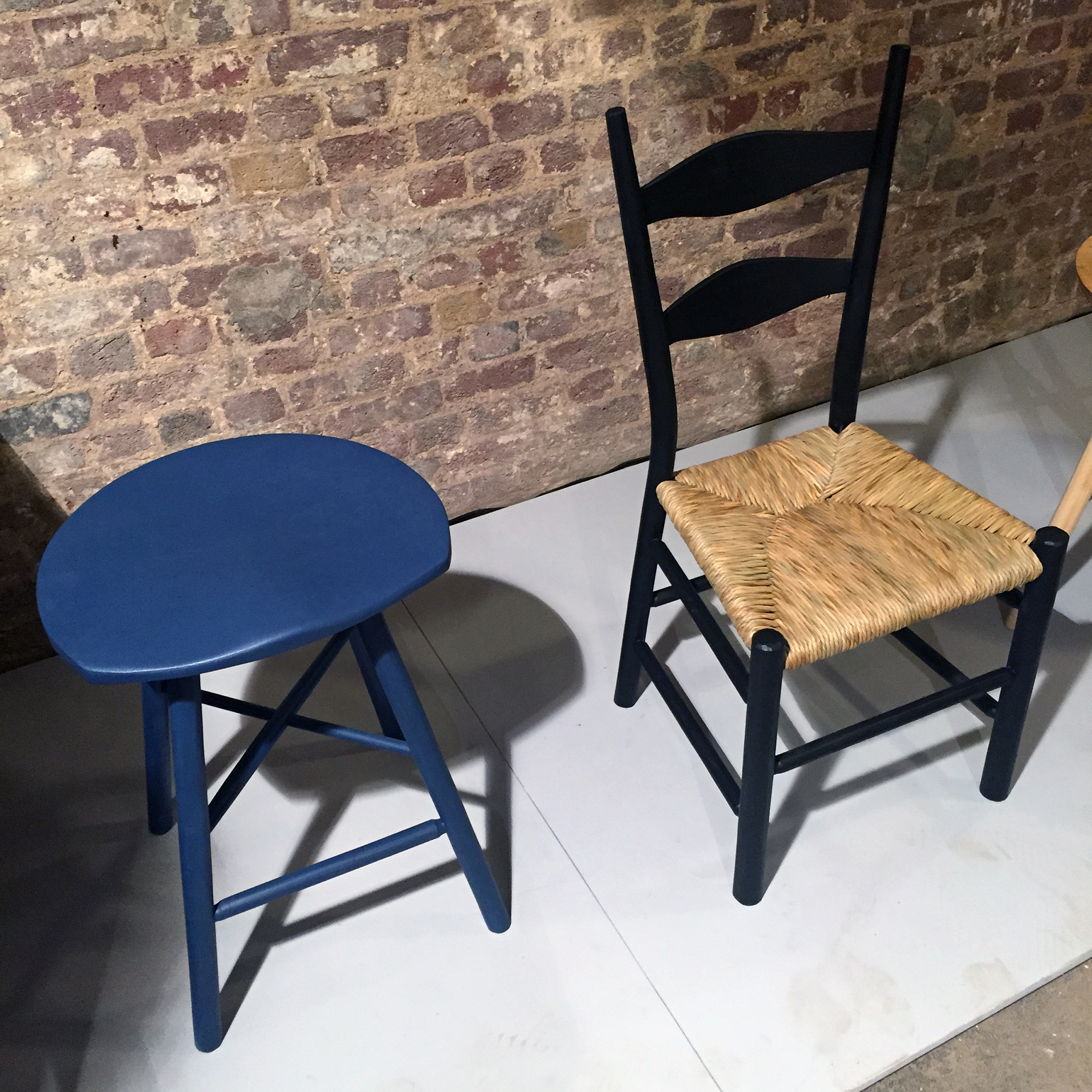
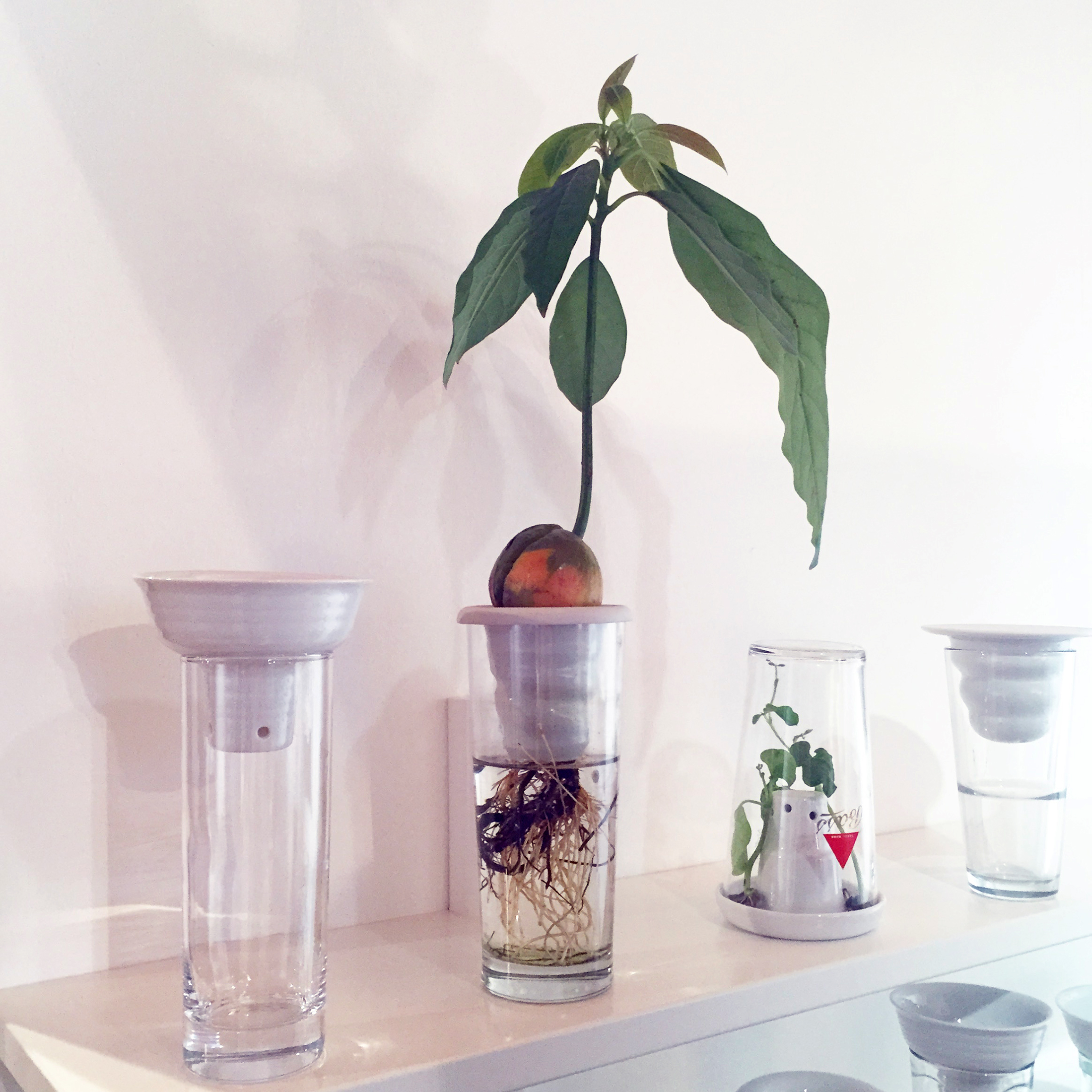
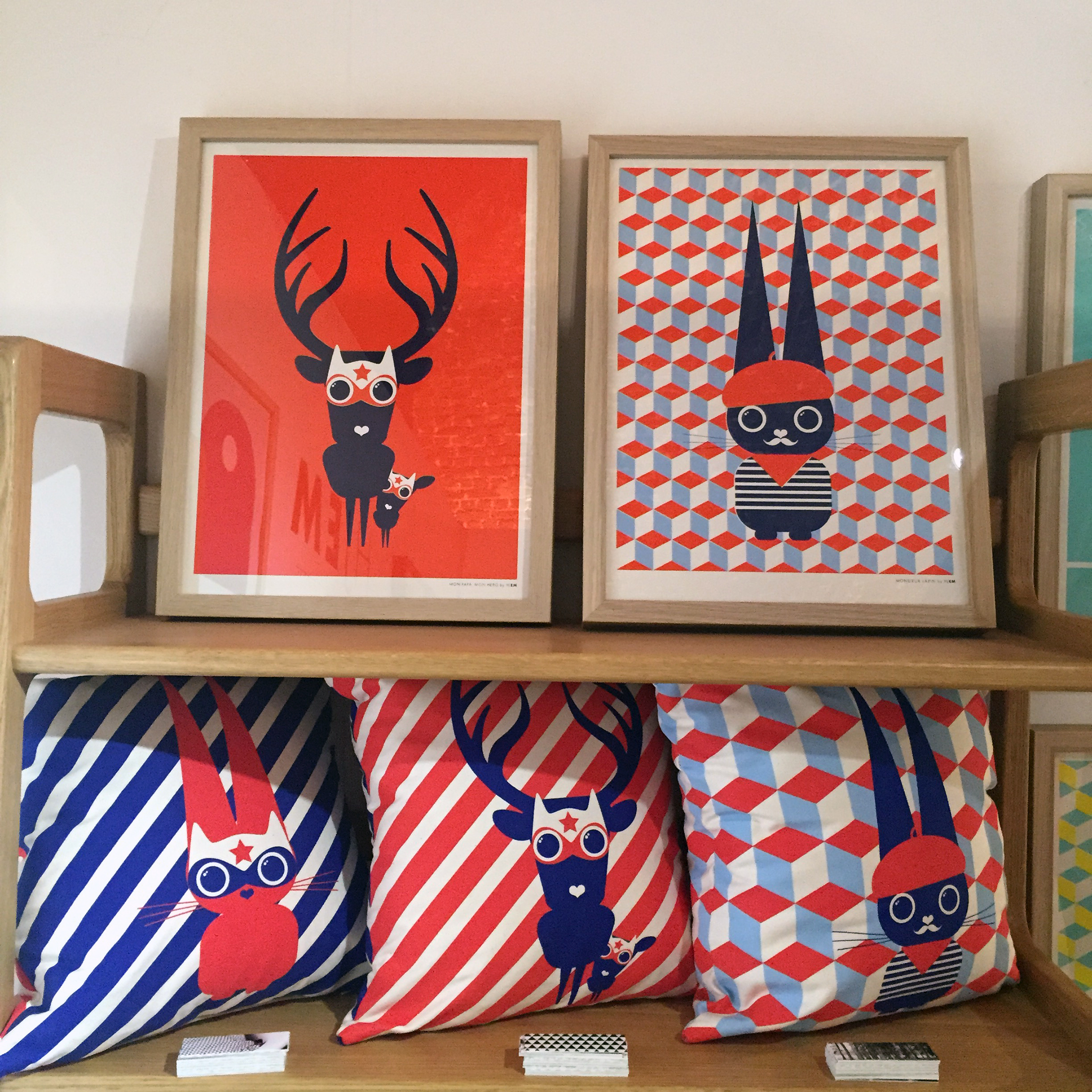
the london design festival pack 15 via camron.
from our friends at camron [ view the london design festival pack 15 ] @CamronPR @L_D_F #ldf15

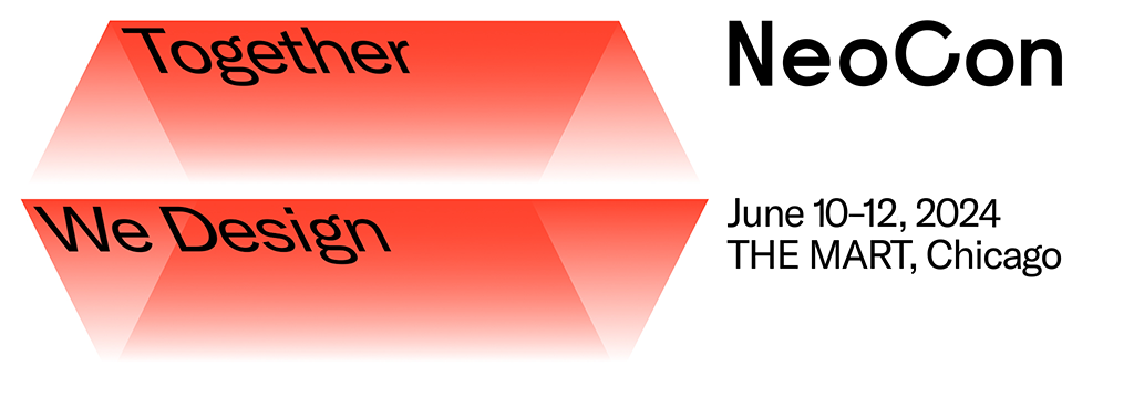

from our friends at camron [ view the london design festival pack 15 ] @CamronPR @L_D_F #ldf15


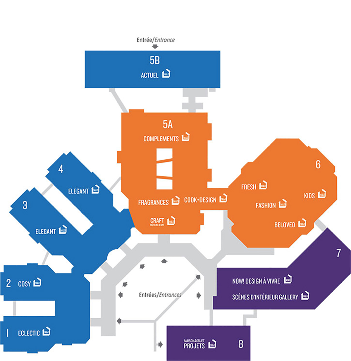
A richer visit that is more fluid than ever—that is the goal of Maison & Objet 2015. After several years of study and on the basis of evolving consumption patterns, the show has shifted towards grouping by lifestyle rather than by sector.
There are three categories to seek out.
MAISON and its overarching decorative offer fills Halls 1, 2, 3, 4 and 5B with 4 sectors: ECLECTIC, COSY, ELEGANT and ACTUEL.
OBJET, occupies Halls 5A and 6. It is MAISON&OBJET’s “concept store,” a distribution with its 8 sectors: CRAFT, MÉTIERS D’ART, FRAGRANCES, COOK+DESIGN, FRESH, COMPLEMENTS, KIDS, FASHION and BELOVED.
LUXE, DESIGN & ARCHITECTURE D’INTÉRIEUR in Halls 7 and 8 bring together new themes known as NOW! Design à vivre, scènes d’intérieur gallery and MAISON&OBJET |projets|
ALSO
DesignAapplause offers a glimpse of the following exhibitors:
click image > open lightbox | look for ‘show info’ button for captions
alessi | architectmade | artek | artemide | beyond object | blomus | broke bikes | carlo moretti | chilewich | chisel & mouse | design house stockholm | emu | ev solo | hay | iittalia | joseph joseph | lexon | maiori | menu | normann copenhagen | paola c. | secto design | stelton | th manufacture | vitra
ALSO
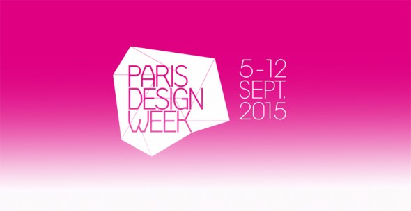
The fifth annual PARIS DESIGN WEEK, scheduled to overlap with MAISON&OBJET PARIS, will take place from Saturday 5 to Saturday 12 September 2015.

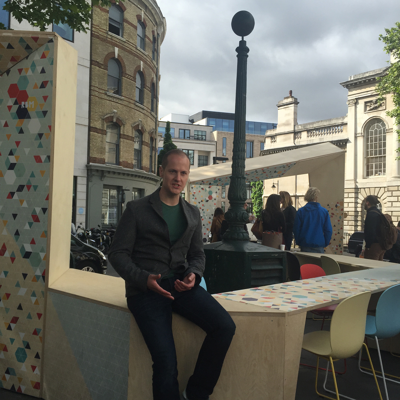
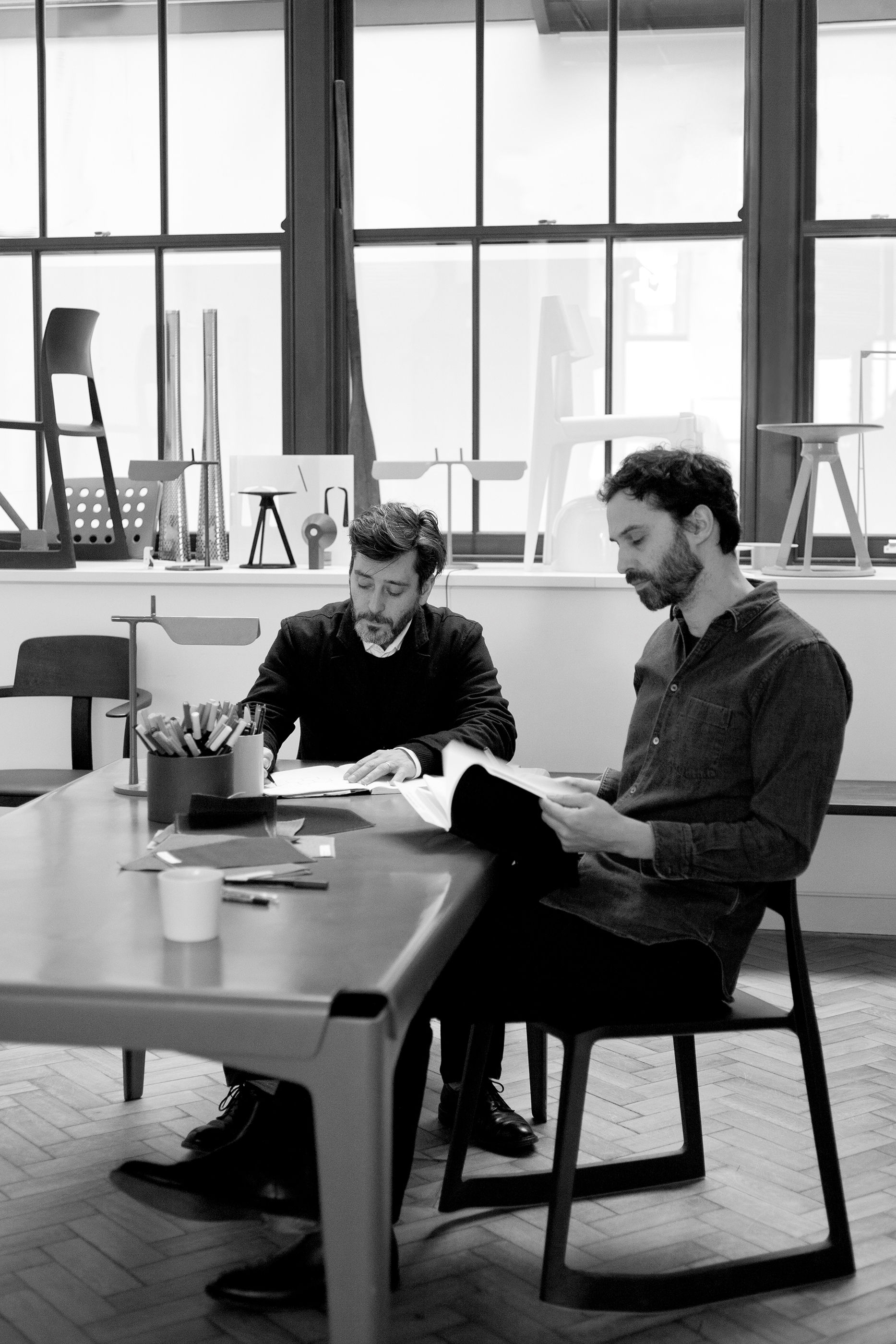 British designers Edward Barber and Jay Osgerby have designed Olio, a disparate tableware collection for Royal Doulton designed to be mixed and matched with existing homeware. We caught up with them in their London studio during <a href="http://www.clerkenwelldesignweek.com/" target="_blank"Clerkenwell Design Week to find out more.
[DesignApplause] What was the collection inspired by?
[ Edward Barber] We wanted to design a complete range that didn’t look like a complete range. There’s a definite diversity to it. The idea is that you could buy the whole thing but it wouldn’t look like you’d gone out and bought a range – you’d kind of had a bit more of an eclectic feel, or each piece stands alone, so you just buy the wooden platter or the teapot and it would fit with what you already owned. People we know don’t go out and buy a full 12-piece dinner set anymore – you tend to think, ‘That’s a really beautiful bowl’ or ‘That’s a great serving plate’ and you tend to buy cutlery from one place, maybe a teapot from another and a jug from here, so we thought if that’s the way people are, let’s try and design a range in that way.
 courtesy barber & osgerby / ©amber rowlands
[DA] What informed some of the shapes?
[EB] It is all about the tactility. These are all objects that you either hold in your hand or you eat your food from, so they’re things that are being touched on a daily basis. That’s why you’ve got that really nice edge on the wooden pieces, and a slightly more coarse finish with the glaze. It’s quite nice that you’ve got these slightly ambiguous objects, for example the wooden serving platter is great with a roast chicken on, but it can also be used as chopping board.
[Jay Osgerby] In terms of the forms, there wasn’t an outstanding influence to any one piece I don’t think – just a life-long collection of visual references from using and living with objects.
[EB] People have to engage with an object – that’s the most important thing for us when we design something. Of all the things that we’ve done, this is one thing where people feel very drawn to it and like to pick it up and play with it and feel it.
[DA] You were talking about people slotting pieces in with their existing collection, and it has got a homely sense of warmth about it…
[JO] Some designers would shoot you for saying that but I actually like that. Generosity is important and it’s not used very much in design. This needed to feel like a collection of miscellaneous objects, which cohere, but don’t really reference one another particularly with the exception of the finish.
[DA] You were talking about the kind of things that you pick up from markets and vintage sales, what catches your eye and why?
[EB] Mostly just interesting objects. I’m always buying wooden things. I’ve bought tons of wooden bowls over the years, some of them Scandinavian, some of them from Africa, I’ve got a couple from Samoa and New Zealand and I use those on a daily basis. But I also like the weird objects that you find in flea markets, sometimes you don’t even know what something is, it’s probably just a part of something else, but it looks great.
[JO] I think you can tell a lot about society from what you find in a flea market – different cultures have interpreted the same problems and found different solutions.
[DA] What’s the most important thing to know about you?
[EB] I think the most surprising fact is that we’ve been working together for 23 years…
[JO] … and we’re not a couple!
[DA] What’s the secret of your success as a duo?
[JO] Lack of options, like any marriage! No, I’m just kidding. We just get on really well – we’re friends. We both grow up with brothers, which teaches you to get along with people I think.
[DA] Talk me through your design process – how do you work together?
[JO] When Royal Doulton came to see us, there was not really much of a brief – it was more of a requirement for a range, they wanted an expansive range with lots of pieces in it and they more or less left it at that.
[DA] When a client leaves something that open, is that exciting or slightly terrifying?
[EB] I think if a furniture company had been as open with a brief for a chair, it would have been impossible, because we’ve designed a lot of chairs and we already know what we’re not going to do. But because we had never done tableware before, you always have faster, clearer ideas. We tend to think about what would we actually use at home, that’s always our starting point.
[JO] We weren’t interested in making a seamless collection. Eating is no longer a formal activity, it’s a social thing and that means there’s an informality about everything else that comes with it, the room you eat in, the way you cook and socialize at the same time, it’s all changed.
 courtesy barber & osgerby / ©amber rowlands
[EB] And as kids, we both had a lot of studio ceramics around our houses – our cereal bowls were hand thrown, so there was a feeling when we started out, to try to create that earthy textural quality. We soon realized that that was really impossible when you’re doing true mass production, which this is. It had to be dishwasher safe and pass all kinds of strength tests. But it certainly has that visual feel with the glaze on the inside and not the outside for example – it’s a very traditional thing, old English Toby jugs quite often had an exposed exterior body and a glaze on the inside.
[JO] The idea of leaving the body like that and not glazing it came from seeing the Jasperware at Wedgewood they’d make for 250 years, so when we visited the factory they were there making those sort of bright blue Jasperware things with a full pigmented body where they dye the stoneware that color and then leave it raw and we just thought it was really beautiful so this is more or less the same as Jasperware, the black Jasperware.
[DA] How does your design process work, how do you capture all of this, do you sketch or do you talk?
[JO] We do all of those things, but in fact in this project we used rapid prototyping a lot…
[EB] …for most projects it is just sketching and physical models. But for this project, we did tons and tons and tons and tons of prototypes until we get the detail right. To make a teapot out of foam just doesn’t work. It’s weird because it’s about the most crafty looking project we’ve ever done, yet it was mostly done on the computer which is not a usual thing for us. We could just send objects off to print and get back 3D printed prototypes really quickly. We also went up to Stoke-on-Trent and worked with a potter in his shed and he actually made jugs, like the teapot and the jug for us before they committed to making moulds.
[DA] What was the biggest challenge of the whole process?
[EB] We’ve actually designed the range to be much bigger than this, so I think one of the challenges for us was working with Royal Doulton to establish what we should launch first. It was really hard to edit the collection down.
[JO] Also because they’re being made in different places, getting the samples back was a very complex process – we never seem to have all the samples together in one place, so we didn’t really get to see everything together until quite late in the day. It was a challenge, but in the end it worked.
[DA] What was the most fun bit?
[EB] It was all pretty enjoyable, Royal Doulton are a really nice bunch to work with – really enthusiastic. Working in something for the first time is always great – we’ve never done a project in ceramics and we’ve never done cutlery before so there was a lot of firsts and a big learning curve. And we’re already prototyping the next wave to be released.
[DA] What are you most proud of?
[JO] Tricky, each project’s so different. Generally it’s the thing that you’ve just done or that you’re currently working on. The Tip Ton chair is probably one of the things we’re most proud of. This seems crazy, but we’ve really honestly actually had letters from all over the world, from the mums and dads of kids with back problems.
[EB] We had one recently: a little girl who was born with a spinal deformation and had to have special chair that kept her away from the table at dinner time. The Tip Ton chair performs the same function for her, so the whole family bought them so that she didn’t feel like the odd one out.
[DA] What advice would you give to a young designer starting out in their career?
[EB] Be original as much as possible.
[DA] What’s your favorite color?
[EB] I like colors where you don’t really know whether it’s one color or another so some people would see it as grey and other people would see it as brown.
[JO] For me it would have to be some ranges of blues that go between beautiful blue sky on a beautiful day or the se. It’s definitely in the blue spectrum, which is vast. One of the projects we did fairly recently was for the tile company Mutina and one of the ranges is called ink and it’s made up of some eight different tones of blue which are all really quite different but when you put them together they sort of work, they have this sort of strange undulating feeling as none of them are the same, they’re all subtly different so, blues.

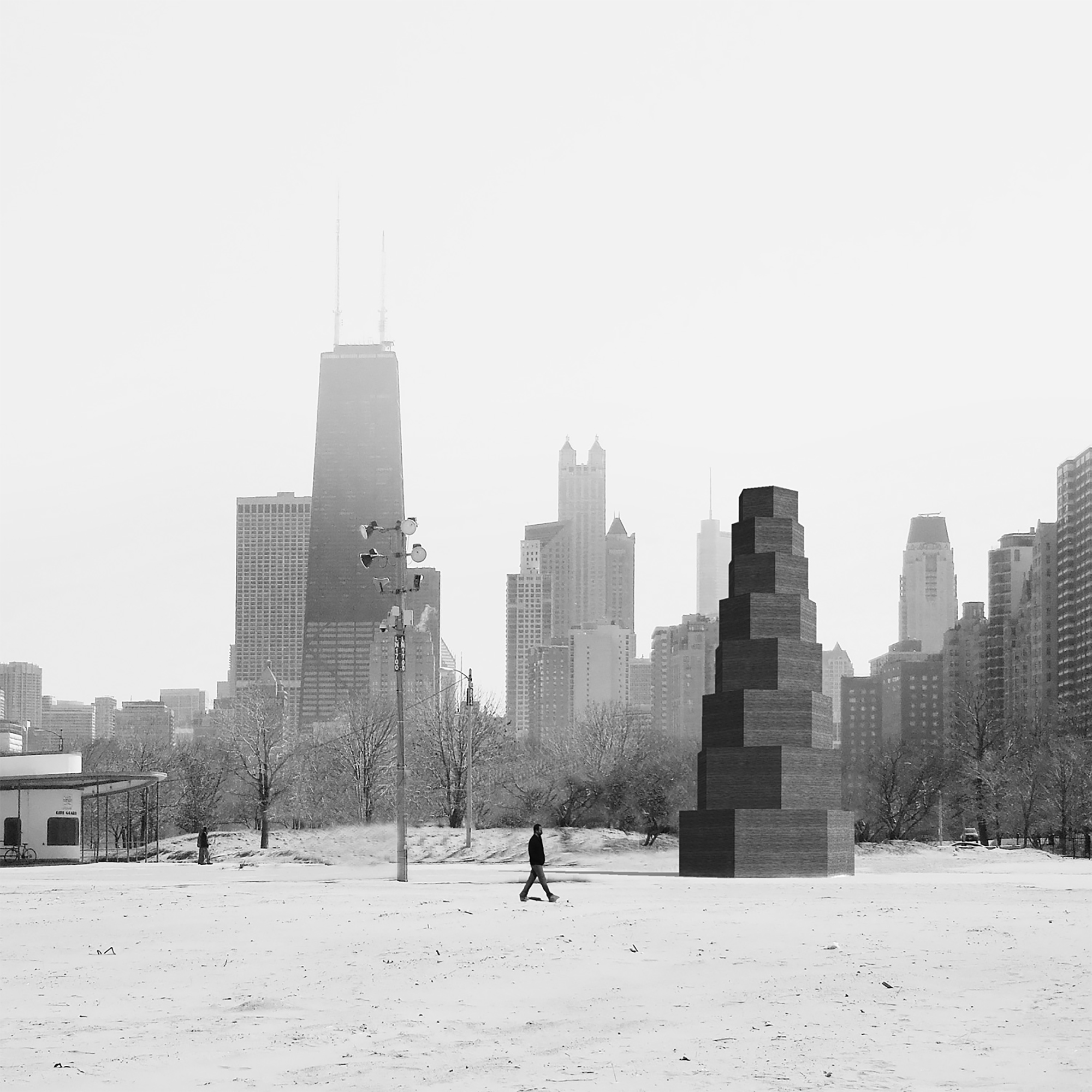
above> chicago horizon – grant park
The shoreline of Lake Michigan has always played a central role in Chicago’s urban identity. During the 1893 World’s Columbian Exposition, architect Daniel Burnham sought to incorporate the lake into the fairgrounds, and his 1909 Plan for Chicago proposed to reclaim the entire length of the lakefront as a place of leisure for all inhabitants of the city—an idea realized during the 20th century. Today, the lakefront is a celebrated and heavily used public space that is a major destination for both visitors and local residents. It features over twenty miles of public parks and beaches, as well as pedestrian and cycling routes.
The Chicago Park District currently oversees over forty kiosks that punctuate the shoreline, which during the summer offer food, retail, and recreational services—ranging from beverages to clothing to surf rentals.
The Chicago Architecture Biennial will unveil four new kiosks. One will be decided through an international competition, and the other three will be designed through collaborations between local architecture programs and internationally-renowned architects. The winning competition entry and the three commissioned kiosks will be displayed in Millennium Park during the Chicago Architecture Biennial (October 2015 – January 2016). In the spring of 2016, all four kiosks will be installed on the lakefront.
[ grant park ]
Grand Horizon won an international design competition organized by the biennial drawing 421 entries from 40+ countries. The jury likened this steel-framed, flat-roofed structure, to that of Chicago’s Ludwig Mies van der Rohe. After being displayed in Millennium Park, the kiosk moves in 2016 to Queen’s Landing, an empty plot east of Lake Shore Drive and opposite Buckingham Fountain. The plot is named from a 1959 Chicago visit by Queen Elizabeth II.
“Instead of creating an object that people would look at and marvel, we created something that would be inhabited, something that would create an interface between the biennial and the public at large,” said Providence, R.I., architect Aaron Forrest. He designed the kiosk with fellow faculty members at the Rhode Island School of Design: architect Yasmin Vobis and structural engineer Brett Schneider.
The competition winner, Grand Horizon, will receive the BP (BP is the biennial’s lead sponsor) Prize, which includes a $10,000 honorarium and a $75,000 budget to realize the design. It’s estimated to relocation to Queen’s Landing will cost another $25,000.
The other kiosks will be built in collaboration with Chicago’s architecture schools. The biennial is supplying $50,000 apiece for their construction
above> montrose beach pavilion
[ lincoln park – montrose beach ]
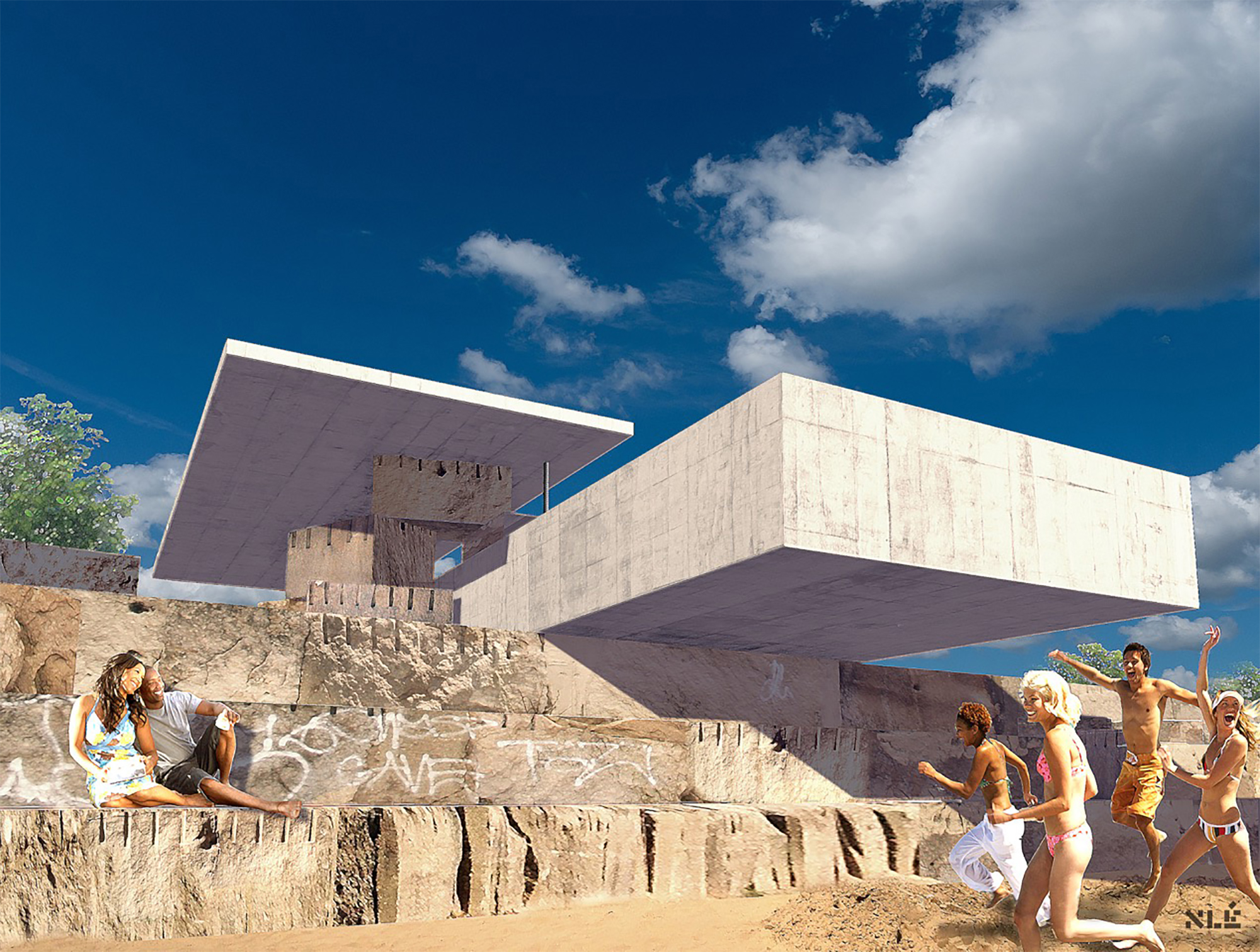
At Lincoln Park’s Montrose Beach, Nigerian architect Kunle Adeyemi calls for a pavilion that boldly projects over stepped limestone blocks at the shoreline’s edge. The School of the Art Institute will collaborate on the project, which could serve as a grab-and-go version of a restaurant at Montrose Beach, Herda said.
Built out of concrete and limestone and meant to recall the stone blocks that protects the city’s shore, the cantilevered pavilion will project out over the beach providing shelter and a meeting place on the beach. The School of the Art Institute will collaborate on the project. The kiosk will be represented in some form in Millennium Park but won’t be built there because of its complex construction.
above> cent pavilion – north avenue beach
[ lincoln park – north avenue beach ]
Chilean architects Mauricio Pezo and Sofia von Ellrichshausen have designed a 40-foot ziggurat made of stacked wood shapes. Wide doors will lead into the ground floor of the kiosk, which will contain a commercial space and be lit by skylights, Sarah Herda, the biennial’s co-curator, said. Collaborating is the Illinois Institute of Technology.

above> summervault – harold washington playlot
[ harold washington playlot park – 5200 south hyde park blvd ]
Colorado architect Paul Andersen and Chicago’s Paul Preissner create a ‘freestanding hangout’ inspired by the look of a Persian garden. A vaulted metal roof protects two triangular spaces — one retail, one communal. The University of Illinois at Chicago collaborates.
The Jury for the Lakefront Kiosk Competition includes:
David Adjaye, Adjaye Associates
Jeanne Gang, Studio Gang Architects
Joseph Grima, Chicago Architecture Biennial
Sarah Herda, Chicago Architecture Biennial
Sharon Johnston, Johnston Marklee and Associates
Michael J. O’Brien, BP
Rob Rejman, Chicago Park District

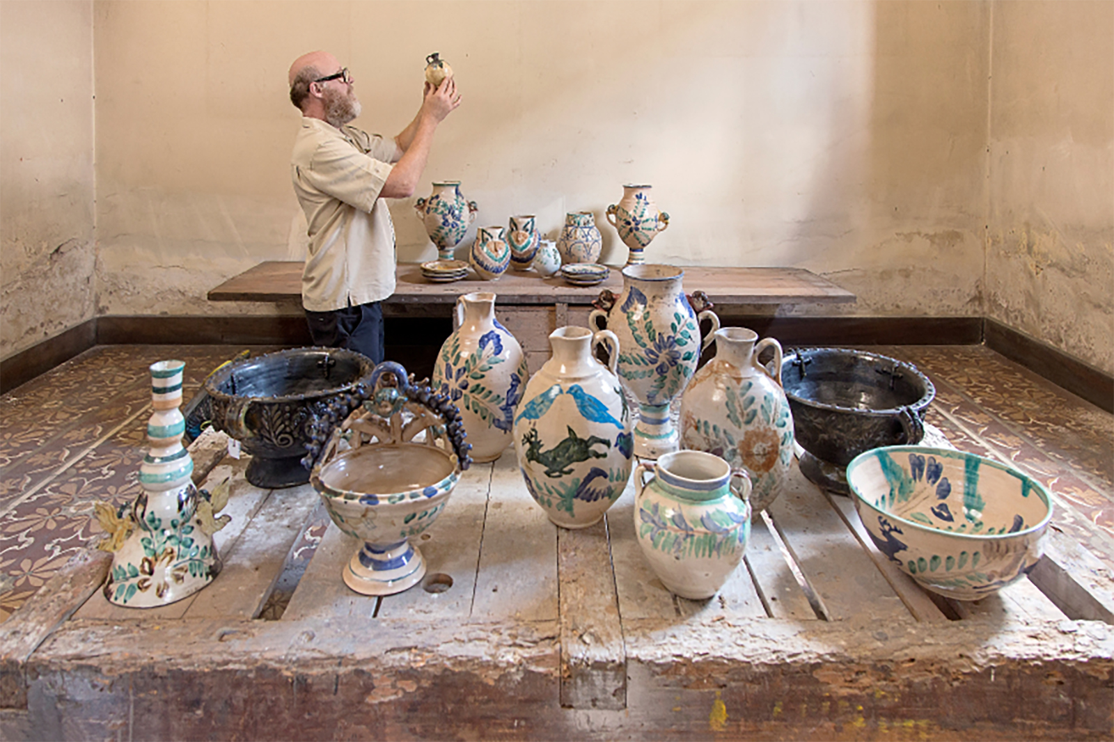
above> andy coolquitt examining majolica during his two-week residency in guatemala city/ courtesy: ag ossaye projects
The Design Miami/ Basel fair is packed with early twentieth century rarities, mid-century masterpieces, rediscovered gems of the 1980s and 90s, and the finest in collectible contemporary works. In 2015 the fair celebrates its 10th anniversary.
The fair’s museum-quality gallery program is supported by additional programming that includes the first edition of Design Curio in Basel, following great success in Miami last December and an exploration of modular architecture in Design at Large, curated by André Balazs.
[ collaborations/ ]

above> audi q7: the great quattro/ design miami/ basel 2015
This year at Design Miami/ Basel, Audi presents an architectural installation inspired by the new Audi Q7, entitled The great quattro: an impressive new design, much lighter and more efficient, boasting significantly greater agility and dynamism without sacrificing comfort, paired with the legendary four-wheel drive quattro.
For Design Miami/ Basel 2015, Audi presents an immersive installation based on this idea of “The great quattro”: A constructed landscape, with varied levels, paths and surfaces. A mixture between object design and architecture, forming the perfect backdrop for the vehicle, with geometric shapes, derived from natural mineral patterns that are both evocative of the power of nature and machine and reminiscent of a monolithic cityscape. The viewpoint changes dramatically depending on the viewpoint of the visitor, inviting visitors to become part of the installation and experience the space in multiple and unique ways.
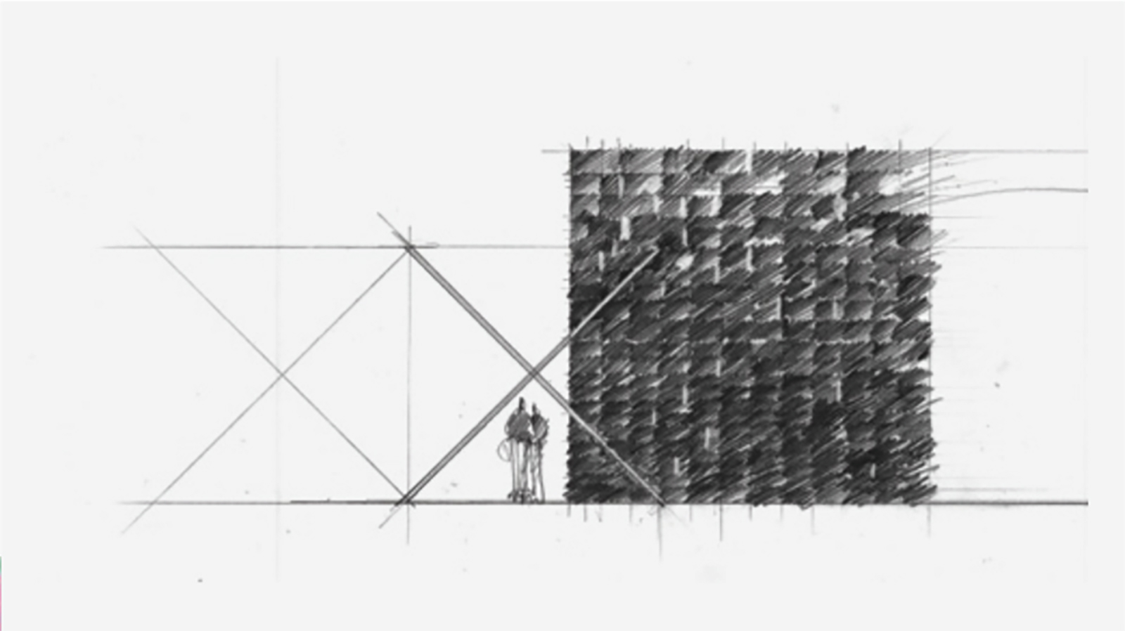
above> sketch of outpost basel/ tom kundig, 2015/ courtesy of olson kundig olson kundig/ outpost basel
Seattle-based architecture practice Olson Kundig was responsible for one of the highlights of Design Miami/ 2014 with their 38 Beams, a monumental wood-framed space constructed from salvaged glulams for the fair’s Collectors Lounge. For Design Miami/ Basel, Tom Kundig explores his own Swiss heritage, as well as the aesthetic links that bind his hometown of Seattle with Japan. Continuing Olson Kundig’s exploration of sustainable building materials and methodologies, the structure, accented with Seattle-sourced iron, is formed of wood from Austrian firm Schweighofer, and finished using Shou Sugi Ban, a Japanese technique for scorching wood that creates a layer of black char on the outside that acts as a preservative.
Tom Kundig of Olson Kundig states “I love how these different elements fuse together to make something new. I hope that with Outpost Basel people recognize these contrasts, but also feel how the space hangs together in harmony, as a whole.”
The Collectors Lounge is furnished by Artek, and plays host to champagne service from regular Design Miami/ partners Perrier-Jouët. Outpost Basel is also home to the Design Talks series, which is part of the Design Miami/ Basel 2015 VIP Program, supported by American Express.
Furniture in the fair’s public areas is provided by Vitra.
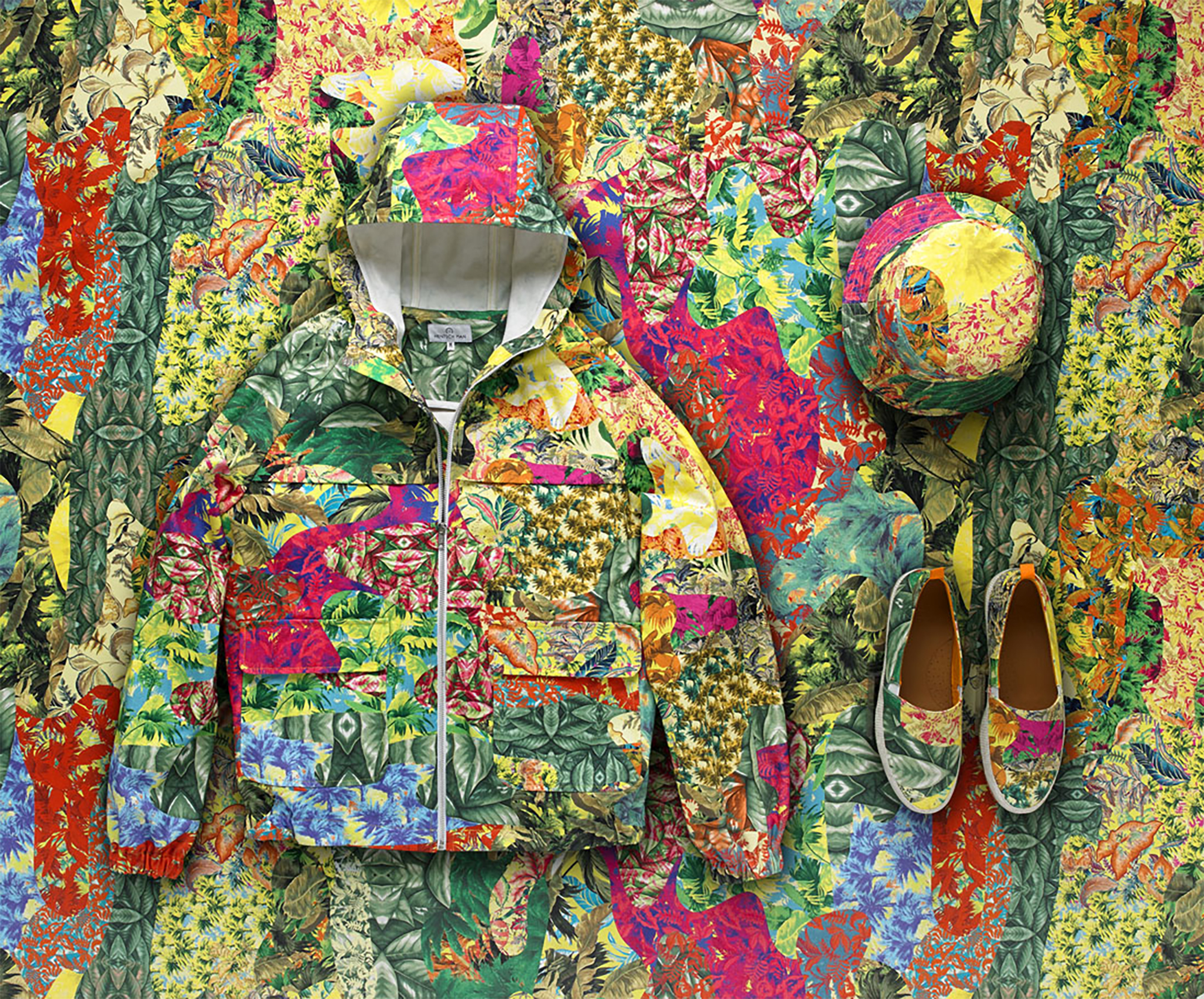
above> chromatropic capsule collection/ hentsch man
Founded in 1935 Maison Pierre Frey now has an archive of some 7,000 wallpaper and fabric designs that demonstrate the house’s commitment to fine craft and rich, hand-drawn pattern work. Design Miami/ collaborates with the luxury textile house for its 10th Anniversary to create Chromatropic, a camouflage-inspired print collaged from tropical textiles from the Pierre Frey archive and collection.
Chromatropic also appears in a capsule collection created by Hentsch Man, a fashion label known for its use of prints. The Hentsch Man anorak, hat and sneakers are available in limited numbers, alongside a specially produced J. Crew Chromatropic pocket square, at the JUNE-Basel pop-up store within Hall 1 Süd.

above> left to right: tomás alonso, alexander groves and azusa murakami of studio swine and elaine ng yan ling/ pictured at swarovski’s headquarters in wattens, austria/ credit: james harris
Swarovski and Design Miami/ share a passion for design, along with a history of supporting emerging talents and honoring well-established designers through innovative commissions.
This is the first time Swarovski and the fair collaborate on the Swarovski Designers of the Future Award, which acknowledges emerging studios and designers who are actively expanding design culture through experimentation with cutting-edge technologies.
The winners of the inaugural Swarovski Designers of the Future award are: Tomás Alonso and Studio Swine, both based in London, and Elaine Yan Ling Ng from Hong Kong. New works by the winners, commissioned by Swarovski, debut at the 10th Anniversary edition of Design Miami/ Basel.
[ satellites/ ]
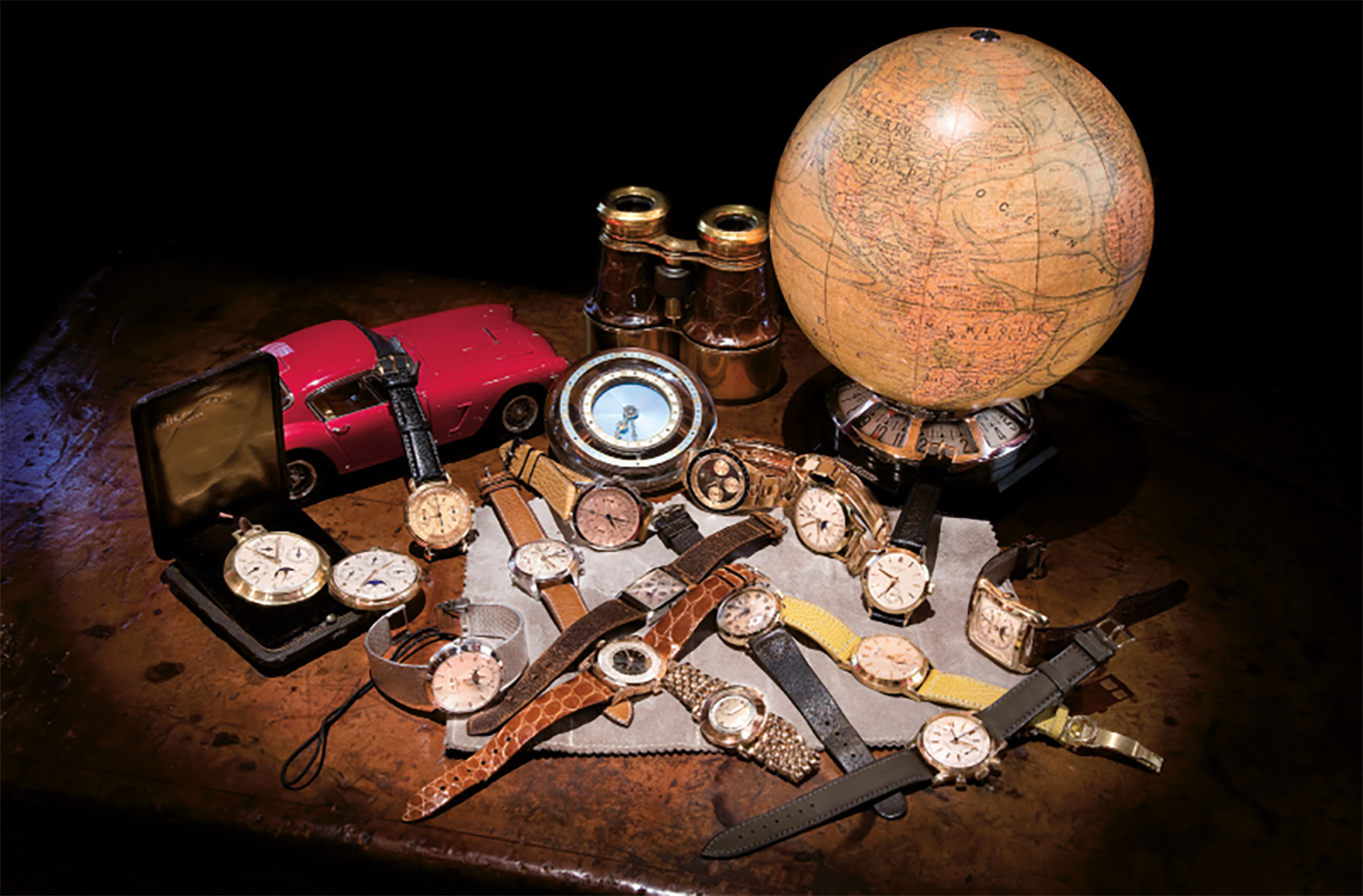
<img src="http://designapplause.com/wp-content/xG58hlz9/2015/06/dm15-basel-rolex1-590×650.jpg" alt="dm15-basel-rolex1″ width=”590″ height=”650″ class=”alignnone size-large wp-image-45601″ />
above> rolex vintage explorer ii 1975, steve mcqueen/ freccione, being inspected by antoine rauis/
Based in Brussels and Luxembourg, the specialist watch dealer Le Collection’Heure presents exhibitions of the work of Gérald Genta and the history of the Rolex Daytona, as well as pieces with exceptional – and often unusual – provenance from the dealer’s collection. The display brings together timepieces of unparalleled complexity completed under Genta’s own marque, as well as his notable creations for other watch houses, including a Patek Philippe Nautilus (1976) and Golden Ellipse (1968), the first Audemars Piguet Royal Oak (1970, shown together with original sketches) and the Cartier Pasha de Cartier (1997). The Rolex Daytona celebrated its fiftieth anniversary last year: the retrospective at Design Miami/ Basel presents all the models – including some of great rarity – from the first series to the current production.
above> davide parmegiani
For over a quarter of a century, Lugano-based watch specialist Davide Parmegiani has bought and sold the most rare and beautiful wrist and pocket watches, ranging in creation from 1850 to 1980. Travelling extensively to track down exceptional pieces, he has assisted his clients in the creation of some of the most important horology collections in the world, and presents an exceptional selection of timepieces telling a story of great watch-making traditions at the Basel fair.

above> waiting to be shipped to basel/ courtesy of casper sejersen
The cult Berlin book and magazine store do you read me?! returns for a 6th year as purveyor of beautifully designed publications – and beautiful publications on design – including small-press periodicals, the latest books on architecture, art and fashion, and collectible rarities. This year, a selection of special works in print are presented in association with the independent Baden-based art imprint Kadoji press.
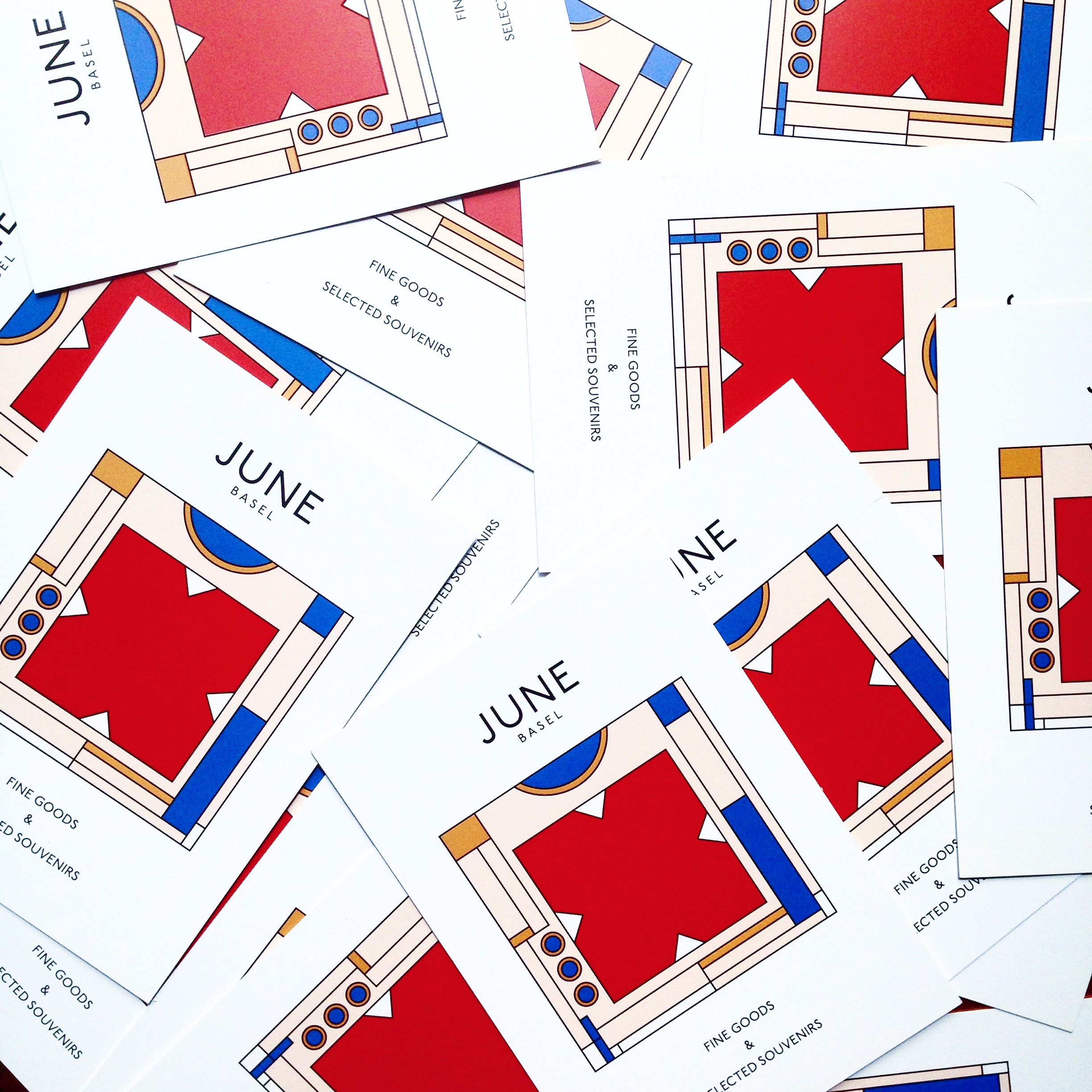
JUNE-Basel is a pop-up concept store that showcases Swiss fashion design, fine goods and selected souvenirs while embracing the ‘Sister City’ relationship between Basel and Miami. The hand-picked selection of items includes the first Design Miami/ capsule collection, a variety of Swiss fashion apparel and accessories as well as unconventional souvenirs. The unique product line makes JUNE-Basel the ultimate spot for the urban adventurer, collector and fashionista.
[ design talks/ ]
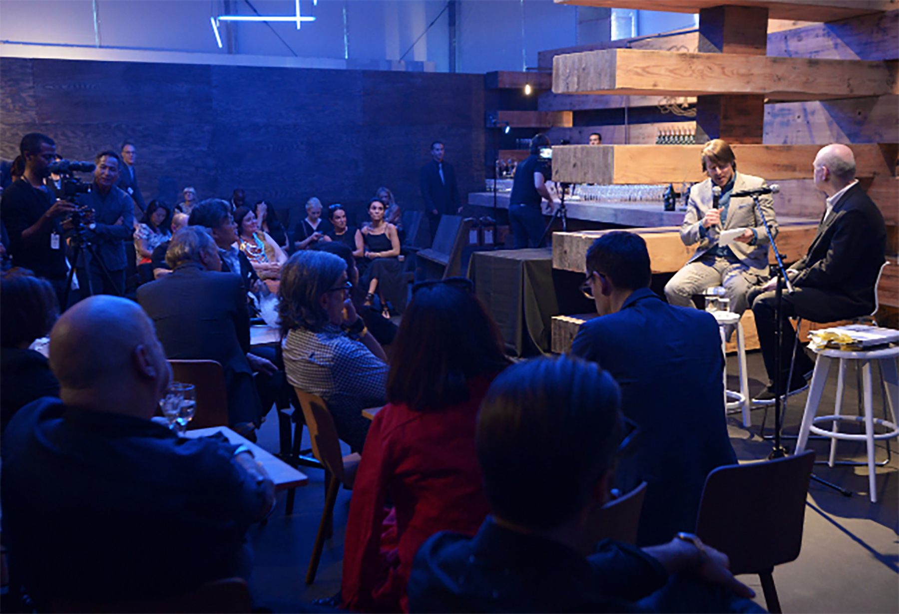
above> murray moss and rodman primack during a talk at design miami/ 2014
For the first time, the much-anticipated Design Talks series takes place in the Collectors Lounge, utilizing Olson-Kundig’s dynamic design and creating a more intimate setting for the talks.
The talks are available with VIP access, and include a conversation with Patrick and Pierre Frey about contemporary use of historical textiles; André Balazs and Ivan Harbour discussing modular architecture; Tom Kundig on super-charged architecture; Tony Chambers, editor of Wallpaper* magazine, in conversation with the winners of the Swarovski Designers of the Future Award; Jehan Chu, William Lim and Yu Wang exploring the future of architecture and design in China’s Pearl River Delta; and Amelie Klein, Curator of Vitra Design Museum on the new exhibition Making Africa – A Continent of Contemporary Design.
[ Design Miami/ ] is the global forum for design. Each fair brings together the most influential collectors, gallerists, designers, curators and critics from around the world in celebration of design culture and commerce. Occurring alongside the Art Basel fairs in Miami, USA each December and Basel, Switzerland each June, Design Miami/ has become the premier venue for collecting, exhibiting, discussing and creating collectible design. For more information, please visit
[ schedule of events ] Design Miami/ Basel 16 > 21 June 2015Public Show Days
16 > 17 June/ 10a > 8p
18 > 19 June/ 10a > 7p
20 > 21 June/ 11a > 7p
Location/ Hall 1 Süd, Messe Basel, Switzerland
[ information/ ]

above> chromatropic/ design miami/ x pierre frey
Design Miami/ Basel celebrates its 10th year. the first showcased 15 galleries, this year features 45 of the world’s leading design galleries including 12 of its founding members and a number of newcomers to the fair – iconic designers from the 20th century alongside contemporary designers exhibited at the fair for the first time.
galerie kreo presents designers muller van severen and julie richoz; ornamentum offers a look into the work of american silversmith jaydan moore; gallery all from beijing displays the works of naihan li, zhouhjie zhang and trent jansen in their first outing as a design miami/ gallery; and a host of lebanese designers, most of which have never exhibited at the fair, will be represented by art factum gallery, including david nicolas , marc baroud, marc dibeh, mary-lynn massoud, rasha nawam, carlo massoud and karim chaya. art factum gallery is joined by fellow lebanese gallery carwan, showing a solo exhibition of the works of karen chekerdjian, also a design miami/ first-timer.

console | gio ponti | nilufar gallery |1929
designed by gio ponti, made for a private commission. these furnishings were conceived by gio ponti as prototypes for “casa di moda” and for “casa all’italiana”, where taste and high quality craftsmanship find their best expression. among these models many in briar root, polished walnut, with bronze decorations, will be part of the limited series “domus nova” set up by gio ponti for the rinascente stores.
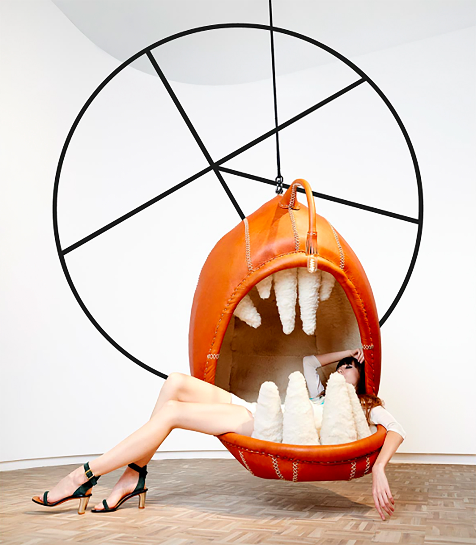
catherine esca | porky hefer | southern guild | 2015
catherine esca brings to life cape town designer porky hefer’s fascination with human-scale, animal-inspired environments – a bold statement in leather and sheepskin inspired by the deep-sea anglerfish.
synthesis | tom price | victor hunt designart dealer | 2015
sculpture table | luiza miller de andrada | magen h gallery | c 1970
transform confessional screen | karen chekerdjian | carwan gallery | 2015
beirut’s carwan gallery presents ‘trans|form’, a three-part collection of limited-edition objects by lebanese designer karen chekerdjian, explores the idea of function-based metamorphism. instilled with an innate sense of liminality — a transitional stage in a process — each piece is in a state of constant, perpetual change and mutation. a vase becomes a hunk of solid metal, a dining table is also a rock formation, a platform morphs into a lamp. the plurality of materials and functions engage in an uninterrupted dialogue with their environments, which help ground the forms within a contextual framework.

in addition to the robust offerings from new designers in the gallery program, the swarovski designers of the future award highlights three new designers/design studios in this first edition carrying the crystal house’s moniker.
[ design galleries ]
ammann//gallery
Antonella Villanova
Armel Soyer
Art Factum Gallery
Caroline Van Hoek
Carpenters Workshop Gallery
Carwan Gallery
Cristina Grajales Gallery
Dansk Mobelkunst Gallery
Demisch Danant
Elisabetta Cipriani
Erastudio & Apartment Gallery
Franck Laigneau
Friedman Benda
Galerie Eric Philippe
Galerie Jacques Lacoste
Galerie kreo
Galerie Maria Wettergren
Galerie Matthieu Richard
Galerie Pascal Cuisinier
Galerie Patrick Seguin
Galerie VIVID
Galleri Feldt
Galleria O.
Galleria Rossella Colombari
Gallery ALL
Gallery FUMI
Gallery SEOMI
Hostler Burrows
Jousse Entreprise
LAFFANOUR – Galerie
Downtown
Louisa Guinness Gallery
Magen H Gallery
Marc Heiremans
Moderne Gallery
Nilufar Gallery
Ornamentum
Patrick Parrish Gallery
Pierre Marie Giraud
Priveekollektie
R & Company
Sarah Myerscough Gallery
Southern Guild
Thomas Fritsch – ARTRIUM
Victor Hunt Designart Dealer
Schedule of Events
Design Miami/ Basel 16-21 June 2015
Public Show Days
June 16-17/ 10am-8pm
June 18-19/ 10am-7pm
June 20-21/ 11am-7pm
Preview Day: Monday, 15 June (by invitation only)
Press Conference and Preview: 2:30p
Collectors Preview: 12noon – 5p
Vernissage: 5-8p
Location: Hall 1 Süd, Messeplatz, Basel, Switzerland
[ Design Miami/ ] is the global forum for design. Each fair brings together the most influential collectors, gallerists, designers, curators and critics from around the world in celebration of design culture and commerce. Occurring alongside the Art Basel fairs in Miami, USA each December and Basel, Switzerland each June, Design Miami/ has become the premier venue for collecting, exhibiting, discussing and creating collectible design. For more information, please visit www.designmiami.com
exclusive automotive sponsor
In 2014 [ Audi ] the Audi Group delivered approximately 1,741,100 cars of the Audi brand to its customers. Audi operates globally in more than 100 markets and currently employs approximately 80,000 people worldwide. Audi is committed to its corporate responsibility and has anchored the principle of sustainability for its products and processes in its strategy. The long-term goal is CO2-neutral mobility.
www.audi.com
main sponsor
[ Swarovski ] fFounded in 1895 in Austria, Swarovski designs, manufactures and markets high-quality crystals, genuine gemstones and created stones as well as finished products such as jewelry, accessories and lighting. Now celebrating its 120th anniversary and run by the fifth generation of family members, Swarovski Crystal Business has a global reach with approximately 2,560 stores in around 170 countries, more than 25,000 employees. In 2014, the Group generated revenue of about 3.05 billion euros and employed more than 30,000 people. The Swarovski Foundation was set up in 2012 to honor the philanthropic spirit of founder Daniel Swarovski. Its mission is to support creativity and culture, promote well-being and conserve natural resources.
www.swarovskigroup.com
For Design Miami/ press inquiries, please contact:
Valentina Giani +44(0) 20 7420 1700
Valentina.Giani@camronpr.com
Design Miami/ Basel 2015
Jun 16-21, 2015
Hall 1 Süd, Messe Basel
Switzerland

In one of the more successful brand interventions at a Milan Design Week that was criticized for being too commercial, airbnb partnered with Fabrica to create Housewarming. 19 international designers were invited to interpret the theme of “welcome” and the results were displayed in Palazzo Crespi, a private home never before opened to the public, that was originally built to celebrate the coronation of Napoleon Bonaparte, along with the other buildings on Corso Venezia.
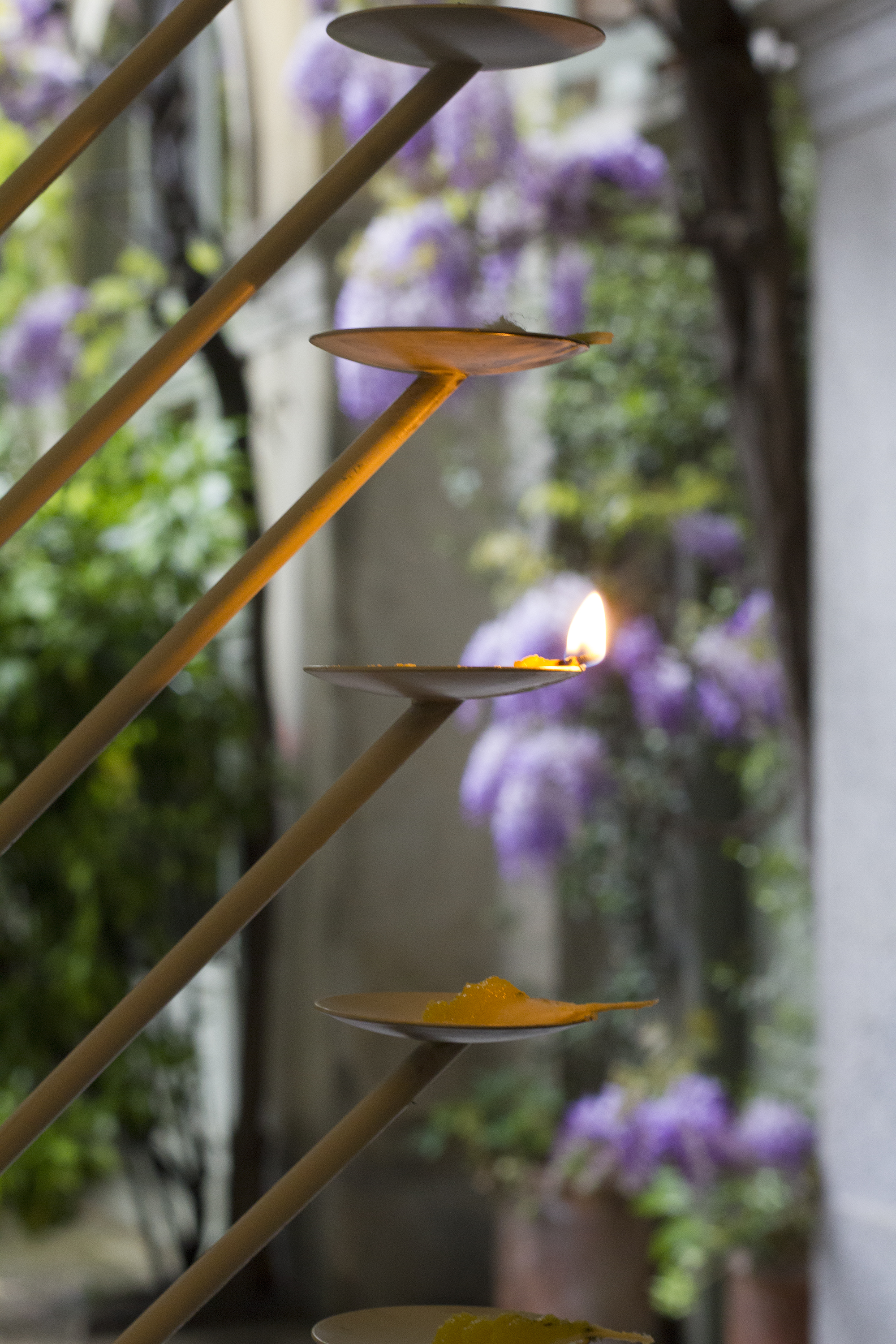
Nikita Bhate’s Samai took inspiration from the Indian ritual of lighting candles. It is a mark of honor to ask a guest in your home to light a candle, and Nikita asked all those visiting Housewarming to light one. “This is my own interpretation of the piece,” said the designer. “I wanted this object to grow with time, so as you see now as the guests come it will keep on getting better.”

The lights were made from ghee and handmade cotton wicks. “Every morning the ladies of the house prepare all of this because we do this ritual every single day,” Nikita said. “This ritual is about the victory of light over darkness – it symoblizes the victory of knowledge over ignorance, and reminds us to be more humble and be detached from material world.”
Digital designer Alex Rothera went completely analogue and transported his childhood game of ‘stickball,’ played with the handle of a broom and half a tennis ball, from the streets of Philadelphia to the Palazzo Crespi courtyard.
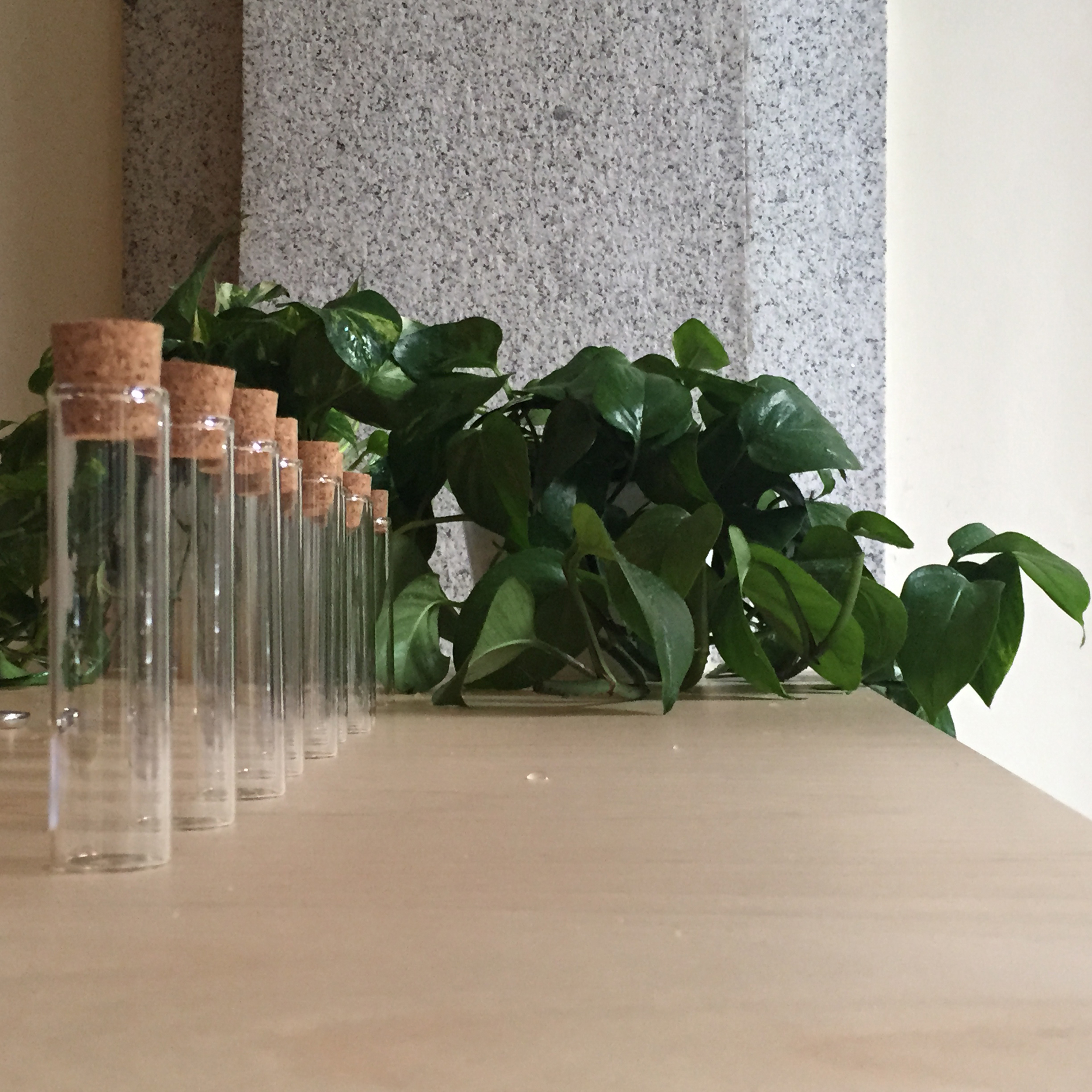
Australian designer Aaron Gillet was creating plant cutting in tiny cork-capped test tubes. “When you go to someone’s house or garden in Australia, and maybe in Britain too, you might take a plant cutting,” he said. “So that’s what I’m doing today. Australia is such a young country – younger than this house, so I wanted to talk about the environment that people are in, and avoid some of the stereotypes.”
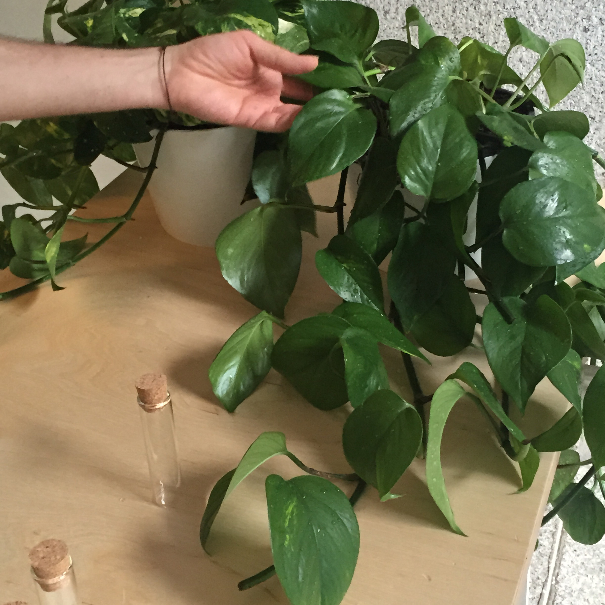
He made a clipping from a native Australian monster for each visitor who could take it home and watch it grow. Mine is on my desk as I type.
Angelo Semeraro’s From Outside to Inside was a motion-sensitive set of wooden hands that welcomed visitors from the outside courtyard into the main house. “The idea is to interpret the non-verbal languages and body language and how passive it is and how you can say something without saying a word,” said the designer. “You get straight to the point and invite people to come from the outside of the house to the inside of the house.”
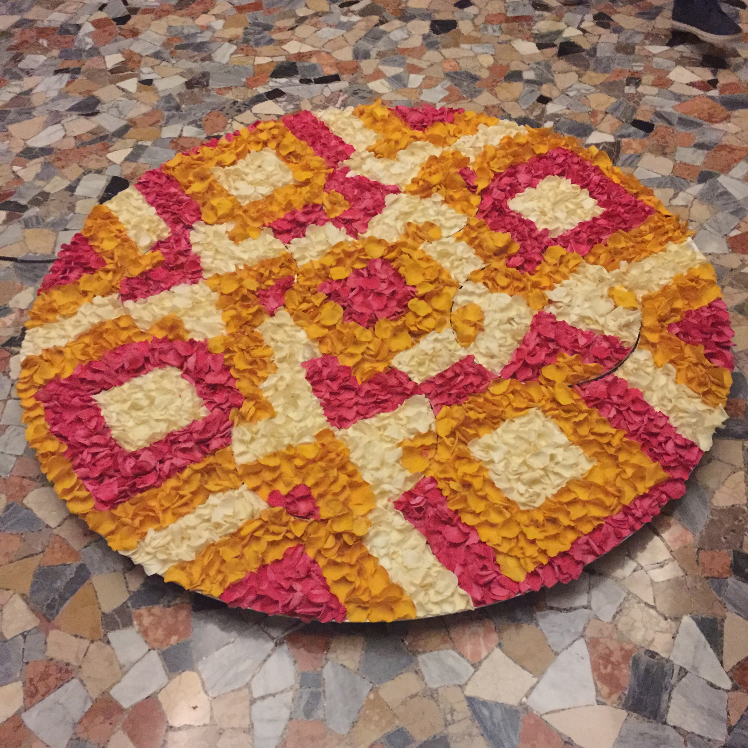
The Welcome Carpet, made from real rose petals by Chandni Kabra was inspired by another Indian ritual. “When we know guests are arriving we make a fresh flower carpet just outside our house door,” explained the designer. “The reason is that when someone comes from outside, their mind is occupied with a lot of thoughts. As soon as they look at something really striking and beautiful, they stop thinking for that moment, and that makes them fall into the present moment, so before they enter the house they’re a bit more grounded.” Being an interaction designer, Chandni added a moving element to the pattern to absorb visitors further.
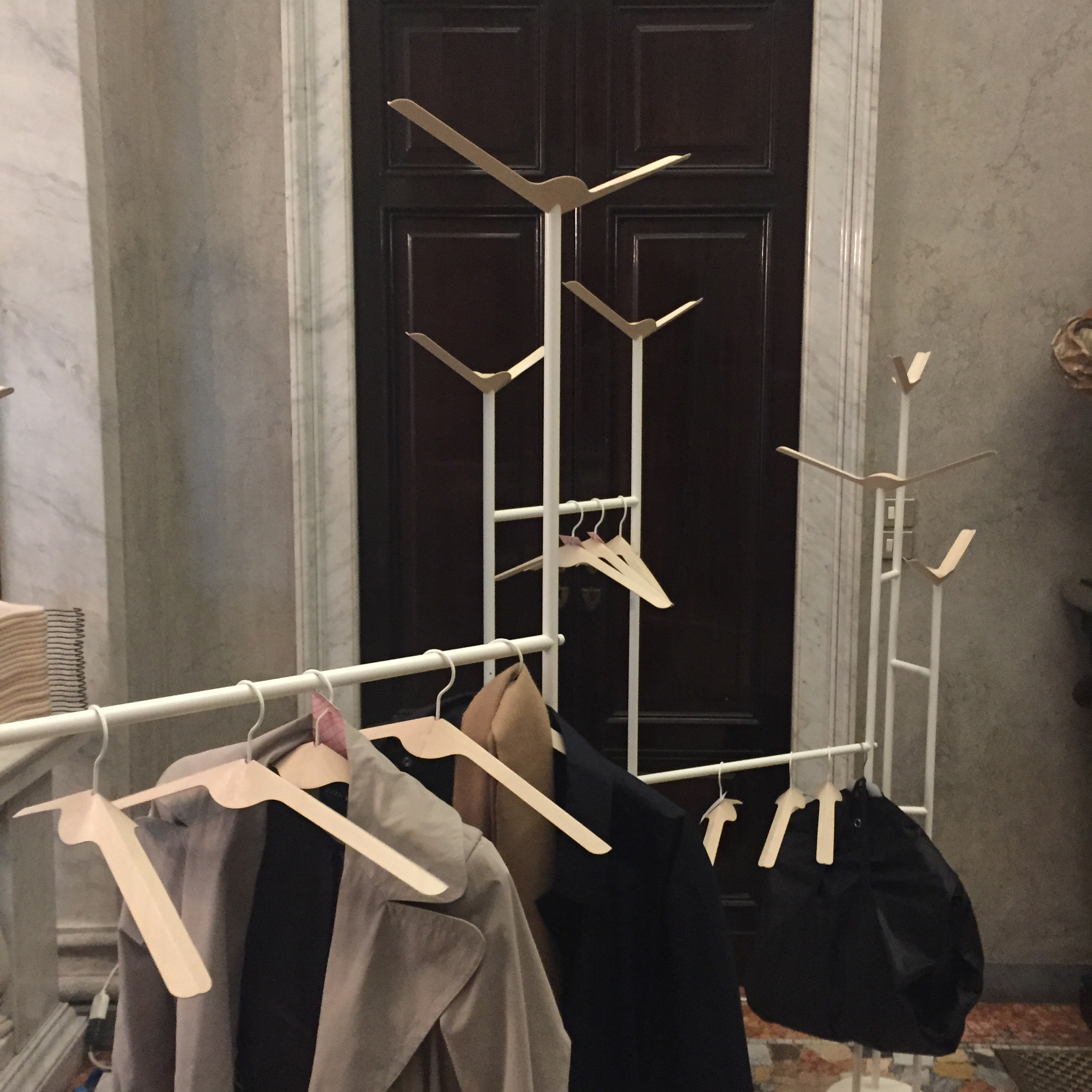
Fabrica’s current design resident Pascal Hien created Foldhanger, coat hangers made from a single sheet of folded plywood, which can also be used as coat hooks when upside down. “I’m from Germany and what we do in Germany when you enter the house as a gesture of welcome is we say, ‘Hey, take off your jacket, put down your bags,” and we hang their coat on a coat hanger, and then the guest feels welcome.”
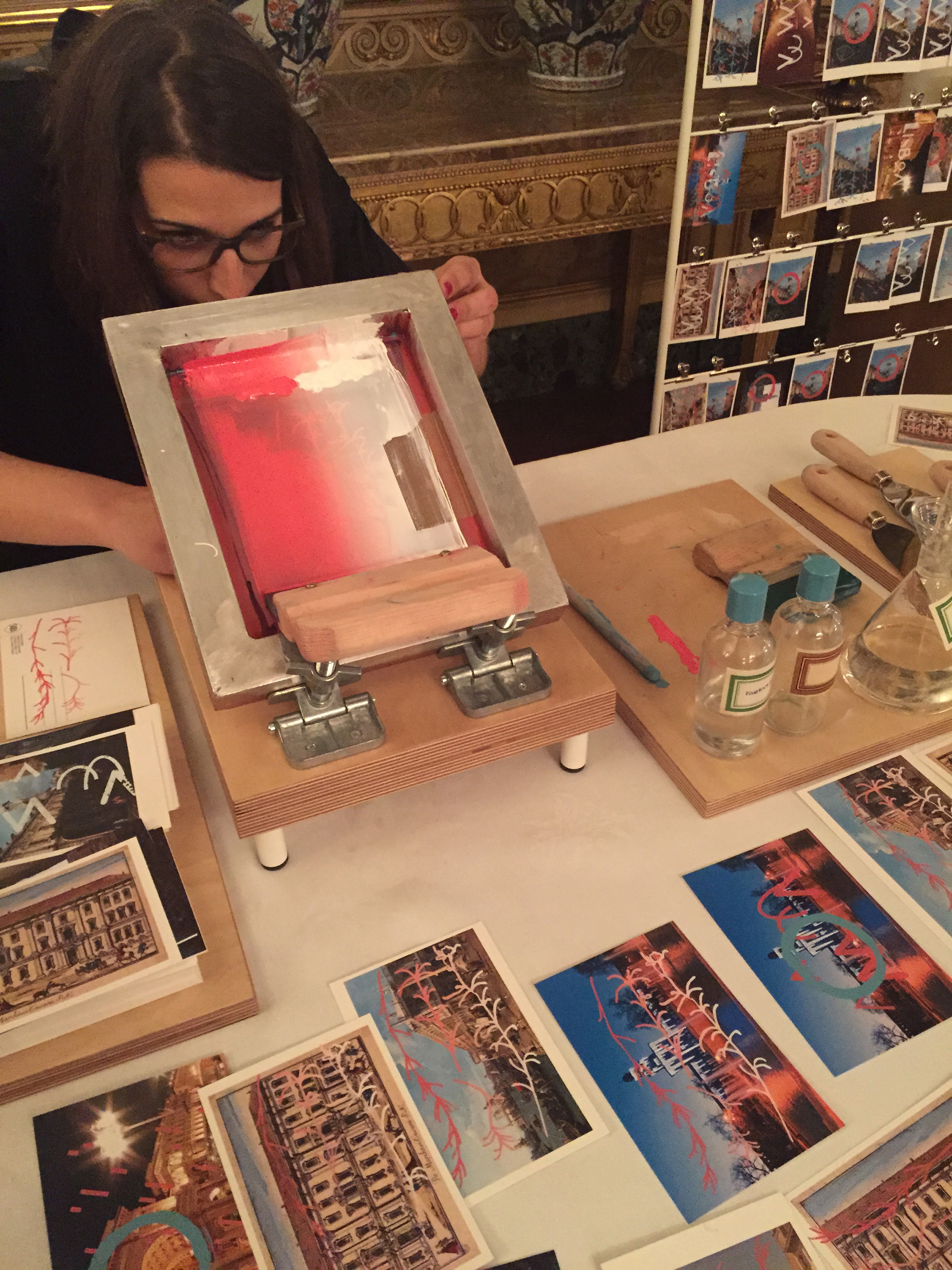
Another Australian, Thomas Fethers, had created typographic advice and then broken them down into jigsaws. “I’m completing the puzzles with the guests throughout the four day period to make them feel welcome. My personal favorite is ‘Get drunk on boxed wine’,” he said.

Following the idiom that the best way to see a city is to get lost in it, Coralie Gourguechon was making bespoke maps to help visitors do just that. “This is a map, but it’s not a map to find your way – it’s a map to lose your way,” she said. “I fill it with different information created at random for every guest.” By rolling dice, asking guests to name something that might interest them, and assigning letters, she creates directions that can be followed in any city.

Lisbon-based designer Mariana Fernandes collected postcards from all over Milan and screen-printed graphics that connected Milan to her home city over the top. “The graphics talk about simple facts, simple stories,” she said. “For example I’m printing the rosemary because we use a lot rosemary in cooking in Portugal and the same is true in Italy so these kind of simple facts, when overlapped, create a story.”

Marlene Wolfmair’s Jausensackerl is based on a typical picnic handkerchief and the tradition in her native Austria for a late afternoon picnic or Jause. “I was inspired by the north of Austria where I’m from,” she said. “We enjoy food together with family and friends at tea time and we eat a lot of heavy food, drink beer and sausages, so there’s also this image of the hiking person with the stick with carrying food – it’s very typical.”
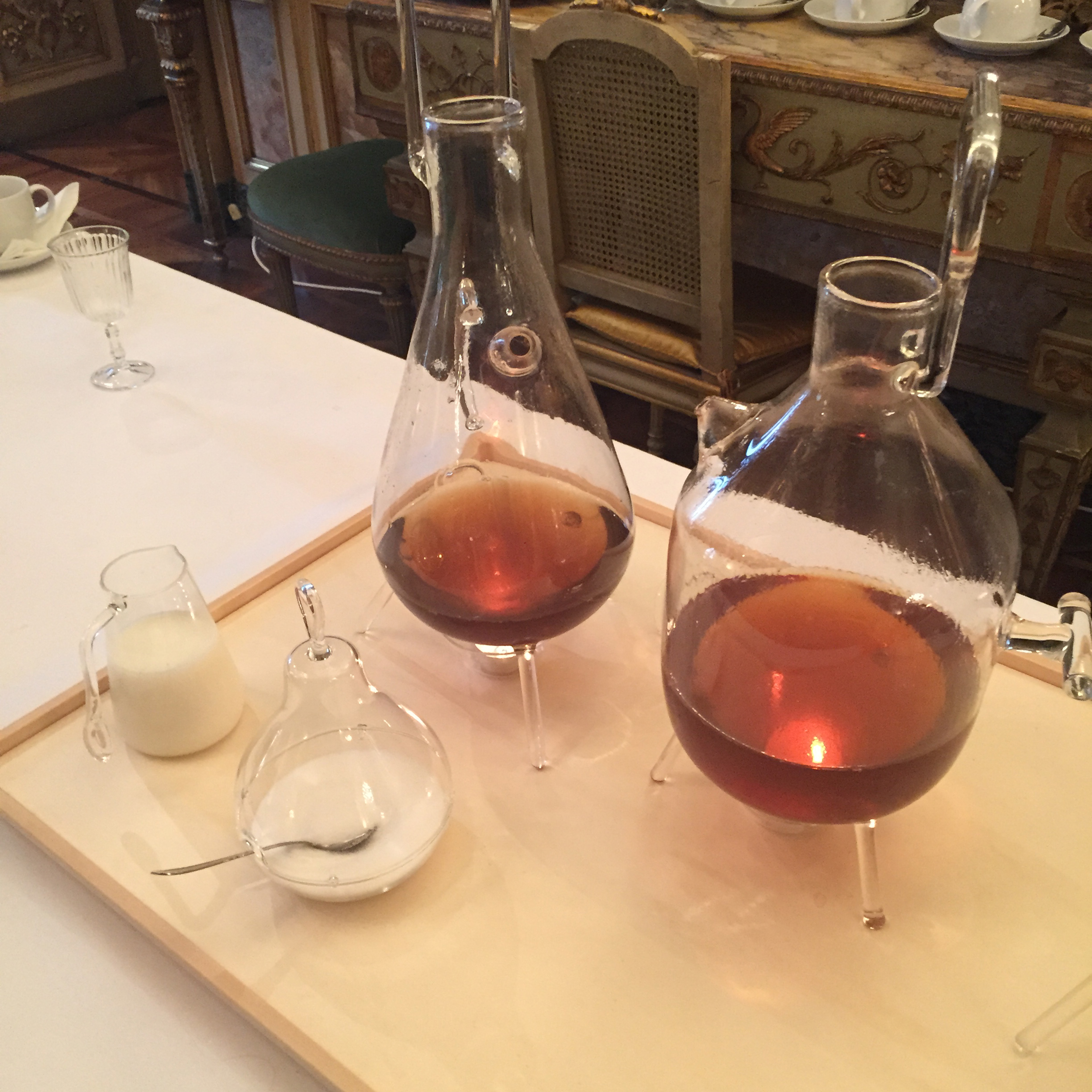
British designer Daniel Rous played with the traditional tea-drinking ritual, creating an intricate hand-blown glass tea station to provide people with refreshment on their visit to Palazzo Crespi.
In Japan it’s customary for guests to bring a gift for the host, but also for the host to give the guest something in return. Japanese designer Tonomi Maezawa
made rubber stamps symbolizing a deconstructed Japanese alphabet, and taught visitors how to print her name and their own onto a cloth bag as a gift for them to take away.
“I start with these paper trays that are like welcoming symbol in Italy – we use them offer pastries,” said Giorgia Zanellato. “I personalise them from papers from Venice, the city where I am from and two mirrors to create a new object and so it becomes a welcome mirror.”
With a spot right outside the (very beautiful) toilets, Marcello Venturini was making scented soaps to signify the special soap that is reserved for guests in many homes. “I like it when people leave one soap for the guest because it’s not just to give something a present to the guest, but it’s also a nice way to say something to the guest: ‘Take your time, refresh yourself, stay a little bit in this intimate space as the bathroom is, we wait for you, no problem’,” explained the designer. “It is also an homage to the city of Milan because I choose three ingredients for the soaps that are connected with three recipes that came from Milanese traditional cuisine, rice for the risotto, yeast for the pannetone and wheat germ for the michetta – a traditional and iconic kind of bread that belongs to the Milanese tradition.”
Housewarming was one of the highlights of Milan Design Week and on a rainy, cold morning, I felt very welcome indeed.

Clerkenwell Design Week is one of my favorite festivals. It’s small enough to get around in a day (although increasingly, I’m there for all three!), the sun (almost!) always shines, and it has a real ‘festival’ vibe with showroom parties spilling out onto the streets, interesting installations, and of course, ice-cream!
My favorite installations this year: Glaze by Cousins & Cousins in collaboration with Gx Glass – an interactive space made of candy-colored glass panels;
…the Invisible Store of Happiness by Sebastian Cox and Laura Ellen Bacon in collaboration with the American Hardwood Export Council;
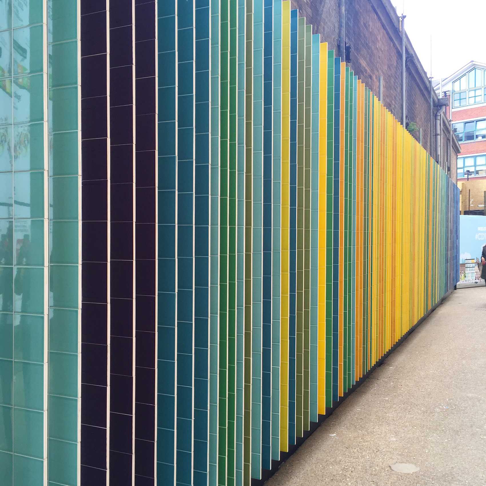
…the Johnson tiles transformation of the entrance to the Farmiloe Building created by Verve – an installation of colored and mirrored tiles, arranged so that you saw all the colors of the rainbow looking one way, and your own reflection looking the other;
…and Agora on the Green – a collaboration between Scandinavian Business Seating, Article 25 and Russ & Henshaw, which invited passers by to take a seat, add to its design, and even raising money for the Nepal Earthquake Appeal.
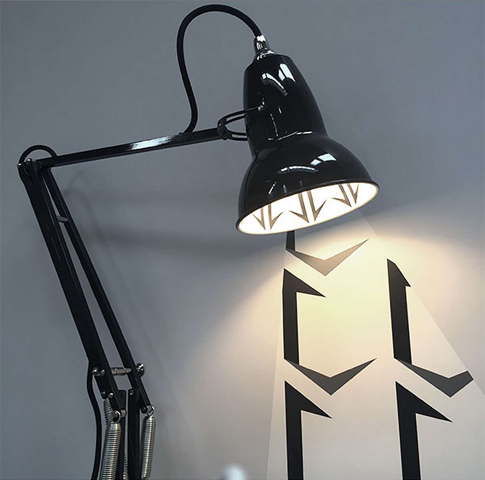
The main hub of the festival is the Design factory at the Farmiloe Building, and this is where the more established brands can be found. Anglepoise launched three new editions of the Original 1227 desk lamp by London-based surface pattern designers Eley Kishimoto.
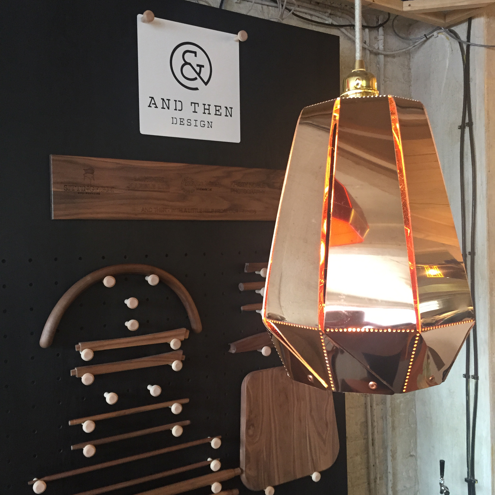
I loved &Then Design’s limited edition Flora in copper – designed in collaboration with Scarlett San Martin.
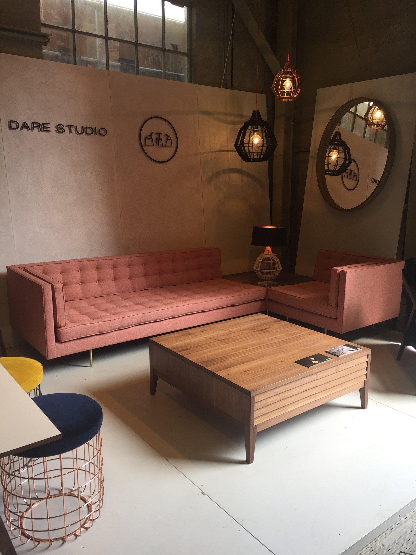
Sean Dare of Dare Studio was launching this fabulous pink sofa – I love the gold legs: a grown-up take on a feminine 1970s-inspired corner sofa.
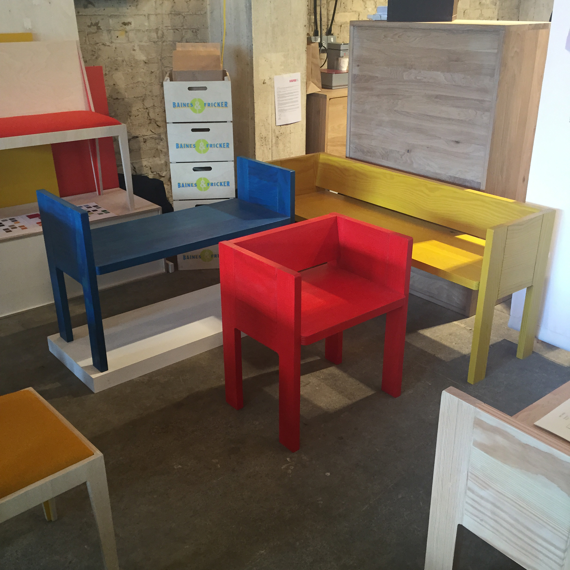
Husband and wife team Baines & Fricker were showing their SB01 and BF02 collections. The latter is their colorful take on a pew – although I think it might raise a few eyebrows in church!
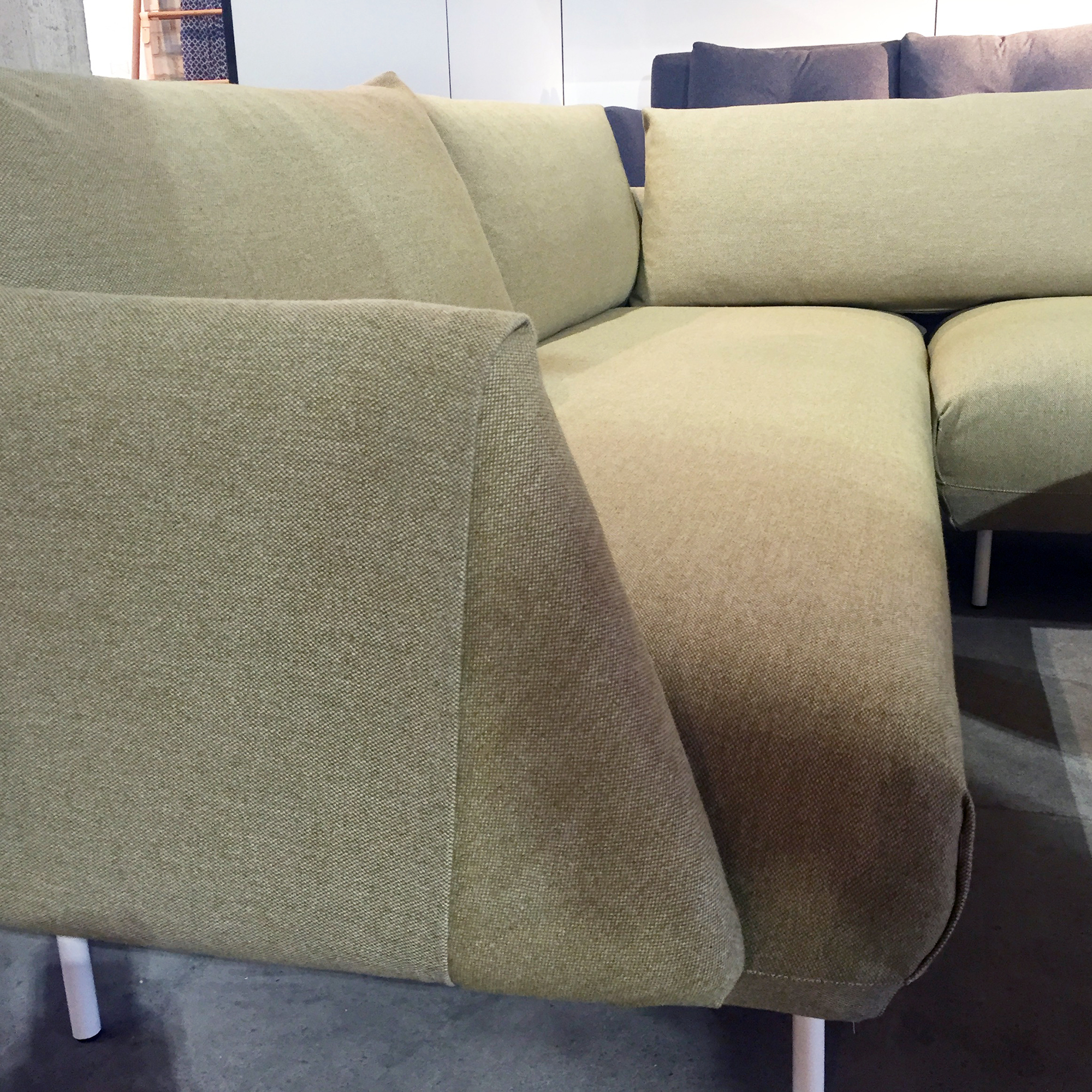
I loved this tailoring detail on Cornish furniture manufacturer Mark’s Fold Sofa.

Next I moved on to Platform, Clerkenwell Design Week’s space for up-and-coming designers – in the spooky subterranean setting of a Victorian former prison. I loved this little orange-legged stool by Amy Whitworth.
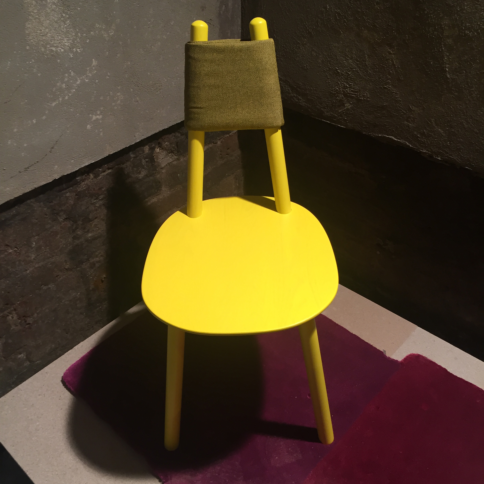
The Naive chair by etc.etc. has been stripped down to the bare minimum, with none of the fun removed – each piece comes in a range of bright colors that can be mixed and matched. This all-yellow version is perfect for me.
There is a real trend about at the moment for embracing the imperfections of natural materials, such as ‘waney edges,’ – the wobbly outside section of wood that goes right up to the bark, which is normally trimmed off to create consistent straight planks. What I love about Richard Hardy‘s collection is the way it combines this sustainable approach with a sense of fun.
Ambrose Vevers’ furniture is all hand-made in the South-West of England – he even fells the trees himself.

Additions is the space for small home accessories at the Crypt on the Green, the brick-walled crypt underneath Clerkenwell’s St James’ Church. I spotted Gemma Kay Waggett‘s quilted textiles almost as soon as I walked into Additions and was immediately drawn by their complex patterns and understated palettes.
I am a big fan of Billy Lloyd‘s ceramics. This collection of mugs was being shown as part of a curation by Charlotte Abrahams called This Is Craft.

This is the debut collection from N and N Wares and I’m already a huge fan. This one stopped me in my tracks – just beautiful.
I love Matt Pugh’s little wooden birds, so was interested to see more of his work. These candlestick holders come in a set of five and I think they work just as well without a candle – as abstract forms adding a pop of color to your interior scheme.
Alicja Patanowska hand-throws ceramic forms to turn discarded glassware (which she collects on the streets of London in the early hours of the morning!) into functional plant-pots, in which you can see both roots and stem.
And last but not least, Homeware and paper goods brand Hjem (Home in Danish), is based in the French Alps and run by Emma Richmond – it launched in October 2014 and this was Emma’s debut show, so it was really exciting to see her work. I’m looking forward to seeing more from her at the London Design Festival in September.

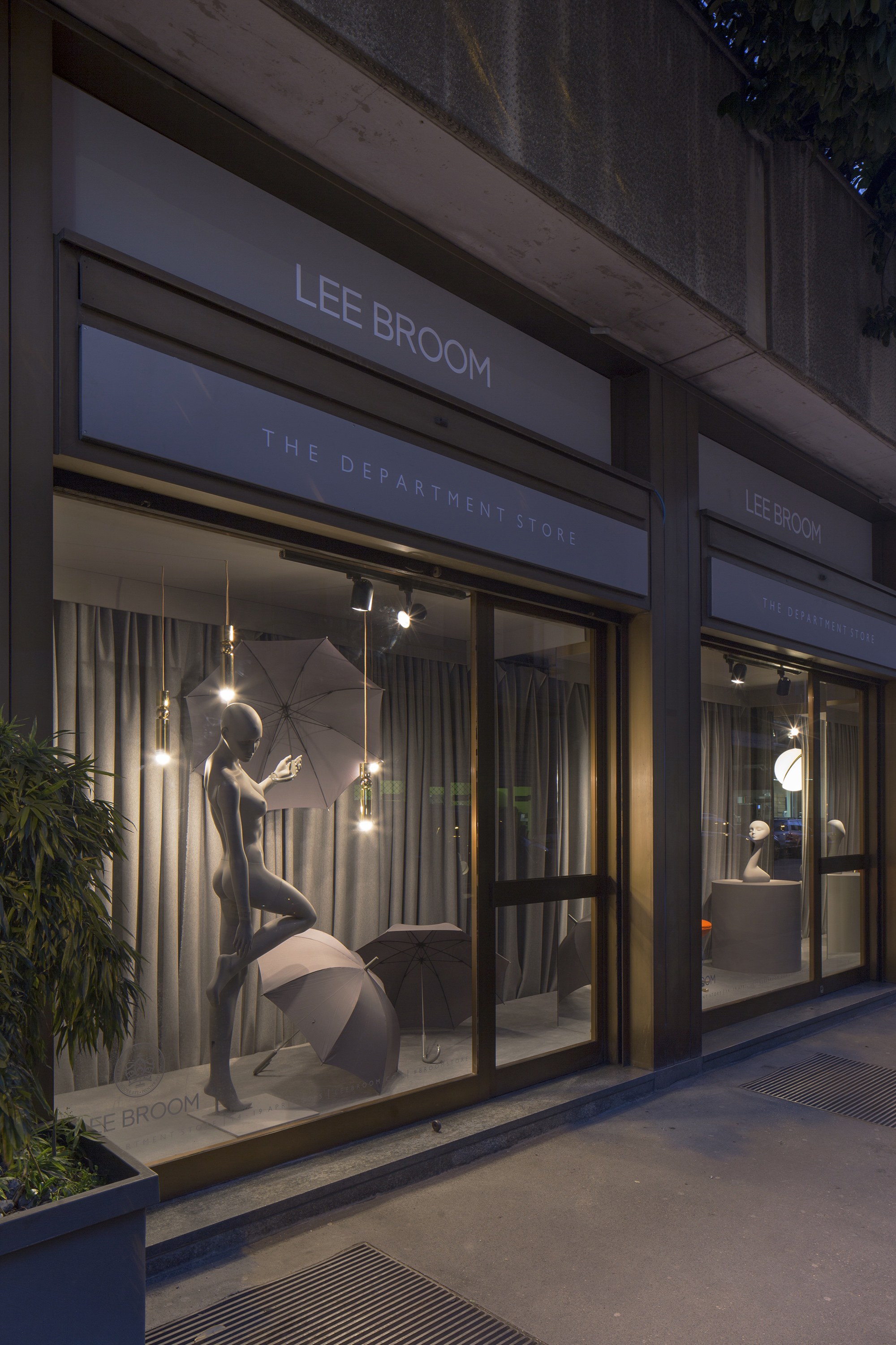
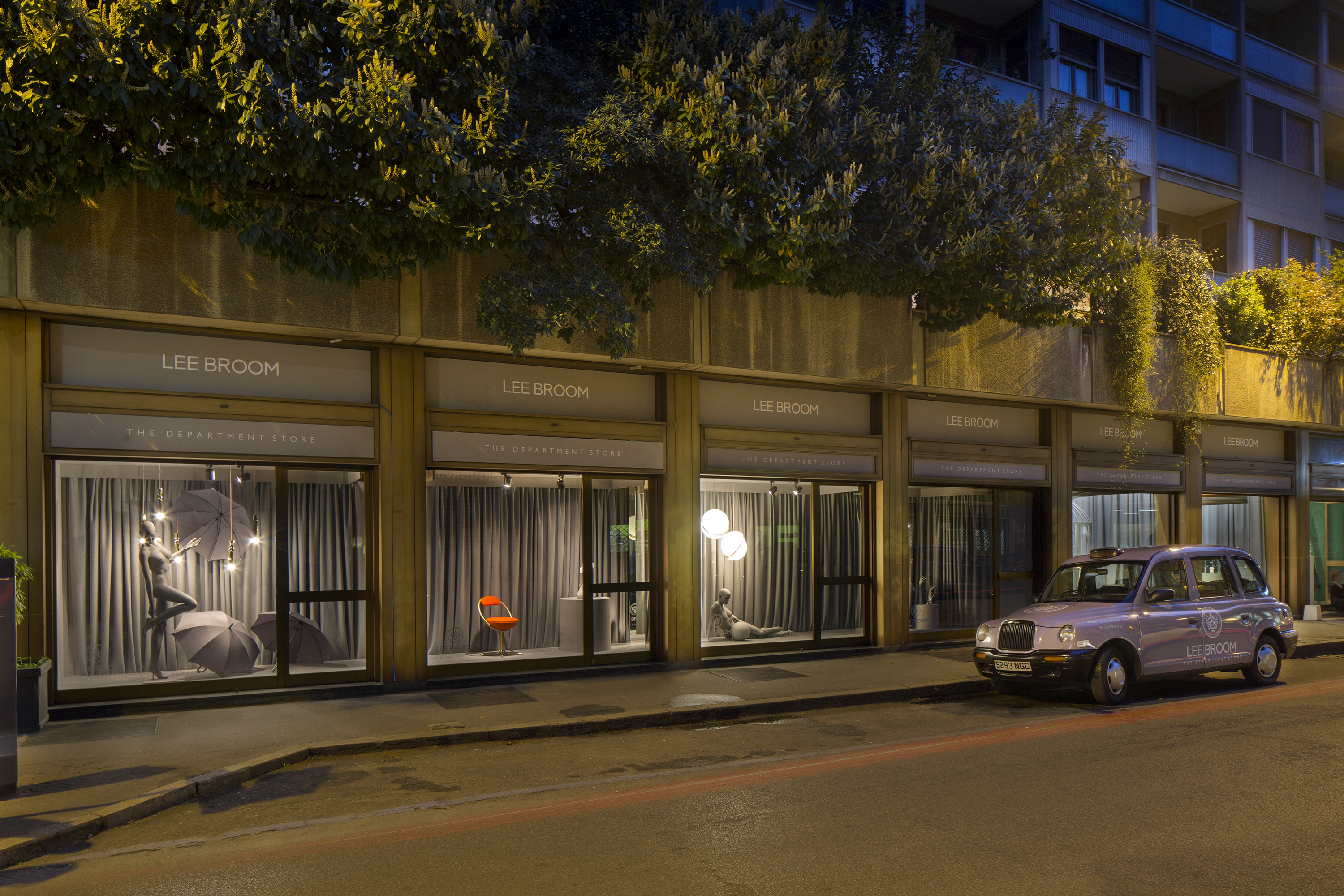
Lee Broom took over a row of shops on Via Alfredo Cappellini and created a faux department store to launch his largest collection to date in what OnOffice Magazine is calling, “Milan’s biggest head turner.”
“I typically work on over 50 products at any given time. I started to see that a lot of pieces were all coming together into something that could become a collection and I didn’t want to wait, so I decided to release everything at the same time,” said Broom.

The result is a collection of over 20 new products spanning lighting, furniture and glassware, showcased in a row of six shops that the British designer converted into a pastiche of a department store, complete with dismembered mannequin arms, theatrical reveals and Vivienne-Westwood-clad shop assistants.
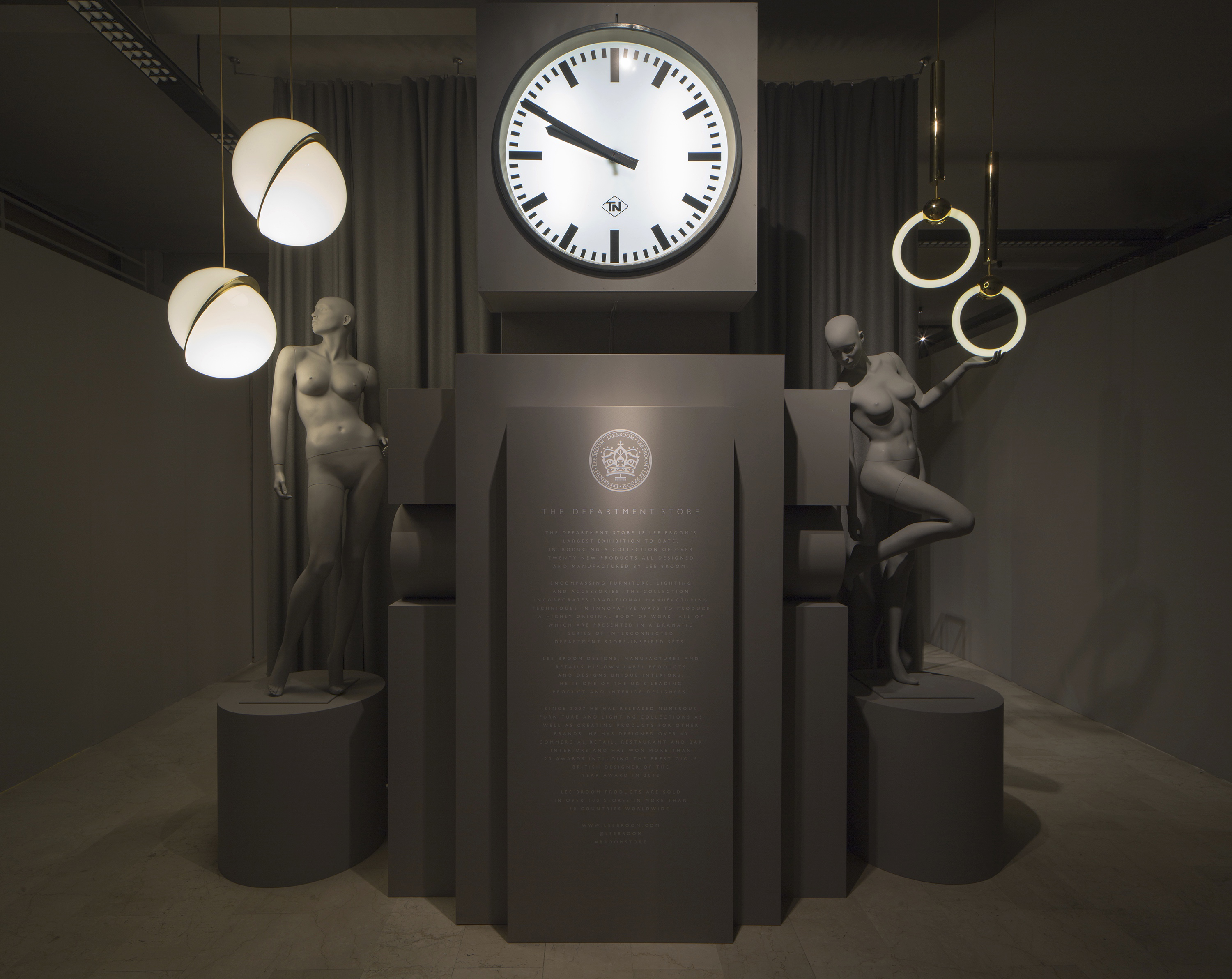
“The other reason for launching such a large collection is that I have been inspired by lots of different things over the past 18 months, so I wanted to show as much of that as I could,” said Broom. “I’ve been very much influenced by a simplicity of shape, working in different materials and taking very simple shapes or classic things that you’ve seen before and just giving them a twist.”

“For instance the Crescent Light is a classic globe light from the Art Deco period that I’ve sliced in half on an angle to reveal this brass surface inside,” he said.
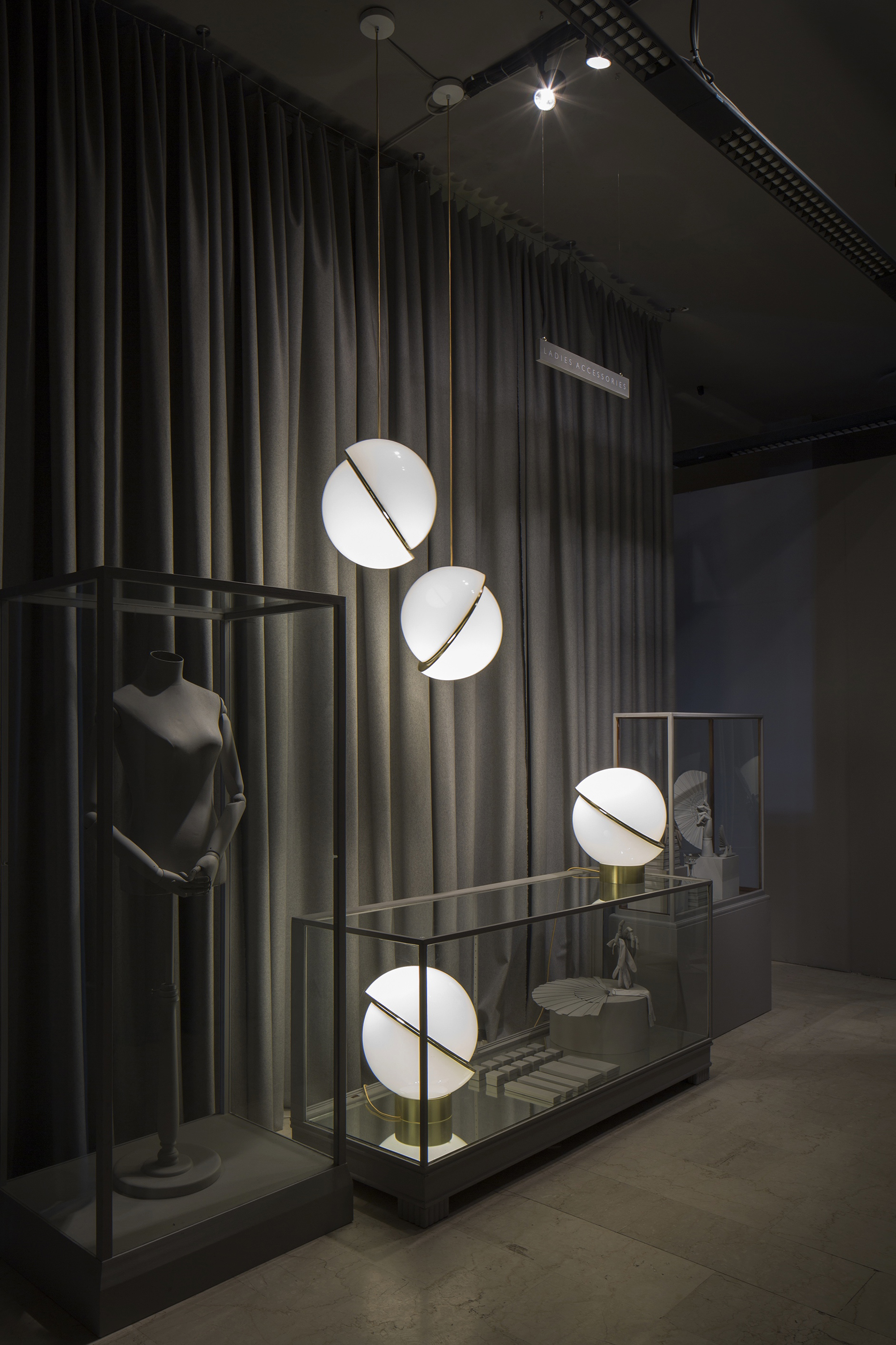
The lights were shown in “Ladies Accessories” – one of 12 departments across two floors in the imitation Department Store. Other departments the designer created included the Gents Fitting Room, the Book Store and the Haberdashery.
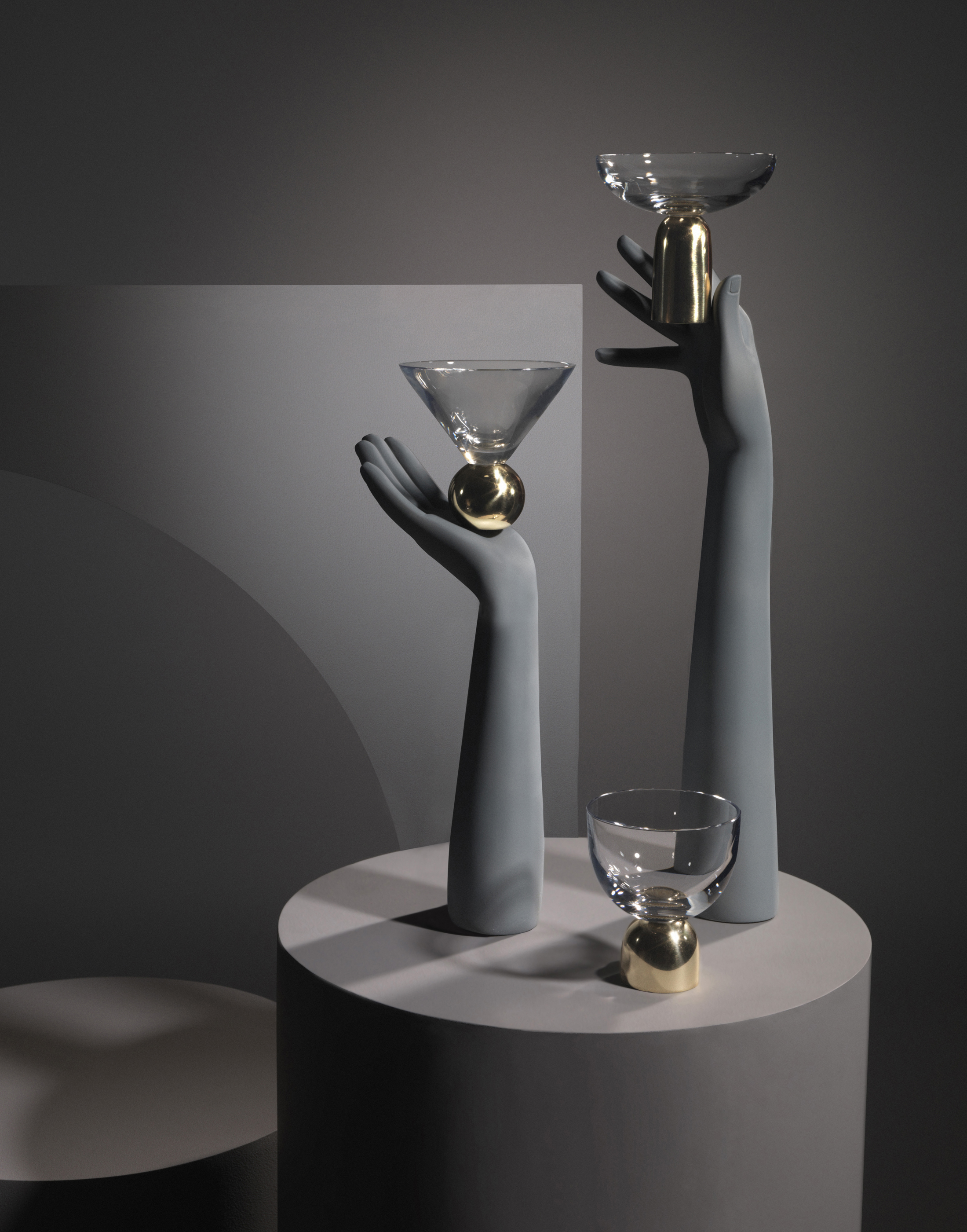
Glass on Brass is a development of Broom’s 2014 On The Rock collection – brass replaces the previous marble, resulting in classic crystal glassware forms delicately balanced on solid spun polished brass bases.
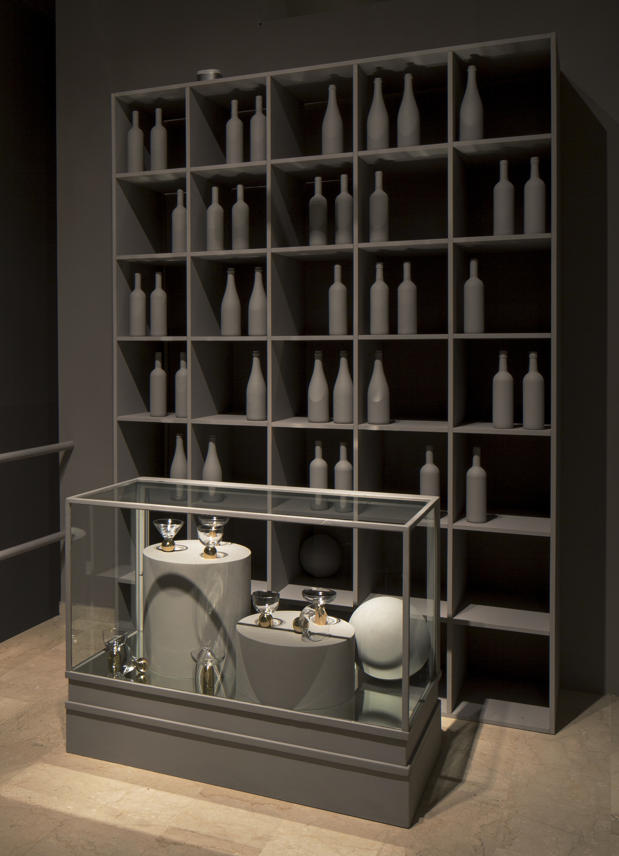
The collection was shown in the “Wine Shop” in front of 38 glass bottles, each of which was individually painted in Broom’s signature grey and shipped over to Milan along with all the other props in the store. “This show is the most theatrical yet,” said Broom. “It’s got a cinematic feel to it, it looks very fake, almost like a film set, which is really nice. Everything is grey, absolutely everything, except for the products, so they really stand out.”
The Hanging Hoop Chair is formed of two circular brass-plated hoops suspended from the ceiling. The two hoops join at the bottom and the inner hoop contains the seat and backrest, upholstered in red or grey Kvadrat wool.
The Hanging Hoop Chair, together with the Hoop Dining Chairs, a similar concept with the inner hoop sitting on a four-footed brass-plated base, were displayed within the “Shoe Department” alongside grey high heels all perched on cylindrical grey plinths.

As ever with Mr Broom, there is a hint of the illicit and the Ring Light mimics a contemporary piercing as much as any lighting form. The light comprises a polished brass sphere impaled on a dimmable ring-shaped fluorescent tube.
The Crystal Tube is another development of a previous collection. Tube was a hollow cylinder of Carrara marble with LED bulbs inside creating the illusion of a glowing tube of solid marble. For Crystal Tube, the marble is replaced with cut crystal creating a tension between traditional and contemporary lighting archetypes.
The Crystal Bulb was showcased in the Department Store’s Perfumery, alongside the Tumbler Lights and 16 grey-painted perfume bottles and 14 bespoke Lee Broom perfume boxes.

Finally, Broom’s ‘back catalogue’ of existing products such as the Decanterlight, Carousel and One Light Only were displayed in the “Stockroom”.
“I had had the idea of the department store theme in the back of my head for a few years. As soon as I saw this space, I knew it would be the perfect way to display the collection,” said Broom, speaking before the show. “Having had this vision in my head for so long, the most important thing is that it’s as I imagined. The second most important thing is that people really enjoy and understand the experience. It’s not just about furniture and lighting – it’s a show. I hope people get that and that they enjoy it. Milan is very stressful and I’m hoping that the show will kind of be a breath of fresh air.” Now that the show is over, Broom can breathe a sigh of relief – it’s safe to say that it was nothing if not that.
new york design week runs from from 8 > 19 may. surrounding these dates is a citywide offering of design related installations and exhibits. for visitor’s interested in taking something in on the 19th or later, here are the best.
thru 19 may | sofitel times square | 45 west 44th street nyc
french design connection / is back for its 34rd edtion featuring acabas, anouchka potdevin, armel soyer gallery, carpenters workshop gallery, dutko gallery, dyptique, servaire & co, valerie goodman gallery and wustenberg

thru 19 may | 11 a 7p | ingo maurer showroom | 89 grand street nyc
new works by ingo maurer and team see new and several world-first prototypes, concepts and finished pieces.

thru 19 may | 9a – 6p | nanimarquina | 588 broadway #607 nyc
nanimarquina: new collection launch designed by sybilla.
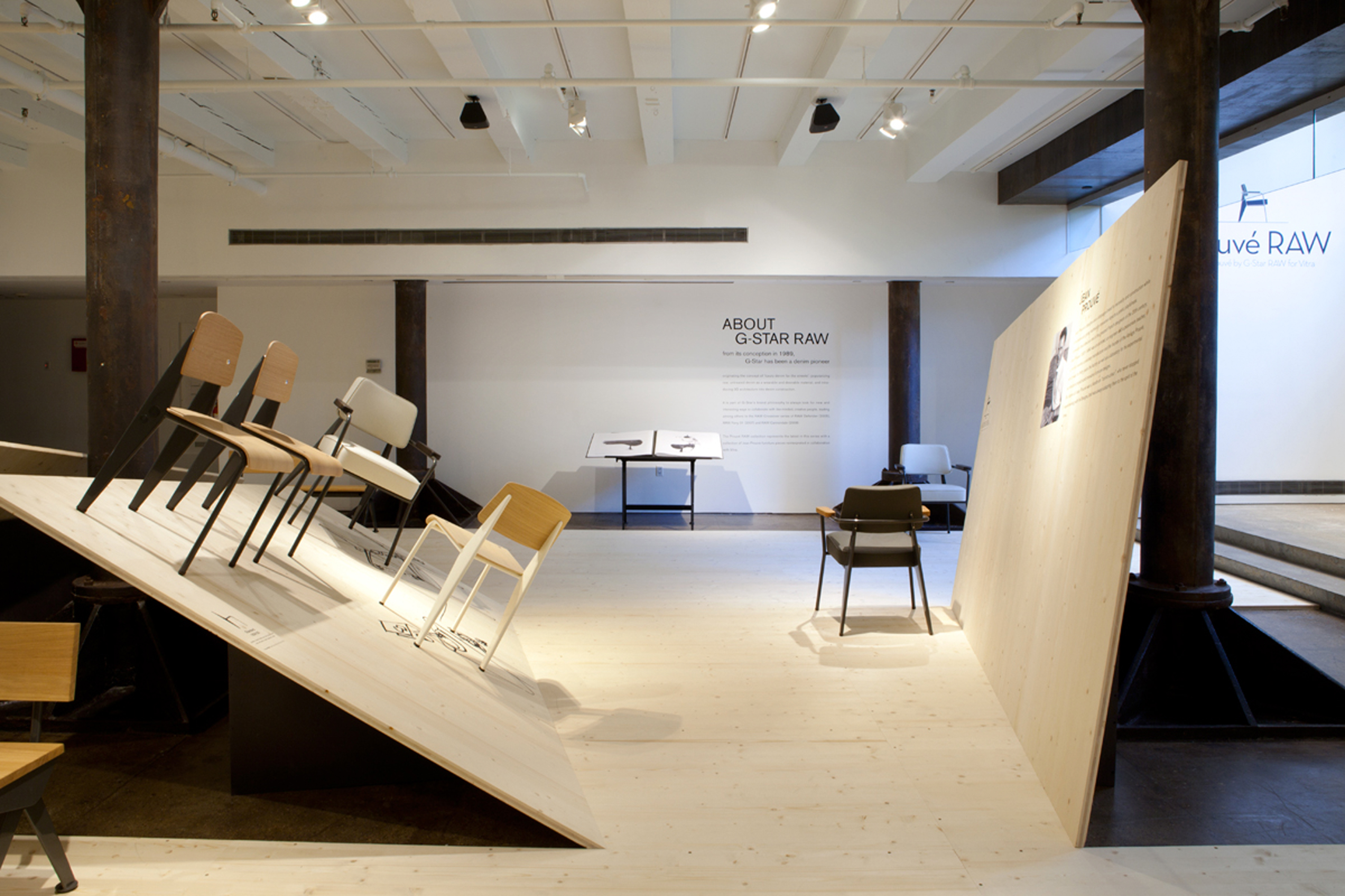
thru 19 may | 11a – 7p | vitra store | 29 9th avenue nyc
prouvé RAW office exhibition is a crossover project between g-star RAW and vitra. this is the second edition of this partnership. above photo courtesy of vitra – wundr studio
thru 19 may | 11a – 7p | the future perfect | 55 great jones street nyc
wonder room curated by piet hein eek features a major installation of one of-kind collaborations and works of art from dutch designers hansje van halem, paul heijnen, linda nieuwstad and floris wubben. in addition works by michael annastasiades and local designer bec brittain and the newest roll & hill lighting.
thru 20 may | 10a – 5p | next door | 4014 1st avenue #603 brooklyn
1:1 piero lissoni exhibition originating from chicago showing architectural models and many objects shown in varying stages of development, from concept to finished piece. In new york it’s curated by studio next door and represents a special partnering with elle decor italia, carin scheve’s styling including emerging brooklyn designers.
panel discussion thursday 21 may | 7p – 8:30p | thru 27 sept | 10a – 6p | museum of arts and design | 2 columbus circle nyc
women in industrial design: a changing field? in certain typologies in the design world – interios, textiles and tableware – women have been extremely successful while others – furniture and product design – they have been conspicuously absent. a panel of curators, industry leaders, teachers, journalists and designers share their thoughts. [note: more exhibit info on ‘pathmakers: women in art, craft and design, midcentury and today’ towards end of this post] above photo courtesy of gabriel ann maher
thru 22 may | 12noon – 6p | matter | 405 broome street nyc
matter made 2015 collection bold new works from in-house brand matter made. also ana kras, henry julier, philippe malouin, vonnegut kraft and visibility are shown. solutions include the latest energy efficient led technologies.
thru 22 may | 12noon – 5p | moma design store | 81 spring street nyc
moma design store presents: london tech city a new suite of products documenting the london tech scene in honor of nycxdesign.
thru 22 may | noon to 7p | project no 8 | 38 orchard street nyc
ward bennett: making sense is an installation of sensual minimalism of iconic new york designer ward bennett. a collaboration between design institutions herman miller and geiger, the environment designed by various projects. above photo courtesy of herman miller
thru 23 may | 11a – 7p | kikkerland | 493 6th avenue nyc
kikkerland celebrates china design challenger winners during beijing design week 20014 kikkerland in collaboration with leaders in design and innovation challenge young design talents. the winners are celebrated and their designs are being produced and sold worldwide through kikkerland’s distribution network.
thru 23 may | 9a – 8p | the center for architecture | 536 laguardia place nyc
praque functionalism is the first major exhibition at the center for architecture to focus on eastern european design. the photographs are of functionalist buildings, projects and drawings.
thru 31 may | 9a – 5p | moiety | 166 north 12th street brooklyn
design collective, field experiments presents a new project focused on the concept of ‘play as work’ featuring a host of visual and tactical programming [ program details ] moiety.nyc
thru 30 june | 11a – 5p | e.r. butler | 55 prince street nyc
rise by karl zahn is part II of the momentum series. a large collection of mezmorizing objects in a display of motion and physical interactions.
thru 30 august | 11a – 6p | socrates sculpture park nyc
agnes denes: the living pyramid new york city artist builds a 30 feet high, site-specific earthwork created from several tons of soil and planted grasses.
thru 13 september | 10a – 6p | museum of the city of new york | 1220 5th avenue nyc
everything is design: the work of paul rand features over 150 graphic design examples by an american design legend. it was rand who most creatively brought european avant-garde aret movements such as cubism and constructivism to graphic design in the usa.
thru 27 sept | 10a – 6p | musuem of arts and design | 2 columbus circle nyc
pathmakers: women in art, craft and design, midcentury and today features more than 100 works.
thru 15 november | 9a – 5p | cooper hewitt, smithsonian design museum | 2 east 91st street nyc
how posters work exhibition shows 125 posters from cooper hewitt’s permanent collection such as masters like herbert matter, paul rand, philippe apeloig, to lesser-known creators.
ongoing | 10a – 6p | moooi | 36 east 31st Street nyc
moooi new york technically not an exhibit but the opening on 15 may 2015 of a new moooi showroom. while we were in milan dutch designer marcel wanders alerted us to dutch lifestyle design company moooi crosses the ocean and lands in nyc to open its first showroom and brand store in the usa. marcel is moooi’s creative director among other things.
All content ©2007 > 2024 DesignApplause