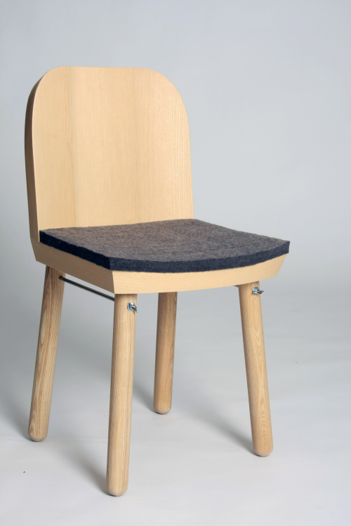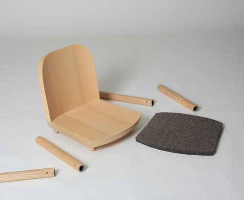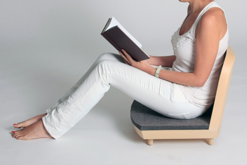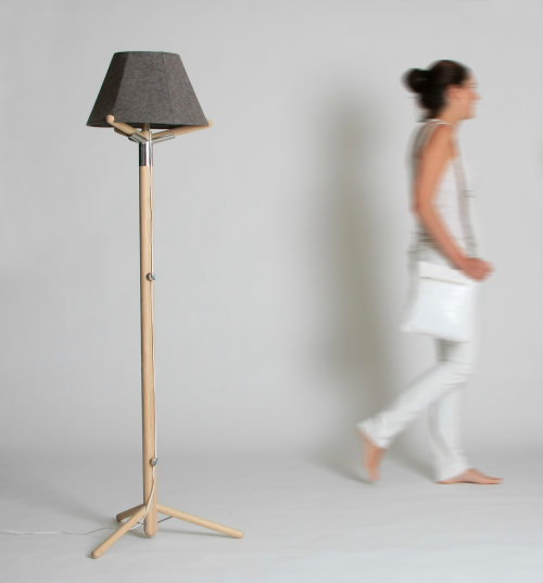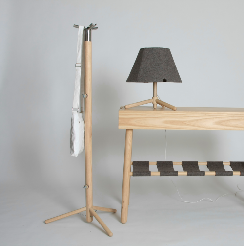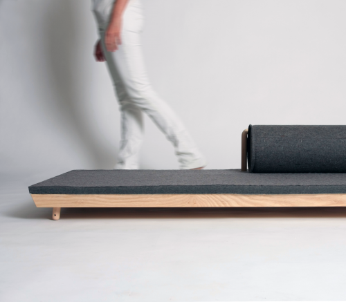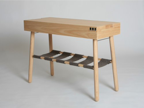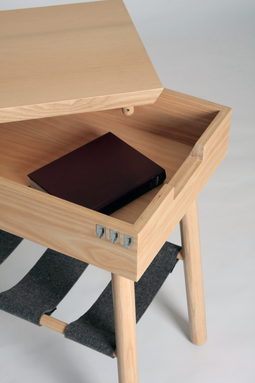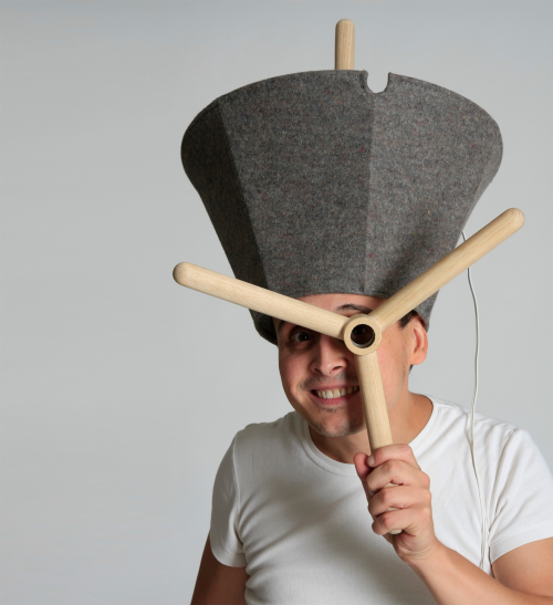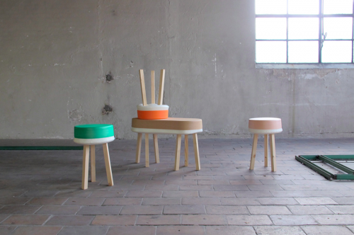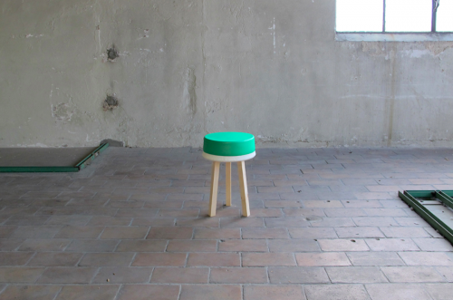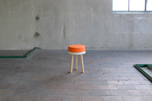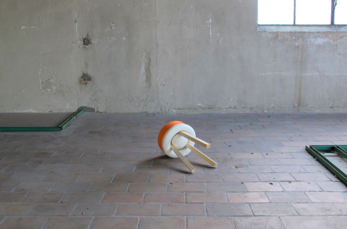
Alma, a collection of many interchangeable parts, including a birch table, an ash chair, felt, steel rods, and wing nuts. The collection needs only a dining table and shelves to completely furnish your space. Alma represents two months of work from the recent graduate in order to participate in Feria Habitat Valencia 2012 > Nude he was invited to.


[ christian reyes ] [ feria habitat valencia ]

[above] Lumière Flame (shown) and Lumière Abatjour |Giovanni Alessi Anghini and Gabriele Chiave | GAA Design Farm |
Alessi | 2010-11
On 15 December the 2012 Good Design Award winners were announced. Thousands of entries were vetted to highlight the best designs based on innovation, form, materials, construction, concept, function, utility and aesthetic appeal. Select 2012 winners on this page via [ BDE ] The [ complete list ] of winners.

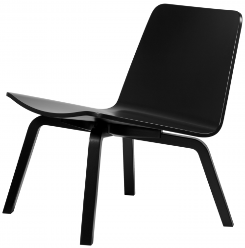
Lento Lounge Chair | Harry Koskinen | Friends of Industry | Artek | 2006-11
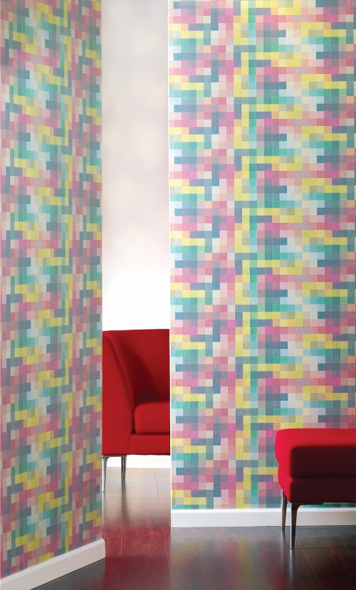
Pixel Graphic | Heather Bush, Carnegie Design Studio | Carnegie Fabric | 2010-11

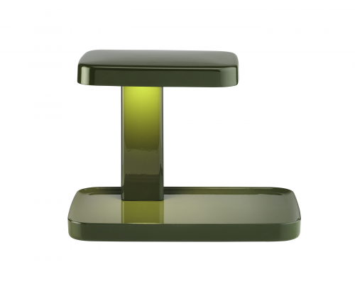
Piani Lamps | Ronan & Erwan Bouroullec | Flos | 2011

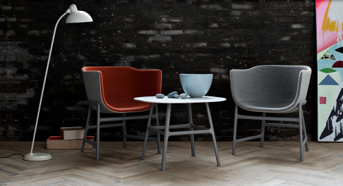
minuscule Chair and Table | Cecilie Manz | Fritz Hansen | 2012

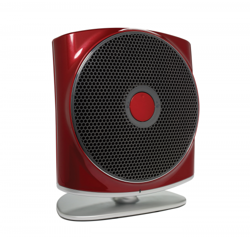
ZŌN® Max Air Purifier | Stefan Spoerl and Andrzej Loreth | Humanscale | 2011-12

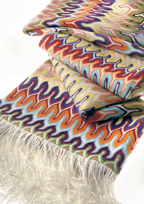
Nadal Throw | Rosita Missoni | MissoniHome | 2012

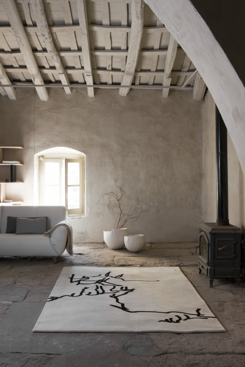
Dibujo tinta | Eduardo Chillada | Nanimarquina | 1957
-

1> AlessiLux |Giovanni Alessi Anghini and Gabriele Chiave | GAA Design Farm | Alessi | 2010-11
2> Floating Earth Tray | Ma Yansong, MAD Architects | Alessi SpA | 2011-11
3> Ape Aperitivo | Giulio Liacchetti Industrial Design | Alessi | 2011-12
4> Ming Tray | Zhang Standardarchitecture | Alessi | 2010-11
5> Lento Lounge Chair | Harry Koskinen | Friends of Industry | Artek | 2006-11
6> Pixel Graphic | Heather Bush, Carnegie Design Studio | Carnegie Fabric | 2010-11
7> Piani Lamps | Ronan & Erwan Bouroullec | Flos | 2011
8> D’E-light | Philippe Starck, Starck Network | Flos | 2011
9> APPS Luminaire | Jorge Herrera, | Flos | 2011- 12
10> minuscule Chair and Table | Cecilie Manz | Fritz Hansen | 2012
11> Float Sit -Stand Height-Adjustable Table | Humanscale Design Studio | Humanscale | 2012
12> ZŌN® Max Air Purifier | Stefan Spoerl and Andrzej Loreth | Humanscale | 2011-12
13> Nadal Throw | Rosita Missoni | MissoniHome | 2012
14> Dibujo tinta | Eduardo Chillada | Nanimarquina | 1957
15> Manos | Eduardo Chillada | Nanimarquina | 1995

[ good design award ] is the oldest Design Awards program organized annually by The Chicago Athenaeum Museum of Architecture and Design in cooperation with the European Centre for Architecture, Art, Design and Urban Studies. The awards program covers new consumer products designed and manufactured in Europe, Asia, Africa, and North and South America. The trademarked awards were created in Chicago in 1950 by three architects: Eero Saarinen, Charles and Ray Eames and Edgar Kaufmann, Jr. The logo was designed the same year by the late Chicago graphic designer, Mort Goldsholl.
 stool 60 | alvar aalto | artek | 1933 | click > enlarge
The 1930s marked a breakthrough decade for Alvar Aalto both as an architect and a designer. Stool 60 was first introduced to the international public at the Wood Only exhibition in London in November 1933, to rave reviews – making 2013 Stool 60’s 80th anniversary. The simple, stackable and durable wooden stool represented a new approach to furniture design, and a continuation of the brand of modernism initiated by Bauhaus. The use of wood instead of bent steel was revolutionary at the time. Aalto spent years developing the L-shaped leg at the Korhonen furniture factory. The development of Stool 60 also took several years. Aalto kept testing different technical solutions together with the experts of the factory. The result of their collaboration is a durable and modern technical solution that later on led to the creation of many other classic designs.
 stool 60 | mike meiré | artek | 2012
In 1935, just a few days before the founding of Artek, the Municipal Library in Vyborg opened and Stool 60 was used for the first time in a public building. Stool 60 represents a crystallization of the values of Artek concerning the importance of technology, art and ethics. Stool 60 is the number one seller of Artek products and one of the most famous design products of the world.
Throughout 2013, Artek will introduce a series of stools, designed by well-known architects and designers, commemorating the anniversary. This month, we are featuring the stools by Mike Meiré (seen above).
Learn how these colorful stools are put together in this short video:
 stool 60 | alvar aalto | artek | 1933
[ artek > stool 60 ]

photos courtesy of patrick norguet
Design Democracy – From Cappellini to McDonalds – Patrick Norguet doesn’t discriminate. McDonalds hires one of Frances top creatives, Patrick Norguet to design an outdoor collection. In collaboration with the producer Alias and the fast-food giant McDonald’s, designer Patrick Norguet has designed a line of outdoor furniture as part of McDonald’s “Come” project. The furniture collection will equip terraces and outdoor spaces McDonald’s worldwide. [ patrick norguet ] [ alias ]

The design solution responds to the ‘COME’ objectives – to design, engineer, develop and install a specific turnkey modular furniture system. The collection consists of 28 pieces made of steel, hand-sanded concrete and Corian tables, chairs, benches, lamps, planters, litter bins and screen. The introduction of the collection will be in Bordeaux and northern France.

Patrick Norguet says:
“For this project, like each of my projects, I wanted to give great attention to the final use. Draw a quality space that fits into the time that meets the demands and requirements specific to McDonald’s. Not all completely outside or completely inside the terrace is experienced as an extension of the restaurant, a separate space for a different experience. It is also a major project for me because we were able to connect two worlds around the project, and thus develop products of high quality. The association with Alias, I was able to reach the level of demand that I wanted for this set consists of 28 objects. A family of tables, chairs, low chairs, lamps, planters, benches, litter bins and screen.”

“I’m lovin it.”
 click > enlarge
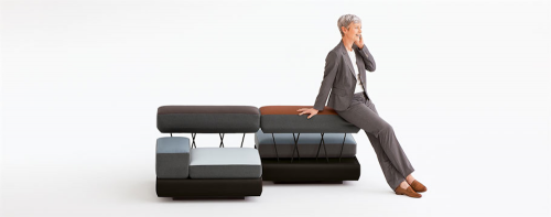
Berlin-based design group osko+deichmann recently released Plot, a padded, modular seating system for the contract market. Designed for Brunner, Plot is a versatile, customizable and easy to adjust lounge system “inspired by cascaded formations in nature.” Intended for use in hotels, lobbies and airports, the system is made up of add-on units that come in three height levels – low, medium and high. The base level acts as a low-lying side table to hold purses, drinks, etc. The medium level cushions act as seats and can be raised to the next highest level to form seat backs, arm rests and area dividers. The color-blocked units make this system much more attractive than your average contract commercial seating, too. Watch this short video to see how Plot can grow or shrink to fit your space.
From Brunner:
How do we sit down while we’re travelling? Do we wait or do we work? Do we meet other people and communicate? Do we take a time-out and relax ? How private do we want to be in public spaces?
plot from Berlin-based designer duo osko+deichmann provides a contemporary response to these questions. Building on a square base module with variable seating surfaces at three levels, plot fully reinterprets the roles of arm-rests and back-rests.
Every person uses furniture in their own unique way. While sitting down, people change their posture and furniture serves a different purpose for each of us – for some it offers a spot to rest or communicate while for others it provides a temporary office space or an oasis of tranquillity. With its multilevel seating, plot allows different seating positions and encourages informal communication. plot, the modular loungescape invites people to return and interpret seating in a new way.

about perrin drumm
 click > enlarge
Though Oscar Tusquets Blanca is an “architect by profession, painter by vocation, writer out of the need to make friends” and a designer only “by adaptation,” it’s his design work we’re most excited about, especially his latest piece, the Fontal Chair, which the Spanish furniture manufacturer, Expormim, presented in the Salone del Mobile in Milan last month.
Cane chairs were popularized with Marcel Breuer’s 1928 Cesca Cane Chair, which paired a rattan seat and backing with a bent metal frame. Blanca’s design is more of a return to basics, not only in his use of traditional rattan, but because he doesn’t combine it with more modern materials. It’s simple and elegant, suitable for the kitchen or for a more formal dining table. I’d also imagine it promotes good posture. While it’s beautifully crafted that back looks none too comfortable. Here’s what Blanca himself has to say about his design:
“The project was born from the desire to take back rattan as a noble material, building on the rich tradition of craftsmanship in our country that supports its use. To that end, we tried to give the hundred-year-old technique a new look, which was achieved by substituting the traditional strutting and joint wrapping for a twinning technique to join one reed to the next. With this innovative option, we created a flexible yet resistant structure that is very lightweight. A light, warm, charming and luxurious, in the true meaning of the world, chair.”


about perrin drumm
 click > enlarge
Is it just me or does the Medici chair by Konstantin Grcic, a Munich-based industrial designer, look like a much improved version of the classic Adirondack chair? Not that I don’t like the Adirondack chair – I have half a dozen on my back patio – but Grcic’s chair is the meeting point between American NorthEastern traditional and European chic.
Designed for the Italian furniture manufacturer Mattiazzi, the chair was actually “born” on their factory floor. Grcic said “The chair was inspired by the material, the machinery and, of course, the skill and craftsmanship of the people we worked with…Right from the beginning, I was looking for a distinct grammar for my design, a language that would express the characteristics of wood. I liked the idea of working with planks. They signify the very beginning of the production process – a tree trunk that is cut into slices. I like the way in which a carpenter joins wood. It is immediate and direct. The construction remains visible and easy to read. Structure turns into form.”
Medici comes in three different kinds of wood: Walnut, Douglas Fir (in natural and yellow) and, for outdoors, thermo-treated Ash.
“Designing for Mattiazzi was like a personal time travel. It took me all the way back to my professional roots. At the very beginning of my career, I was trained a cabinet maker. Working with wood is what I learnt from scratch. It is where it all started for me.”


about perrin drumm
 click > enlarge
Even after Salone Del Mobile is over, I’m still thinking about The Front Room’s presentation at Ca’Laghetto, Via Laghetto, which featured a number of remarkable designers, including the Rotterdam-based Earnest Studio headed by Rachel Griffin. For Milan this year she presented Swell, a series of stools and benches that put an emphasis on the production process by cutting costs at every stage.
“Upholstered furniture typically uses foam created in massive block molds and cuts it into smaller pieces that are added to a separate frame. Swell integrates these production elements by using the frame and fabric as the mold for the foam. This also allows the foam to acts as a binding agent, eliminating costly handwork.”
Griffin goes on to explain that Swell simplifies the production process. Instead of molding massive blocks of foam, cutting them down to size, gluing them to a wooden frame and then sewing the fabric on top, “Swell uses the fabric and frame as the original mold for the foam.” The result cuts down on production time and materials and, because the foam fills the fabric, “no material is wasted as cut-offs.” Furthermore, the foam acts as a binding agent between the fabric and frame so there’s no glue, extra adhesive or sewing necessary. And since the foam expands in the fabric in a slightly different way each time, every piece is unique.
Swell Stool and Bench are available from The Front Room’s online shop for $393 and $542, respectively.


about perrin drumm

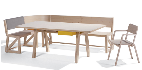
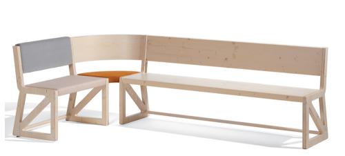
German designer Alexander Seifried named his latest furniture collection Stijl after De Stijl, the Dutch art and design movement that advocated “pure abstraction and universality by a reduction to the essentials of form and color.” Traditionally De Stijl-ers focused on vertical and horizontal lines and used only primary colors in addition to black and white. That’s a bit limiting, and though I appreciate the rigors of De Stijl, black, blue, red and yellow furniture doesn’t exactly assimilate very well into too many homes nowadays.
Fortunately, Seifried didn’t think so either. His Stijl collection updates white to include raw birch wood and black to include shades of gray. Added bonus? It’s something of a BIY (build-it-yourself) unit. The main component is a desk with a bright yellow drawer. When you add any combination of the chair, seat, bench and corner bench piece, it becomes a dining table. If you buy two of each seating elements you get a full circle of seats. What’s Dutch for wunderbar? (Okay, I couldn’t help looking it up: prachtig!)


about perrin drumm

