Steve jobs didn't always want an ibooks store.
steve jobs didn’t always want an ibooks store. until the ipad came out. via washington post [RK]
steve jobs didn’t always want an ibooks store. until the ipad came out. via washington post [RK]
 click > enlarge
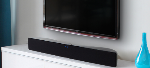
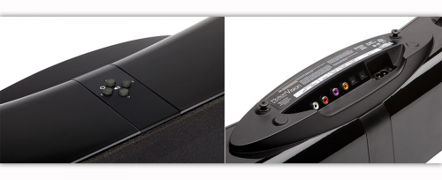
The Ultimate Single-Speaker Surround Sound System. Motion® Vision delivers 5-channel surround sound from a sleek and sculptural all-in-one system that’s stylish yet unobtrusive, simple to install, and easy to operate. Three advanced-resolution Folded Motion™ tweeters, four 4-inch high-performance woofers, and seven dedicated amplifiers deliver 100 watts of total system power. This is an awesome performer. If 5-inch height does not obstruct the viewing, it’s perfect. [ martin logan ]

 click > enlarge
If your day involves too much pinging, pinning, liking, sharing, checking in, following, digging and tweeting for your taste (and sanity), yet you can’t bring yourself to move completely off the grid, there’s an answer – a way to still be a part of your digital community, but in a refreshingly analog way.
A few months back Berg Cloud unveiled the prototype for their latest design, The Little Printer, a teeny tiny printer that uses the cloud to keep track of the tweets you follow, what your friends are up to Facebook and the pictures they take on Instagram, and relays that information in one nonaggressive ‘newspaper.’
“There’s a slightly nightmarish vision of a world full of glistening, super high-res Retina displays all over your house, a sort of Total Recall world where everything’s a TV,” Berg’s Jack Schulze told Co.Design. “These objects have to live in your home, connected, but they can’t all be ringing and pinging, winking and flashing all the time. They have to be kind of calm.”
With that in mind, Berg designed The Little Printer to make it possible for you to access the content from your social networks as well as your personal calendars and to-do lists in the comforting form of a newspaper, albeit a very small one. The Little Printer uses thermal paper, which is cheap (about .50 cents a roll) and, unlike a regular printer, doesn’t require toner. Better yet, every member of your household can use the same Little Printer for their own subscriptions, which they manage on an iPhone app, “so when Mom leaves for work at 7:30, the printer can have current news headlines, a “mini newspaper,” waiting for her to read on the train, along with a crossword and perhaps the most popular pictures from Instagram. When Dad takes the kids to school at 8:30, his daily to-do list could be ready at the door.”
But the really winning element of Berg’s design is The Little Printer’s face. They purposefully gave it a human face (that it prints itself), which might seem like nothing more than a cute touch, but it actually changes the way you think about the information and how you manage it on your many other faceless devices. You may be interacting with people all day long via email, Twitter, Facebook and all the rest, but unless you Skype a lot you’re not actually interacting with anyone face-to-face, and even then there’s a screen in the way. If everyone had The Little Printer set up on their kitchen counter or desktop, it might very well help to humanize their web-based existence, and maybe even serve as a reminder that real life happen offline.

about perrin drumm
 click > enlarge
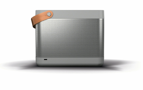
The boom box is back—again. Portable sound in the age of the IPad and Iphone has taken the form of an electronic picnic basket—the Beolit 12. The Beolit 12 features Apple’s AirPlay technology. Place a device in its tray top and it charges and plays. That link is simpler and surer than the Bluetooth used in such devices as Yves Behar’s brick like Jambox for Jawbone.
The basket, in graphite or blond colors, was designed by a 40-year-old Danish designer Cecilie Manz. She said, “I wanted Beolit 12 to have a clear expression showing its functionality and at the same time blending in naturally in people’s home. The natural leather handle invites you to move Beolit around—it makes it more approachable somehow.”
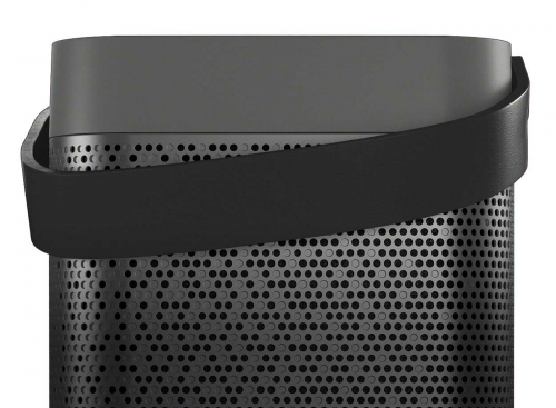
The look is new for B&O known for its Scandinavian modern space age electronics in the 1960s and 1970s. The work of Jens Jensen and his British born heir David Lewis, B&O was at its height in 1978, when the Museum of Modern Art gave the company’s work a show and has included some 20 of its pieces in the collection: the Beogram phonograph with its sliding tone arm, the CD player that magically opens when a hand approaches.
But B&O audio was never taken very seriously by audiophiles of whom there were many in the 1970s, before the focus of cool tech switched to computers. B&O stuff was for well off guys who wanted to impress women; in films of the 1980s it signaled the cad or villain.
The bright aluminum and glass of that look is absent in the Beolit 12, which just won the Red Dot design award in Europe, also echoes portable tube radios from the 1950s. Manz has designed several hand blown glass products, as well as lighting fixtures and furniture. On her web site is a wicker basket rendered in composites, foreshadowing the Beolit.
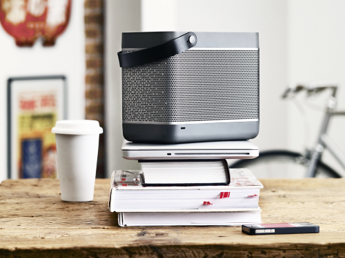
The company’s long time design consultant, David Lewis, died in November of last year. One of B&O fans of course was Steve Jobs, who happily adapted the wheel style controls of the first iPod from B&O phones. In January the company announced a new sub brand, supposed to be more accessible. But the Beolit 12 lists at $770. [ b&o ] [ cecile manz ]
<a href=" about phil patton
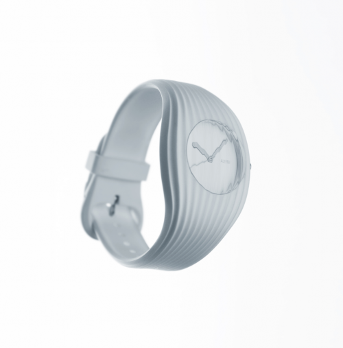 grow watch for alessi | click > enlarge
[DesignApplause] We are in the Alessi Milan flagship showroom at an open house showcasing new products. One new product is a beautiful wristwatch called the “Grow Watch” and with us is the designer of the watch Andrea Morgante. Andrea, please tell us where your office is located, how it’s structured, and what kinds of things do you do.
[Andrea Morgante] My office is in London. I started Shiro Studio roughly three years ago. It’s call Shiro Studio because I have an obsession with white and shiro means white in Japanese. A very good friend of mine came back from Japan and he just read a book titled “Shiro” by graphic designer Kenya Hara and the book talked about all the reasons why white is just an amazing color. The book hit a nerve, and started some very deep thoughts about a specific creative attitude. For example, white is more than just a color but rather a state of mind. It is about purity, about creativity. White is the paper, white is the blank slate, it’s both the emptiness and the everything, the endless possibilities.
During these three years I’ve been really busy completing a project I kind of inherited, the Ferrari Museum which is a project I started in 2004. Back then I was an associate director for Future Systems, a highly-recognized practice based in London. And when sadly the founder Jan Kaplicky passed away in 2009 the project was left basically orphaned. Soon after the client asked me to complete the building, which we eventually did, last March.
[DA] Andrea, are you an architect or product designer?
[AM] It’s architecture mainly, but I’m Italian and went to school in Italy before moving to London and design is a part of our DNA. Back in the “Golden Era” 50s and 60s, the major designers like Castiglioni, Colombo, Magistretti, were architects. There was no formal design school but they designed many products. So I was exposed to a culture where there is no clear boundary for what is architecture and what is product design. And even though European schools today now offer options of both architecture and design, for me the disciplines are one in the same.
[DA] In the U.S. formal education separates the disciplines. Designers and architects sometimes complain and wish both were melded together like early European educations.
[AM] They’re similar but for me here is the difference. I like product design because it is more immediate, it is more direct contact, between you and the design process and the outcome. You might say architecture is a confrontational process. You can have the most amazing idea, but in the end you need to interface successfully with a client, with a planning approval office, with engineers, with a contractor, a subcontractor, there are quite a few restraints. And it’s becoming more and more complex to actually complete a building. When it comes to product design, I found there’s more free expression because it is just you, the producer and the technology. And the responsibility is interestingly different in this way. You only design one building but a product, you produce hundreds, thousands.
Another aspect is scale. I find it inspirational to work for example on the 10,000 square meter museum and then shift to the wristwatch for Alessi. It’s such an amazing change of scale you can actually feel the brain working harder. Like a camera lens, whirring from wide-angle to macro.
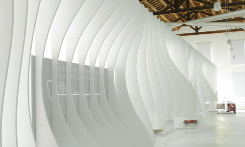 enzo ferrari house exhibtion
[DA] Is there an advantage in what order you master the discipline.
[AM] It seems very personal, probably what one learns first. And then there is who is good at both. We have seen famous architects fail miserably trying to design a product. And vice versa, a great designer trying to build something bigger and they mess up on the architectural aspects.
[DA] Is this watch the smallest product you designed to date?
[AM] Yes. And things get pretty small when you design a watch. Designing the hands is pretty amazing.
[DA] I was taught to explore both the smallest and largest applications of a design first. For a logo start with the business card. Then throw the logo on an airplane or truck. It gets even smaller today with app icons on smartphones. It’s a small world.
[AM] I recently met a friend of mine who is a graphic designer is designing a font for the Internet and he showed me how he is cutting into the letters so the corners are sharp given the small size of the font. I didn’t realize that kind of detail was necessary. It’s rather beautiful. It is possibly the smallest thing you can design.
[DA] This is your first watch. I know a little bit about how Alessi selects their designers. How did you even get asked?
[AM] (Chuckle) Then you know the designer selections go through Alberto Alessi, that is his role within the company. And considering the roster of designers selected it is quite a privilege to be asked. When I go there to present something his desk is a bit unsettling at first because there are so many amazing objects, sketches, magazines, everywhere, not a lot of space to lay down a drawing. Because of this, when I go there I present possibly 8 to 10 ideas on A4 sized paper so at least I know it’s going to fit on the table. The last time I came in I brought a watch idea, though they didn’t ask for one, and I dropped it on the desk. And he grabbed it immediately and said this was quite interesting and let’s take this idea forward.
This moving forward is done in different stages. There’s an analysis to gauge product interest. From there you go into a physical-study phase. It’s a long process.
[DA] The styling on your watch mirrors a style seen in your architecture. There is a flowing, wave-like visual on the skin of the structure.
[AM] The scale of the object or structure may dictate characteristics. The concept exploration would always include my passions. There is also a technology language being spoken. I have been intrigued the last few years with the ribbing you find in nature. It’s not only beautiful but there are structural properties of ribbing such as strength and rigidity without the volume and weight. In architecture in would mean less material needed for support which could lessen the financial burden. And visually there is both a feeling of fluidity and weightlessness.
A watch does not demand structural strength like a building and the use of ribbing here does communicate a variety of possibilities. For example, if you suggest muscle fiber the ribbing transcends to fibers. So structurally the ribbing has no specific function but I discovered how the watch and the hand and wrist can communicate harmony through a muscular anatomy. I studied numerous anatomy drawings to reach these conclusions. It was an amazing discovery. The watch now feels to me like it has grown around your wrist. It’s become very life-like and comfortable. That’s why I call it the Grow Watch.
[DA] What is the watch skin material? And did you specify the material?
[AM] It’s polyurethane, a very versatile and resistant material. It was specified together with Seiko Japan who is the business partner with Alessi for this watch. Seiko was very happy with this choice of material as they have the engineering and manufacturing experience. Seiko was extremely open to explore new languages and solutions. Like the integration of the glass and the case which they had not done before. The solution was to respect the grow concept where the grooves found in the wristband and shell grew into grooves found in the glass. We were all surprised how readable the watch is considering the grooves on the glass. One of those delightful moments, you know.
[DA] Is your vision that this is more of a dress watch than an everyday watch or a specialty watch like a sports watch as it looks like it can take moisture.
[AM] That’s really difficult for me to say. I will say I like to run, usually three times a week, and I’ve never used a runner’s watch. If something works then it will work under almost any conditions, keeping its visual “Raison d’être” dignified. And yes, it’s waterproof.
[DA] How was color determined?
[AM] It was an intimate choice, colors I deeply relate to. Then Alessi suggested black, as apparently that is the color most people wear. We wound up with five colors: black, pure white, Yves Klein blue, fluorescent orange and yellow, the same yellow of the Ferrari Museum’s roof.
[DA] Are your solutions green, i.e., a low carbon footprint?
[AM] I try as best as I can. You know, many years ago green was still perceived as a sign of being contemporary. But today it is just mandatory. Even from the production side. The people I collaborate with, like Alessi, you’re already engaged in discussions concerning what’s renewable, what’s recyclable or even repairable. Another point of view is whether a design is useful and needed. If you’re creating something new and useful and not repeating what already exists, that can be considered even more environment friendly. Today’s the challenge is to define and create new typologies, that did not exist yesterday, and that is far more challenging than designing a new sofa.
[DA] Is this a man’s or women’s watch?
[AM] It has to be both. How horrible if it is only a man’s watch… It is good to blur some boundaries. Now this watch is quite over-sized but as you can see here, it looks good (we are in a crowded showroom and we have at our disposal several women’s wrists) on the thin wrist of a woman and for a woman the watch also becomes a bangle.
[DA] Other than scale were there any other challenges creating the watch?
[AM] Every time you design something you are inevitably communicating a message. And the message is better to be relevant, meaningful. The message should reflect contemporary values. And this is not easy at all. Alongside this challenge we are working in an over-saturated design environment. How to say something intelligent when building another chair or lamp? This to me is the challenge I face, every single day.
[DA] What’s next?
[AM] With regards to Alessi, this is my third project with them in two years and I feel we are now establishing a strong relationship. I am completing some new projects, where I am trying to re-define new typologies, so I guess I will fly soon to Crusinallo and pitch some of these new ideas to Alberto and his team.
[ vitals ] Andrea Morgante is a registered ARB Architect in the UK. After working in 1997 with RMJM in London he joined Future Systems in 2001 where he became Associate Director, working closely alongside the late Jan Kaplicky. In 2008 he collaborated with Ross Lovegrove, to develop a number of innovative architectural projects. Currently Andrea Morgante is supervising the construction of the Enzo Ferrari Museum in Modena for Fondazione Ferrari and designing for companies like MGX, Agape Design, Poltrona Frau and Alessi. [ shiro studio ] [ agape ] [ alessi ] [ enzo ferrari museum ] [ marsotto ] [ poltrona frau ] [ seiko ]
 click > enlarge
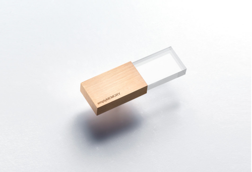
If what we store on our flash drives is important enough to back up lest we lose it forever, why do we toss the physical drives around without a second thought? I used to keep my flash drive on my key chain where it rattled around against relatively sharp metal objects and got crammed into the black hole of my purse, trusting a little plastic cap to keep all my most important files safe. At the designboom mart at ICFF I saw a design team who’s getting people to rethink how they treat their flash drives with a collection made from materials as precious as your files.
Logical Art is a small operation run by Yoo-Kyung Shin and Hanhsi Chen, who spread their time between Korea, Taiwan and the UK. Together they’ve created Empty Memory, a line of flash drives made out of wood, plexi and stainless steel as well as more luxurious offerings in silver, gold and rose gold. The plexi/wood model is the most streamlined of the bunch, whereas the metal drives have a more complex geometrical finish. You can buy them directly from the designers for $75-$95.


Chicago reminds everyone that the city embraces the bicycle as evidenced in new bike lanes seen behind the Merchandise Mart. The lanes promote bikes and bike safety. Here are five well-designed bike safety products you should put on your gift list.
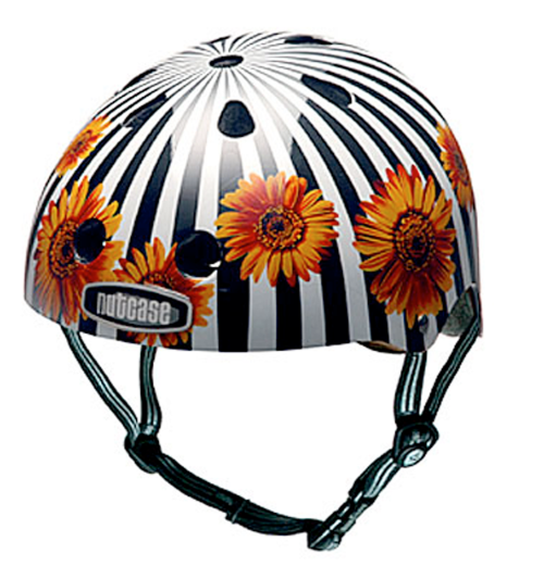
Feel dorky wearing a bicycle helmet? Nutcase creates an aesthetically dis-pleasing, strictly utilitarian experience. Helmets seemed made to be ripped off as soon as possible. [ nutcase ]
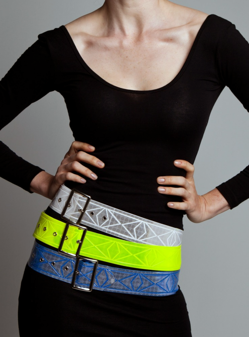
Vespertine Cinch Belts offer a subtle pattern of intertwining diamonds wraps around the extremely reflective ANSI approved material of the Cinch Belts. They even reflect in the rain! [ vespertinenyc ]
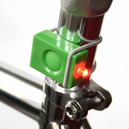
Bookman bicycle lights. Stylish, luminous and pocket-sized. A slim, detachable bike light from Bookman, a Stockholm based company that makes accessories for bikes and people on bikes. [ bookman ]
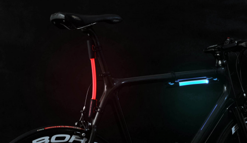
Fibre Flare™ is a portable self-contained flexible solid core side emitting fibre optic element interposed between two electronic housing ends. Inside each of the housing ends is a single high intensity LED. Water resistant silicone outer housing. Powered by 2 x ‘AAA’ batteries. [ fibreflare ]
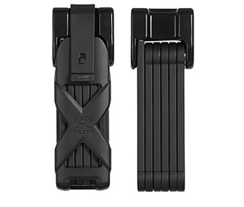
Ok, you’ve made yourself safer. What about your bike? The innovation for all cyclists, whether hobby cyclists or pros protects two-wheels with a high theft risk using this foldable lock. [ abus bordo granit x-plus ]
 click > enlarge
File it under brilliant, Jake Frey’s NeoCover is a magnetized light switch cover that makes it more convenient than ever to hang up your keys the moment you walk through your front door. You don’t even have to go as far as tossing them into your key bowl or dish or whatever you’re currently using, just place them against the light switch the moment you flip them on.
You may have seen Frey’s first version of the Magnetic Light Switch Cover, which came out last year, but he’s just released a new “enhanced” model and dubbed it NeoCover. This heavy duty upgrade can hold up to 27 keys and any other metal object, like bottle openers, lighters, a dog leash, even a hammer. It comes in standard white but you can request a custom color job or 2-, 3- and 4-switch models. Who would have thought a light switch cover could ever be so useful?


 click > enlarge
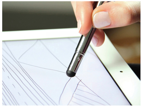
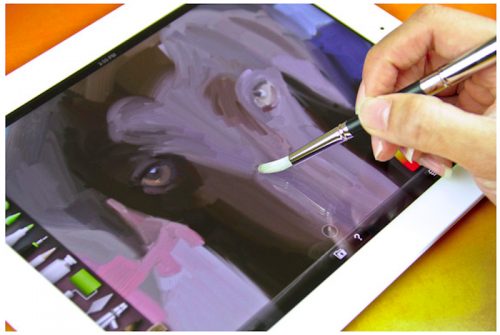
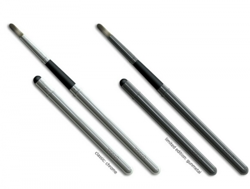
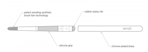
Artist Hardware, an arts materials company the produces Field Portage bags, notebooks, sketchpads and paintbrushes, is about to release the Sensu Brush, a paintbrush designed specifically for the iPad.
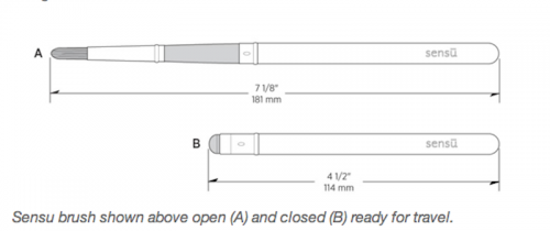
“Sensu is two very useful tools in one. A brush and a stylus for capacitive devices like the iPad and iPhone. The rubber stylus is exposed when the brush is closed. This stylus is great for sketching and writing or as a general navigation tool. Grasp Sensu near the nib section and pull it out of the protective cap. You will reveal the capacitive bristles of the artist brush. Insert the rubber stylus into the cap and the cap becomes a handle for your brush.”
Artist Hardware funded Sensu with a successful Kickstarter campaign, and now, six months after it ended, they’ve finished production on the brush and have begun sending them out to backers. The reviews are starting to come in, and so far they’re all positive.
“We were really impressed by the way the Sensu Brush works as a stylus or pointing device. The chrome-plated brass body feels light but stable in hand. The length of the stylus means it fits perfectly in the crook of our hands between thumb and index finger when used in pen/pointer mode. The smooth sculpted shape of the stylus body/brush cover is simply lovely. We felt it was one of the most natural and balanced styli we have used. It seems just about perfect for long sessions writing, sketching, or painting. Of course, everyone’s hands are different, but we think the Sensu is spot-on as a stylus.” –ipadcreative
It won’t be on sale until May 25, which – yes – falls after Mother’s Day, but nothing says Mother’s Day nostalgia like an I.O.U. gift. But this time you’ll actually deliver, right?

 click > enlarge
When Yamaha was developing a new amplifier, they realized that most amps available to musicians are best suited for live performances, not for personal use and most definitely not conveniently transportable. Not that you can’t get a good, small-sized amp with a handle, but the new THR Amp is about the size of a shoe box so you can comfortably carry it with you. It boasts a range of effects and superior sound quality, but as a non-musician I’m not going to deny that I like it for its homage to vintage sound equipment design.
It has “the tone and response of a tube amplifier, hi-fi stereo output for playing along with a backing track and a range of effects to modify the tone,” like Modern, British Hi Gain, Lead, Crunch and Clean. It also has four dual effector circuits: Chorus, Flanger, Phaser and Tremolo. Watch the instructional lab video to see and hear a demonstration of the range of sounds.


There are few different models in the THR line up. See the specs and enter to win one of your own.
All content ©2007 > 2024 DesignApplause
Notifications