 click > enlarge
Industrial designer Jordi Blasi specializes in minimal, practical and, most importantly, durable objects, like outdoor trash bins, large modular seating units and bottles for commercials products like beer, milk and tomato sauce. One of his most recent projects is Branca, a standing “simple and functional coat hanger” that you could use in your home, but its intended for more heavy duty repeated, daily use in an office.
The first thing you might notice when you look at all the components laid out (see image below) is that there’s not a lot there – only seven pieces: a painted steel body and base and hooks made of injected strengthened plastic. By eliminating excess components – even nuts, bolts and screws – Blasi not only simplifies the assembly process and minimizes the packaging, he makes it much more economical – a major factor for anyone outfitting an entire office building, for example. Plus, it’s not as if he sacrifices on design. I love how the hooks can be used as knobs or as loops for coat hangers.


about perrin drumm
 click > enlarge
Maybe I’m a bit of a museum geek, but I love hearing news about what artworks museums acquire for their permanent collections. My enthusiasm goes double for design objects since they tend to receive less focus than fine art. That’s why I was so excited to learn that The Shop at Cooper-Hewitt recently acquired Sarria, a basket made by Catalan architect Lluis Clotet for Alessi.
The collection started with Foix, a round serving tray. Those same rumpled edges are amplified in Sarria, which is made from the same steel colored epoxy resin, now in super black, a new color version made with a special epoxy. It’s uniquely waterproof – pour any liquid over the surface and it will run off without wetting the basket at all. You don’t have to wait for Cooper-Hewitt to exhibit it, either. Sarria is for sale from the Cooper-Hewitt’s gift shop for the modest price of $75 (it’s $130 everywhere else).
More about Clotet, from Alessi’s bio:
Born in Barcelona in 1941. He receives the architecture degree in the “Escuela Técnica Superior de Arquitectura” of Barcelona in 1965. In that school, he was a drawing teacher from 1977 to 1984. During the 95/96 and 96/97 courses he was a visiting professor in the P.F.C classroom and Projects I and II teacher in the 97/98, 98/99 and 99/00 courses. In 1964 he founds Studio Per in cooperation with the architects Pep Bonet, Cristian Cirici and Oscar Tusquets. With the latter, he collaborates in multiple projects until 1983. In 1984, he joins in partnership with Ignacio Paricio for the architectonic production until the year 2008. He is also a founding partner of the firm “B.D Ediciones de Diseño” There are collections of his work in the Modern Art Museum of New York (USA), in the Industrial Design Centre Georges Pompidou in Paris (France), in the Architecture Museum in Frankfurt (Germany), in the Bonnafort Gallery in San Francisco (USA), in the New York World Gallery (USA), and in the Columbia University (USA).


about perrin drumm
 click > enlarge
It took designer Jasper Morrison four and a half years to perfect his new line of outdoor furniture for Kettal. The stackable tables, chairs, a sofa and lounger were made especially lightweight to make moving them into winter storage as easy as possible. The collection was shown as part of Kettal’s display at Salone del Mobile in Milan, along with pieces by their other designers, like Patricia Urquila.
Apparently, it took Morrison almost five years to design the collection because he spent much of the time researching outdoor furniture products, analyzing standard codes and testing materials for durability. I like his clean, streamlined collection because it reminds me of the simple, well-made, modern patio furniture my grandparents had in their backyard. Like Park Life, those pieces were built to last. In fact, many of those pieces currently furnish the pool area at my cousin’s home. That kind of generational lifespan is one of Kettal’s biggest selling points – along with considered design, of course. Morrison took ergonomics seriously in his approach to make leisurely summer afternoons as comfortable as they ought to be.


about perrin drumm
 click > enlarge
The CONST Lamp by Thailand-based Thinkk Studio first struck me with its odd mix of materials and shapes. An octagonal base is anchored only by the weight of a hunk of marble with a stepped-out, ridged design for holding pens and pencils. I’ll admit that at first I wasn’t sure what to make of it. I like that it incorporates elements of play – not just the call back to handmade wooden toys but the motion of adjusting the lamp feels a bit like playtime. And now, after coming back to it every day for the past few days, I have to say it really delights me. I love that it’s technically a marble lamp that’s the complete opposite of everything else a marble lamp has ever connoted. Moreover, it’s so different from every other desk lamp I’ve seen lately. It’s not sleek. In fact, it’s clunky, and this is probably the first time – for me, anyhow – that clunky isn’t a bad thing at all.
If you’re in Milan you can see it for yourself at At Spazio Rossana Orlandi. From the designers:
“The main idea behind the desk lamp CONST are three basic components; base, body and shade. Keeping in mind these simple elements and their role, The design playfully combines expression with function. The marble base keeps the octagon-shaped wood body balanced and at the same time, one can adjust the angle of the shade by rotating it. Reminiscent of playing with block toys, CONST gives one the ability to have fun with functionality.”


about perrin drumm
 click > enlarge
Sometimes design weeks can really burn you out. You start each day fresh, but as you’re assaulted by one fabulous chair or sleek table or spectacular lamp after another you start to fade out. Full disclosure: I’m not in Milan this week but I bet that if I was and I was starting to zone out, Hilla Shamia‘s “Wood Casting” would snap me right out of my design induced stupor.
Shamia is an Israeli product designer who works mainly with metal and has only recently begun to introduce wood into her pieces. Her first products featured a range of metals in varying states of rust and decay, but now her products use mostly shining aluminum fused with the warmth of wood.
Her “Wood Castings” (shown here) are made using a whole tree trunk. Molten aluminum is poured directly into the wood, burning the exterior. A plank is then cut lengthwise, flush with the metal base. The final result are unique, one-of-a-kind pieces, their shape and fusing determined by the type of the wood and the pour of the molten metal itself.


about perrin drumm
 click > enlarge
Designers Ronan and Erwan Bouroullec hit the ground running early on in their career, snagging commissions from Cappellini, Issey Miyake, Vitra and later Magis, for whom they’ve designed two furniture collections including the Pila chair and Pilo table which debuted in Milan this week. It’s almost impossible to say that it resembles their other projects because with a portfolio that includes store design and iPad apps along with furniture, lighting and housewares their work is so diverse it defies categorization. The common link would be craftsmanship and intention of design, which the designs speak to:
“With Pila, our intention was to design a chair that would be brought down to its minimum, using the least quantity of material and assembling items. The plywood seat and back parts of the chair are supported by four very thin sticks in solid wood which are maintained together by a structure in injected aluminum that is almost invisible. The back of the chair, like the blade of a knife, subtly comes into the main frame while guaranteeing high support resistance. We wanted this chair to be as light as possible, to almost float in the space as if it would stay on its feet by magic.
“Pilo answers the same quest for lightness and additionally proposes an open system that allows to compose a table that goes with one’s needs and wishes. Pilo is a table reduced to its minimum: solid wood feet that support a wooden top thanks to discreet and strong aluminum connections.”

>
“>

>


about perrin drumm
 click>enlarge
Stockholm-based studio Claesson Koivisto Rune have an impressive showing at Milan Design Week, with over twenty projects being exhibited at thirteen different booths, but out of all their impressive work that includes furniture as well as architecture, I like Ray, the LED pendant lights made for the Dutch retailer NgispeN.
Named after the rays of a sun in a child’s drawing, the shade is laser-cut from thin metal that can be bent or adjusted into a variety of angles. Clustered tightly together, the light will focus strongly on one point, but open up the rays and you get a softer effect. The lights look great clustered together in one color as well as in multiple shades (I smell a restaurant interior…) or alone. Even though this takes its inspiration from children’s drawings, I could really use something bright and cheerful in my grown up apartment. Let’s hope NgispeN makes them available to the public soon.
You can see the light at NgispeN’s booth as well as the Temporary Museum for New Design in Superstudio Piu. [ claesson koivisto rune ]


about perrin drumm
 click > enlarge
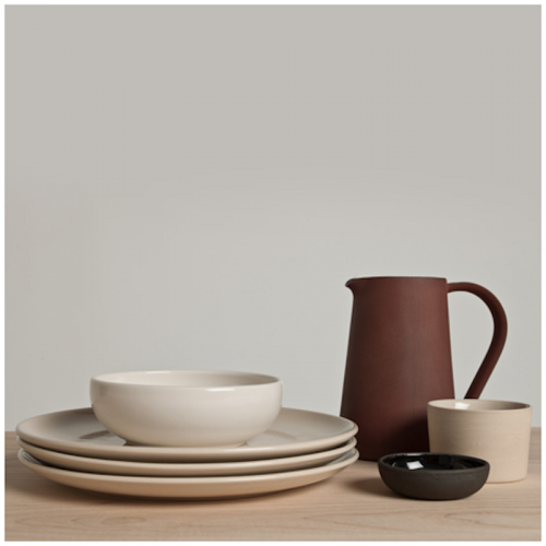
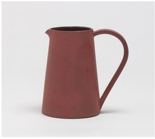
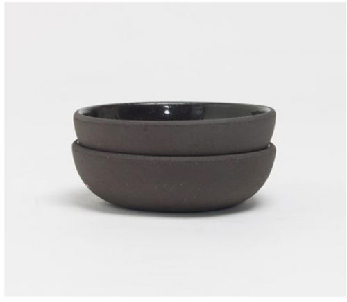
I’ve long been a fan of Another Country’s contemporary craft furniture, especially their Series Two dining set, but they’re also a great example of how a furniture company can increase their brand visibility by selling other home products made by designers and craftsmen who share a similar aesthetic – like Ian McIntyre, for instance. Another Country debuted his tableware collection, Another Pottery Series, during London Design Week last year.
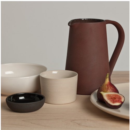
The hand-crafted collection includes a jug, plate, bowl, cup and something called a pinch pot, which gets its name from the original process, which didn’t involve a potter’s wheel, but consisted of simply pinching the wet clay together to form a small dish. All the pieces are made using a Jigger/Jolly process wherein “a piece of clay is placed into a spinning female mould and a male profile is introduced, squeezing the clay between the two surfaces. Mould and profile come together and any excess clay squeezed out by the process is trimmed off. This project,” McIntyre goes on to say, “explores the aesthetics created when the clay does not fully fill the moulds.”
More specifically, “the jug is slip cast and made of Terracotta which has been fired to an unconventionally high temperature that vitrifies the body of the clay giving it the strength of stoneware and achieving the scorched colour. The pinch pot is black stoneware, the bowl, cup and plate are sandy stonewares. The clay shapes are pressed on these machines and then fettled, dipped in glaze, fired and polished.”
Right now only the pitcher ($79) and pinch pot ($21.50) are available for sale online to US markets.


about perrin drumm
 click > enlarge
RISD furniture design student Joseph Guerra has a noble ambition “to design useful, mass market objects that exhibit a simplicity and beauty that challenge traditional societal notions of value.” This is a goal he’s gotten closer to reaching over the past few years. Much of his early work is more art object than practical design. His latest piece, Utility Mirror, is probably the most practical, but his Flashlight is, to me at least, the most beautiful.
The flashlight’s components are housed in a CNC-cut cork case that can be disassembled to replace the batteries, making production easier. But that’s not the only practical aspect of this design. The fact that its rectangular and sits flat instead of rolling around like a typical flashlight is, perhaps, one of the unintentional bonuses. Not unintentional at all is the choice to use cork and a contrasting white handle. Cork is one of my favorite materials, and I love to see used thoughtfully or unexpectedly. Flashlights are usually made of cold, hard metal, but Guerra makes the flashlight a touchable, almost comforting object, one that you want to leave out instead of tucking it away into the tool shed.


about perrin drumm
 click > enlarge
Sofia Lagerkvist, Charlotte von der Lancken and Anna Lindgren of the Swedish design studio Front recently created the Collage chair for artisan furniture manufacturer Gemla. Front combed through Gemla’s archives for inspiration and came up with a collage, so to speak, of the company’s history of products.
Once you look you can see many different chair designs at work here. The legs and rounded back bar remind me of classic midcentury cane chairs, but the shortened backrest recalls a lounge or side chair, while the webbing is reminiscent of vinyl pool furniture. Clearly, the Collage chair, with its supple, dyed leather and handcrafted wooden base is a far cry from patio seating. And unlike other furniture manufactures, Gemla has an in-house team of woodworkers and craftsmen that make their pieces. Collage is not for sale directly from the site. Rather, it’s made to order to enable the client to choose their own colors and materials


about perrin drumm
 click > enlarge


