 click > enlarge
Le Moutin Noir literally translates into The Black Sheep, a name the founders of Le Mouton Noir & Co. explain they chose because, “For many years we have followed the herd like a flock of sheep. Working hard, learning and growing, we have never let go of our dream. The black sheep finally wakes up and steps forward to have some fun.” Fun is the operative word here. The designers they feature promote their goal of introducing “fun, quirky, safe and interesting design products…that bring a smile to your face.”
One product that does just that is the B.B. bank, a piggy bank that sits the pig back on its hind legs and shows off its big Buddha belly, though the idea was actually inspired by the pregnancy of Le Mouton’s founder’s wife. When George Lee saw his wife’s belly grow bigger and bigger it apparently reminded him of how much it would cost to raise a child. According to Lee, “I went on the hunt for a piggy bank to help mark the start of a new life and savings for that future boy or girl. I found a loss in the market for a classic style piggy bank with any sort of design appeal. So I got to work on my own interpretation of this timeless piece adding meaning behind it and an eccentric design twist.”
My favorite product in Le Mouton’s repertoire is the Tie Tea Mug, a classic white mug with two notches cut out near the handle for you to tie the string of your tea bag around so it won’t fall inside. This mug accomplishes what I love best about design – how the slightest alteration can completely change the functionality of an object. See more of Le Mouton’s product line as well as their list of stockists.


about perrin drumm
 click > enlarge
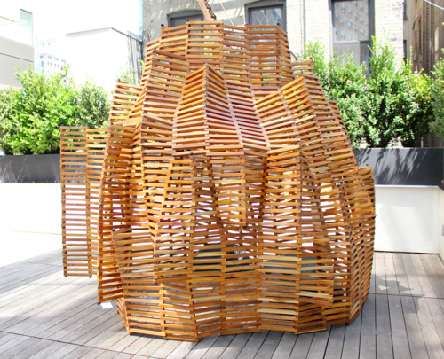
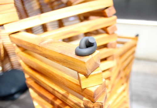
Who says you’re too old for a fort? Made from rich hardwood, Matt Gagnon‘s Knit Fort is decidedly grown up. The wooden pieces are stacked like Linkin’ Logs and stitched together with a rubberized cord, creating a flexible structure that can be tailor made to suit your space. Gagnon assembled this particular structure on the outdoor patio of the Standard Hotel as part of the “Hotel California” show for Noho Design District. He also suggested it could be used for a terrace sunshade, conference room dome, outdoor shower or living room cabana, whatever that is.
When I came across it, two grown men were sitting inside on floor pillows engaged in what seemed like a very serious conversation, oblivious to that fact that people nearby could hear them. When they left I ducked inside to give it a try. Sitting in the cozy little space with sunlight warming the wooden slats, you feel safe and distant from the world just outside and could very easily lose yourself in intimate conversation with a friend.
This may be Gagnon’s first fort, but it’s similar to his other work in that it shows what he describes as “an obsession with material and process, old craft and new technology.” He’s worked with woven wood before, too, in his Squeeze Lamp and Scissor Doors. See the rest of his work on his website.


about perrin drumm
 click > enlarge
When I came across Peteris Zilbers‘ Moodbroom at ICFF this weekend, I thought the designer had cleverly repurposed unloved push brooms into a creative lighting element, and I was actually disappointed to learn that the Moodbroom is, in fact, a brand new object made from wood, plexiglass and an unknown composite material, not, as I had hoped, from recycled materials.
Zilbers’ design asks the question, “What happens when an ordinary household object like a broom is re-imagined?” His answer is a lamp that “plays with function in everyday objects and engages users in a game that alters perceptions of a common item.” The lamp is controlled by a remote that allows you to change the light to any color of the rainbow, or you can set it to rotate through the spectrum.
You can’t tell from the pictures, but the ‘brush’ part of the broom is incredibly heavy – so heavy that I couldn’t even lift it. Yes, I have weak arms, but I shouldn’t have to be a body builder to lift a lamp. Besides, even if you don’t have a problem with the Moodbroom’s weight and materials, what about that cord? In such a simple design the cord seems like a blaring distraction and a huge flaw. Overall, repurposing the traditional broom shape into a light doesn’t strike me as a real stretch of the imagination, and the finished project has too many unconsidered elements to justify its hefty price tag ($500+).


about perrin drumm
 click > enlarge
Though Oscar Tusquets Blanca is an “architect by profession, painter by vocation, writer out of the need to make friends” and a designer only “by adaptation,” it’s his design work we’re most excited about, especially his latest piece, the Fontal Chair, which the Spanish furniture manufacturer, Expormim, presented in the Salone del Mobile in Milan last month.
Cane chairs were popularized with Marcel Breuer’s 1928 Cesca Cane Chair, which paired a rattan seat and backing with a bent metal frame. Blanca’s design is more of a return to basics, not only in his use of traditional rattan, but because he doesn’t combine it with more modern materials. It’s simple and elegant, suitable for the kitchen or for a more formal dining table. I’d also imagine it promotes good posture. While it’s beautifully crafted that back looks none too comfortable. Here’s what Blanca himself has to say about his design:
“The project was born from the desire to take back rattan as a noble material, building on the rich tradition of craftsmanship in our country that supports its use. To that end, we tried to give the hundred-year-old technique a new look, which was achieved by substituting the traditional strutting and joint wrapping for a twinning technique to join one reed to the next. With this innovative option, we created a flexible yet resistant structure that is very lightweight. A light, warm, charming and luxurious, in the true meaning of the world, chair.”


about perrin drumm
 click > enlarge
Industrial designers Irina Kozlovskaya and Aaron Tsui founded Vim & Vigor Design in 2009 after graduating from RISD. For a young studio their work is pretty advanced, especially where materials are concerned. They made the Barnes & Noble NOOK Tablet and all its accompanying gadgetry, like the silicone reading light, stylus, stand and collection of covers. But for all their high-tech design work, they’ve grown nostalgic for the “countless hours” they spent in RISD’s metal shop, so they decided to create a product that pays “homage to the vanishing art of hand-spinning metal.”
Metal spinning is a bit like using a pottery wheel. Each cup or bowl starts from a spinning piece of metal that’s shaped with a lathe. The technique is age-old, but Kozlovskaya and Tsui had a chance to visit a metal shop during college and witness the process firsthand. In their latest product, the SF (Spin and Fold) Lamp, they incorporated the craft of metal spinning into a flat piece of metal that’s spun into one of three patterns – obtuse, acute or intermediate – but to keep the lamp mass produceable the handmade aspect ends there. Once the flat metal piece is painted in either silver/white or black/bronze, it’s folded along a perforated line and then shaped according to size of the piece of metal it was made from, ranging from very skinny to wide.
Quotes via fastcodesign


about perrin drumm
 click > enlarge
I like that Stefano Pugliese calls his latest furniture collection a ‘family.’ According to Pugliese, the Furniture Family is from Chitaly, or Italy and Chile, the two countries where the pieces were made. The simple, plywood forms are already childlike and playful, and by calling the whole set a family it evokes images of afternoon playtime or sitting down to breakfast with your children.
But there’s also a formal elegance at work here. Pugliese lets you see – in fact wants you to see – the joinery between the seat or the table top and the legs, and because this normally concealed aspect of furniture making is exposed, he takes full advantage of it by joining the stools together with fun and whimsical shapes. There’s an exclamation point, an X or a plus sign and a single line with two dots that become a round face.
Pugliese said the design was born from “a formal exercise that explores the mechanical and aesthetic value of plywood paired with black Raystone, which is a 100% organic petrol-free bio composite board produced from the waste of sugar production. Through digital controlled cutting technology and simple finishing work, the project seeks to deliver different solutions starting from a single type of joint. Like all members of a family, all pieces are slightly different but similar.”


about perrin drumm
 click > enlarge
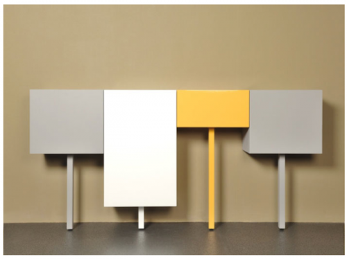
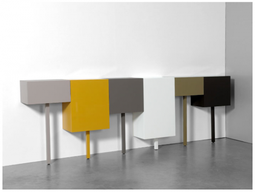
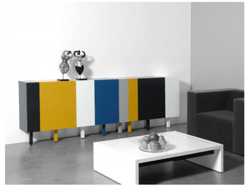
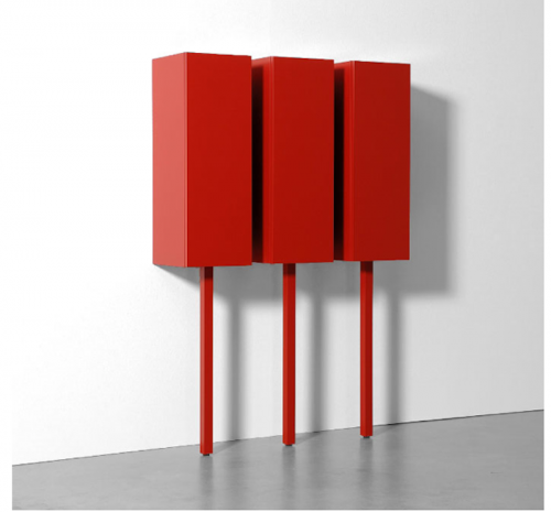
Sticks aren’t a brand new design, but since I’ve never seen a cabinet system quite like it I think deserves some attention anyway. Made in 2011 by Gerard de Hoop, a product and interior designer based in the Netherlands, Sticks come in four different heights and widths and a variety of colors, so you can customize them to fit the needs of your space. They can be used a lowboard, sideboard, small wardrobe or as a single loose cube that can serve as a nightstand or side table.
Which brings me to their best design feature (if it wasn’t obvious already): they stand on one leg, making them the pirates of the cabinet world. Really, their one-legged-ness comes from de Hoop’s devotion to minimalism, so minimal, in this case, that he did away with 75% of the product’s base. Still, they’re just as stable and function just as well as their quadraped counterparts.


about perrin drumm
 click > enlarge
Is it just me or does the Medici chair by Konstantin Grcic, a Munich-based industrial designer, look like a much improved version of the classic Adirondack chair? Not that I don’t like the Adirondack chair – I have half a dozen on my back patio – but Grcic’s chair is the meeting point between American NorthEastern traditional and European chic.
Designed for the Italian furniture manufacturer Mattiazzi, the chair was actually “born” on their factory floor. Grcic said “The chair was inspired by the material, the machinery and, of course, the skill and craftsmanship of the people we worked with…Right from the beginning, I was looking for a distinct grammar for my design, a language that would express the characteristics of wood. I liked the idea of working with planks. They signify the very beginning of the production process – a tree trunk that is cut into slices. I like the way in which a carpenter joins wood. It is immediate and direct. The construction remains visible and easy to read. Structure turns into form.”
Medici comes in three different kinds of wood: Walnut, Douglas Fir (in natural and yellow) and, for outdoors, thermo-treated Ash.
“Designing for Mattiazzi was like a personal time travel. It took me all the way back to my professional roots. At the very beginning of my career, I was trained a cabinet maker. Working with wood is what I learnt from scratch. It is where it all started for me.”


about perrin drumm
 click > enlarge


