 click > enlarge
It was easy to miss the small DMY satellite show where Veronika Wildgruber‘s craft-focused products were on display earlier this summer, though I wish I hadn’t. The attention she pays to every aspect of the design process, from concept to execution, is clear even just by looking through her website. Because she has a knack for making hard wood appear soft, the Berlin-based designer describes her work as “simple and surprising.”
The best example of this is Soft Wood, a limited edition collection of chairs that, at first glance, appear to have upholstered seats and backrests but are actually made from wood. Her Wood Bulbs series has a similar soft look, with rounded edges that mimic the form of a traditional bulb, though these are fitted with LEDs. Little Creatures, her latest collection is a modular storage unit that can be stacked one on top of the other for a tower of handmade wooden cubicles, or used alone on the ground, where “they look like little living creatures who conquered our spaces. A bit familiar, a bit strange.”
See the rest of Wildgruber’s work, like her clever Hand Towel, which is equal parts dishcloth and oven mitt.

about perrin drumm

click > enlarge
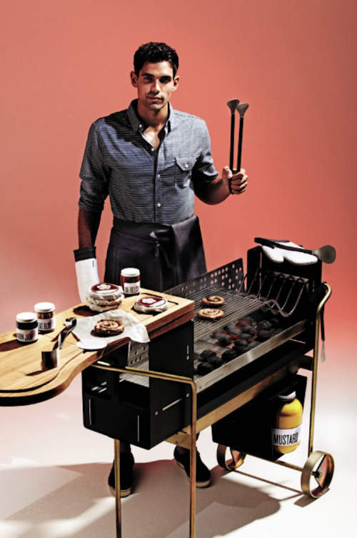
Just as the kitchen has evolved from purely a work space to a hub of chatter and bonhomie during the pre-dinner party social hour, so should the outdoor kitchen – aka the barbecue – be a location for the host to engage with his or her guests. For some reason, however, the bbq hasn’t followed the same evolutionary path and, more often than not, is still kept distinctly separate from the rest of the party, meaning the host is left to cook in solitude while everyone else has fun. With this in mind, Wallpaper* asked Zurich-based design Alfredo Haberli to create a bbq that was also a social destination.
For his barbecue, Haberli worked with metals specialist Kim Stahlmobel to create a mobile grilling station made from a mix of oak, yellow zinc-plated steel, brushed stainless steel and painted steel with a tool set made from hand-forged stainless steel. The barbecue is quite lovely as far as barbecues go, with a rich wooden work station and minimal wheels and legs, but frankly I don’t see how it’s any more conducive to backyard chit chat than any other barbecue, unless you’re chatting about the nice bbq or its cute operator.
Perhaps Wallpaper*’s reasoning is that they brought a whole party of designers together for this collaboration? Aside from Haberli and Stahlmobel, the magazine asked London-based Argentine chef Diego Jacquet to provide something yummy to grill. He obliged with chorizo criollo, a coiled sausage made from British pork and Argentine beef. Frankie Harrington and Cord Jarvie of Canadian sandwich shop Meat & Bread supplied the condiments and created a meat rub made from fennel, coriander and star anise. “The set is rounded off with a supersized jar of their signature mustard, all housed in a herringbone box created by the duo’s design collaborators Glasfurd & Walker. Made from 700 pieces of wood to echo the shop’s countertop, its animal logo is revealed when it’s empty.”

about perrin drumm
 click > enlarge
Some of our favorite designers are represented by De La Espada, which is why we were excited to get a little taste of what they’ll be showing during the London Design Festival this September. This year they’ll return to The Tramshed event at designjunction, where they’ll be showing special exhibitions from Autoban, Matthew Hilton and Søren Rose Studio.
“A celebration of authenticity, creativity and innovation, The Tramshed is a carefully curated event with a diverse selection of both established and emerging companies. designjunction, this year in central London’s disused Sorting Office, is a stimulating place for design, culture and entertainment.”

Autoban will exhibition their second of four site specific installations schedule for 2012. Spread over 1,000 square feet in The Sorting Office, environment has an ethereal depth created by multiple layers of sheet material and the passage of light. The spatial organization highlights the interplay between the product, the space and the visitor. New products launching at the event include Cloud Table, an oversized wood dining table inspired by the organic forms of clouds; and Master Chair, an upholstered dining chair with a slender wood frame. Each will be available in a choice of four hardwoods: oak, walnut, chestnut and ash. The new products will be displayed next to classics from the range.”

Matthew Hilton will use the festival to launch Mary’s Chair and Mary’s Side Table, two new pieces of furniture inspired by a trip to the Cathedral of St. Mary of the Assumption in San Francisco. Apparently, Hilton was moved by “the contrast of the oppressive weight of the concrete structure and the release of the swooping, expansive space within. Mary’s chair and side table are inspired by this experience. Crafted in solid hardwood, American white oak and American black walnut, the side table with a marble top, the forms are substantial yet delicate, sculptural yet highly functional. Also launching are Misty sofa, a cool and brooding design with an exposed timber frame and a cast iron leg; Misty coffee table in the same materials and design language as the sofa; Pole Light, a functional timber reading lamp with brass detailing; and a new version of the existing Horizon Coffee Table, with larger overall proportions.”
>
Søren Rose Studio (top of post) will also release new products from their Park Avenue collection, including P.A. Bed, a solid wood bed with a light expression; P.A. Bookcase, a timeless, expansive storage unit with drawers a seamless part of each shelf; P.A. Rectangular Table, a functional table with lightness and purity of form; P.A. Ottoman Tray, which transforms the P.A. Ottoman into a coffee table; and Church Chair, a stackable timber chair suitable for use as a dining or conference chair.

about perrin drumm
 click > enlarge
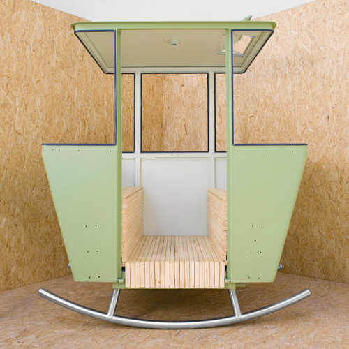
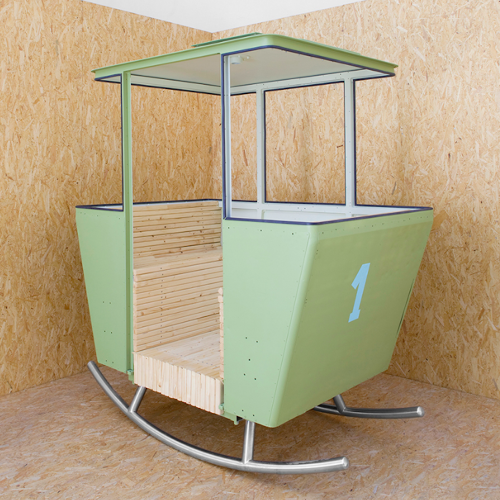
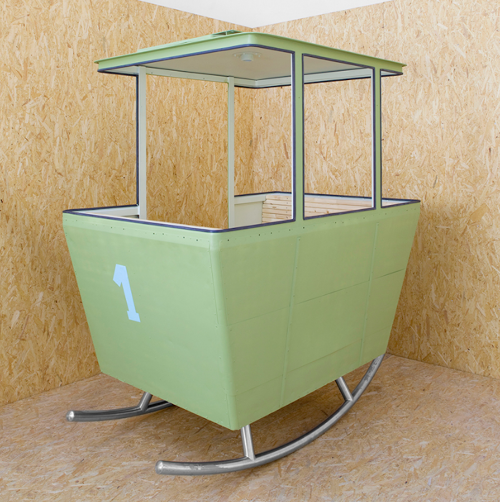
Just what we need for the dog days of summer: Rock, by Swiss designer Adrien Rovero, brings a breath of cool, crisp mountain air to our steamy urban heat traps (aka our apartments). Rovero is just one of 40 Swiss artists, architects and designers who were asked to reinterpret the 40-year-old aluminum cable car for “Mountain Climbers: revisiting a Swiss icon.”
Rock is currently on view at Mudac in Lausanne at Rovero’s solo show “Landscale,” which runs through October 28, 2012. Rovero’s take on the vintage gondola is the first of the 40 to be seen by the public, with the remaining 39 cable car interpretations to follow. All of them will be exhibited around Switzerland after debuting at Design Miama in Basel in June, 2013. After another year of exhibitions, the pieces will be sold at auction by Christie’s and all the profits will be donated to the Make-A-Wish foundation.


about perrin drumm
 click > enlarge
Milanese designer Alberto Biagetti‘s on trend 2012 collection for Post Design perfectly fulfills his Atelier’s motto of blending “fashion, art, design and architecture without distinction, creating a bridge between established forms of expression and new digital ones.” The tables, side tables and credenzas are ultra streamlined, combining traditional minimal forms and materials (spare cubes, glass, metal) with more contemporary choices, like pairings reflective surfaces with brass in pieces of furniture that look so luxe they’re more like semi-precious jewels, complete with display cases for your most precious things.
The same spindly, geometric base is echoed in the arm chairs – delightful miniature versions of the ombre sofas, the most striking of which sets off ho-hum beige with au courant neon yellow. If you don’t think you can rock day-glo furniture, the gray-to-navy version is still a progressive choice, albeit a more subdued one.
While the shapes are rigorously cubic, the seating is actually made with memory foam padding, so they’re extremely comfortable, too. Once again, Biagetti has designed a collection that is both luxurious and spare with unexpected colors and materials that add edge to longterm investment pieces.

about perrin drumm
 click > enlarge
Without specifically naming Bertoia, French designer Patrick Norguet cites the “tradition of iron wire chairs” as the inspiration for his Kobi chair, designed for Italian furniture manufacturer Alias. Of course, if you want to make a woven metal chair, references to Bertoia are impossible to avoid. Still, Norguet expands on is predecessor’s basket-weave seat, bringing it up higher on the sides. The base is more prominent, too, with thicker legs and a wider support belt made from cast aluminum that wraps from the seat bottom all the way out to the sides.
Seat cushions are available in fabric and leather, and there are two options for the chair as well: support and legs in stove enamelled aluminum with a colored or chrome shell, or a stove enamelled support with aluminum legs in oak veneered aluminum and a shell lacquered in a variety of colors.
Even though my family’s hand-me-down Bertoia patio chairs are rusty and badly in need a paint job, I still prefer the shape of his seat over Norguet’s. What do you think? Is the Kobi an unnecessary remake, an overdue upgrade, or simply another option?

about perrin drumm
 click > enlarge
One year after he got his Masters in Design Products at the Royal College of Art in London in 2001, Sylvain Willenz opened his own design office in his hometown of Brussels. In the past eight years he’s worked with brands like Cappellini, Established & Sons, Hay and Tamawa, and has won a handful of awards, including two Red Dot Best of the Best Product Design Awards for his work with Freecom Mobile Drive.
What I particularly like about Willenz’s work is that even when it’s at its most technical it remains approachable, never intimidating. The simple, minimal forms and bright elementary colors are a friendly callback to the Bauhaus aesthetic. In fact, one of Willenz’s more recent pieces, the Folk rug, is right at home with Bauhaus textile designer Anni Albers’ bold geometrical patterns.
Designed for Chevalier Edition, the Folk rug “was born out of the desire to organize geometric forms while exploring colors and structure. The motifs clearly evoke and play with the idea of folk or traditional rugs in a deliberately simplified manner.” Willenz, who works mostly in lighting and furniture and has never before collaborated with a manufacturer on a textile or pattern said “the opportunity to work solely on a graphic level does not occur very often in my design office and when Chevalier Edition approached me for this collaboration the assignment was certainly appealing. The exploration of two-dimensional forms became, without a doubt, most liberating and I truly enjoyed this exercise.”
The Folk rug is made from 100% handknotted wool and comes in three color variations, Light, Dark and Bright.
<


about perrin drumm
 click > enlarge
Craft System, the new lighting collection by François Chambard of UM Project, might just be the most imaginative interpretation of a lamp I’ve ever seen. When all the lamps are lined up side by side they look more like characters from a children’s story – think Wall-E’s progeny – than even the most inventive lighting on view at WantedDesign during NY Design Week. François describes the collection as one basic form with multiple variations. The most basic variation in the system, the Atum Lamp, has a Corian base in black, grey or white with a shade of either a fabric mesh or powder coated satin brass. There are two options for the light source, either an LED grid or four small incandescent light bulbs (both are operated with a built-in dimmer switch), and you can choose the table top variety or make it into a floor lamp with a wooden ash base.
But the similarities end there. The other variations François has come up with turn the basic lamp into a clever and playful lighting device with a prominent second function, like growing a plant or playing the theremin, that strange, UFO-sounding electronic rod instrument. Some other variations have a packed grid of tiny light bulbs or a brightly colored shade. The variations are only as limited as your imagination, and I know François is currently cooking up a few more ideas.
His other work has what you might call more standard applications, but whether he’s designing a small Milking Stool or an entire sound recording studio, his meticulous attention to material and craft and his unique combination of modern technology and handmade elements remains constant. See all his work and check out my visit to his Brooklyn studio.


Photos by Francis Dzikowski/Esto

about perrin drumm
 click > enlarge


