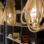
Pour a boutique hotel lobby into a factory building*. Mix in objects from select naval hardware auctions. The one-of-a-kind Cabos Adujados Lamp made of coiled rope that’s been reclaimed from the La Boca shipyard in Buenos Aires. Creative recipe. (*) Actually, this is just one exhibit of many seen at Casa Foa 2012. Chief cook: Argentinian designer [ Silvina Descole ] [ casa foa 2012 ]


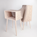
textile design and furniture manufacturing re-imagined. [ kata monus ] is a hungarian designer who specializes in textile techniques, patterns, graphic design, furniture, recycling and structures.


 stool 60 | alvar aalto | artek | 1933 | click > enlarge
The 1930s marked a breakthrough decade for Alvar Aalto both as an architect and a designer. Stool 60 was first introduced to the international public at the Wood Only exhibition in London in November 1933, to rave reviews – making 2013 Stool 60’s 80th anniversary. The simple, stackable and durable wooden stool represented a new approach to furniture design, and a continuation of the brand of modernism initiated by Bauhaus. The use of wood instead of bent steel was revolutionary at the time. Aalto spent years developing the L-shaped leg at the Korhonen furniture factory. The development of Stool 60 also took several years. Aalto kept testing different technical solutions together with the experts of the factory. The result of their collaboration is a durable and modern technical solution that later on led to the creation of many other classic designs.
 stool 60 | mike meiré | artek | 2012
In 1935, just a few days before the founding of Artek, the Municipal Library in Vyborg opened and Stool 60 was used for the first time in a public building. Stool 60 represents a crystallization of the values of Artek concerning the importance of technology, art and ethics. Stool 60 is the number one seller of Artek products and one of the most famous design products of the world.
Throughout 2013, Artek will introduce a series of stools, designed by well-known architects and designers, commemorating the anniversary. This month, we are featuring the stools by Mike Meiré (seen above).
Learn how these colorful stools are put together in this short video:
 stool 60 | alvar aalto | artek | 1933
[ artek > stool 60 ]
 click > enlarge
Portuguese designer Martinho Pita makes his Bichos from Holly Oak tree branches, which he prunes, peels while they’re still soft and fresh and then sands, shapes and details before they dry completely. Bichos is a loose translation of creatures, which the branches resemble, as if wild and strange forest animals were frozen in motion. The fabric-covered cord is run through narrow pathways and holes made in the branch like the creature’s veins. In a way they really do work like veins – the object’s lifeline – delivering the vital mechanics to power the bulb, or the creature’s brain, on the end.

about perrin drumm
 click > enlarge
The latest in home automation products comes to us via Kickstarter, where Spark Devices is seeking to raise funds for their new Spark Socket, a Wi-Fi connected light bulb designed by Scot Herbst. The Spark Socket is an attachment you twist onto a light bulb before screwing it into a light fixture. Once it automatically connects to you Wi-Fi, your phone registers the bulbs (there’s a color coded and labeling system to help you identify and organize them all) and creates a unique on/off switch for each Socket.
Spark Devices founder, Zach Supalla, grew up with a deaf father, who wired the family doorbell to the lights so they would flash when someone rang the bell. “You can have your lights slowly illuminate in your bedroom as an alarm clock, or blink when you receive an email or text message. It’s all pretty neat for everyday consumers, but it could be revolutionary for the deaf or hard of hearing.” (via Fast Co.)


about perrin drumm
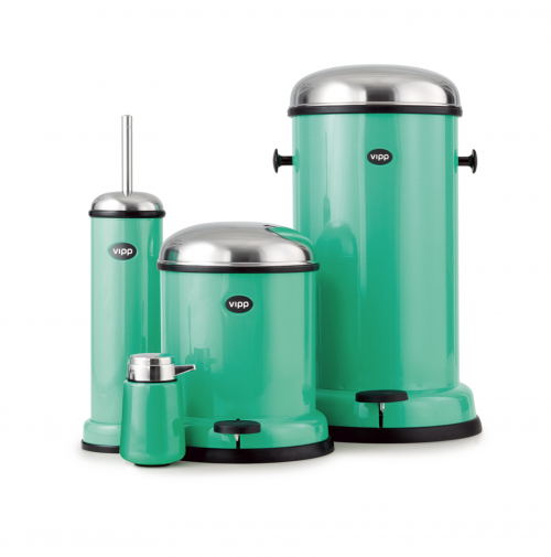
 vipp annual color 2012. copenhagen green.
[ vipp ]
 click > enlarge
Study after study shows that sitting all day long at a desk is bad for your health. It slows your metabolism, decreases your body’s ability to process sugars and fats, and even increases your chance of developing diabetes, blood clots or thrombosis. Men who sit for more than six hours a day have a 20% higher mortality rate, while women have a 40% higher rate – a factor, we might add, that can’t be counteracted by increasing your exercise. The only way to not die earlier, apparently, is simply not to sit down all day long anymore.
While newer offices are being designed for more flexible coworking environments that encourage movement, sometimes you just need to hunker down in one place and get a job done. The best solution designers are offering up so far is the standing desk. You can read more about how employees at companies like Mircrosoft, Google, the Mayo Clinic and the FBI are benefiting from a conversion to standing desks and walkstations (a slow moving treadmill-desk) in the Chicago Tribune‘s recent article.
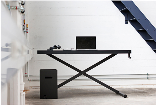
Before committing you can test it out by working at an ironing board or countertop, but once you’re convinced consider springing for the Xtable, an adjustable height desk designed by Danish studio KiBiSi for furniture manufacturer Holmris. You can manually raise and lower Xtable with a hand crank; the two crossing legs operate much like an ironing board. It comes with a floor organizer for your papers and pens, though it really ought to come with a matching, adjustable height chair.

about perrin drumm
 click > enlarge
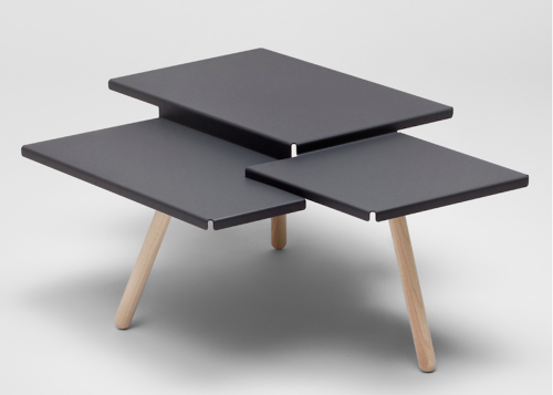
Netherlands-based furniture designer Frederik Roijé was apparently inspired by tiered rice fields he saw during his travels for his new Tablefields. Manufactured in Holland from a single sheet of folded metal, Tablefields reminds us of the classic nesting tables made iconic by Bauhaus designers Breuer and Albers. We’re seeing more and more designers starting to craft the metal parts of their products from single sheets, and are loving how the constraints of the energy and cost effective manufacturing process have pushed designers into new directions.
Tablefield’s three-tiered top is mirrored with three lacquered ash legs. It’s available in four colors and we can’t decide which one we like best, classic black or white or one of the two pastel color choices, though we’re leaning towards the machine green.

about perrin drumm
 click > enlarge
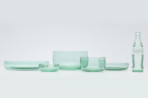
By now we’re all familiar with the array of lovely, upcycled glass wine bottles cut and repurposed as vases, carafes, decanters, etc. Japanese design powerhouse, Nendo, took the idea one step further with their recent collaboration with Coca-Cola, which they debuted a few days ago at Design Tide Tokyo.
The five-piece dishware set is handblown in northern Japan from recycled glass Coke bottles. Though the glass isn’t cut from larger bottles, the design of the dishes mimics that cut mark and also references the bottle’s shape, with the circle of dimples on the bottom. We’re not soda drinkers, but we love the glass’ greenish hue and the way it looks on a table, as well as the slight imperfections that come with handmade objects, like the air bubbles.
images courtesy designboom

about perrin drumm


