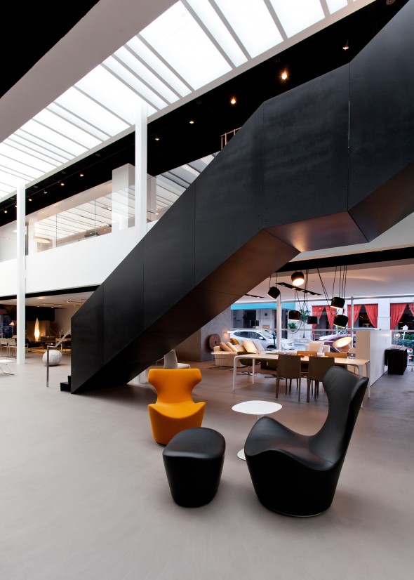
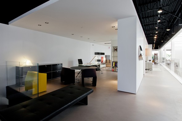
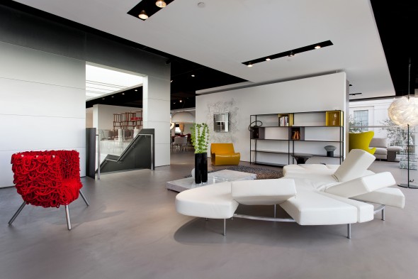
above> dwell on design new york presentation venue

For nearly 14 years Dwell magazine has pioneered ‘accessible’ modern residential architecture and design. They grew to be the embodiment of sustainability, prefabrication and small living spaces. More recently embracing such concepts as healthcare, universal design and cityscaping while delving into new media and hosting conferences and summits via ‘Dwell on Design’. It’s reassuring to be asked to interview Dwell’s editor-in-chief, Amanda Dameron. We talk to Amanda while she’s waiting for a flight in San Francisco.
[DesignApplause]
Amanda tell us about your journey to live and work in New York.
[Amanda Dameron ]
I lived in Los Angeles for many years. I moved to San Francisco to work for Dwell, living there for three-and-a-half years. I departed San Francisco with the intention of establishing a creative foothold in New York. As of January of this year, I brought the entire creative team to New York and opened a small satellite office in Los Angeles.
[DA] How large is the NYC team?
[AD] We have 25 in the office, 15 are part of the creative team.
[DA] What is your title and your role?
[AD] I actually have two titles. One is editor-in-chief but I’m also the executive vice president of content. Editor-in-chief is what I call myself.
[DA] What’s happening in Dwell on Design in New York?
[AD] We’ve been having this conference for the past nine years in Los Angeles. Based on that success, we are bringing it to New York. LA is a trade show and rooted in content. We’re very proud of the conversations, the speakers, the exhibitors and everyone else who make ‘Dwell on Design’ in LA happen. We welcome over 30,000 people for one weekend.

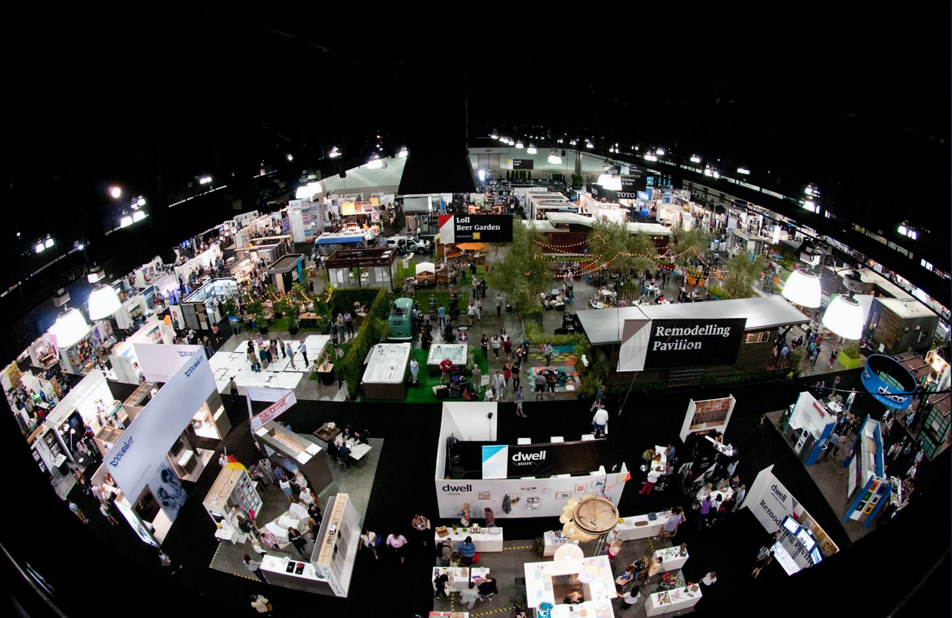
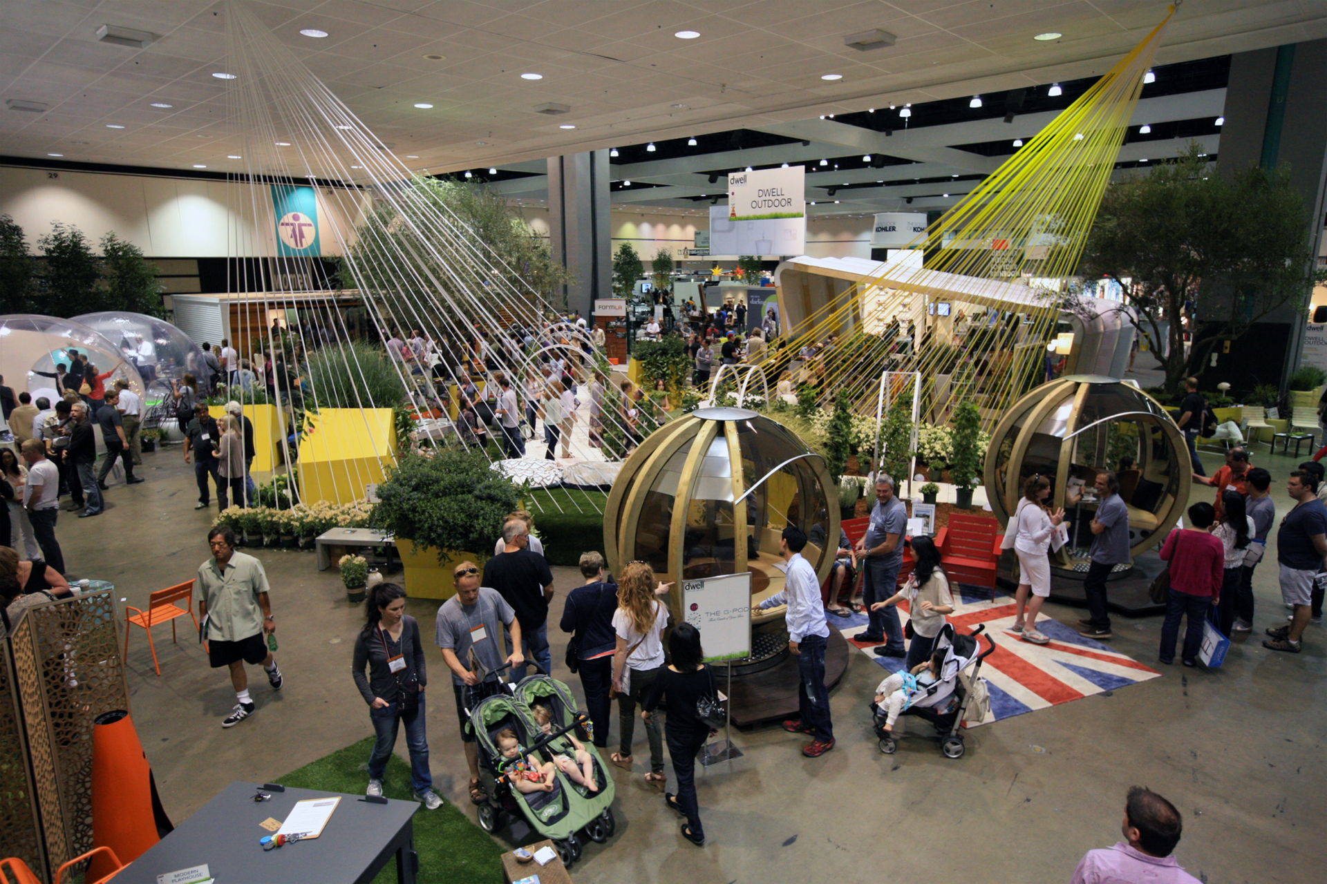
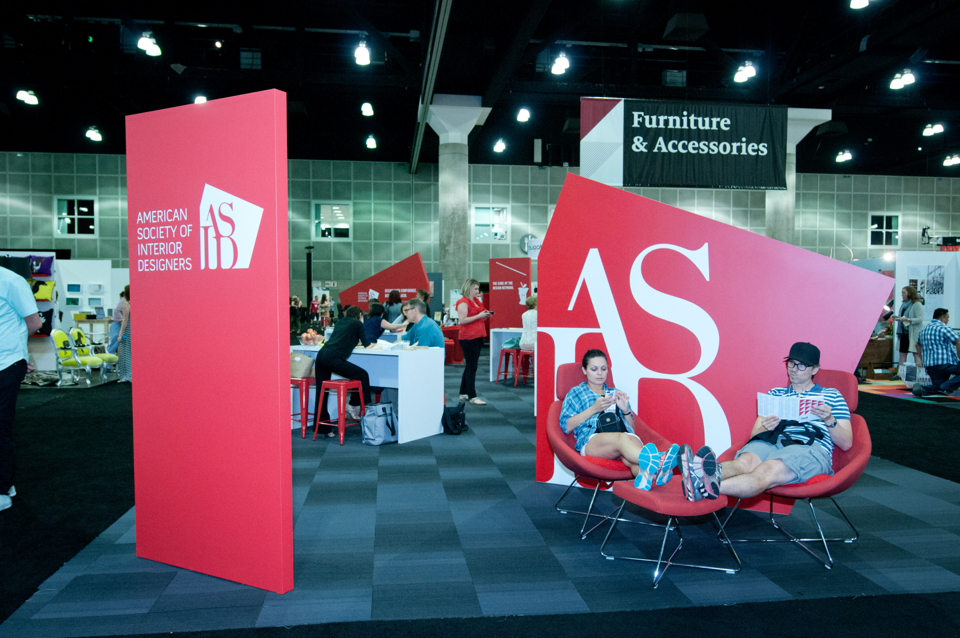
dwell on design los angeles 2014

dwell on design los angeles 2014
With our NYC event, we wanted to create an experience and an environment for discourse around design and architecture, similar to what we do year around in the magazine only in a live context that encourages interaction. So New York is not a trade show, it’s meant to be a 3-day summit for ideas.
[DA] What inspired the summit concept?
[AD] For the last two years we’ve been doing a collaborative enterprise called ‘City Modern’ with New York Magazine which was great. We were doing home and showroom tours and talks, but what we lacked was one locus for all the conversations to emanate from. Our new event location, at 82 Mercer Street in Soho, has over 35,000-square-feet of industrial loft space that will give us room to have these conversations.

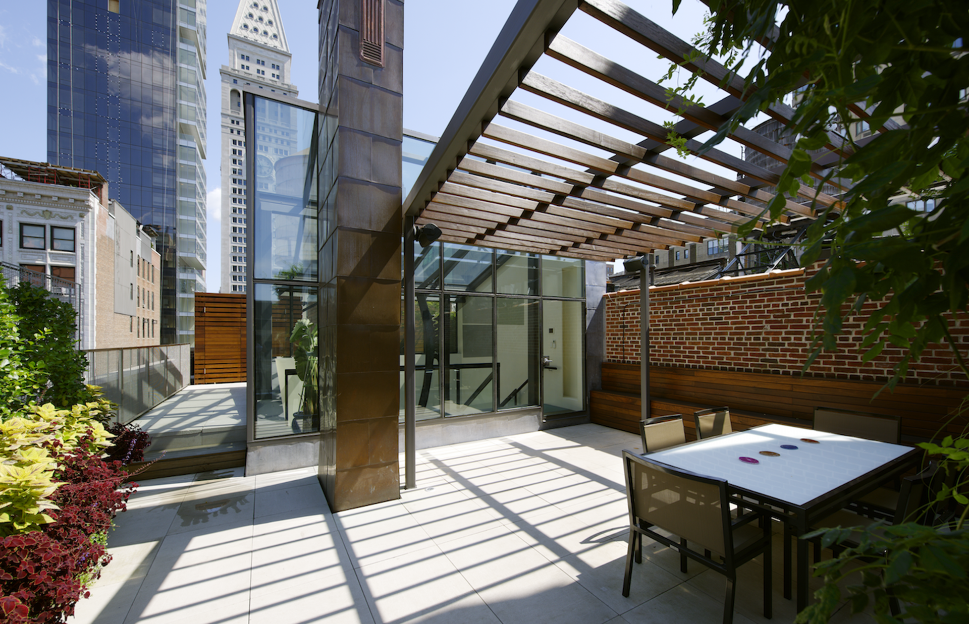
home tour: flatiron penthouse | charles rose architects
[DA] For those who can’t attend, how are you going to share the content?
[AD] We’ll be covering it in upcoming issues. There are perennial subjects that we return to again and again no matter what the platform is. We’ll be discussing the intersections of design, healthcare, small space living, all these things which we are constantly turning over in our minds.
[DA] This reminds me of the recent AIA National Convention in Chicago.
[AD] There are certainly similarities in that 50% of our audience are trade professionals, accredited architects and designers. We’re very proud that 75% of the content is CEU, so architects can get their accreditation.

dwell on design los angeles 2014
[DA] What is your architecture and design background?
[AD] I’ve worked for architecture and design publications the entirety of my career. The foundation of my understanding is really the result of my own explorations. Above everything else I think of myself as a storyteller and producer. I love design and architecture so this was a natural path for me to go.
[DA] What prompted you to take your job at Dwell?
[AD] I remember when Dwell launched and it was so fresh, so irreverent, and so unlike any other publication in its category. At that time I was an editor in Architectural Digest. I was so excited about this new publication. I applied to get a job at Dwell three times and only on the third try did I even get an email back. I was always an admirer from the sidelines and always wanted to work for Dwell.
[DA] A classic example of perseverance. Preparing for our talk prompted me to read the Karrie Jacobs ‘Fruit Bowl Manifesto‘ on the Dwell website. I highly recommend reading that manifesto as an inspiring example of a founding mission statement. The manifesto was written in 2000!
[AD] The way that I think about it, Karrie Jacobs wrote that as a manifesto and it’s such a clear and incisive point of view. I get 100% behind what she wrote that day. I’m the fourth editor-in-chief at Dwell and I have a lot of respect for my three predecessors and what they were able to accomplish. It’s my job to span the parameters of what it means to be modern and what modern means in architecture and design landscape today.
But it’s also my job to make sure that Dwell stays true to the tenants on which it was built. The fruit of that manifesto is a beautiful encapsulation that design is meant to be accessible. The way we want to talk about design is not design with a capital ‘D’ but design that works for people and is smart and innovative. And my hat is always off to Karrie Jacobs, she’s incredible.
[DA] Agreed. If the principles haven’t changed then what has?
[AD] It’s interesting. When you look at any editor-in-chief you understand where their perspective lies and the direction that they are laying. Dwell’s second editor, Allison Arieff, had an understanding of the power of prefab and made sure that Dwell was a leader in that category. It was important for Dwell at that time and continues to be important. Sam Grawe, the third editor-in-chief has an incredible academic knowledge of design and architecture. He did a lot to advance the publication’s graphic design identity working in tandem with design director Kyle Blue. They created an effective brand in look and feel for Dwell, in both print and digital. It was very unique and it won a national design award.
And so, for me, I’m very interested in the concept of universal design, I believe in pursuing and highlighting examples of accessible design, design-for-all, whatever you want to call it. I think that all of us, all four of us, have been interested in promoting notions of sustainability and at its most basic level, smart design.
[DA] I can see the evolution and I remember the prefab and sustainability in the beginning. Today your content is much more broad and there’s more than just residential. I have noticed that, in promoting the NYC summit, you mention cityscapes, planning boutique hotels, though one tower mentioned is a residential tower.
[AD] That’s true about the New York event where the focus is more commercial, more contract based. That’s because we don’t have the opportunity to delve into these issues as much as we’d like in the magazine. The magazine’s focus is largely residential but these other issues are super exciting for us and we can talk about academia, healthcare, transportation and city infrastructure. And these issues are top-of-mind to us.

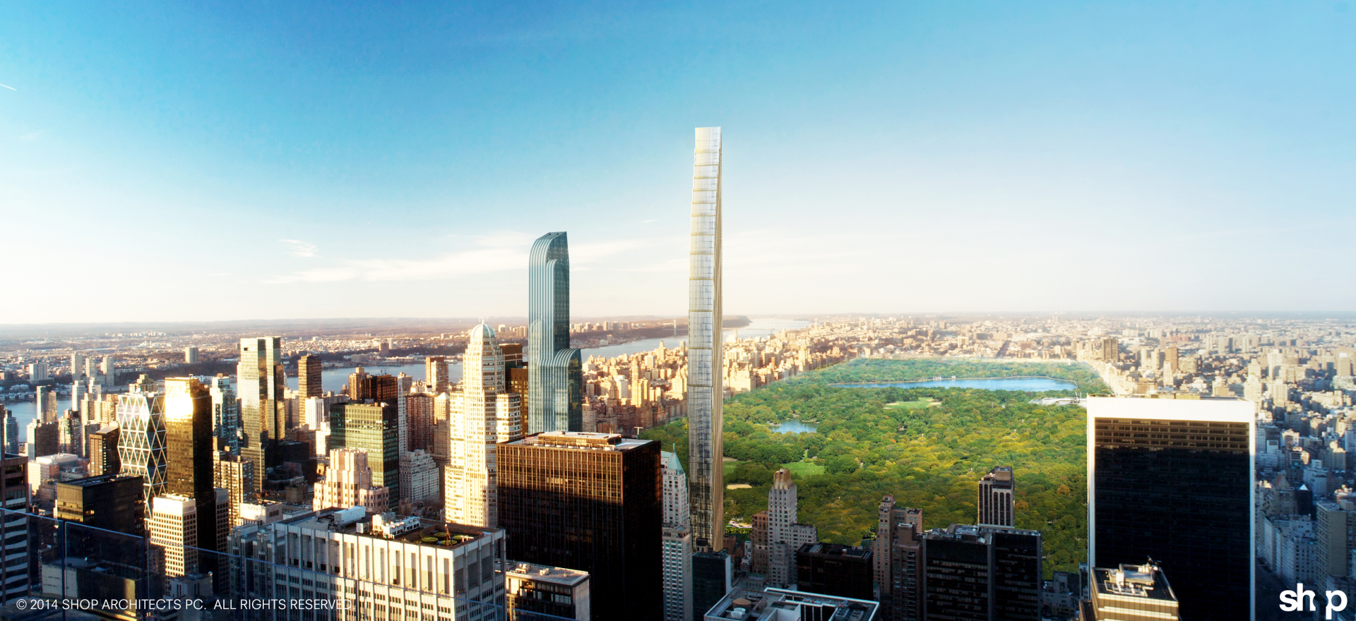
111 west 57th street | presenter vishaan chakrabarti | shop architects

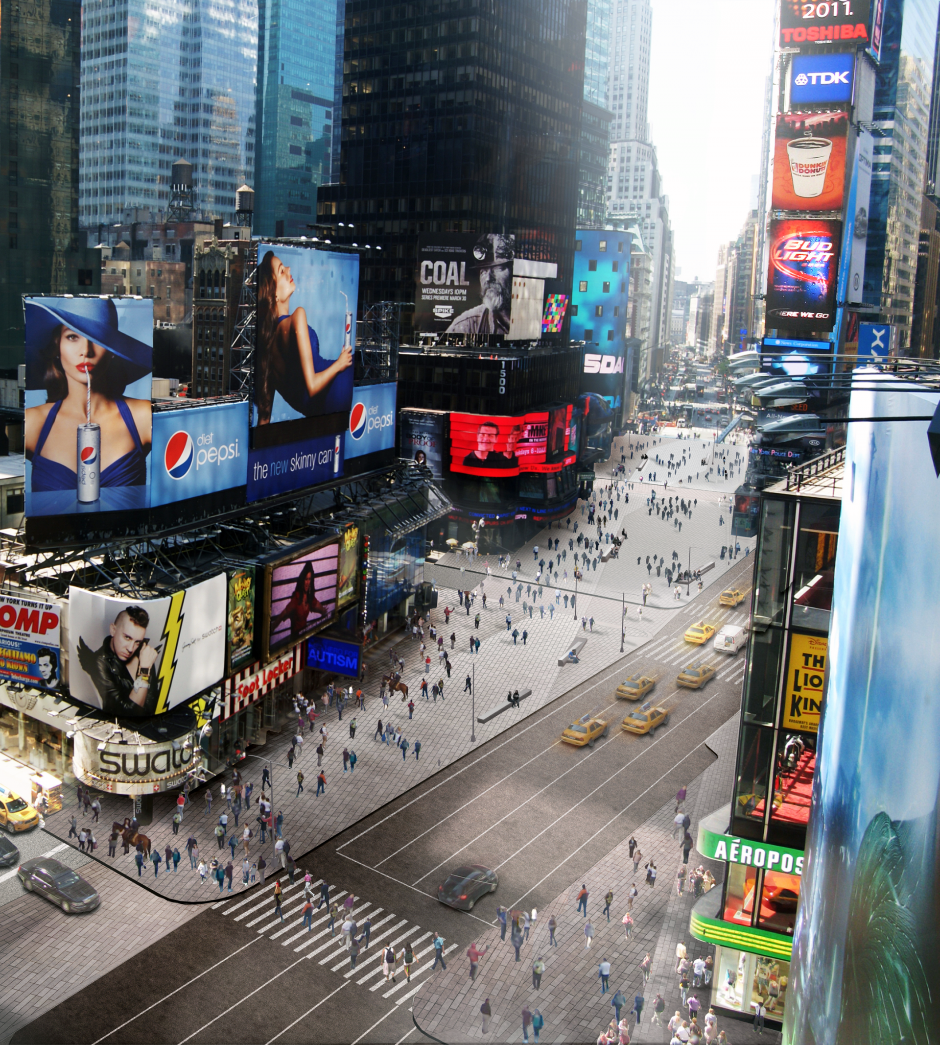
times square plaza | presenter claire fellman | snøhetta
[DA] How do you juggle the printed magazine vs digital messaging?
[AD] I think with storytelling today, it’s a fallacy to think content can be slapped onto any emerging platform in the same context and it’s going to work well. That’s absolutely not the case. With each platform, you really have to understand the strength of that platform. And you have to make sure your content is malleable enough fit the platform.
If people are looking for inspiration and ideas online, we know online that a rich visual language has emerged. People are using imagery to represent ideas and long-form narrative has less of a place than in the print medium.
What I try to is getting to the most basic level of storytelling. I think about how do I offer an audience compelling stories and rich imagery in a way that they’re at the helm. People today want their information and ideas in the way that they want it. If someone wants to read Dwell on a mobile device or in print, I’m happy. It’s my job to make sure the reading experience is pleasurable and beneficial. I’ve got to be equally conscious of our print and digital iterations. It’s a long-winded answer to your question.
[DA] It’s a good answer thank you. Storytelling is an important concept to communicate and engage an idea. You and I are talking about design and architecture. Architecture for example communicates space in a very tangible experience. How do you, can you, capture the feeling of being in a space in print for example?
[AD] The way I think about laying out a magazine is like a record producer or a musician creating an album. There are ebbs and flows that are inherent within the layout. They’re intending for the experience to unfold for the user. The musician or producer want people to listen to the entire album in the way that they laid it out, but the reality today is people to pick and choose the songs and when they want to listen. The listeners are choosing their own experience.
As a magazine editor, the space you have to work with is finite, limited by word and page count and I try and really cram as much as I can. However in the finished product, the layout is clean and uncluttered. It’s a negotiation of space always. And the storyteller has to be conscious of the space, whether it’s real space, or print or digital and the reading experience it brings on.
[DA] What hats do you wear at Dwell?
[AD] I’m lucky to have a that job let’s me do what I love which is largely reading and writing and talking to people. I am constantly viewing and reviewing submissions. Another part is traveling and talking to people. I’ve got to be plugging into what’s emerging and to educate myself about design and architecture so I am solidifying my own perspective and point of view. I’m on the lookout for talented writers, photographers and speakers. I and plan for conferences, videos and content across all mediums. It’s kind of a constant state of transmit and receive.
It’s what editor’s do. You know at one time an editor had elite access to information that was rarefied and they controlled it. Today that’s not the case. Everyone has access to content as never before and anyone can educate themselves to have a sophistication and high appreciation for design.
It means that those of us who are still operating from a platform of transmitting ideas, we have to be conscious that the messaging is conversational, the audience and the storyteller are in many ways equal. I’m always looking at and responding to the feedback that comes in, whether in writing, or an email or tweeted.
[DA] Those of us who teach agree that our title of professor feels different. We’re facilitators now. In a classroom with computers you can ask a question and get six good answers immediately. Those answers provoke debate and conversation. In such a scenario everyone is learning including the teacher.
[AD] Your role as facilitator is a good way of looking at it. You’re encouraging your students to develop critical thinking. And the power of discourse is just as powerful today as it was when people controlled access to information. I think that those of us who play the role of translator, between transmitting and receiving, facilitator is an important role.
[DA] In your most current issue “modern dreams,” the focus is on life inside a house which is really at the heart of any good design. That’s a lovely theme. Did you learn anything new in the process of creating this issue?
[AD] I think any good design emanates from the human experience. That’s where I tend to start when considering a project. Every issue surprises and delights me. I’m always so enamored of the players that create these projects. They use their creative minds to find solutions to make people feel at home. That’s a noble endeavor and a pleasure to be able to photograph and communicate in a way that people appreciate.
[DA] Other than Dwell, what are your other passions?
[AD] I love to read in my downtime. I have a young son so there’s not a lot of downtime. I’m reading at the airport right now. ( Breaking Ground by Daniel Libeskind and Let’s Explore Diabetes with Owls by David Sedaris. There you go, as I said earlier, my passions are traveling and reading.
event > dwell on design new york
venue > 82 mercer soho
date> 9>11 october 2014
1-3> dwell on design los angeles 2013
4> home tour: flatiron penthouse | charles rose architects
5> home tour: tribeca manufacturing building | andrew franz architect
6> home tour: harlem townhouse | architect nicholas moons

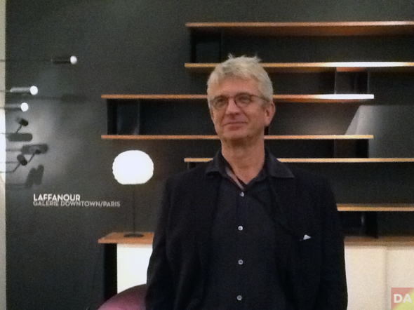 francois laffanour | galerie downtown/paris
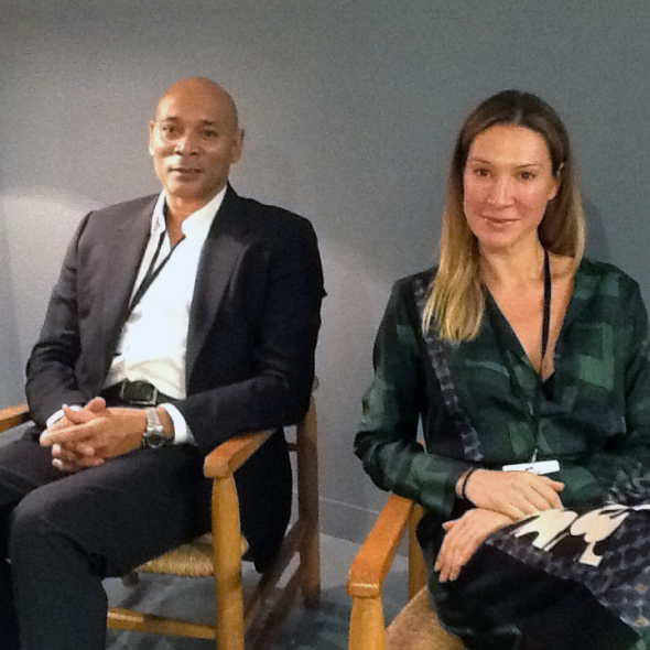
 stephane danant | demisch danant
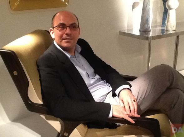 ugo alfano casati | casati gallery
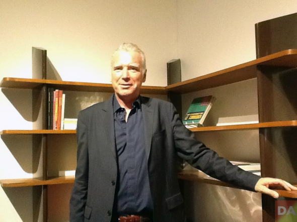 patrick seguin | galerie patrick seguin
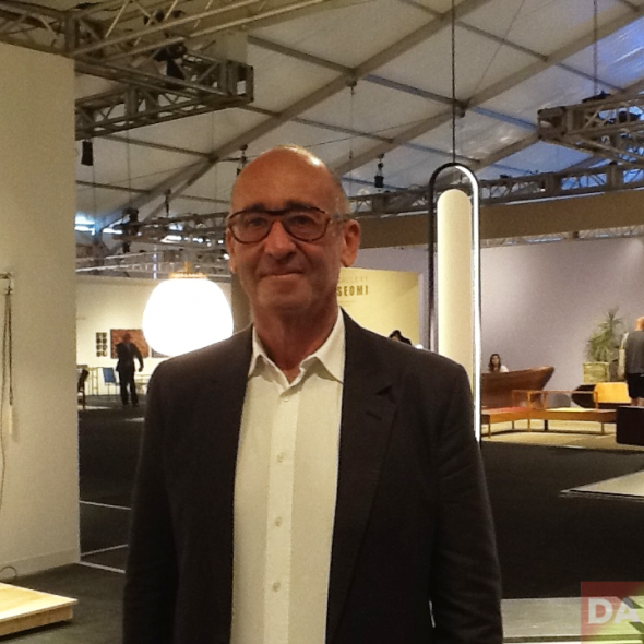 didier krzentowski | galerie kreo



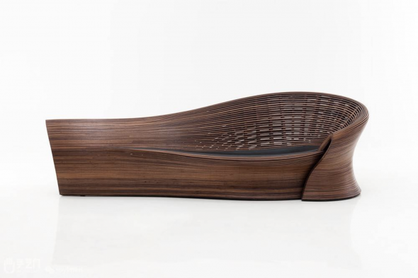


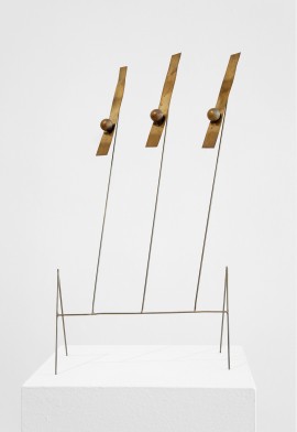 untitled | fausto melotti | galerie karsten greve | 1979