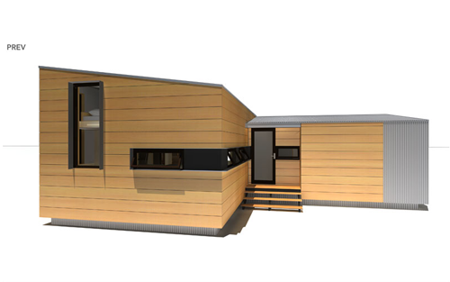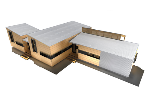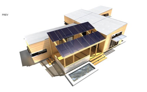
 michael hughes “trailorwrap”
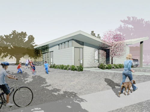
Designers are always looking to update an old design, to essentially reinvent a classic. That’s why there are so many corkscrews, can openers, whisks and spatulas on the market. Sometimes old faithful is just as good – or better – than the fancy, marked-up designer version (I still cook with my great-grandmother’s big, metal US Army spoon from way back when she worked in kitchens at refugee camps), and sometimes it really is time for an update. In the case of the trailer home, it’s time for a complete makeover.
 michael hughes “trailorwrap”
Because trailer parks and their inhabitants have been relegated to the outskirts of society, not to mention the outskirts of neighborhoods, designers haven’t exactly put them at the top their to-do list, but with the housing market in shambles and more and more people finding themselves unable to afford a home affixed to the ground, the timing is right for a redesign.
 michael hughes “trailorwrap”
 christopher deam “glassic flat”
 christopher deam “glassic flat”
First, “you need to create a visually attractive package,” says Allan Wallis, author of Wheel Estate: The Rise and Decline of Mobile Homes. “I would ask the designers of the iPod: Could you do that for a mobile home?” And designers are heeding his call. There’s Michael Hughes of TrailerWrap and Christopher C. Deam‘s 400-square-foot “Glassic Flat” that goes for $65,000. It’s small, sure, but its modular design is a great jumping-off point for other architects.
[ via ]

about perrin drumm

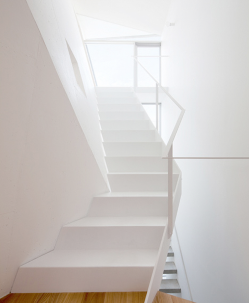
Called house folded, here’s a home configuration that uses Voronoi line segments that devide equally the shortest distance to create spaces. The slanted (folded) center wall is focal to the staircase corridor that provides access to each floor in this three-story floor plan. A very interesting, organic and prism-like construction indeed.


Architects: alphaville
type: residence, osaka, japan
site area: 75.93sqm | 817.3sqf
total floor area: 102.03sqm | 1,098.241sqf
building configuration: 3-story
structure: reinforced concrete construction
structural engineer: mitsuda structural consultants
photography: kai nakamura
 click on photos to enlarge
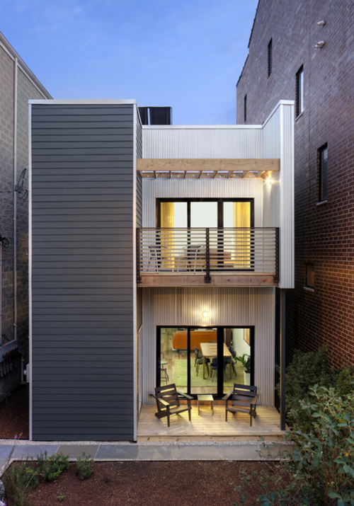
The C3 Prefab project, is a prototypical example a prefabricated sustainable residence (Chicago’s first) constructed in an urban environment.


C3 sets a high standard for energy efficiency by surpassing the current energy code by 54%, and becoming the first model for sustainable, affordable housing in Chicago. Reducing the upfront cost of housing is only part of the equation. The compounded savings by reducing energy usage gives homeowners an additional $282,000 at 10% over a 30-year period.

The C3 was designed to meet the LEED Platinum and Energy Star standards with low-tech, common sense solutions in lieu of expensive gadgetry. Many materials used were sustainably harvested as well as sourced through local vendors to encourage economic growth within the region. To date, this project has received Energy Star.
Relative to this project, the word ʻprefabʼ means that portions of the home were constructed off-site and shipped to the project location once the foundation and utilities were prepared. There are many prefab benefits. There’s a higher level of quality control within a factory setting. No “bad weather” means year-round, simultaneous construction for speedier delivery and timelines are more predictable. And an economy of labor and material Reducing labor and through the use of repetitive assembly lines and volume purchasing.
[ sustainable materials | benefits ]
• Uses 54% less energy and produces 64% less emissions then a comparable home. • Energy savings of over 70% in water heating costs due to solar thermal panels and on-demand water heating.
• Recycled content, low-maintenance exterior siding (galvalume corrugated and fiber cement board), and reclaimed barnwood siding.
• Low-VOC water based sealants and finishes; cabinetry and woodwork that contain no formaldehyde or toxic binders.
• Water-conserving plumbing fixtures and energy-efficient appliances and lighting; at least 80% of lighting is either compact fluorescent or LED.
• Recycled/sustainably harvested flooring (hickory and cork).
• Efficient floor plan with high ceilings and substantial natural light and ventilation reduce lighting and heating/cooling loads.
• Ductless, high-efficiency heating & air conditioning system provides quiet operation and controlled zoning for higher level of interior comfort.
• Heat Recovery Ventilator (HRV) provides continuous outdoor air circulation without energy loss.
• Natural native landscaping provides minimal maintenance and utilizes reclaimed storm water for irrigation.
• Roof is designed for future roof deck, vegetated green space, and photovoltaic (electricity producing) solar panels.
• All wood framing is FSC certified.
[ project data ]
designer: architect square root architecture + design jeffrey sommers
location: chicago usa
project size: single-family | 2039 sqft
hers rating: 46
[ resources ]
manufacturer: Hi-Tech Housing
general contractor: Helios Design + Build
energy consultant: The Sylvan Company
green rater/energy rater: Energy Diagnostics
interior furnishings: Post 27
landscape architect: KMS Gardens and Design
solar panel design & installation: Solar Service, Inc
mechanical consultant and installation: Ardmore Fresh Air
window consultant: Murphys Windows
[ materials and products ]
hvac system: Fujitsu Ductless
windows & doors: THV Compozit
kitchen & bath cabinetry: EcoUrban Collection
lighting consultant: Lightology
low-vov paint: Color Eco Paint Boutique
corrugated galvalume siding: Firestone UnaClad
cement board lap siding: James Hardie
floor & wall tile: Dal-Tile
erv: RenewAire
tankless water heater: Noritz
information/contact: architect square root architecture + design jeffrey sommers
 the reduced aesthetics of modern construction reflects a desire for minimalism and symmetry.
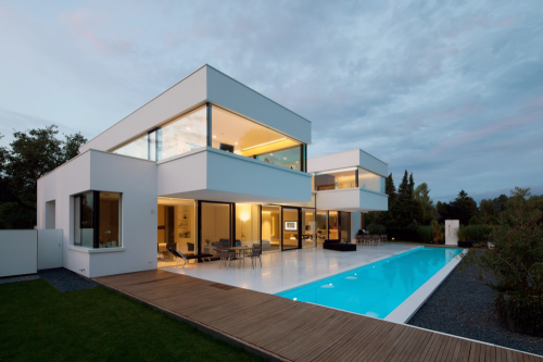
After successfully concluding a variety of HI-MACS® projects, Karl Dreer incorporates the material for his own private house. “HI-MACS® provides the opportunity of creating nearly any design in nearly any building – regardless of unusual weathering conditions, high degrees of moisture or enormous loads. It exceeds the standard material limits.”

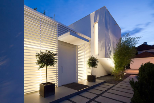
An oversized entrance door is flanked by two window frames made out of HI-MACS® Arctic White. Also the grey pedestals are made from the material.

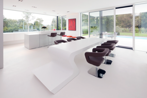
The dining room table is the central feature of the first floor and the link between the living room and dining area. The ability to thermoform HI-MACS® was critical in implementing the designed table.

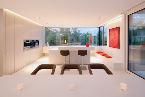
In the kitchen all furniture including cabinet doors, worktop and sinks are made also from HI-MACS® with a special detail on the front milled cabinet doors.
A fitness and wellness area and family office are located on the upper floor of the left cube. A shower, wash basin, shelves and small seating options made from HI-MACS® are also included here.
Temperature, lighting and shading of the house are controlled via BUS system – central, but individual. The operation and visualization of all details takes place via touch panels which are installed in every room. This HI-MACS® house exists without fossil fuels and sets standards for environmental protection and efficiency.
Finishing touches like self-designed garden furniture made completely from HI-MACS® complete this story.
project: private house, ammersee, germany
period: 2010
design: karl dreer
fabrication: dreer gmbh – klöpfer surfaces, germany
project implementation: felix bembé & sebastian dellinger
material: hi-macs® arctic white, concrete grey
photographer: dirk wilhelmy

At 9:45 pm on May 4th, 2007 an EF5 tornado leveled the rural town of Greensburg, Kansas. Just days after the storm, the community came together and decided to rebuild sustainably, striving to become a model green town for the future. Ever since this landmark commitment was made, Greensburg GreenTown – a grassroots community-based organization – has worked side-by-side with city and county officials, business owners and local residents to incorporate sustainable principles into their rebuilding process.
As part of the rebuilding plan The Chain of Eco-Homes project was launched in the winter of 2009. It is a series of demonstration eco-homes designed to be “living laboratories” featuring a variety of building techniques, prices, sizes, energy efficiency features, and green living products and services. Each home will be unique, and serve both as an informational center and as eco-lodging where visitors can experience green living first-hand. The eco-homes will also be monitored to demonstrate how each type of construction technology performs under local conditions, and to determine actual energy savings.
Three home designs, winners in a design competition, will drive the project. The latest eco-home, the Meadowlark House, will follow a building standard that has been around for over two decades but remains relatively unknown in the United States. That standard, called Passive House, was developed in Germany by two professors starting in the late 1980s. It was brought to the U.S. in 2006 by the Passive House Institute U.S.
The standard is a design process, not a supplemental program to a building – meaning its components have to be taken into account from the beginning of a project. The design of a Passive House centers around six principles used together to create an extremely energy efficient home: passive solar design, super-insulation, high performance windows, airtightness, ventilation, and space heating. Through the use of Passive House, energy needs are reduced up to 90% compared to traditional, conventionally built homes. The team is also aiming for LEED-Platinum status. [ greensburg – green town ]
 zamel house is two-story house with a beautiful vista of the beach.
Homes are designed so that all the main rooms have direct views towards the sea. The public area generally open-air taking advantage of the cool evening sea breezes during tropical days in Huatulco. The first floor is equipped with a den / guest bedroom. There’s also a full bath, with polished concrete counter tops, glass tile and a large bathroom. A large master bath offers an outdoor bath.
specifications:
location: bahías de huatulco, oaxaca, mexico
architects: kontrast arquitectura
project architects: jorge herrera martinez
land area: 193.75 sqm ( 2,085 sqft )
project area: 272.25 sqm ( 2,930 sqft )
budget: USD$ 290,000.00
project Year: 2007-2008
Photographs: fabian lasala guevara
about hultuco:
Only destination in Mexico that has Green Globe 21 Certification, one out of seven in the world. This area is known as Mexico’s Costa Chica. With no roads to the outside world, this region remained virtually uninhabited and undeveloped until 1982, which is around the time the coastal highway 200 was pushed through (as part of Fontur’s tourism development plan). This is one of North America’s last ecologically pristine tourist locales and one of the only accessible destinations where you’ll feel as though you have literally stepped off the plane into a seemingly untouched tropical paradise. high rises, welcoming town to all travelers and families, exquisite beach, international restaurants,
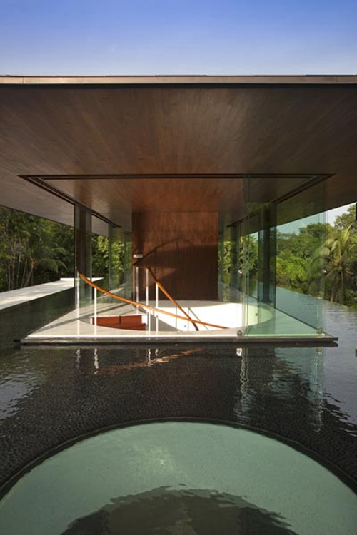
 we’re looking at a home where water not only provides a serene and natural surrounding but is engineered to cool the home as well.
a spiral staircase leads from the ground-floor entrance foyer to the second-story living area.

above: the second-story is the main living room and study. the elevated layout is an unobstructed pavilion-style structure to fully appreciate the natural surroundings.
on the ground-floor, the residential and service functions of the house are delineated by a long continuous light and air corridor that is paralleled below by a similarly long and continuous koi pond. the pathway running along-side the pond that leads to the bedrooms hides the substantial service areas which are beyond the pathway wall.
as with the second-story pond, the air corridor and ground-floor koi pond is also designed to facilitate in micro-cooling the first storey rooms and spaces. the pathway is a conduit for prevailing breezes; the koi pond’s thirty metre length and two metre width exposes a sixty square metre surface area within the house to those breezes for evaporative cooling.
as a gesture to the prominent role that water plays within the residence, an oculus within the pond highlights the main entrance, the circle of sunlight cooled and animated by the constantly changing sinusoidal patterns of refracted rays through the water above.
Specifications:
location: Singapore
site Area: 1634 sqm
completion: Nov 2009
Architect: wallflower architecture + design
via archinnovations

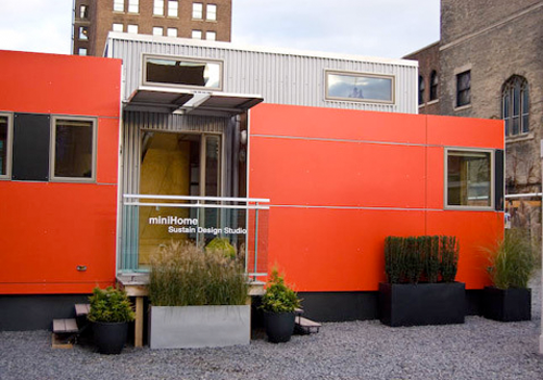
Toronto-based Sustain Design Studio, creator of the much-touted MiniHome, is giving a series of workshops in Los Angeles and San Francisco. Sustain has been developing dedicated ecological trailer parks for communities of MiniHome residents as well.


Sustain’s Trevor McIvor and Andy Thomson will be coming to both events to discuss prefab architecture and the future of sustainable community design. They’ll also answer questions on their line of products. Sustain is offering a 25% discount to the first California customer to purchase a 12×34 model, which will be on show at Dwell on Design.
San Francisco Session and Venue Information:
Date: Tuesday, April 7th, 2009, 6:30pm to 9pm
Location: Anshen+Allen Architects. 901 Market St.
*Participating architects will be eligible for AIA continuing education credits. The San Francisco event will take place on Tuesday, April 7, from 6:30-9pm California workshops
Los Angeles Session and Venue Information:
Date: Wednesday, April 8th, 2009. 6.30pm to 9pm
Location: SPF: a Gallery, 8609 Washington Blvd
Producer: sustain design studio

A home that makes the Smart car, standing side-by-side, look like a SUV. No, an 18-wheeler.
“Micro-Compact Home” [m-ch] was inspired by Japanese tea houses, yes, the Smart car and first class air travel. They are lightweight, modular, mobile and very minimal 2.65m (roughly 77 sq ft). That equates into a 266 x 266 x 266 centimeter cube ‘Home,’ Imagine that? It’s not for the claustrophobic, a dwelling non-the-less, for one or two people. This is not a tent, a trailer, but a home, in a super compact design.

The tiny cube provides a double bed on an upper level and working table and dining space for four to five people on the lower level. The entrance area has triple use: it functions as a bathroom and drying space for clothing, in addition to a lobby. Costing $80,000 USD, this little prefab integrates state-of-the-art technology into its compact design, boasting a sound system, flat screen TV, and temperature controls. It requires no furniture and all storage space is cleverly concealed within the structure of the dwelling. (more…)

 michael hughes “trailorwrap”
 michael hughes “trailorwrap”
 michael hughes “trailorwrap”
 christopher deam “glassic flat”
 christopher deam “glassic flat”


