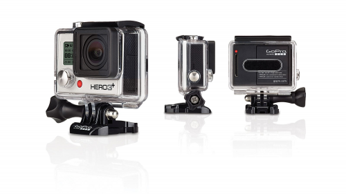
A remote control drone, a high-performance mini-video camera, a photographer and North Shore’s Pipeline beach collaborate on a very sweet surfing video. Taken December 2013.
[ Phantom ] [ hero 3+ ] [ eric sterman ] [ Pipeline ]

A day after returning from an early January North Beach trip with friends, the video you just watched, was sent by a friend who talked me into taking a surfing lesson. Up to that point we were finding ourselves on the beach at 9am a few times, coffee in hand, watching the surfing at Pipeline. Pretty heady stuff. You could see boards flying in the air. One surfer’s board was broken in half and spectators ran to have a photo taken with him and his broken board. Before going to bed we would all watch Youtube tutes on surfing. Plans to surf the big waves prior to our trip were dashed when we saw the waves, the reefs, face-to-face.
 click > enlarge
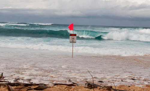
These signs are never taken down during the month of January. No one is swimming. But if you have a surfboard or a boogie board and swim fins, the signs are ignored. Here’s what I learned in a few short days about surfing…
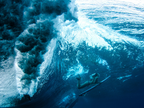 the duck dive
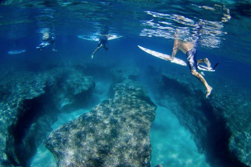 waves break over a razor sharp reef where the water is only six feet deep | look at the video again!
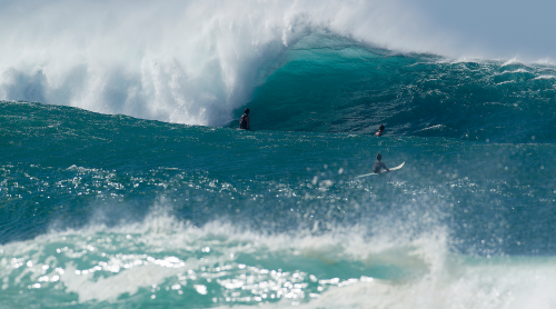 6-8 foot waves measured from back of wave
A California surf photographer now living in Hawaii said waves in Hawaii are measured from the back and in California from the front. No official statement available.
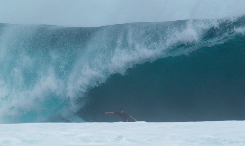 15-18 feet-high in six-feet of water
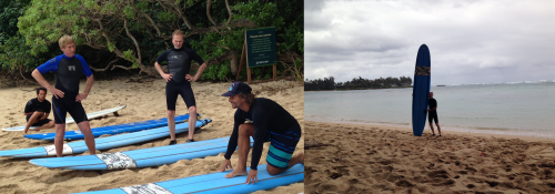 the fine points of the ‘pop-up’ | in a cove just north of pipeline
The North Shore was considered un-surfable prior to the evolution of plastic boards with fins, c. late 1940s. Surfing is the equivalent of skiing down an avalanche. A surfing lesson on North Shore in January is like taking a lesson on a double black run that’s both rocky and narrow. Our cove where our lessons transpired required paddling 200 yards to the protective reef where, on the day we surfed, the waves on the first reef were 3-4 feet-high and the water 18 inches! deep. Akin to running and sliding on a sheet of glass shards. I took a pass. Going to watch the video again thinking, ‘Eddie would go!’
[ surfboard history ]

above> aluminum front of a london underground train at the entrance to the in the making exhibition
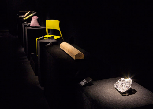
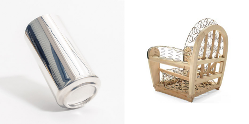
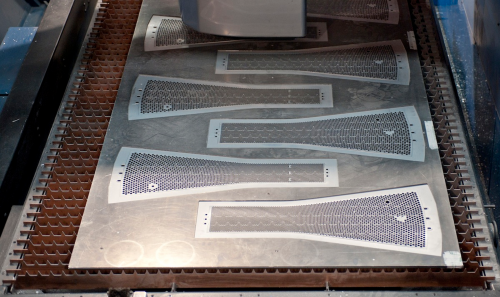
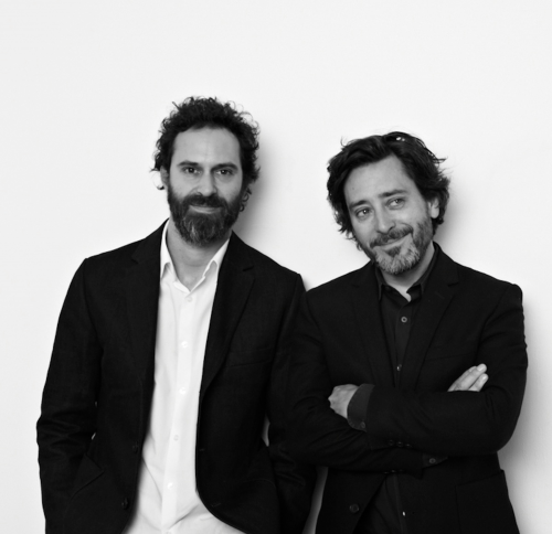
The Design Museum in London, presents “In the Making” an exhibition curated by Edward Barber and Jay Osgerby. An interesting theme is the capturing in various and unfinished states of the production process of 24 objects. The curators comment ‘We have always been fascinated by the making process as it is an integral part of our work. We have curated an exhibition that will provide a platform to capture and reveal a frozen moment in the manufacturing process and unveils an everyday object in its unfinished state. Often the object is as beautiful, if not more so, than the finished product!’

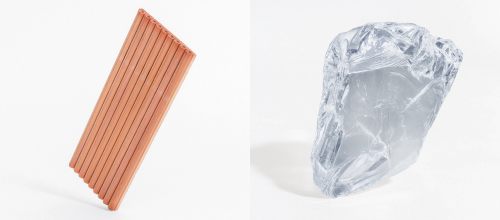
 derwent pencils in the making |unfinished swarovski crystal / photography györgy kőrössy
 coke can | charles sofa designed by antonio citerio for b&b italia / photography györgy kőrössy
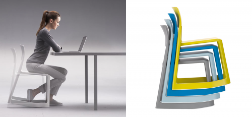
Most of the pieces are everyday objects – we see forks, pencils, tennis balls and a Coke can. There are indeed B&O objects. The 2012 Olympic torch. My favorite is indeed a B&O creation for Italian furniture producer Vitra, the Tip Ton Chair. The chair is made of made of polypropylene and is manufactured from a single mould without the use of mechanical components. This makes it extremely durable and up to 100% recyclable and defines a whole new chair typology: the solid plastic chair with forward-tilt action. The chair still may need to prove that its ‘half-rock’ feature is both good for the back and blood circulation. Tip Ton is also a candidate for iconic object with its innovative and proprietary profile.
 the 2012 olympic torch manufacturing process
 tip ton
An important underlying idea in the installation is a glance at the ongoing dialogue between designers and manufacturing through the making process. ‘This perspective is distinctive to their practice: throughout their careers, Edward and Jay have had a curiosity about the way things are made.’ Though there are several videos of the manufacturing process the ‘in the making’ theme presented an opportunity to go a little deeper into the ‘dialogue’ idea, a unique difference maker with some of the more function-driven, innovation-driven and design-driven objects in this show and like-kind successful objects in general. After all, how do certain products fulfill a need the best or become become iconic in their form and sensitivity. If you indeed get into what’s going on here, prepare to be educated, entertained and maybe even inspired. And discover in London that many of the most advanced techniques for the production of furniture were born right in the Bel Paese.
The exhibition opened on the 22 January and goes until 4 May 2014.
 edward barber, jay osgerby
[ barber & osgerby ] [ design museum ] @designmuseum #designmuseum
 about ron kovach

 click > enlarge

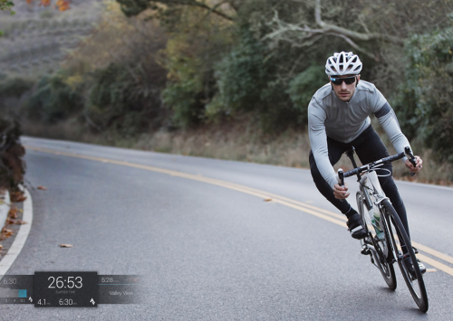
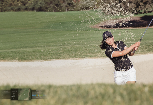
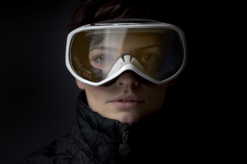
Google Glass was really introduced without much thought to its use. Probably because it doesn’t have to worry making money out of the gate. As a result there are more skeptics than believers. 2014 should convert many to the promise of ‘enhanced POV real-time visualization’ that’s now in the marketplace. Example, I just discovered [ Recon Snow2 ]: Many, me, ski for the thrill derived from falling a little out of control but these glasses conjur up a different motivation to hit the slopes. Note the emphasis on motivation as in what motivates one to use a product. That’s why Glass is perfectly tied to fitness because fitness for many, me, requires a great deal of motivation, passion, competition and fun.
 snow2
snow2
DesignApplause is not a fitness destination but folks, this is the last week of the year and we know how almost empty the health clubs are this week and then packed in January and February. By March much of the motivation to ‘work’ has moved on. But just maybe Glass will be a life-changer. Stay fit, my friends. Happy New Year.
[ glass ] [ trevor trowell ] [ glassfit ] #resolution14
 about ron kovach

I certainly knew of him but didn’t connect until I started talking to Michael Bierut when DesignObserver was born 10 years ago. If you’re in the design blogging hemisphere long enough you seek him out or he finds you. He inspired and encouraged all of us to keep going. [ designobserver tribute ] Here’s a video of Bill and Jessica Helfand.
<a href=" about ron kovach
 click > enlarge
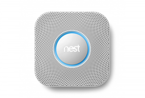
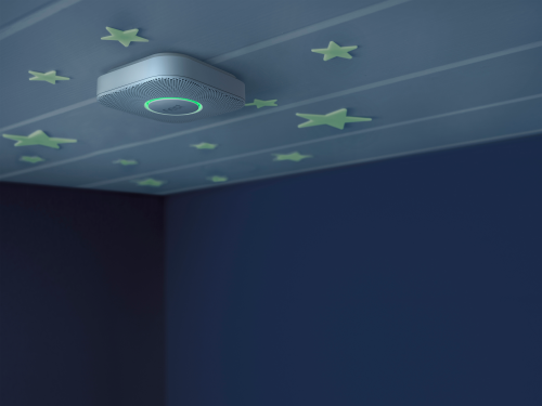
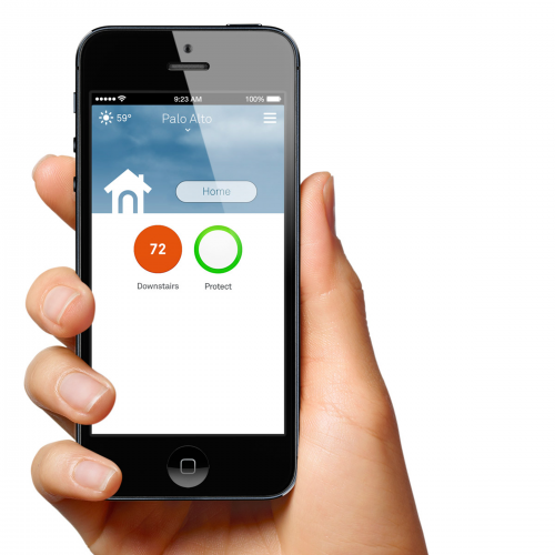
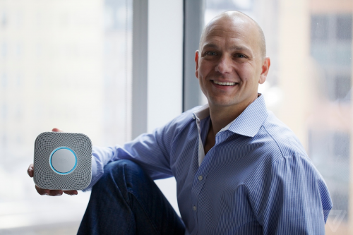
Here is something new from the designer(*) of the Nest thermostat. Meet the Nest Protect smoke and carbon monoxide (CO) alarm. Burned the toast? Nest Protect won’t just start yelling at you. Before turning on a loud, howling alarm, Nest Protect gives you an early warning we call Heads-Up. Nest Protect lights up yellow and speaks with a human voice. It tells you where smoke is or when carbon monoxide levels are rising. This gives you an earlier warning if there’s an emergency, or allows you to silence Nest Protect if it’s just a nuisance alarm, like an overly enthusiastic toaster.
AND Silence alarms with a wave. No more frantically swinging towels at the smoke alarm to quiet it down. If there’s a nuisance alarm, just stand under Nest Protect and wave your arm to hush the alert. It does a lot more [ details ] Starting in November available for pre-order and will be available in 5,000 stores across the United States and Canada.
(*)Tony Fadell, 44, who turned his frustration with “unloved” domestic products into a mandate to “make them smart and save lives,.” Tony is now the chief of Nest. At Apple he led the team that created Apple’s original iPod and iPhone,


<a href=" about ron kovach
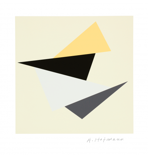
 silkscreen
Just in: The A+D museum was kind enough to send images. Detailed captions coming. I met Mr. Hofmann in 1972, at the height of the ebb of the Swiss USA invasion. Seems like 10k AH images through the years. You couldn’t avoid them if you needed an inspiration, taught design and presented his typography / color explorations, went to gallery openings, etc. I’m absolutely not sure that I’ve seen the images in this post though the architectural graphics are new to me. Hope to see this installation in person. The internet is misleading and almost a disservice. Nothing even close to experiencing some things in person.
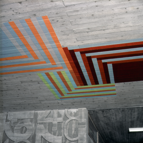
 disentis high school | architects hermann and hans peter baur
 color sketch
 b/w sketch
More information from an exhibition at Galerie Susanna Kulli (30 August – 28 September 2012
)
“It has always seemed to me that there must be a life of color as such, divorced from any object.” (Augusto Giacometti, Die Farbe und ich, 1933)—Until now, the reception of Armin Hofmann’s oeuvre has focused on this renowned Swiss graphic artist’s posters, which are largely in black and white. The exhibition at Galerie Susanna Kulli now offers the first in-depth look at his intense engagement with color. Its centerpiece is a portfolio of silkscreen prints that is unique in Hofmann’s oeuvre.
The silkscreen portfolio is complemented by writings and sketches from Hofmann’s private archive and problems he assigned in his classes.
Recollections of four of his former students—Philip Burton, April Greiman, Aki Nurosi, and Moritz Zwimpfer—open up new perspectives on Hofmann’s close engagement with issues of color.
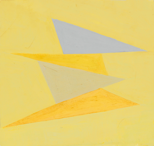
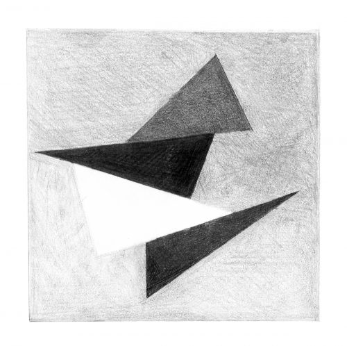
Each of the twelve plates in the portfolio, created between 1989 and 1999, shows four triangles arranged in a square. By eliminating light-dark contrasts, Hofmann was able to focus on color as such and the contrasts specific to it—cold–warm and luminous–dull, as well as contrasts in hue and quantity. As Hofmann emphasizes, the twelve plates should not be regarded as final results; they are guideposts in a process, and their order is variable. The reduction to a single problem held constant led him to a more nuanced vision and a growing awareness of the sensual qualities of color: “When you work in this manner, you become ever more refined, more sensitive.”
In his teaching, too, Hofmann sought to raise his students’ sensitivity for the qualities and effects of color.
He had no interest in imparting an authoritative system of color, striving instead to accommodate the individual element in color perception.
Of particular interest in connection with the silkscreen portfolio, which Hofmann describes as “a sort of account of my pedagogical activities,” is a problem he assigned in a class in 1984. The extant sketches produced by the students and their final results bear considerable compositional and chromatic resemblance to the twelve plates in Hofmann’s portfolio.
Two case studies—of the former PTT-Areal in Arlesheim and the high school in Disentis—further illustrate Hofmann’s use of color in three dimensions. Both buildings were designed by the architects Hermann and Hans Peter Baur, early advocates of an “integration of the arts” into architecture; during the almost six decades of their collaboration with Hofmann, they frequently involved the artist in the planning process from the very outset.
Art for public spaces was the only field of his practice in which Hofmann employed color as a defining artistic element. As in the silkscreen portfolio and in his classes on color, the study of the relativity of chromatic values was central. The critical examination of the role of the mark in its context pervades Hofmann’s entire oeuvre. The engagement with color added another layer to this complex issue and may be seen as bringing further nuance and elaboration to his teaching of form.
venue> a+d museum | 6032 wilshire boulevard los angeles | 323 932 9393
opening reception> 14 november 2013 | 6p
open to public> 14 november 2013 > 19 january 2014 | los angeles
 about ron kovach

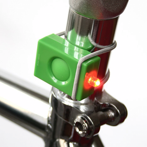
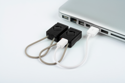
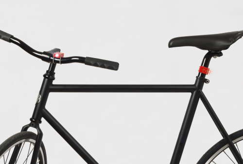
Here’s a gift I give year-round because of its design and safety features and now it’s green statement: The USB Light is compact, lightweight, weather resistant and surprisingly bright. It fits all bicycles and is quick and easy to attach to the handlebar or saddle pole with an elastic rubber band. Its large button on the upper side makes the light easy to turn on and off, even with gloves. Rechargeable batteries. But don’t limit to just putting these lights just on your fixie. They not only light you up at night, they help you find things when it’s dark. I put them on arms | legs | rollerblades | umbrellas | folding concert chairs | pets | kids. Newer models are getting [ greener ] Run time > 5 hours (steady) 25 hours (flashing) | Visibility > Over 500 meters | Modes > steady/flashing/off | Contents > front light white led rear red [ bookman ]


<a href=" about ron kovach
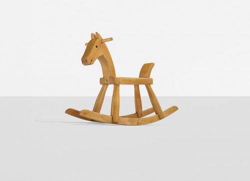
 rocking horse | kay bojesen | 1936
who hasn’t dreamed of waking up and finding a horse in the garage? here’s your chance to fulfill that dream for someone you love. this pony goes on the auction block 14 November 2013 noon CST (USA) [ wright ]
<a href=" about ron kovach

 click > enlarge
 the duck dive
 waves break over a razor sharp reef where the water is only six feet deep | look at the video again!
 6-8 foot waves measured from back of wave
 15-18 feet-high in six-feet of water
 the fine points of the ‘pop-up’ | in a cove just north of pipeline