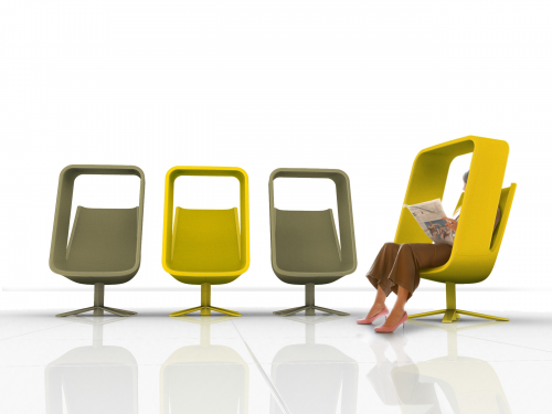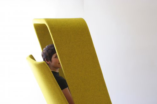
San Francisco designers Mike & Maaike have designed Windowseat utilizing an interesting juxtaposition of furniture and architectural elements. The chair is being introduce at Neocon 2013 by Haworth.
[DesignApplause] Mike and Maaike, what brings you here?
[Mike Simonian] We’re debuting the Windowseat chair we’ve been collaborating with Hayworth for the past two years. It’s a lounge chair designed to provide an escape from the open office environment and give you a bit of personal space and break from the noise and hustle and bustle of a busy office, lobby or airport.
[DA] The ‘escape’ and concept is trending now and maybe you are the trendsetters. Did Haworth seek you out with this concept?
[Mike] The original concept was actually many years ago that we developed independently. About 2007. It was at that time more of an experiment. Not really intended for production. I think maybe it was ahead of the acceptability level at the time. Now, technology has changed and people are working a lot more on hand-held devices than ever expected. Now these furniture pieces are a core part of work. Anyway, we presented it to Haworth and they decided they wanted to include it in their line. Haworth is very excited about solutions of this type and they thought it would be a great fit.
[Maaike Evers] It’s a combination of that liberation of not having to be at a desk anymore. But also, the fact that this new generation of young people are going to come in the workplace. The workplace is going to be more dense and open and collaborative so that movement requires the counter balance to happen at the same time. Where are people going to have time to reflect or think?
[DA] 2007! You’re the genesis of what’s going on right now. If you’re a thinker and you wish to get away, the Windowseat lyrically opens a window. Have you seen the Massaud chair he’s done for Coalesse? He would love your chair.
[Mike] Yes, we’ve seen each others chairs. That chair is really interesting because it creates a complete cocoon in a way so you’re completely in a private space. The Windowseat is more about controlling your perspective yet still connected to the outside.
[DA] I sat ‘in’ Windowseat Thursday night and it’s an interesting experience, much more of an enclosure sitting in it than I expected. I liked the way swivel seat centers itself when you get up, ready for the next person.
[Mike] We wanted to create this room within a room. To make furniture do what normally architecture would have to do, providing the wall and the ceiling. In this case, furniture can do that as well. By letting it do some of that work, you’re able to deploy this private space anywhere in an your environment. We wanted to cut away at the enclosure as much as we could so it doesn’t feel like you’re hiding. We cut most of the back off so it’s open all the way down.
[DA] What’s the fabric? It looks and feels like felt.
[Maaike] It is a wool felt, but it’s a woven wool felt called Divina. This is the fabric we really like on this piece because it acoustically absorbs sound even more. From a sound perspective, it somehow creates a private bubble.
[DA] It’s interesting how this chair plays a space trick with your mind. It also plays acoustic tricks with the material and wrap-around but also presents a lot of air space.
[Mike] Yes, no one can sneak up behind you. Yes. When you’re sitting here, you notice you’re in enclosed space, but you don’t pick up on the fact that the space is not really there. People acknowledge that a person is there and that they want some privacy.
[Maaike] Yes. When we started thinking about this concept, we talked about playing in boxes as kids. The experience was both fun and good to have your own little vista with the flaps and doors you would use. Our concept started very rectilinear but we massaged it to be comfortably looking.
[DA] Did you present a prototype?
[Mike] Yes. It’s pretty innovative from the manufacturing and materials perspective and we worked very hard with them to achieve a good price point.
[DA] How did you model your concept?
[Maaike] We built the concepts all in 3D CAD to perform what we were after in ergonomic terms in order to understand the size of space. Pretty quickly we created cross section prints and hot gluing laser-cut cardboard to create a structure to see how it felt to sit in it.
[DA] The chair is visually interesting because of the angle of the enclosure. It looks like it’s just balancing on its legs.
[Mike] Part of the reason for the angle is that it’s inviting. And functional as you don’t bump your head when you’re sitting down or getting up.
[DA] Is this your first piece of furniture? Wait, you did a very nice table, Divis?
[Mike] Divis, yes. Though furniture is not our core business, we really enjoy exploring that space. We worked with Watson Furniture in Washington as well as Council in San Francisco. Chairs, room dividers. It’s nice to jump around.
[Maaike] Actually when we started working together, we came from the tech industry in the Bay area, we deliberately decided to break from tech and explore furniture and jewelry. It was a way of working where each space plays off the other. The range of materials and manufacturing is a source of inspiration and keeps our work fresh.
[DA] What drives your process?
[Mike] The CAD is part of the execution but everything starts with a concept for us. It’s usually an abstract concept or question. In this case, the concept was furniture and architecture: where can they blend? Where does one stop and begin?
[Maaike] That’s what happens when you’re a couple and you work together. You have to agree before you start working with each other. It usually has a very strong concept or else we don’t pick up the project.
[DA] How long have you been working together?
[Mike] 18 years. Almost our whole career.
[DA] That’s a wonderful story. In the design world, what’s really hot right now?
[Maaike] I am stunned to see how much soft more texture is coming into the workplace and how that makes for much more casual work environments. Much more inviting. More sense of color, texture. It’s fantastic.
[Mike] Along that line, these pieces by Patricia (Uriquiola) are amazing and to see that in a space that is normally filled with hard office furniture is really showing the office’s evolution.
1/6> windowseat | haworth
7> divis | council
8> mute | council
9> swarm | council
10> baha bbq | design annex
11> ATNMBL | concept
12> 24110 | concept
[ mike&maaike ] [ haworth ]
