in the tube > from the architectural to the domestic. The architect Dominique Perrault and the designer Gaëlle Lauriot‑Prévost designed this collection with the objective of it being utterly original, almost indescribable, nearly unbreakable, timeless and completely durable.
The in the tube > collection comprises strong forms, designs that are both free and constrained, developed in several lengths, diameters and colors. Made in borosilicate glass and closed with aluminum stoppers sealed in silicon, the mountings are in stainless-steel which allow it to be used as a suspension as well as wall or ceiling-mount. « IN THE TUBE » diffuses a soft, filtered light that can be orientated by the movable mesh filter or by a reflector whose color determines the light given: stainless steel for a silver light, anodized aluminum for copper or gold.
The in the tube > collection of high-performance tubes (IP64) could be just as easily at home in a James Bond spy kit as it could in a Jules Verne rocket.

about maria vittoria capitanucchi
 click > enlarge
Portuguese designer Martinho Pita makes his Bichos from Holly Oak tree branches, which he prunes, peels while they’re still soft and fresh and then sands, shapes and details before they dry completely. Bichos is a loose translation of creatures, which the branches resemble, as if wild and strange forest animals were frozen in motion. The fabric-covered cord is run through narrow pathways and holes made in the branch like the creature’s veins. In a way they really do work like veins – the object’s lifeline – delivering the vital mechanics to power the bulb, or the creature’s brain, on the end.

about perrin drumm
 click > enlarge
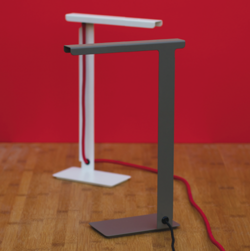
Last month Hackney-based Group Design launched the simple, purpose-driven 490 Desk Lamp. The base, stand and shade are laser-cut from a single piece of powder coated 1.5mm steel formed into shape by a few simple 90-degree “folds.” The minimal body is balanced by a retro fabric cable in contrasting red or silver.
The warm, glare-free light source is a low, 3 watt LED that produces about 240 lumens, equivalent to a 12V 20W halogen bulb. The light can be controlled with a touch dimmer, making the lamp suitable for the beside as well. All the parts can be completely recycled at the end of their life, though with a light that lasts 50,000 hours you might not ever need to. If you run the lamp all day long it will last for 2,083 days, or almost six years, and if you use the lamp every day for an eight hour work day, the LED will last over 17 years without needing to be replaced, making it the best £150 you’ll spend this decade.

about perrin drumm
 click > enlarge
The stockholm-based design studio Form Us With Love contends that “lamps are like people; They are happiest in families.” The sentiment is certainly true for their eponymous pendant lights. The three forms that make up the happy Form family (Cone, Globe and Tube) are handblown in shapes inspired by bare light bulbs.


The affordable lights are sold individually as opposed to being sold in sets that you can choose what combination suits your space and taste best. A row of three or four of the Tube pendants works just as well as a 25-piece cluster of all three shapes combined. “With very modest means and simple forms, Form Pendants can make a big difference in an interior. There is almost an infinite number of possible combinations.” [ design house stockholm ]

about perrin drumm
 click > enlarge
Graypants is a design studio and think tank based out of Seattle and Amsterdam that takes on a wide range of projects, from larger architectural commissions to furniture and lighting. Where their smaller products are concerned, it’s clear that Graypants makes their materials work as hard as possible. The sleek Slice chair (below) gets the most out of a single sheet of plywood. Three entire chairs can be made from just one sheet, and because the low-VOC finish is a byproduct of cheese (yes, really), the only waste is the saw dust.
At ICFF this year, Graypants showed off their stunning cardboard-based lighting collection. Available in a variety of shapes from perfect circles to oval pendants, each light is made of thin strips of laser-cut cardboard that are glued one on top of the other. Because of the irregularities in the cardboard’s honeycomb structure, the light shines through in unique ways particular to each individual light. In certain lights, like the Drum or the Bell (below), the cardboard rings are arranged to create a subtle pattern. The lights, which range in price from $179 – $1,399, can be purchased directly from graypants’ online shop.


about perrin drumm
 click > enlarge
Craft System, the new lighting collection by François Chambard of UM Project, might just be the most imaginative interpretation of a lamp I’ve ever seen. When all the lamps are lined up side by side they look more like characters from a children’s story – think Wall-E’s progeny – than even the most inventive lighting on view at WantedDesign during NY Design Week. François describes the collection as one basic form with multiple variations. The most basic variation in the system, the Atum Lamp, has a Corian base in black, grey or white with a shade of either a fabric mesh or powder coated satin brass. There are two options for the light source, either an LED grid or four small incandescent light bulbs (both are operated with a built-in dimmer switch), and you can choose the table top variety or make it into a floor lamp with a wooden ash base.
But the similarities end there. The other variations François has come up with turn the basic lamp into a clever and playful lighting device with a prominent second function, like growing a plant or playing the theremin, that strange, UFO-sounding electronic rod instrument. Some other variations have a packed grid of tiny light bulbs or a brightly colored shade. The variations are only as limited as your imagination, and I know François is currently cooking up a few more ideas.
His other work has what you might call more standard applications, but whether he’s designing a small Milking Stool or an entire sound recording studio, his meticulous attention to material and craft and his unique combination of modern technology and handmade elements remains constant. See all his work and check out my visit to his Brooklyn studio.


Photos by Francis Dzikowski/Esto

about perrin drumm
 click > enlarge
When I came across Peteris Zilbers‘ Moodbroom at ICFF this weekend, I thought the designer had cleverly repurposed unloved push brooms into a creative lighting element, and I was actually disappointed to learn that the Moodbroom is, in fact, a brand new object made from wood, plexiglass and an unknown composite material, not, as I had hoped, from recycled materials.
Zilbers’ design asks the question, “What happens when an ordinary household object like a broom is re-imagined?” His answer is a lamp that “plays with function in everyday objects and engages users in a game that alters perceptions of a common item.” The lamp is controlled by a remote that allows you to change the light to any color of the rainbow, or you can set it to rotate through the spectrum.
You can’t tell from the pictures, but the ‘brush’ part of the broom is incredibly heavy – so heavy that I couldn’t even lift it. Yes, I have weak arms, but I shouldn’t have to be a body builder to lift a lamp. Besides, even if you don’t have a problem with the Moodbroom’s weight and materials, what about that cord? In such a simple design the cord seems like a blaring distraction and a huge flaw. Overall, repurposing the traditional broom shape into a light doesn’t strike me as a real stretch of the imagination, and the finished project has too many unconsidered elements to justify its hefty price tag ($500+).


about perrin drumm
 click > enlarge
Brooklyn-based art and architecture studio Snarkitecture has received a lot of press in recent years for their experimental exhibition design as well as for their installations for public art and retail spaces, but as a practice that’s interested in exploring spatial relationships on both a large and small scale, their design objects shouldn’t be overshadowed by their larger work.
For starters there’s “Slab Table,” which riffs on the form of an iceberg, a motif Snarkitecture used to great effect in 2010 in their storefront Richard Chai in New York. The play on topographical mapping is also a major part of “Excavated Mirror,” the mirror’s edge mimicking the squiggly line of a cartographer’s water edge.
My personal favorites are their prototypes, especially “Ghost Chair,” (above) a simple black chair with a ‘ghostly’ white resin sheet frozen in place around it, whipped across its front as if by a fierce wind. “Erosion Table” is a big, white slab that looks as if its been eaten away by acid, and “Break Light” is a long, bent fluorescent tube hanging precariously from a single cord.
All their pieces are for sale. Email info@snarkitecture.com for inquiries.


about perrin drumm

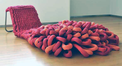
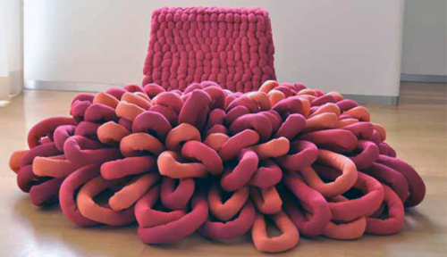
Born from a love of tufting, Danish furniture designer Sophie de Vocht’s “Loop Chaise Lounge” takes a technique typically reserved for carpeting and applies it to seating instead. Bright, playful and overwhelmingly tactile, de Vocht’s lounge chair practically begs to be touched and, of course, lounged upon.

To create it, de Vocht wove over-sized yarn through a metal frame, tufting it tightly on the back rest and loosening (and brightening) it up along the length of the chair until it fans out and acts as a sort of carpet/ottoman.
Oftentimes really innovative furniture is a pleasure to behold and admire form afar, but actually using it can be an uncomfortable prospect. Clearly, that’s not the case here. The “Loop Chaise Lounge” is as inviting as a pile of freshly raked autumn leaves, waiting to pounced upon or curled up in. See other examples at salone internazionale del mobile
designer: sophie de vocht

about perrin drumm
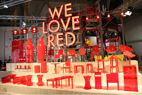
 left: kartell
Apartment Therapy called this year’s show-stopping booths “a mix of design carnival, furniture circus and visual theme park,” and if we’ve learned anything so far from Salone Milan this year, it’s that designers love a good show. Years of planning and hard work go into each and ever product featured on the exhibition floor, but what would these designers be without a good display? Out of the hundreds of chairs at Salone, what draws your attention to one and not another? Let’s take a look at who’s sitting down on the job and who’s strutting their stuff.
Kartell’s unabashed use of red is real winner in my book. Displaying all their wares side by side in a single color is also an effective way to show off the individuals designs without distraction. It’s simple, bright and straightforward, and the flawlessly executed big, bold lettering is downright eye-arresting.
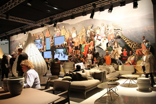
 left: dedon
I also love the collaged wall mural Dedon used. Their mostly neutral-colored wares benefit from the backdrop of bright shapes and patterns.
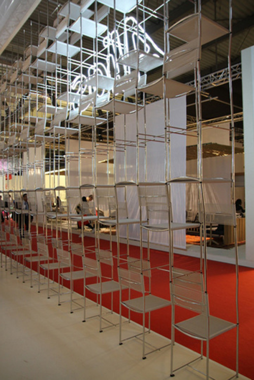
 left: alias
Lastly, Alias wins for cleverness with their great wall of stacked chairs. Talk about a way to effectively display your product while using the product as the display itself. Of course, it doesn’t hurt that all of these booths also have stellar products to hawk.
[ at the salone internazionale del mobile ]

about perrin drumm


