grow watch for alessi | click > enlarge
[DesignApplause] We are in the Alessi Milan flagship showroom at an open house showcasing new products. One new product is a beautiful wristwatch called the “Grow Watch” and with us is the designer of the watch Andrea Morgante. Andrea, please tell us where your office is located, how it’s structured, and what kinds of things do you do.
[Andrea Morgante] My office is in London. I started Shiro Studio roughly three years ago. It’s call Shiro Studio because I have an obsession with white and shiro means white in Japanese. A very good friend of mine came back from Japan and he just read a book titled “Shiro” by graphic designer Kenya Hara and the book talked about all the reasons why white is just an amazing color. The book hit a nerve, and started some very deep thoughts about a specific creative attitude. For example, white is more than just a color but rather a state of mind. It is about purity, about creativity. White is the paper, white is the blank slate, it’s both the emptiness and the everything, the endless possibilities.
During these three years I’ve been really busy completing a project I kind of inherited, the Ferrari Museum which is a project I started in 2004. Back then I was an associate director for Future Systems, a highly-recognized practice based in London. And when sadly the founder Jan Kaplicky passed away in 2009 the project was left basically orphaned. Soon after the client asked me to complete the building, which we eventually did, last March.
[DA] Andrea, are you an architect or product designer?
[AM] It’s architecture mainly, but I’m Italian and went to school in Italy before moving to London and design is a part of our DNA. Back in the “Golden Era” 50s and 60s, the major designers like Castiglioni, Colombo, Magistretti, were architects. There was no formal design school but they designed many products. So I was exposed to a culture where there is no clear boundary for what is architecture and what is product design. And even though European schools today now offer options of both architecture and design, for me the disciplines are one in the same.
[DA] In the U.S. formal education separates the disciplines. Designers and architects sometimes complain and wish both were melded together like early European educations.
[AM] They’re similar but for me here is the difference. I like product design because it is more immediate, it is more direct contact, between you and the design process and the outcome. You might say architecture is a confrontational process. You can have the most amazing idea, but in the end you need to interface successfully with a client, with a planning approval office, with engineers, with a contractor, a subcontractor, there are quite a few restraints. And it’s becoming more and more complex to actually complete a building. When it comes to product design, I found there’s more free expression because it is just you, the producer and the technology. And the responsibility is interestingly different in this way. You only design one building but a product, you produce hundreds, thousands.
Another aspect is scale. I find it inspirational to work for example on the 10,000 square meter museum and then shift to the wristwatch for Alessi. It’s such an amazing change of scale you can actually feel the brain working harder. Like a camera lens, whirring from wide-angle to macro.
 enzo ferrari house exhibtion
[DA] Is there an advantage in what order you master the discipline.
[AM] It seems very personal, probably what one learns first. And then there is who is good at both. We have seen famous architects fail miserably trying to design a product. And vice versa, a great designer trying to build something bigger and they mess up on the architectural aspects.
[DA] Is this watch the smallest product you designed to date?
[AM] Yes. And things get pretty small when you design a watch. Designing the hands is pretty amazing.
[DA] I was taught to explore both the smallest and largest applications of a design first. For a logo start with the business card. Then throw the logo on an airplane or truck. It gets even smaller today with app icons on smartphones. It’s a small world.
[AM] I recently met a friend of mine who is a graphic designer is designing a font for the Internet and he showed me how he is cutting into the letters so the corners are sharp given the small size of the font. I didn’t realize that kind of detail was necessary. It’s rather beautiful. It is possibly the smallest thing you can design.
[DA] This is your first watch. I know a little bit about how Alessi selects their designers. How did you even get asked?
[AM] (Chuckle) Then you know the designer selections go through Alberto Alessi, that is his role within the company. And considering the roster of designers selected it is quite a privilege to be asked. When I go there to present something his desk is a bit unsettling at first because there are so many amazing objects, sketches, magazines, everywhere, not a lot of space to lay down a drawing. Because of this, when I go there I present possibly 8 to 10 ideas on A4 sized paper so at least I know it’s going to fit on the table. The last time I came in I brought a watch idea, though they didn’t ask for one, and I dropped it on the desk. And he grabbed it immediately and said this was quite interesting and let’s take this idea forward.
This moving forward is done in different stages. There’s an analysis to gauge product interest. From there you go into a physical-study phase. It’s a long process.
[DA] The styling on your watch mirrors a style seen in your architecture. There is a flowing, wave-like visual on the skin of the structure.
[AM] The scale of the object or structure may dictate characteristics. The concept exploration would always include my passions. There is also a technology language being spoken. I have been intrigued the last few years with the ribbing you find in nature. It’s not only beautiful but there are structural properties of ribbing such as strength and rigidity without the volume and weight. In architecture in would mean less material needed for support which could lessen the financial burden. And visually there is both a feeling of fluidity and weightlessness.
 grow watch for alessi
A watch does not demand structural strength like a building and the use of ribbing here does communicate a variety of possibilities. For example, if you suggest muscle fiber the ribbing transcends to fibers. So structurally the ribbing has no specific function but I discovered how the watch and the hand and wrist can communicate harmony through a muscular anatomy. I studied numerous anatomy drawings to reach these conclusions. It was an amazing discovery. The watch now feels to me like it has grown around your wrist. It’s become very life-like and comfortable. That’s why I call it the Grow Watch.
[DA] What is the watch skin material? And did you specify the material?
[AM] It’s polyurethane, a very versatile and resistant material. It was specified together with Seiko Japan who is the business partner with Alessi for this watch. Seiko was very happy with this choice of material as they have the engineering and manufacturing experience. Seiko was extremely open to explore new languages and solutions. Like the integration of the glass and the case which they had not done before. The solution was to respect the grow concept where the grooves found in the wristband and shell grew into grooves found in the glass. We were all surprised how readable the watch is considering the grooves on the glass. One of those delightful moments, you know.
[DA] Is your vision that this is more of a dress watch than an everyday watch or a specialty watch like a sports watch as it looks like it can take moisture.
[AM] That’s really difficult for me to say. I will say I like to run, usually three times a week, and I’ve never used a runner’s watch. If something works then it will work under almost any conditions, keeping its visual “Raison d’être” dignified. And yes, it’s waterproof.
[DA] How was color determined?
[AM] It was an intimate choice, colors I deeply relate to. Then Alessi suggested black, as apparently that is the color most people wear. We wound up with five colors: black, pure white, Yves Klein blue, fluorescent orange and yellow, the same yellow of the Ferrari Museum’s roof.
[DA] Are your solutions green, i.e., a low carbon footprint?
[AM] I try as best as I can. You know, many years ago green was still perceived as a sign of being contemporary. But today it is just mandatory. Even from the production side. The people I collaborate with, like Alessi, you’re already engaged in discussions concerning what’s renewable, what’s recyclable or even repairable. Another point of view is whether a design is useful and needed. If you’re creating something new and useful and not repeating what already exists, that can be considered even more environment friendly. Today’s the challenge is to define and create new typologies, that did not exist yesterday, and that is far more challenging than designing a new sofa.
[DA] Is this a man’s or women’s watch?
[AM] It has to be both. How horrible if it is only a man’s watch… It is good to blur some boundaries. Now this watch is quite over-sized but as you can see here, it looks good (we are in a crowded showroom and we have at our disposal several women’s wrists) on the thin wrist of a woman and for a woman the watch also becomes a bangle.
[DA] Other than scale were there any other challenges creating the watch?
[AM] Every time you design something you are inevitably communicating a message. And the message is better to be relevant, meaningful. The message should reflect contemporary values. And this is not easy at all. Alongside this challenge we are working in an over-saturated design environment. How to say something intelligent when building another chair or lamp? This to me is the challenge I face, every single day.
[DA] What’s next?
[AM] With regards to Alessi, this is my third project with them in two years and I feel we are now establishing a strong relationship. I am completing some new projects, where I am trying to re-define new typologies, so I guess I will fly soon to Crusinallo and pitch some of these new ideas to Alberto and his team.
[ vitals ] Andrea Morgante is a registered ARB Architect in the UK. After working in 1997 with RMJM in London he joined Future Systems in 2001 where he became Associate Director, working closely alongside the late Jan Kaplicky. In 2008 he collaborated with Ross Lovegrove, to develop a number of innovative architectural projects. Currently Andrea Morgante is supervising the construction of the Enzo Ferrari Museum in Modena for Fondazione Ferrari and designing for companies like MGX, Agape Design, Poltrona Frau and Alessi. [ shiro studio ] [ agape ] [ alessi ] [ enzo ferrari museum ] [ marsotto ] [ poltrona frau ] [ seiko ]

 click > enlarge
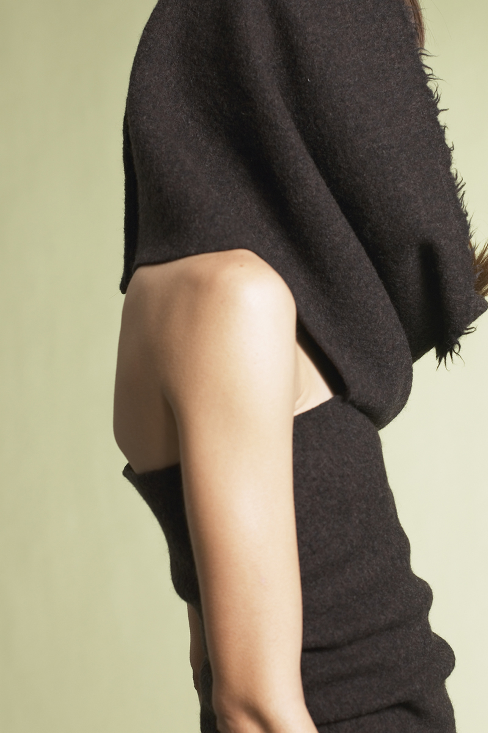 katrin schnabl
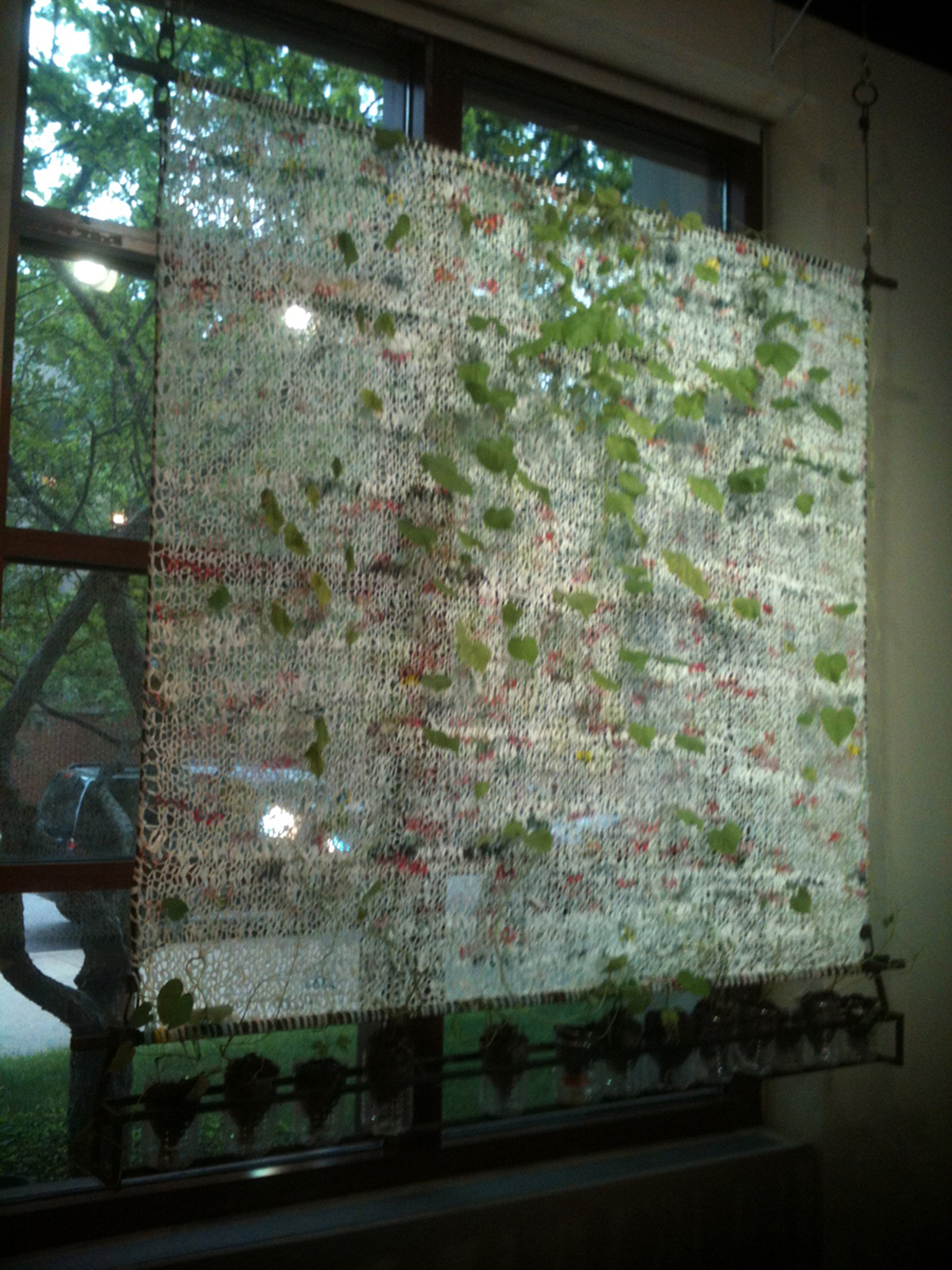 LIMB | katrin schnabl
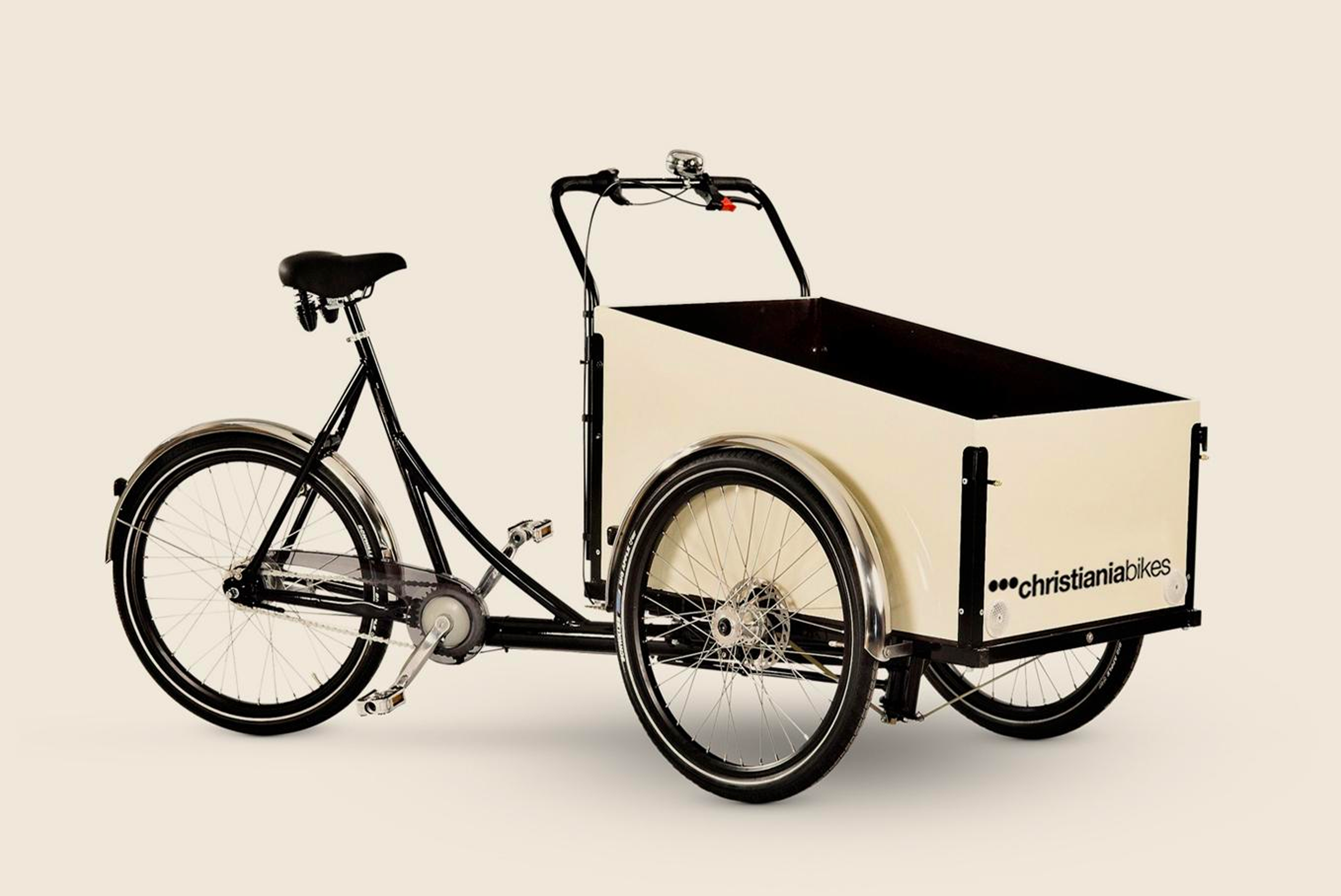 christiania trike
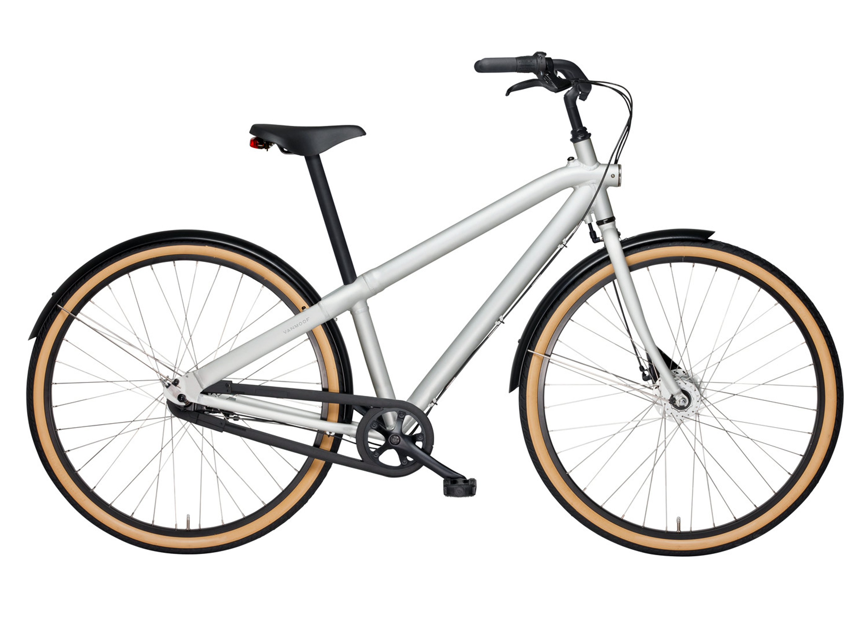 vanmoof m2 6